Tag: Israel
-
Mission Accomplished
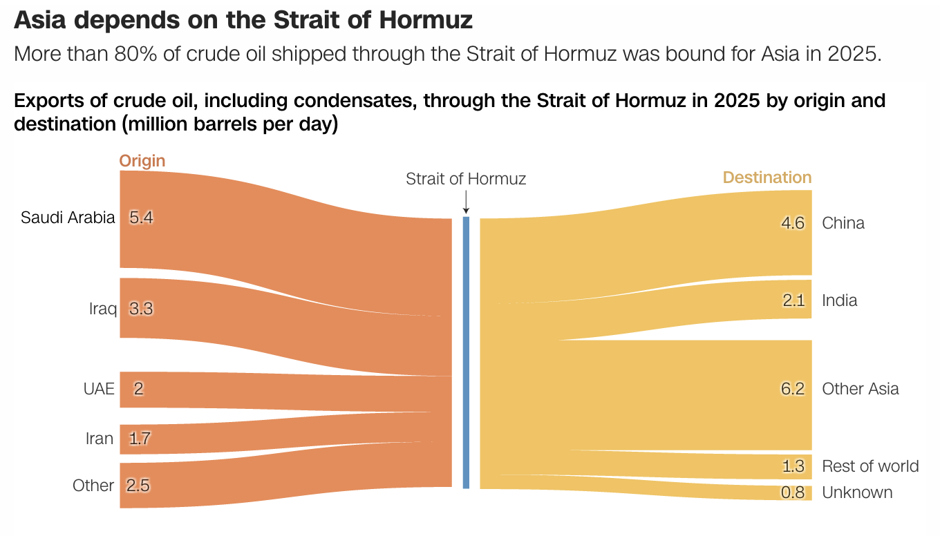
Last weekend the United States and Israel preemptively struck Iran and kicked off a regional war. As I type this Monday morning, the US–Israeli strike forced assassinated the ayatollah and numerous other senior Iranian officials—but this seems to have been anticipated to a degree and the regime quickly retaliated and has delegated roles and responsibilities.…
-
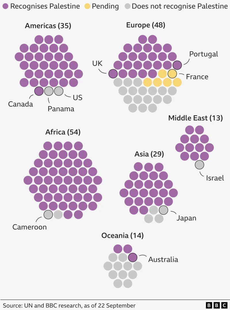
Palestine. The Newest Country in the World?
One of the most debated questions one could ask at pub trivia: How many countries are there in the world? To start, the question cannot be answered completely. What is a country? What is a state? What is a nation? Define recognition. Whose definition? When I worked at Euromonitor International I had to edit a…
-
The Times Wore It Better
Two weeks ago I posted about the death toll in the latest conflict between Israel and Hamas. As it happened, later that morning when I opened the door, there was this graphic sitting above the fold on the front page of the New York Times. The piece sits prominently on the front page, but tones…
-
Hamas’ Rocket Swarms
Last week I wrote about the deaths in Gaza and Israel, where a ceasefire is holding at the time of writing. But I also included a graphic about the size of Hamas’ rocket arsenal. In a social media post I commented about how it appeared Hamas had also changed its tactics given Israel’s Iron Dome…
-
Israel’s Palestine Trilemma
In what feels like forever ago, I wrote about the trilemma facing the British government as it related to Brexit. Brexit presented Westminster with three choices, of which they could only make two as all three were, together, impossible. Once made, those two choices determined the outcome of Brexit. For better or worse, Prime Minister…
-
Israeli Electoral History
One of the important stories of last week that was not black hole related was that of the re-election of the Likud Party in Israel, a party headed by Benjamin Netanyahu. This will be his fourth consecutive time as prime minister plus a fifth back in the late 1990s. Of course, he is facing an…
-
Casualties in Palestine and Israel
Yesterday I mentioned the cost of the conflict in and around Gaza and we looked at a map of damage. Today, we look at a daily-updated graphic from the Washington Post that counts the human cost—the number of dead. Credit for the piece goes to Lazaro Gamio and Richard Johnson.
-
Devastation in Gaza
I have done quite a fair bit of coverage on Ukraine. It is a terrible story, but I have also been personally interested in Eastern Europe for awhile. But Ukraine is not the only story in the world, we have seen Gaza erupt in flames. But with the recent, temporary ceasefire, we have been able…
-
Death Toll in Gaza and Israel
Today’s piece, the first not on Québec, is a small but poignant reminder of the disparity between the number of deaths in Gaza and in Israel during this most recent conflict. According to the article, as of 16 July there has been one death in Israel for 194 in Gaza. This small piece from the…