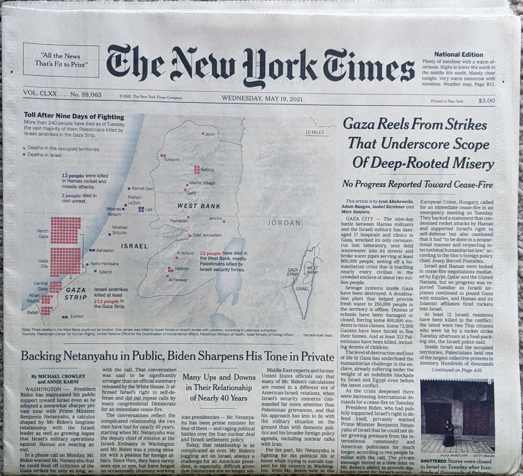
Two weeks ago I posted about the death toll in the latest conflict between Israel and Hamas. As it happened, later that morning when I opened the door, there was this graphic sitting above the fold on the front page of the New York Times.

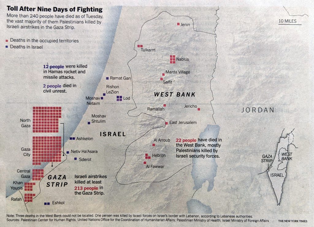
The piece sits prominently on the front page, but tones down the colour and detail on the map to let the graphical elements, the coloured boxes, shine and take their prominent position.
Here’s a detail photo I took in case the above is too small.

Ultimately, the piece isn’t too complex and isn’t more than what I made. However, the map adds some important geographical context, showing just where the deaths were occurring.
The piece also highlights the deaths in the West Bank and those in Israel from civil unrest. That was data I didn’t have at the time.
redit for the piece goes to the New York Times graphics department..
Leave a Reply
You must be logged in to post a comment.