Last week I wrote about the deaths in Gaza and Israel, where a ceasefire is holding at the time of writing. But I also included a graphic about the size of Hamas’ rocket arsenal. In a social media post I commented about how it appeared Hamas had also changed its tactics given Israel’s Iron Dome missile defence system.
Specifically, in the past Hamas launched rockets at a fairly even pace. However, with Iron Dome, Israel could—and did—defend about 90% of incoming fire. Consequently, Hamas tried to swarm Israel’s defences and some fire did leak through, killing over a dozen Israelis. I was looking for data on that, but couldn’t find what I wanted.
Clearly I didn’t look hard enough. This graphic appeared in the Wall Street Journal last week. It shows the cumulative number of rockets launched at Israel during this most recent surge in violence compared to the 2014 war between Israel and Hamas.
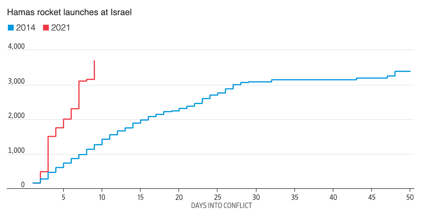
In 2014, you can see even, incremental steps up in the total count of rockets. But from earlier this month, you can see much steeper increases on a daily basis with more time between those swarms.
From a design standpoint, it’s a really nice graphic. I will often say that good graphics don’t need to be crazy or flashy. This is neither. It relies on solid fundamentals and executes well. All the axis lines are labelled and the data series fall within the bounds of the x- and y-axis. The colours chosen contrast nicely.
Credit for the piece goes to the Wall Street Journal graphics department.
Leave a Reply
You must be logged in to post a comment.