Tag: alcohol
-
Pour One Out—For Your Liver
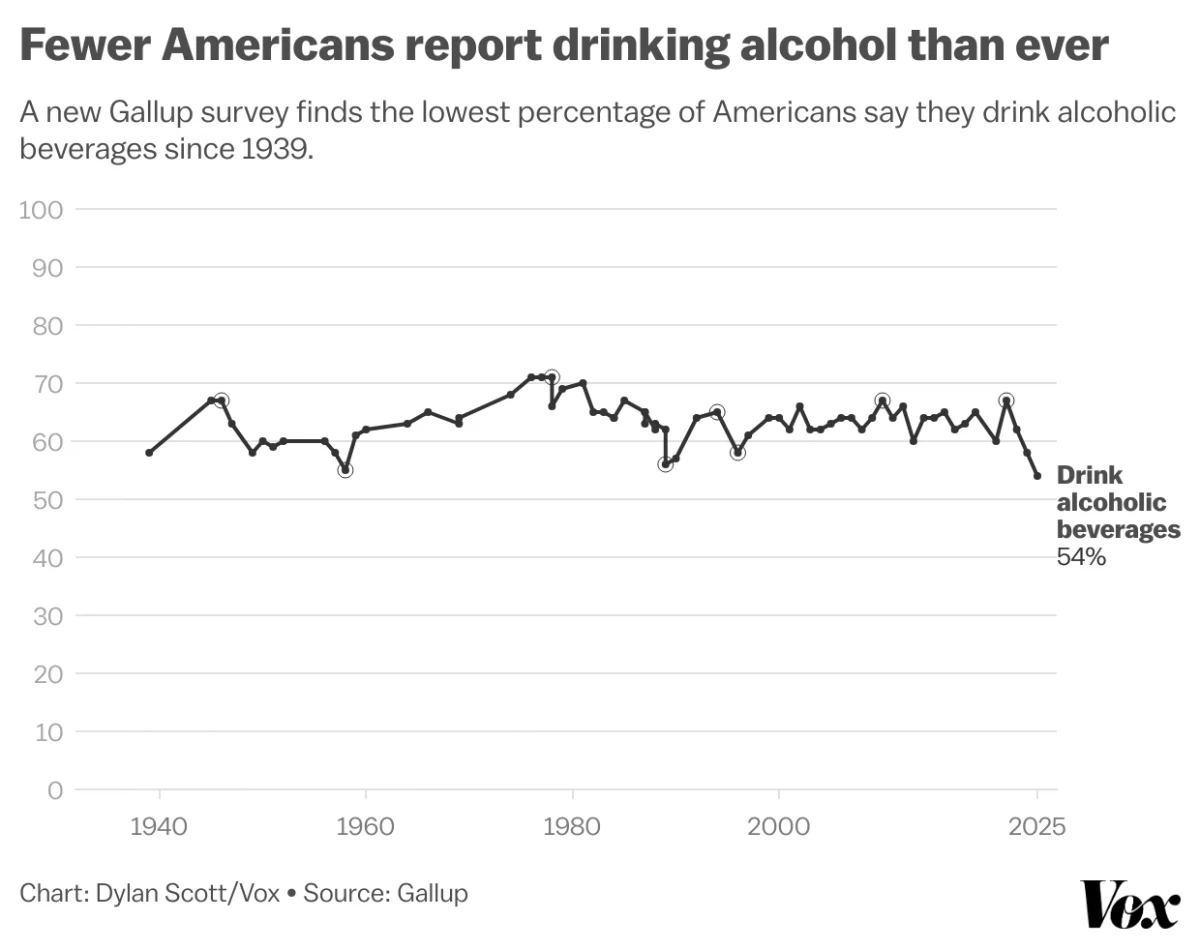
Last month Vox published an article about the trend in America wherein people are drinking less alcohol. They cited a Gallup poll conducted since 1939 and which reported only 54% of Americans reported partaking in America’s national tipple—except for that brief dalliance with Prohibition—making this the least-drinking society since, well, at least 1939. Vox charted…
-
The Sun’s Over the Yardarm Somewhere
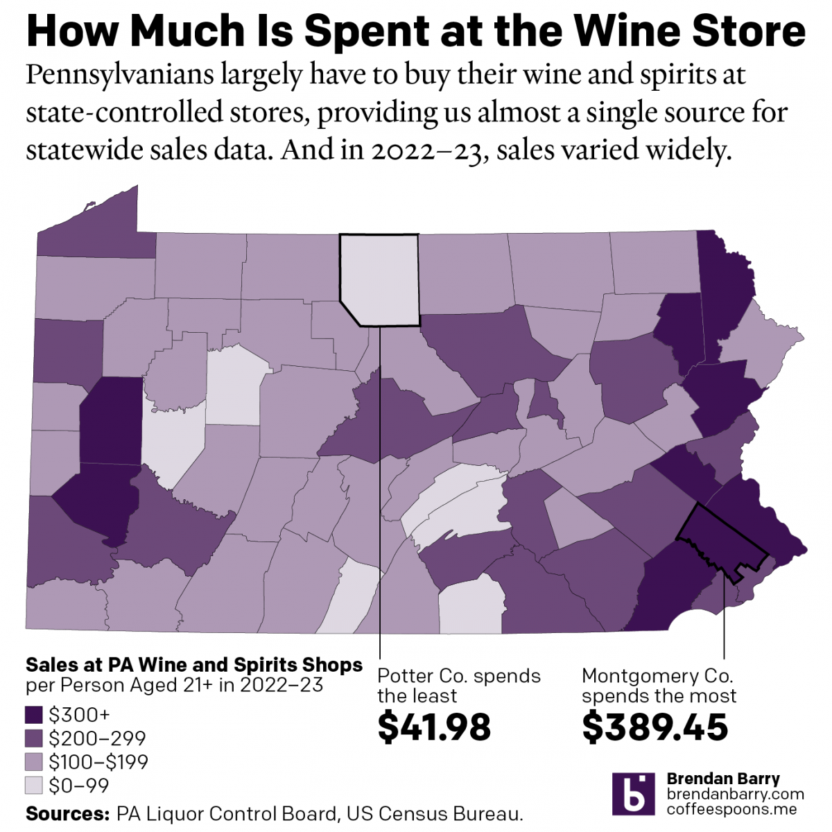
It’s been a little while since my last post, and more on that will follow at a later date, but this weekend I glanced through the Pennsylvania Liquor Control Board’s annual report. For those unfamiliar with the Commonwealth’s…peculiar…alcohol laws, residents must purchase (with some exceptions) their wine and spirits at government-owned and -operated shops. It’s…
-
It’s Friday, Can I Drink Yet?
Happy Friday, everyone. We made it through to week’s end. And you know what that means. It’s time for a drink. Thanks to one of my best mates for sharing this comic from Saturday Morning Breakfast Cereal. He shared it with the comment: “I now understand your love of gin.” Credit for the piece goes…
-
London in Small Multiple Form
You all know that I love small multiples. And we have been seeing them more often as representations of the United States. But today we look at a small multiple map of London. The piece comes from the Economist and looks at the declining numbers of pubs in London. With the exception of the borough…
-
Boston Beer Company
Boston Beer Company is the parent company of Sam Adams, which is definitely one of those beers I imbibe when I visit Boston. But, as one of the larger craft brewers in the United States, it finds itself under immense competition. This article from Bloomberg examines the situation the brewery finds itself in from a share…
-
Expensive Wines
Another Monday, another week, another post. But this week we will try to get by without any more Brexit coverage. So what better way to cure a hangover than with more booze? So let’s start with some fancy wine. I meant to post this piece a little while back, but yeah that unmentionable thing occurred.…
-
What Will You Have
Now that it’s Friday, it’s time for happy hour drinks. Well, maybe not quite yet. Let’s get through the workday first. But over at the Wall Street Journal, together with Yep, they looked at which cocktails are most popular in eight cities based on Yelp reviews. They do note that the metric is not perfect…