Today is just a quick little follow-up to my post from Monday. There I talked about how a Boston Globe piece using three-dimensional columns to show snowfall amounts in last weekend’s blizzard failed to clearly communicate the data. Then I showed a map from the National Weather Service (NWS) that showed the snowfall ranges over an entire area.
Well scrolling through the weather feeds on the Twitter yesterday I saw this graphic from the NWS that comes closer to the Globe‘s original intent, but again offers a far clearer view of the data.
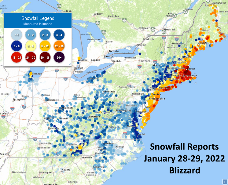
Whilst we miss individual reports being depicted as exact, that is to say the reports are grouped into bins and assigned a colour, we have a much more granular view than we did with the first NWS graphic I shared.
The only comment I have on this graphic is that I would probably drop the terrain element of the map. The dots work well when placed atop the white map, but the lighter blues and yellows fade out of view when placed atop the green.
But overall, this is a much clearer view of the storm’s snowfall.
Credit for the piece goes to the National Weather Service graphics department.
Leave a Reply
You must be logged in to post a comment.