Dude Where Did I Park My Car?

Mother Jones had a lengthy but fascinating piece on urban parking. (I mention the lengthy bit only lest you think it a quick lunch read.) While the design uses a few factettes as sidebars to the main body copy:

Sidebar factette
Sidebar factette

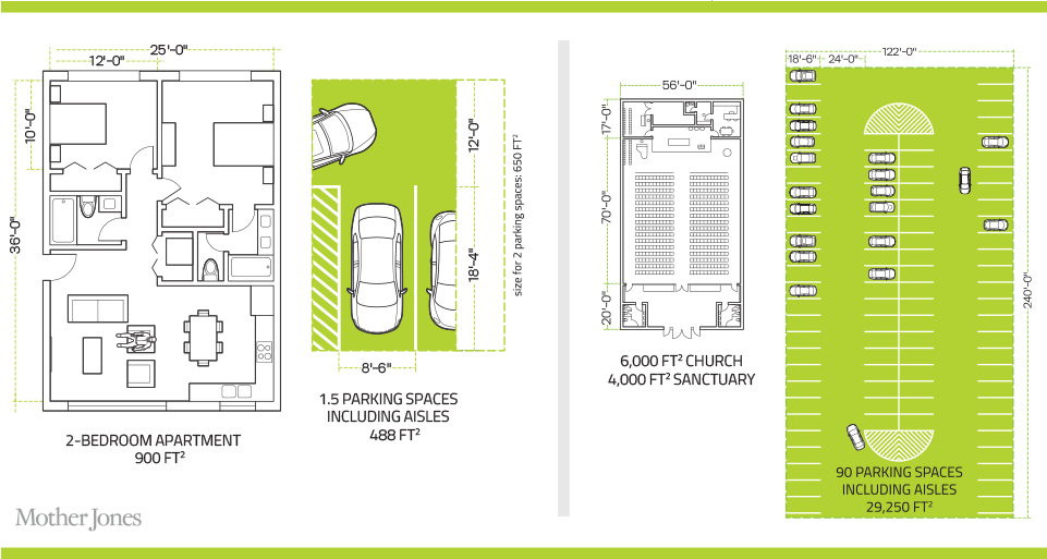
The more interesting piece is the illustrative comparison of a 1.5 vehicle parking space to the size of a 2-bedroom flat. This is the main and really only graphic of the whole piece. However it does a great job comparing the sizes required for humans and for vehicles. We use a lot of space for vehicles.

2 bedrooms vs 1.5 vehicles

Not that I have any intention of getting rid of my car.

Credit for the piece goes to Chris Philpot.

Blizzard of 2016 Snowfall Totals

You may have heard that the East Coast received a wee bit of snow. Here is the snowfall map from the Wall Street Journal.

Where the snow fell
Where the snow fell

I can report that my family received 30 inches. Which makes sense, because they live somewhere near here. That’s a lot of snow.

My hometown
My hometown

Credit for the piece goes to the Wall Street Journal graphics department.

Snowmageddon Round 2?

For those of you like myself from the East Coast—even if some of us have unfortunately moved away from civilisation—terms like Snowmageddon and Snowpocalypse draw upon memories of lots and lots of snow. So with all the hype about today’s snowstorm about to pummel the East Coast, the Washington Post took a look at the forecast range of snow and compared that to Snowmageddon.

Attack of the 6-ft tall snowman

Side note, as someone who it could be said uses a lot of purple in his work, I love the colour choices here.

Credit for the piece goes to Kat Downs.

US Fed Forecasts

Organisations that forecast things are not often inclined to go back and review their forecasts against the actual results. So that makes today’s post from the Wall Street Journal fascinating. They reviewed the Federal Reserve’s forecasts for US GDP growth against the actual growth. And it turns out the Fed consistently overestimated US growth.

US Federal Reserve Forecasts

From a design standpoint, what makes this piece interesting is how they presented the range of forecasts. After all, it would otherwise become a plot of squiggly spaghetti lines. Instead, they used colour to group each projection set. A smart idea. Plus a nice literary allusion. I mean if you like Dickens.

Credit for the piece goes to the Wall Street Journal graphics department.

Symbology for Maps

I’m sure the word you were looking for was symbolism. (Points if you get the reference.) Apologies for yesterday, I was a bit under the weather.

Today we deviate from graphs and things and go to another area of conveying information: symbology. I mean iconography. The BBC featured an article about possible new symbols for maps ahead of the 2020 Olympics when, presumably, lots of foreigners will need maps to get around Tokyo. And so you can imagine that the agency behind the proposed ideas has received a backlash about changing customary Japanese symbols for foreigners.

I combined each of the examples from the article. Each row includes the proposed Japanese version and the foreigner version. See if you can identify them without the word. You can imagine, however, that the focus of the article was upon that first row. The answers are after the credits.

Proposed map symbols

Credit for the original work goes to the Geospatial Information Authority of Japan.

The answers, top to bottom: temple, hotel, church, hospital, post office, police station.

If the Government Were a Household

One of the things that irritates me about when people complain about government spending is the comparison against household budgeting. The two are very different. I mean on the surface, I suppose yes, both have income and both spend on stuff and services. But, to put it all in context there is this nice piece from the Washington Post that shows what US federal government monthly spending looks like from the perspective of a household earning $64k.

The government-is-a-household budget

I wish I could get away with that level of spending on housing and transportation…

Credit for the piece goes to the Washington Post graphics department.

More on the Muslim Split in the Middle East

Yesterday we looked at the Economist’s work on breaking down the Sunni and Shia split throughout the Middle East. Let’s take a look at that again today, especially since the world’s largest Muslim nation dealt with a terror attack overnight. That’s right, Indonesia is actually the world’s largest Muslim country and it is also largely secular in nature. But, back to the Middle East where the New York Times put together an article exploring the two power blocs and the religious affiliations within.

A map of the region
A map of the region

The map provides a bit more detail on a few different sects that are relevant, especially the Wahhabists in Saudi Arabia.

Credit for the piece goes to Sarah Almukhtar, Sergio Peçanha, and Tim Wallace.

The Muslim Split in the Middle East

Turning away from selfies and returning to the upbeat world of the Middle East, today we look at a graphic from the Economist that breaks down the Middle East into the Sunni and Shia sects. See anything that looks familiar? Do you know how Saudi Arabia and Iran are feuding at the moment? Well, take a look at the predominant sect in each country.

Sunni vs. Shia
Sunni vs. Shia

Credit for the piece goes to the Economist’s Data Team.

Selfiexploratory

New year, new selfies. Thankfully we have the Selfiecity to look at a sample of selfies, the goal to determine patterns and trends in the art of the selfie. Of course you also want to be able to look at the aforementioned selfies. For that they built the Selfiexploratory, an application that allows you to filter the set to see what you want. What I like is the return of data to show what the results of the filter look like against the whole set.

How my filters affect the results

Credit for the piece goes to the Selfiecity team.