Organisations that forecast things are not often inclined to go back and review their forecasts against the actual results. So that makes today’s post from the Wall Street Journal fascinating. They reviewed the Federal Reserve’s forecasts for US GDP growth against the actual growth. And it turns out the Fed consistently overestimated US growth.
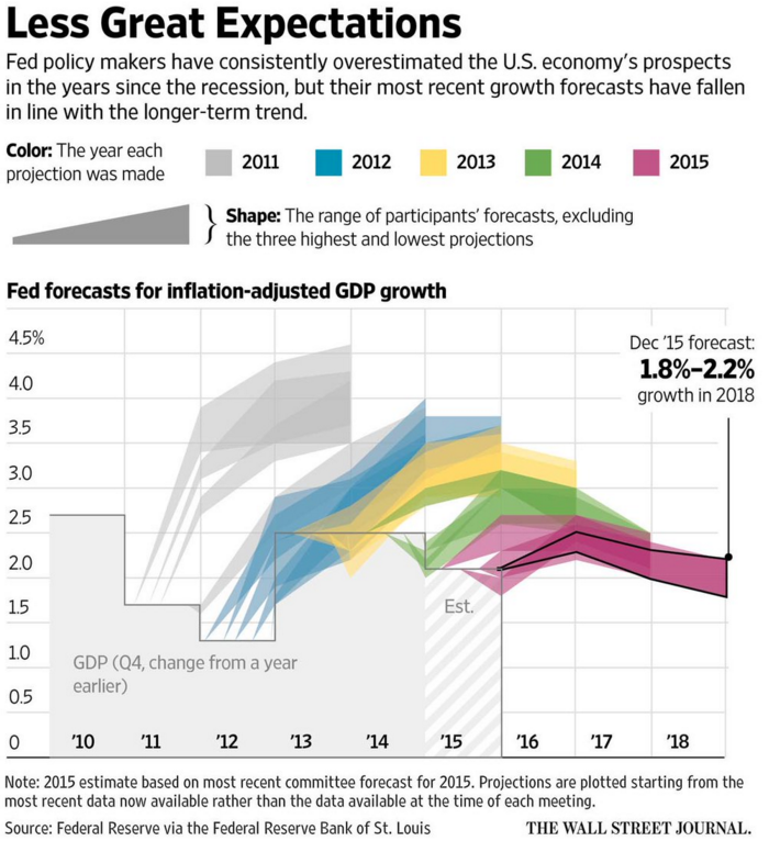
From a design standpoint, what makes this piece interesting is how they presented the range of forecasts. After all, it would otherwise become a plot of squiggly spaghetti lines. Instead, they used colour to group each projection set. A smart idea. Plus a nice literary allusion. I mean if you like Dickens.
Credit for the piece goes to the Wall Street Journal graphics department.
Leave a Reply
You must be logged in to post a comment.