North Korea wanted to launch a missile, but failed miserably in doing it. Richard Johnson at the National Post created an infographic, prior to the missile’s launch, that looked at what the North Koreans wanted to do.

North Korea wanted to launch a missile, but failed miserably in doing it. Richard Johnson at the National Post created an infographic, prior to the missile’s launch, that looked at what the North Koreans wanted to do.

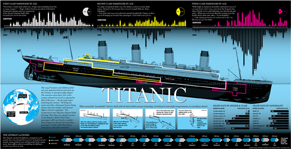
The anniversary of the RMS Titanic’s sinking led to a flurry of graphics related to the sinking, two of which I covered last week. Today’s is from the National Post and looks at the people onboard, most of whom died. Specifically, it breaks out the survivors and those who perished into their class—by berth not birth—and age. It also shows how empty most of the lifeboats were when they launched.
Credit for the piece goes to Richard Johnson.
Global warming is probably not the worst-branded concept out there, but it is not particularly effective. Mostly because it implies the world will warm and warm evenly. In truth, some parts will get colder, some parts drier, some parts wetter, and yes, some parts warmer. Hence the better term is climate change.
In the US, we have a tendency to be rather skeptical of climate change and the degree to which, if not whether entirely, it is due to mankind. So, the New York Times released the results of a survey about whether Americans believe recent weather events are related to global warming—their word choice, not mine.
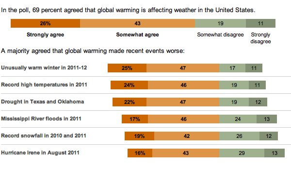
While not all bars sum to 100, probably due to rounding, note how the bars are all aligned against the point of divergence between the scales of agreement and disagreement and then sorted according to agreement.
For the past two posts I focused on the sinking of the RMS Titanic, an historical event that has always been of some interest to me, but is not always the most uplifting of subjects. When in high-school, I once had an English teacher who took to heart our complaints that our literature selection was rather dark and depressing. So after finishing yet another such story, he had us turn to a specific page in our reader. The title of that day’s story was To the Gas Chambers, Ladies and Gentlemen; it was a story about the Holocaust.
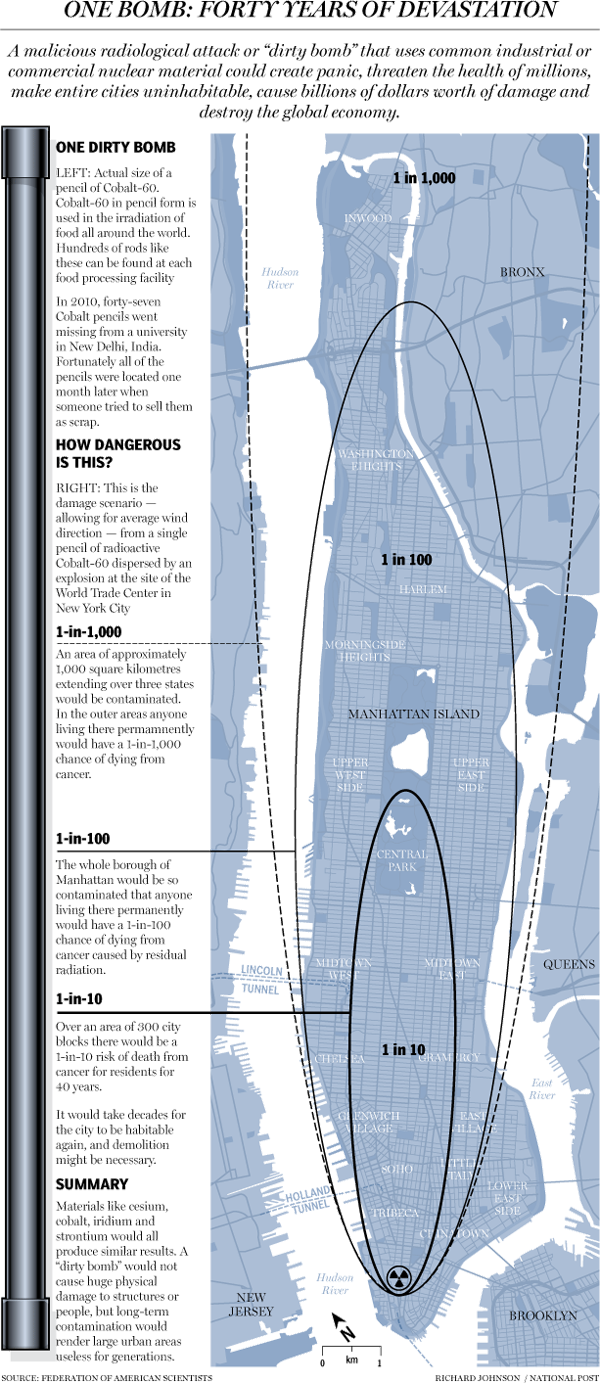
Here is today’s uplifting story. What would happen if a dirty bomb was detonated in lower Manhattan. Courtesy of the National Post.
Credit for the piece goes to Richard Johnson.
On 14 April 1912—that is 100 years—RMS Titanic avoided slamming bow-on into an iceberg. But her turn allowed the iceberg to slice a long gash beneath the waterline and the North Atlantic gushed into watertight compartment after watertight compartment. Several hours later over 1500 people would be dead.
The BBC has published several articles about the sinking in the lead-up to the anniversary. This one is an illustration through small multiples of how the Titanic sank, from the bow slipping beneath the waves to the point at which the liner split in two to the stern rising vertically out of the water before it too plummeted to the seabed.

At the end of the graphic is an exploration of the wreck and a small chart showing the scale of the depth at which the wreck now sits, slowly deteriorating.
Credit for the painting goes to Ken Marchshall.
Saturday will be the 100th anniversary of the sinking of the RMS Titanic. She struck an iceberg just before midnight—at the time the crew thought merely as a glancing blow—and within three hours she would be headed towards the seabed. By the time the survivors were all picked up, over 1500 people would die in what is perhaps the most (in)famous sinking in human history.
But, what about the iceberg? There are of course the reports that a ship scouring the sea for survivors after the sinking found the killer berg. But how did it get there? The New York Times put together an infographic exploring the science behind how the RMS Titanic might have ended up colliding with what originally was part of (probably) a Greenlandic glacier.
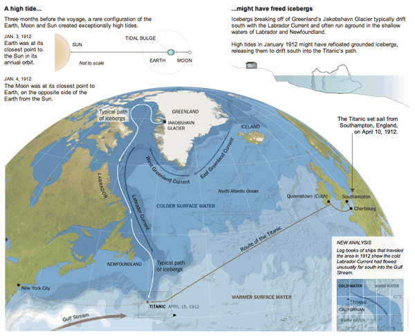
Also in the piece are explanations of how it is possible that the SS Californian did not come to the rescue of the stricken RMS Titanic.
Credit for the piece goes to Mika Gröndahl and Joe Burgess.
For many, this past winter was not so wintery, warmer than average temperatures and less than average snowfall. The National Post looked at Canada’s winter experience and found it to be the third-warmest in history. The story was covered in a large infographic piece that uses small multiples to look at previous Februaries across Canada and then bar charts to look at March temperatures specifically.

Credit for the piece goes to Tristin Hopper, Jonathon Rivait, and Richard Johnson.
Via the Guardian, Stamen Design has teamed up with Climate Central to create an interactive piece that maps the potential effects of rising sea levels. The user has control over the amount of the rise—this graphic says four feet—after which the coastline recedes to reveal the devastation. This is complemented by statistics of the land, including the population potentially affected along with the number of homes and total acres. In this case you see South Jersey, which is where I spent my summers. As you can see, the coastal beach towns I called home would be underwater. (And the little blue specks inland in Pennsylvania near my hometown, those are quarries; nobody lives there. No need to worry.)
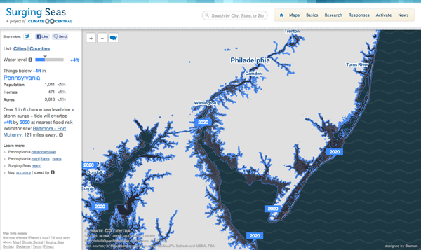
The problem, of course, is that a large percent of the Earth’s population lives near the ocean. There are not, after all, many people living in the interiors of the continents. So receding coasts may very well be a problem in the coming years.
Cholera. It’s more than just a disease on the Oregon Trail. It exists in the 21st century, though typically we do not experience it in the industrialised Western world. Where one does see it crop up are in places with poor sanitation, which is usually in the developing world. But, if one were to take a developing country and then in a few seconds wreck the national infrastructure in a devastating earthquake, one could see the creation of the right conditions for an outbreak.
Sadly, that is exactly what happened—and to a lesser degree is still happening—in Haiti. The New York Times wrote about the problem in an article in the Sunday edition. The article was accompanied by an infographic that mapped the spread of the outbreak geographically and then its intensity over time.

Credit for the piece goes to Joe Burgess and Lisa Waananen.
We have an obesity problem in the United States. And in some cases, obesity leads to diabetes. A study was commissioned to discover whether surgery is more effective than the usual prescription of drugs, diet, and exercise. It turns out that surgery may very well be more effective.
The New York Times produced an infographic to explain the three types of surgery investigated in the study.
