How the RMS Titanic Sank

On 14 April 1912—that is 100 years—RMS Titanic avoided slamming bow-on into an iceberg. But her turn allowed the iceberg to slice a long gash beneath the waterline and the North Atlantic gushed into watertight compartment after watertight compartment. Several hours later over 1500 people would be dead.

The BBC has published several articles about the sinking in the lead-up to the anniversary. This one is an illustration through small multiples of how the Titanic sank, from the bow slipping beneath the waves to the point at which the liner split in two to the stern rising vertically out of the water before it too plummeted to the seabed.
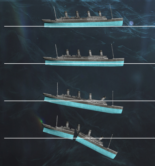
How the RMS Titanic sank

At the end of the graphic is an exploration of the wreck and a small chart showing the scale of the depth at which the wreck now sits, slowly deteriorating.

Credit for the painting goes to Ken Marchshall.

Setting the Stage for the Sinking of RMS Titanic

Saturday will be the 100th anniversary of the sinking of the RMS Titanic. She struck an iceberg just before midnight—at the time the crew thought merely as a glancing blow—and within three hours she would be headed towards the seabed. By the time the survivors were all picked up, over 1500 people would die in what is perhaps the most (in)famous sinking in human history.

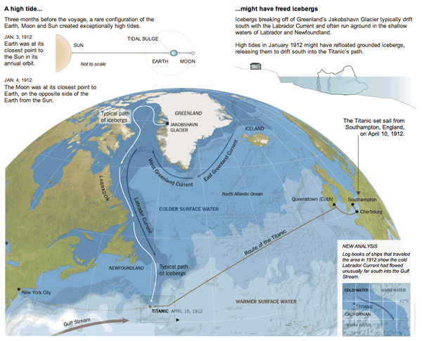
But, what about the iceberg? There are of course the reports that a ship scouring the sea for survivors after the sinking found the killer berg. But how did it get there? The New York Times put together an infographic exploring the science behind how the RMS Titanic might have ended up colliding with what originally was part of (probably) a Greenlandic glacier.

The Titanic Iceberg
The Titanic Iceberg

Also in the piece are explanations of how it is possible that the SS Californian did not come to the rescue of the stricken RMS Titanic.

Credit for the piece goes to Mika Gröndahl and Joe Burgess.

Delivery Routes

Sunday in the New York Times, an article on bicycle delivery had an accompanying infographic. It detailed the dinner route of the article’s main individual. The piece is an interesting use of small multiples to provide a timeline of a route, while each new delivery maintains the old paths for reference. And from a data perspective, I found it good to acknowledge the one instant where the follower lost contact with the delivery man.

Delivery routes
Delivery routes

Fatal Passenger Train Derailment

Sunday afternoon in Burlington, Canada, a VIA passenger train—think Canada’s version of Amtrak—derailed shortly after switching tracks. The two engineers in the locomotive and their trainee died in the accident, which is still under investigation.

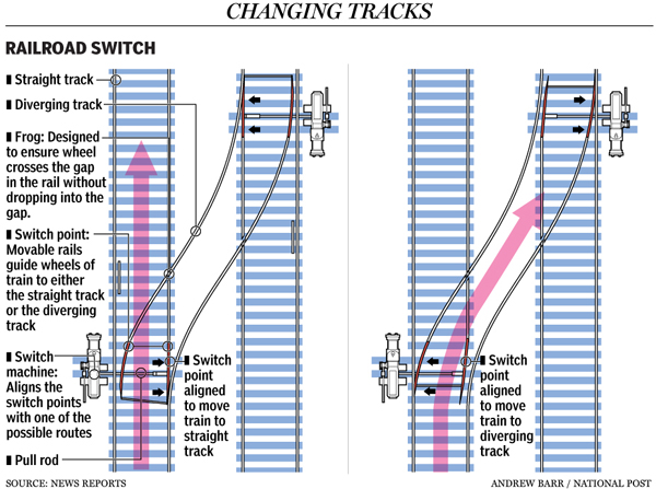
The National Post covered the story and included a few graphics to explain just what happened. Maps pointed out exactly where the train derailed. The graphic below details how a switch works for those unfamiliar with rail transport.

How rail switches work

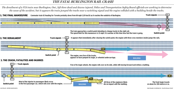
And lastly, a larger graphic attempts to explain what may have happened in lieu of the final accident report from the Canadian Transportation Safety Board.

How the derailment occured

Credit for the switches graphic goes to Andrew Barr and for the accident diagram credits go to Richard Johnson.

Replacing the Bay Bridge for the Long Term

Bridges are vital parts of infrastructure networks connecting two separate pieces of territory, but often they can be choke points. Damage to a bridge can result to isolation at worst and at best long, circuitous reroutes that add significant time to travel. In the San Francisco area authorities are building a new bridge to replace the current Bay Bridge. But as everyone knows, buildings and infrastructure in that area can be significantly damaged during earthquakes. And the area is waiting for the ‘Big One’ that shall come some day or another.

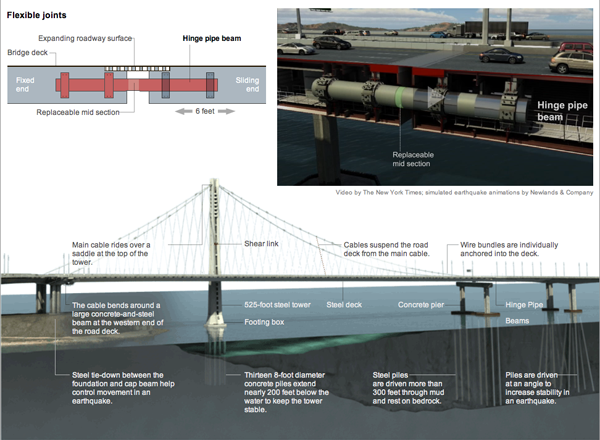
So how to build a new bridge for the long-term that will also survive a major earthquake? The New York Times explains it in an interactive piece accompanying an article. The interactive piece includes an animation with voiceover explaining the details of the design, with diagrams illustrating the components placed next to the video player. At the bottom, anchoring the piece (pun intended), is a photo-illustration of the new bridge’s design.

Diagram explaining the Bay Bridge replacement

Credit for the piece goes to Mika Gröndahl and Xaquín G.V.

How the Costa Concordia Sank

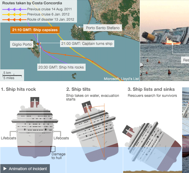
The Costa Concordia sank nearly a week ago, but the questions of exactly how and why she sank will likely linger for much longer.

The BBC has had extensive coverage of the story, including this page that details what is known about how and why the cruise ship sank.

How She Sank
How She Sank

China’s Secret Nuclear Missile Tunnel System

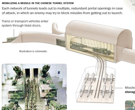
I do not often get the chance to post illustrative works. But, the Washington Post reported on the work of Georgetown students that shows how China has tunneled thousands of miles of, well, tunnels to create a secret labyrinth for their nuclear weapons programme. The result is that instead of the few dozen warheads that China is thought to have, they could have many more times that. They included this graphic, cropping below, with the article.

Cropping of a Nuclear Tunnel

The New York City Marathon

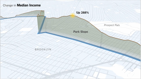
Something I’ve been meaning to put up for a little while, the New York Times’ coverage of that city’s marathon and changes in the socioeconomic composition of the neighbourhoods through which the course winds.

The piece includes a narrated motion graphic explaining the changes along a map of the course, while a series of charts look at those factors from a static perspective. The horizontal axis being the route of the course.

Brooklyn segment of the NYC Marathon

Credit for the piece goes to Graham Roberts, Alan McLean, Archie Tse, Lisa Waananen, Timothy Wallace, Xaquin G.V., Joe Burgess, and Joe Ward.

Curiosity

In just a few days, NASA’s next Martian rover, Curiosity, will lift off for a 2012 date with the Martian surface. The Washington Post has a two-part motion graphic piece to look at the rover’s landing and scientific components.

A look at Curiosity and its mission

Credit for the piece goes to Alberto Cuadra, Sohail Al-Jamea, and Andrew Pergram.

Maps of the Democratic Republic of the Congo

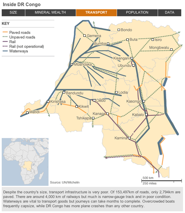
The Democratic Republic of the Congo is preparing for elections at the end of the month. For decades since independence from Belgium, the country has been beset by insurrection and civil war. Eastern portions of the country are all lawless and beyond the control of the government in the capital Kinshasa. Yet, DR Congo, which is almost the size of all of Western Europe, holds vast mineral and energy reserves.

Much like with the independence of South Sudan, the BBC has released a small interactive piece detailing DR Congo through maps. While not as extensive and lacking in visualising anything about the warfare and bloodshed, the piece is useful to gain a brief insight into the complexities of the country and the sheer scale of its problems. But that is not wholly surprising as the title of the piece is Failed State: Can DR Congo Recover?.

Screenshot of a guide to DR Congo