Something I’ve been meaning to put up for a little while, the New York Times’ coverage of that city’s marathon and changes in the socioeconomic composition of the neighbourhoods through which the course winds.
The piece includes a narrated motion graphic explaining the changes along a map of the course, while a series of charts look at those factors from a static perspective. The horizontal axis being the route of the course.
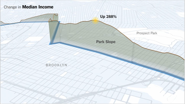
Credit for the piece goes to Graham Roberts, Alan McLean, Archie Tse, Lisa Waananen, Timothy Wallace, Xaquin G.V., Joe Burgess, and Joe Ward.
Author: Brendan Barry
I am a graphic designer who focuses on information design. My day job? Well, they asked me not to say. But to be clear, this blog is my something I do on my own time and does not represent the views of…my employers. I think what I can say is that given my interest in information design—be it in the shape of clear charts, maps, diagrams, or wayfinding systems—I am fortunate that my day job focuses on data visualisation. Outside of work, I try to stay busy with personal design work. Away from the world of design, I have become an amateur genealogist and family historian. You will sometimes see that area of work bleed into my posts.
View all posts by Brendan Barry