Jumpin’ Juniper
Commentary, critiques, and observations on information design and data visualisation
Happy Friday, all. Baseball is back with Spring Training now in full swing. That means checking in on my Twitter feeds for Red Sox baseball coverage. Sometimes that means seeing content not at all related to baseball. And given yesterday was the day before the weekend, this post stuck with me and now you can […]
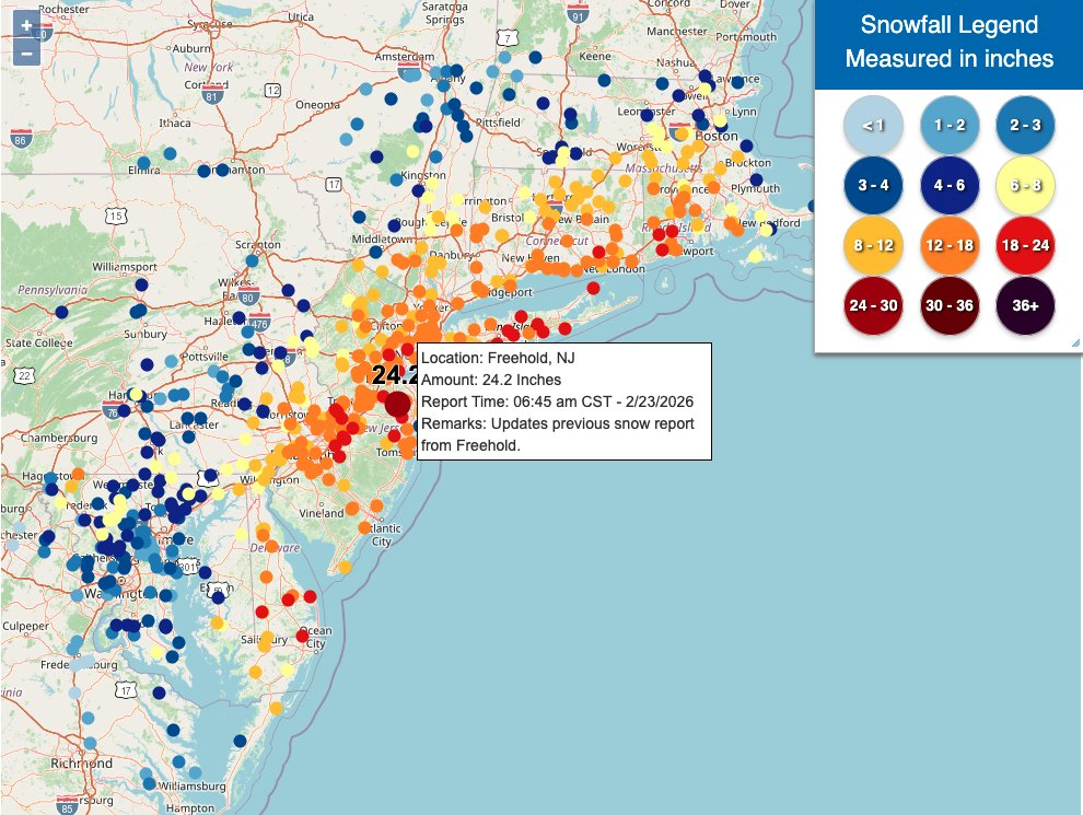
Ah, a blizzard. Even if the worst of the storm that recently impacted Philadelphia struck mostly at night, it still left a picturesque mess for the morning. I, however, was struck by some of the maps of the snowfall totals and I figured that would be worth sharing today. What got me started on this […]

Editor’s note: I wrote this Friday afternoon, and then on Saturday afternoon a new BBC article included a graphic similar to my design. I address later on in this post. (I am also my own editor.) Friday’s US Supreme Court ruling struck down President Trump’s tariffs—mostly, not all—as unconstitutional. I had a browser tab up […]
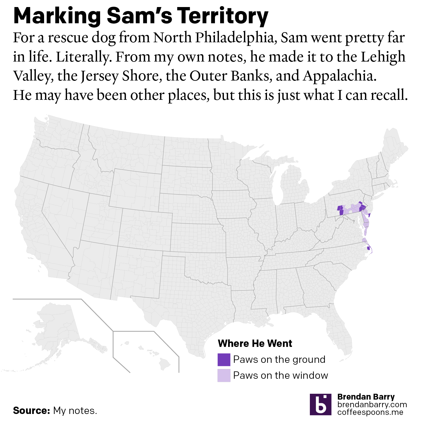
After last Friday’s post went live I headed home, because I received word that in the evening, we would be saying farewell to our family dog of 17 years, Sam. My sister adopted him after his first owners gave him up to a rescue shelter with injuries they could not afford to tend after he […]
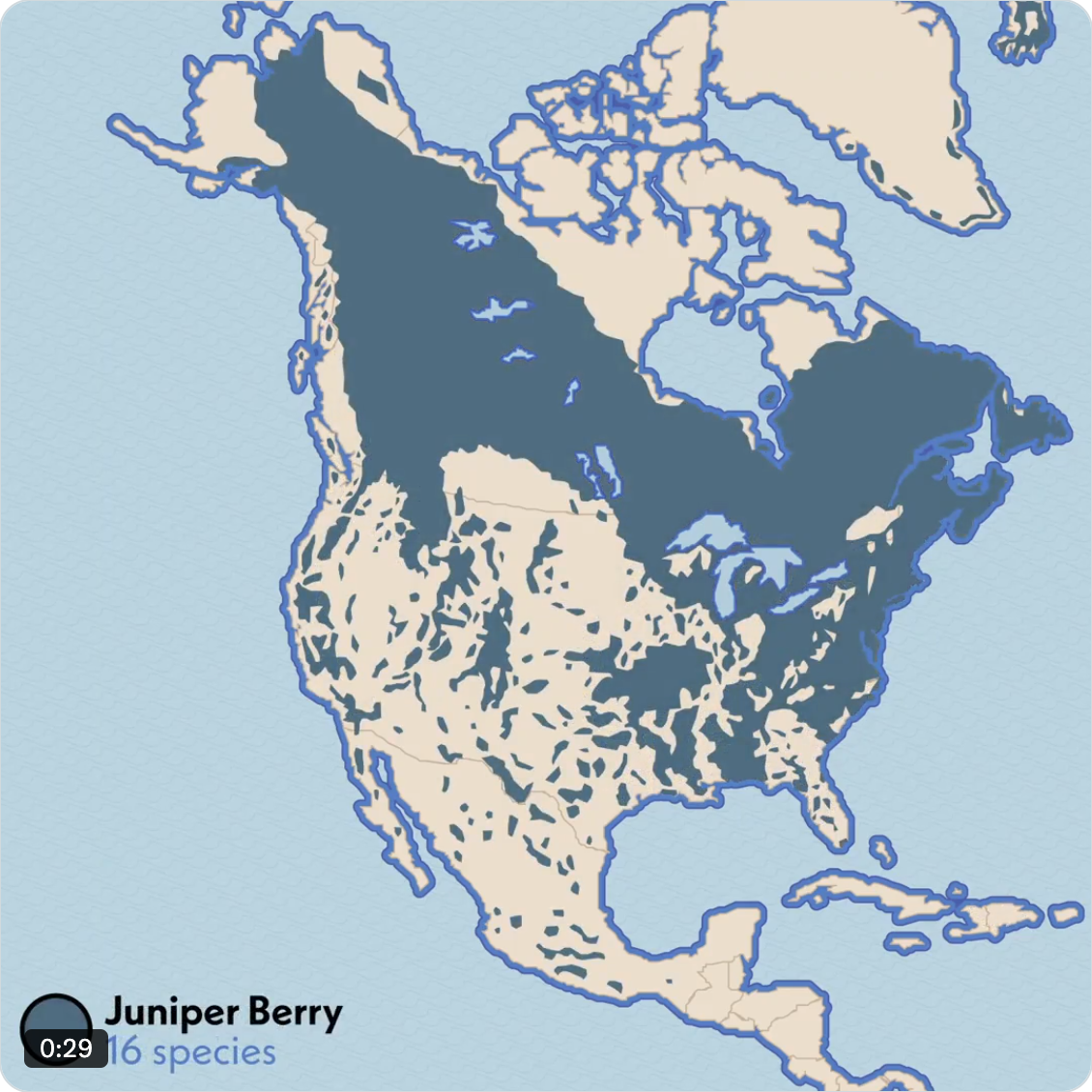
Well, we made it to the weekend once again. Sometimes—often if I’m being honest—I will sit and watch birds hop around on my balcony, chirping to each other for a minute or two before they fly off to destinations unknown. And in the back of my mind I am always thinking, that little guy is […]
The democratisation of design tools ostensibly allows people to create high-quality graphics. But I think we can all admit to ourselves we see a lot of work that…misses its mark. As a general rule, I do not often post work here by untrained designers. My peers and I have the benefit of education and experience […]
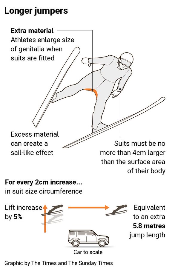
Well we have made it to the weekend. And so it is the time to look at the area of men’s genitalia. This week on baseball Twitter the following graphic made the rounds. The graphic itself claims to be from the Times—the original, not the New York version for my American audience—though I have been […]
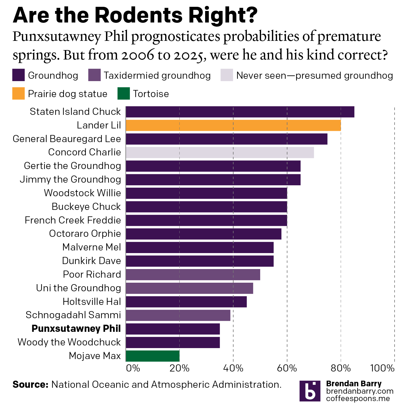
Every year on Groundhog’s Day I feel as if more and more critters crawl up from the Earth to offer their portents of prolonged winter. And every year we look backwards with the fullness of meteorological observations to evaluate the accuracy of these armchair—armburrow?—forecasters. This year, the Philadelphia Inquirer’s required article on the matter included […]
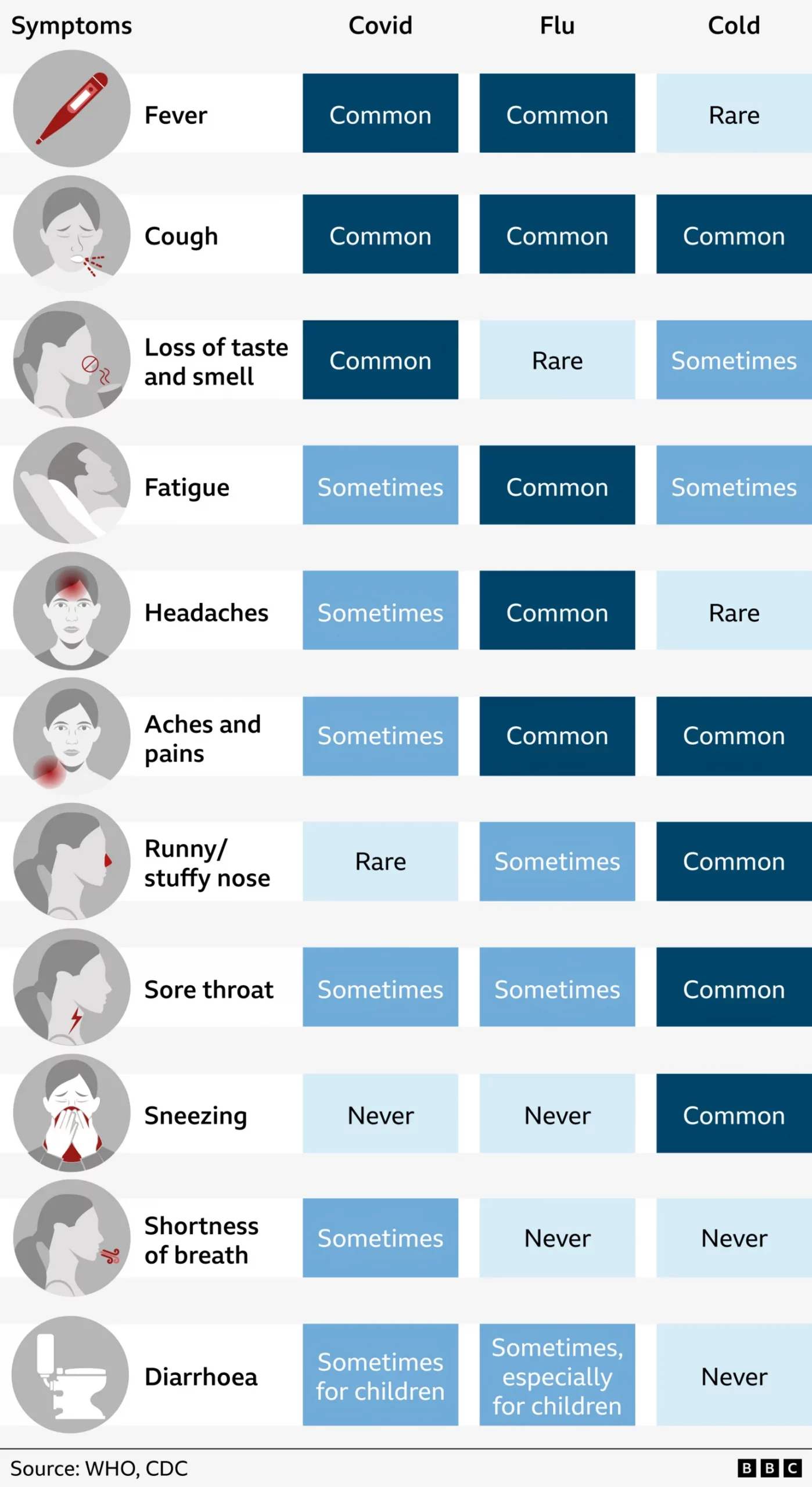
Last week I suffered from the aforetitled and wondered what just might be ailing me. My sore throat woke me up in the middle of the night with intense, sharp pain and reminded me of stories I had read earlier this flu season about “razor blade” sore throat associated with the latest COVID strain, Nimbus. […]
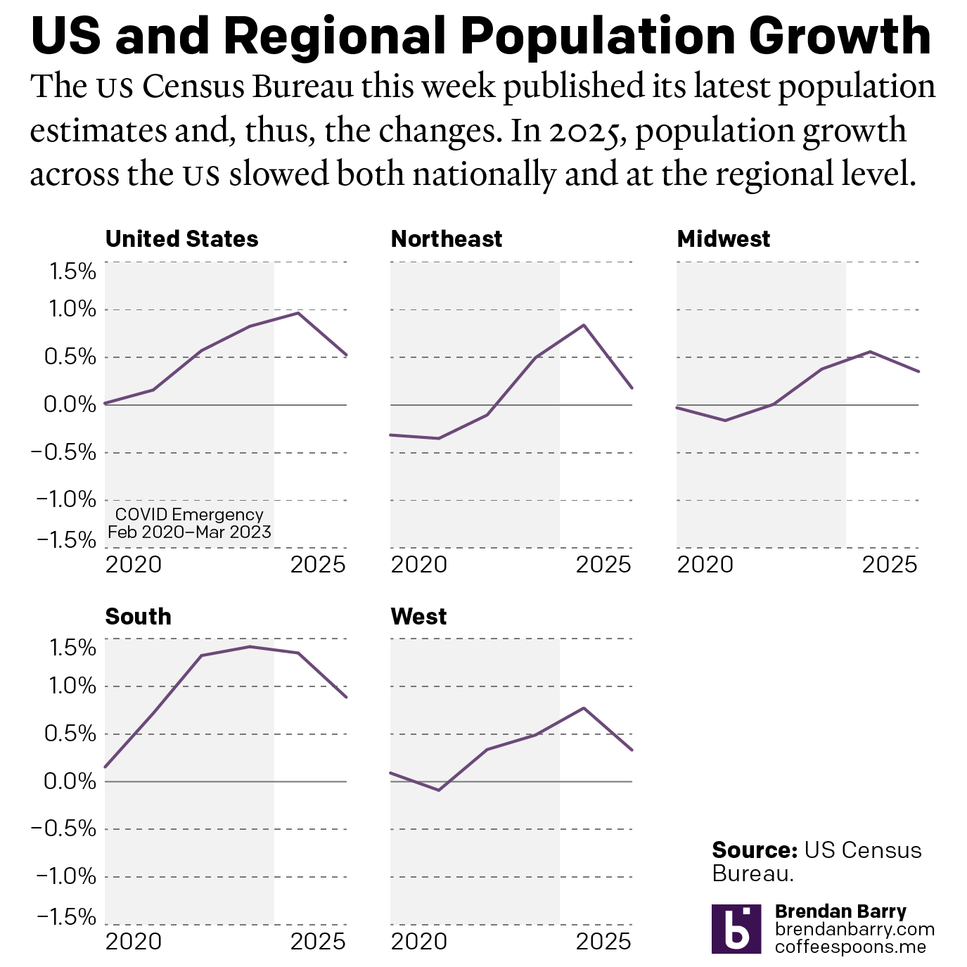
This week the US Census Bureau released their population estimates for the most recent year and that includes the rate changes for the US, the Census Bureau defined regions, and the 50 states and Puerto Rico. I spent this morning digging into some of the data and whilst I will try to later to get […]