Tag: BBC
-
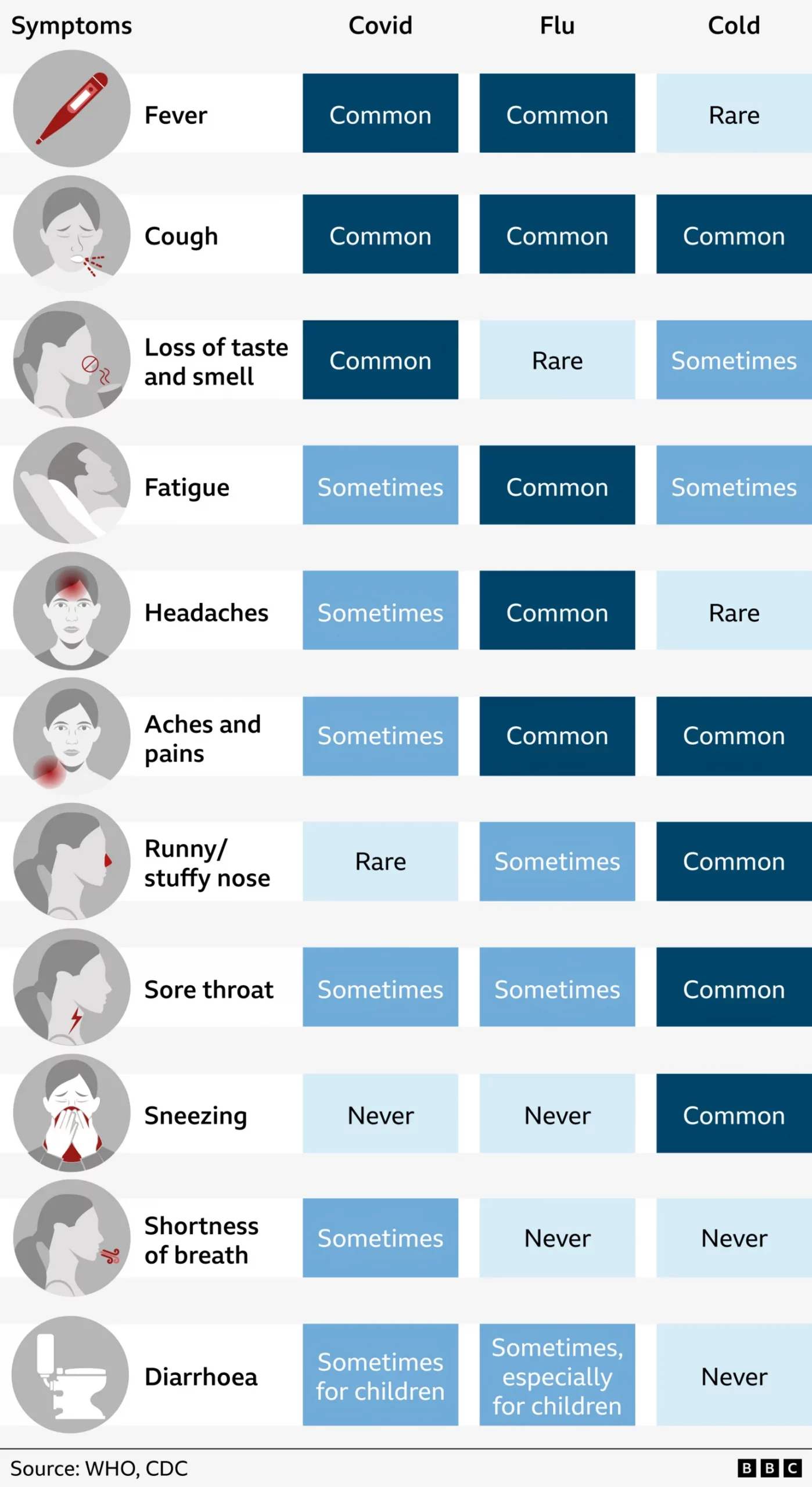
Aches, Fevers, and Chills, Oh My!
Last week I suffered from the aforetitled and wondered what just might be ailing me. My sore throat woke me up in the middle of the night with intense, sharp pain and reminded me of stories I had read earlier this flu season about “razor blade” sore throat associated with the latest COVID strain, Nimbus.…
-
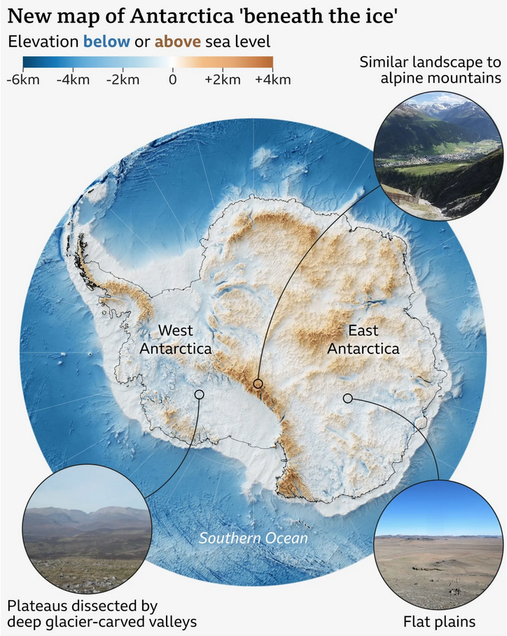
A View Beneath the Ice
I love maps. And above the ocean’s surface, we generally have accurate maps for Earth’s surface with only two notable exceptions. One is Greenland and its melting ice sheet is, in part, contributes to the emerging conflict between the United States and Denmark over the island’s future. The other? Antarctica. Parts of the East Antarctic…
-
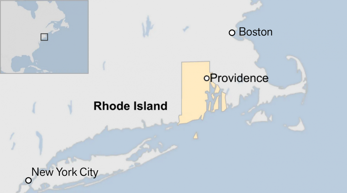
Off on the Road to Rhode Island
Yesterday I read an article from the BBC about this weekend’s shooting at Brown University, one of the nation’s top universities. The graphic in question had nothing to do with killings or violence, but rather located Rhode Island for readers. And the graphic has been gnawing at me for the better part of a day.…
-
When the Walls Fell
Back in September I wrote about the siege of el-Fasher in Sudan, wherein the town and its government defenders faced the paramilitary rebel forces, the Rapid Support Force (RSF). At the time the RSF besiegers were constructing a wall to encircle the town and cut residents and defending forces off from resupply and reinforcements. At…
-
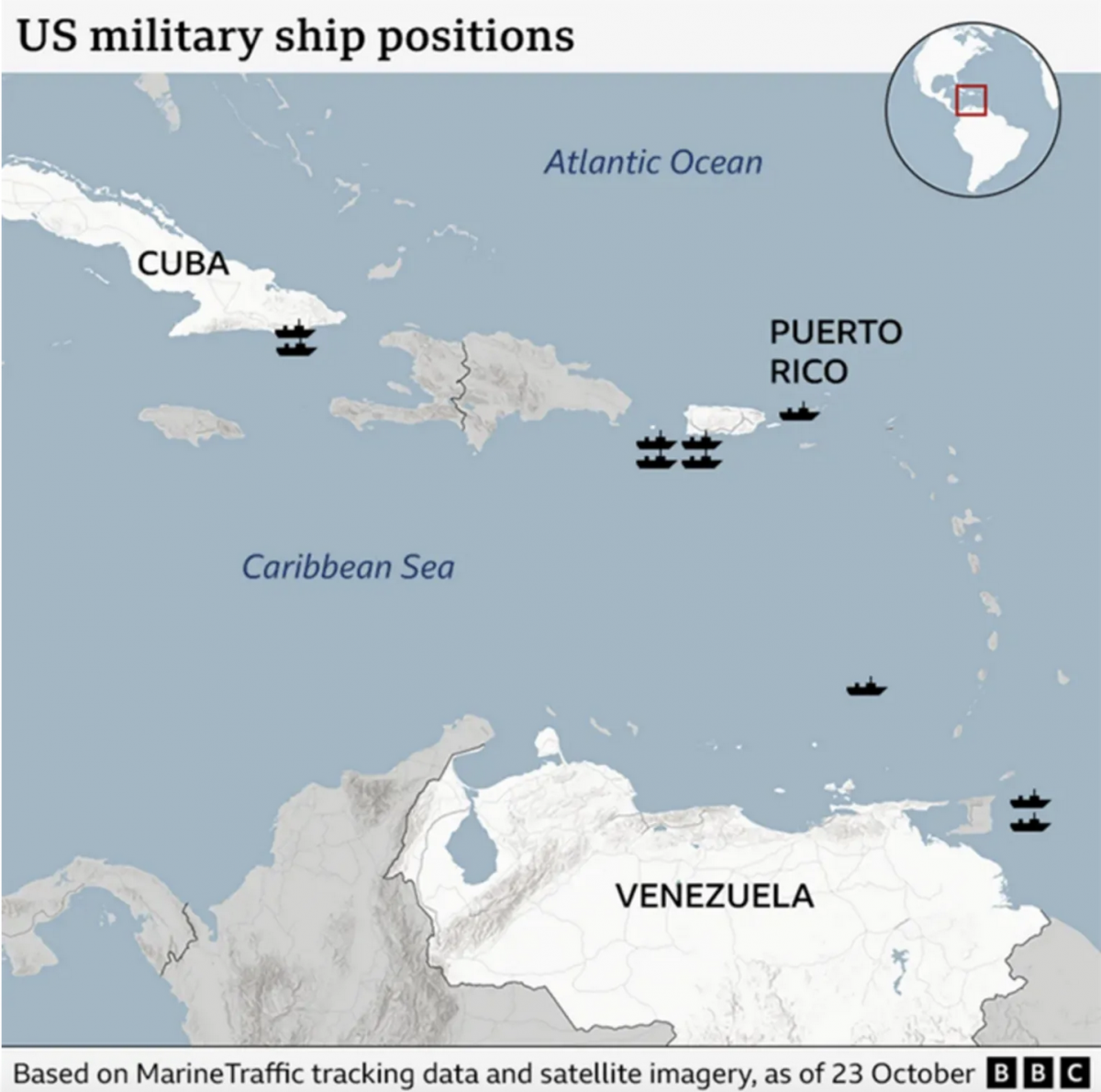
Where’s the Tin Can?
After a few weeks away for some much needed R&R, I returned to Philadelphia and began catching up on the news I missed over the last few weeks. (I generally try to make a point and stay away from news, social media, e-mail, &c.) One story I see still active is the US threatening Venezuela.…
-
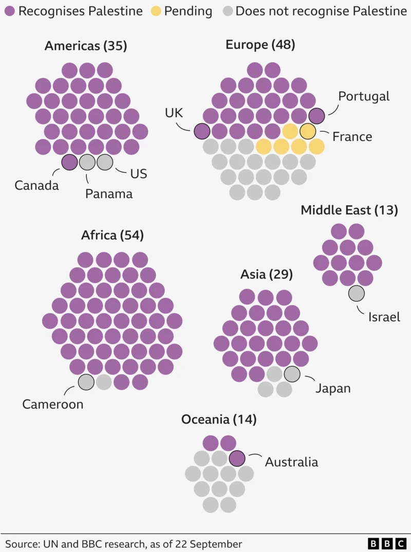
Palestine. The Newest Country in the World?
One of the most debated questions one could ask at pub trivia: How many countries are there in the world? To start, the question cannot be answered completely. What is a country? What is a state? What is a nation? Define recognition. Whose definition? When I worked at Euromonitor International I had to edit a…
-
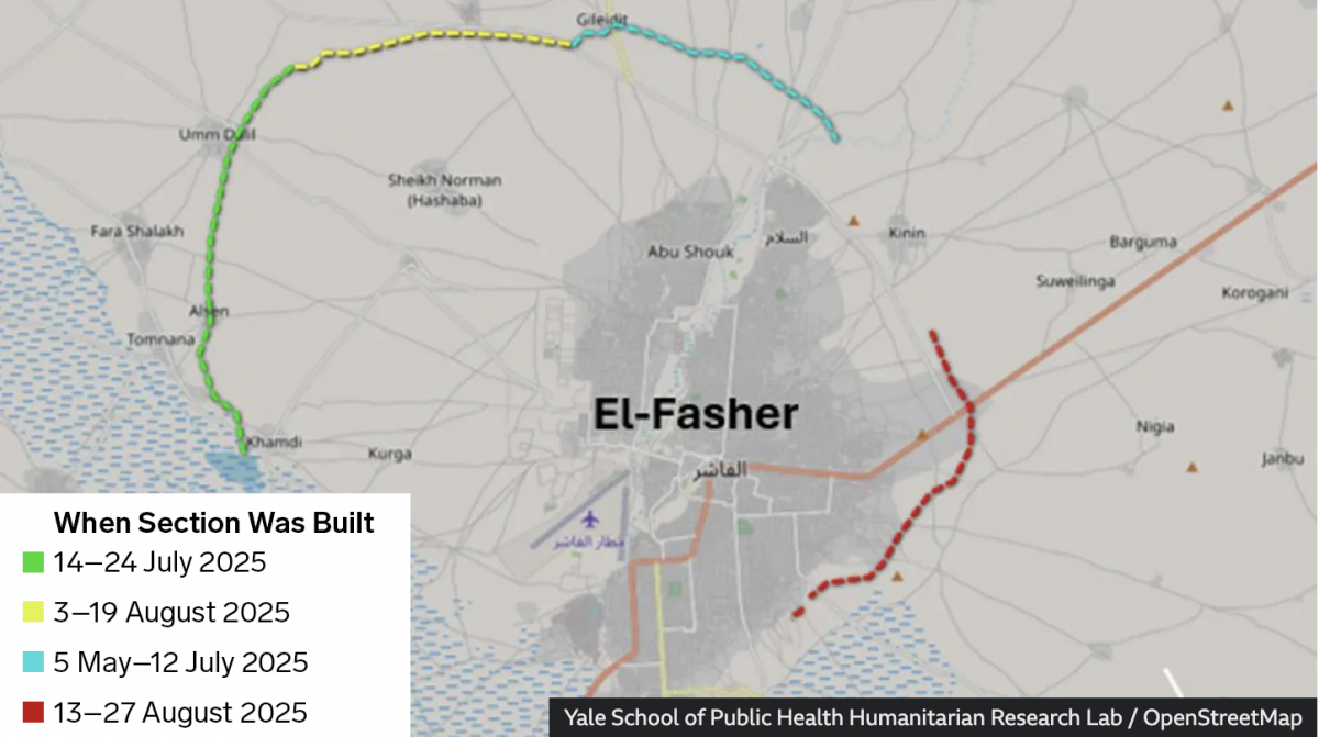
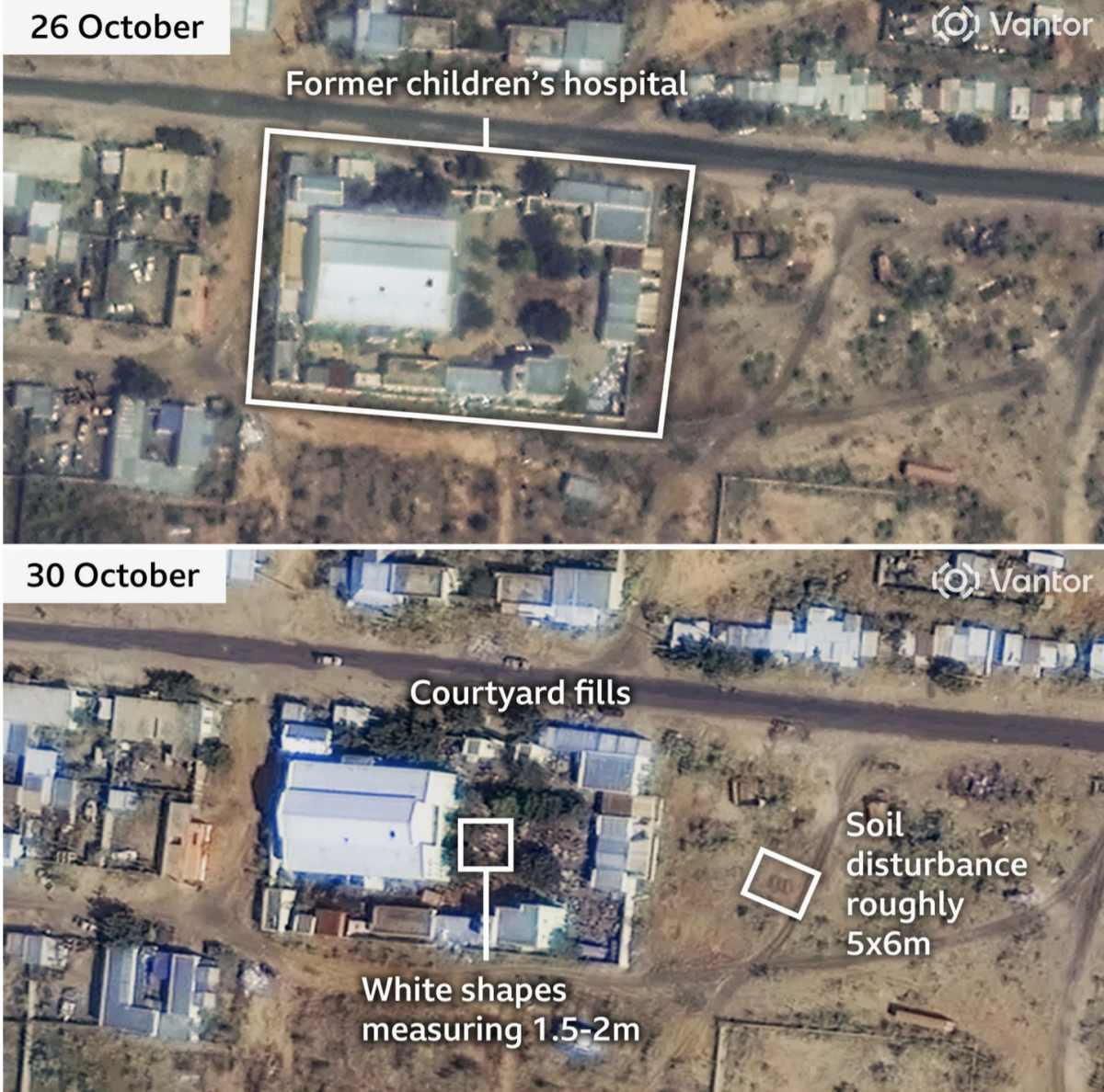
Sudan Side by Side
Conflict—a brutal civil war—continues unabated in Sudan. In the country’s west opposition forces have laid siege to the city of el-Fasher for over a year now. And a recent BBC News article provided readers recent satellite imagery showing the devastation within the city and, most interestingly, one of the most ancient of mankind’s tactics in…
-
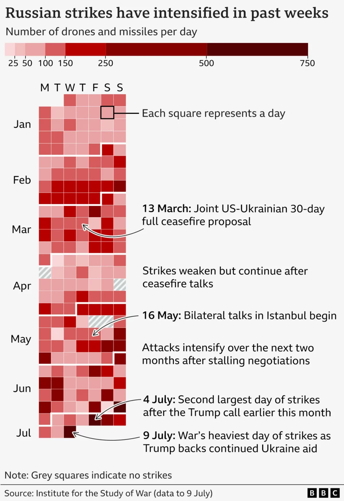
It’s Raining Drones
Last Friday the BBC published an article about the US’ resumption of supplying military assistance to Ukraine in its defence of Russia’s invasion. But in that article, the author referenced the increased intensity of Russian drone and missile strikes on Ukraine over that week. To show the intensity, the BBC included this graphic, which incorporates…
-
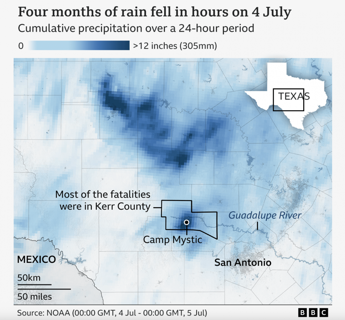
A Warming Climate Floods All Rivers
Last weekend, the United States’ 4th of July holiday weekend, the remnants of a tropical system inundated a central Texas river valley with months’ worth of rain in just a few short hours. The result? The tragic loss of over 100 lives (and authorities are still searching for missing people). Debate rages about why the…
-
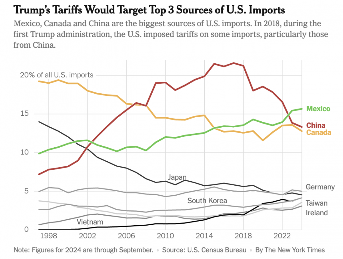
Imports, Tariffs, and Taxes, Oh My!
Apologies, all, for the lengthy delay in posting. I decided to take some time away from work-related things for a few months around the holidays and try to enjoy, well, the holidays. Moving forward, I intend to at least start posting about once per week. After all, the state of information design these days provides…