Let There Be Light

In several decades…

Just a quick little piece today, a neat illustration from the BBC that shows how the process of nuclear fusion works. The graphic supports an article detailing a significant breakthrough in the development of nuclear fusion. Long story short, a smaller sort-of prototype successfully proved the design underpinning a much larger fusion reactor currently under construction in France. We are potentially on our way to proving the viability of nuclear fusion as an energy source.

Why is that important? Well, first of all, no carbon emissions. Nuclear fusion powers the Sun, where hydrogen is fused with hydrogen to produce helium and in the process release an enormous amount of energy. Mankind wants to take that energy and use it to heat water to generate steam to spin turbines to create electricity.

And we use a lot of electricity.

So how does fusion work?

The BBC graphic shows how. This is a bit simplified, even for my tastes, but it’s generally pretty good. For example, I probably would have labelled protons and neutrons earlier (to the left) of the graphic. And my big question mark is about the widths of the arrows, because if the width of the arrows relates to the scale of the energy, as that is the crux of the matter. (See what I did there?)

Basically when we want to generate energy we want to add as little as possible to start a reaction to net as much output as possible. A little bit of energy is used to split a uranium isotope and that generates a tremendous amount of energy. Thus far with nuclear fusion, however, we use a lot of energy to fuse hydrogen into helium and get little back as output. In other words, a net loss.

The graphic omits how this reactor in the UK works, by using a doughnut-shaped vessel to contain the hydrogen reaction. To do this they use superconducting magnets to generate powerful electromagnetic fields. This contains the hydrogen that turns into a superheated plasma. After all, it’s not like there are any materials known to man that can safely contain the temperatures of the Sun. But we have evidence that as the amount of plasma scale up, the closer we get to breaking even. And that’s the goal for the French reactor.

The other big question in the room is how this helps us with climate change, because as I stated up top, no carbon emissions. Unfortunately, not much. The French reactor is still several years away from being complete. And if that works as expected, commercial-scale reactors powering electricity generation stations are many more years away. Fusion will help power us into the 22nd century. And so we will still need nuclear fission and renewables to get us through the 21st.

Credit for the piece goes to the BBC graphics department.

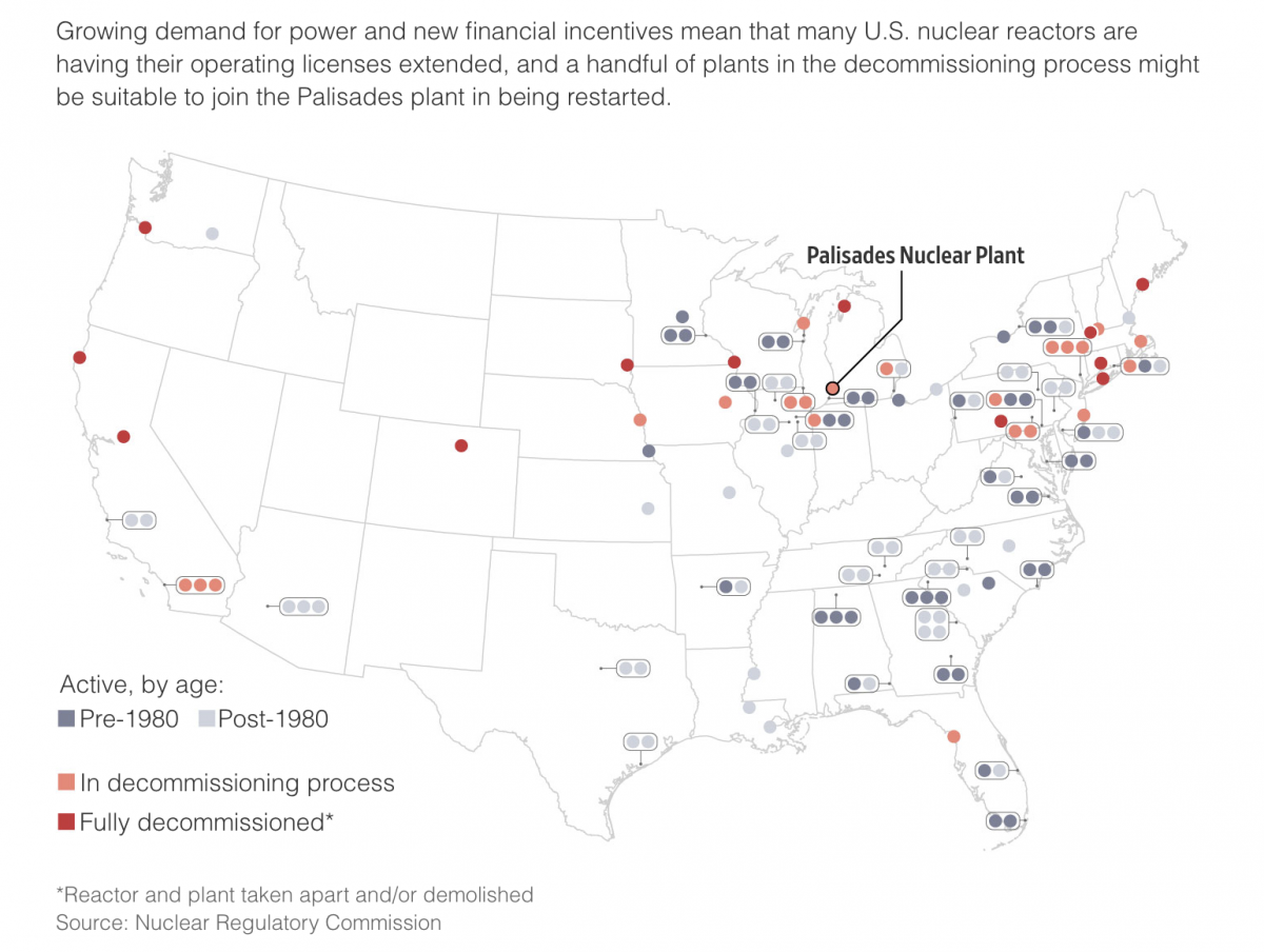
American Nuclear Generating Stations

Those that have followed me for a long time know that I am a big fan of nuclear power. It does have some drawbacks, namely its radioactive waste, but otherwise creates enormous amounts of stable, carbon-free electricity. So when I saw this article from Bloomberg about the impact of climate change on US nuclear powered electricity generating station. It makes use of a number of nice maps to show that, yeah, not good things.

Pennsylvania is a big state for nuclear power

I normally am not a huge fan of scaling circle size to the data point, but here it makes sense since the circles are tied to the geographical location. Like I mentioned with the one Notre Dame graphic, I’m not sure the advantage of the black background, but it could be that there is a benefit to the contrast over the white background.

There are additional maps in the piece that look at a few specific locations in a moderate hurricane and the expected storm surge. Again, not good. These also use light colours on a dark background.

Credit for the piece goes to Christopher Flavelle and Jeremy C.F. Lin.

Energy Production in Pennsylvania

Pennsylvania was the country’s first state to operate a nuclear power plant for electricity generation and is today the second-largest nuclear-generated electricity state after Illinois. But in recent years the triple threat of the Pennsylvania Marcellus Shale natural gas boom, wind power subsidies, and solar power subsidies have hit the state’s nuclear industry hard. Consequently the power company Exelon has announced plans to shutdown the generating station at Three Mile Island—yes, that Three Mile Island—in 2019 if Pennsylvania does not rescue the industry as have the states of Illinois and New York, each facing similar challenges.

I wanted to take a look at the electricity generated by nuclear power in Pennsylvania, but had to settle for energy produced. And while the data was only as recent as 2014, it did extend back to 1960 thereby dating back almost as far back as nuclear power in Pennsylvania—it began in 1957.

The subject has always been of interest to me and was the focus of one of my first data visualisation pieces back at university. And so while the data is not quite the same, nor over the same geographic area, it is interesting to see the spike since even 2008. (Worth noting that even in a coal state the long, slow decline of coal even before President Obama is self-evident.)

The rise of Marcellus Shale natural gas has been quick and dramatic

Unfortunately the EIA data came through a .pdf and not a more accessible data file so I spent most of my time recreating the data. Consequently, I had little time to do more than track these changes. But even still, I think you would agree the message is clear: natural gas has quickly disrupted the market. (Let’s again ignore the fact I could not plot renewable energy sources.)

Small disclaimer I suppose, I have always supported nuclear power as part of a non-carbon energy portfolio. But I also grew up within sight of and fascinated by the Limerick Generating Station steam clouds, so call me biased.

Credit for this graphic is mine.

Your State’s Power Sources

By now you should all know that I am a sucker for small multiples. They are a great way of separating out noise and letting each object be seen for its own. You should also know that I am a sucker for things industrial, e.g. nuclear power. So when you put the two together like NPR did earlier this month, well, I am going to be a huge fan.

All 50 states
All 50 states

Credit for the piece goes to Alyson Hurt.

Where’s Your Power Coming From?

A few weeks back the White House announced some new plans for clean electricity. The Washington Post put together an interactive graphic looking at the sources for American power.

America's power sources
America’s power sources

Credit for the piece goes to John Muyskens, Dan Keating, and Samuel Granados.

Enriching Uranium

This past weekend, the US and allies reached an agreement with Iran on the Iranian nuclear programme. In this graphic the Washington Post explains the several steps necessary to take uranium and make it useful for a reactor, a research reactor, and nuclear weapons. Admittedly, a simplified diagram, but still quite useful.

Enriching uranium
Enriching uranium

Credit for the piece goes to the Washington Post graphics department.

Fixing Fukushima

Two and a half years ago an earthquake and then tsunami devastated Japan. But it was the tsunami that crippled the Fukushima nuclear power station and created the world’s worst nuclear disaster since Chernobyl. Unfortunately things are still not working properly and the plant is still leaking radioactive particles into the local environment. This interactive guide from the Guardian illustrates just what Tepco, the power company responsible for the plant, is trying to do to prevent further radiation from leaking into the ocean.

Location of silt fences

Credit for the piece goes to Paddy Allen and the Graphic News.