Counting People

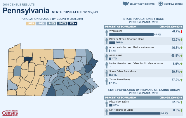
The Census Bureau has been releasing state population figures over the past several weeks and one means of accessing those figures is through a small, interactive map feature. Clicking through makes for some interesting observations—although not all states are currently available. In this screenshot, one can see an interesting story. Western Pennsylvania is shrinking whereas eastern Pennsylvania is growing. And, perhaps importantly, Philadelphia has perhaps reversed its long-term trend of population decline and saw a 0-5% increase in population while its further suburbs have seen increases in the 5–25% range.
census map feature
census map feature

If one is not viewing the piece in fullscreen mode, the navigation can be a bit small, especially for small counties. And the counties over which one rolls with the mouse cannot be selected, they are purely rollover functions that display census data from 1960 and the total population as of 2010. I would have liked the ability to select a particular county and then compare it to others by rolling over neighbouring counties. The colour choice, blues and a light, brownish-beige work rather well within the overall blue motif of the site. And by restricting the palette there, one gains the ability to use an altogether different colour, here green, to indicate which counties are rolled over along with differentiating the rollover box from the remainder of the map piece.

I wonder if more could not have done with the ethnic breakdowns on the right. Certainly the overall breakdown is effective, but it appears to lack a summary of sorts. What was the overall change for the state? And on a minor note, the person symbol is downright distracting.

To get to the first state, one clicks on said state from an overall map of the United States. States are blue if they have had their data released, grey otherwise. However, once looking at a state, there is no way back to the overall map as states are chosen from a small button in the upper-right. This works just fine, we are here to look at state data, not for a geography lesson. However, that they use the map at the beginning seems incongruent with the remainder of the experience. I wonder if they could not remove the map at the start, or keep the map but make it more useful. After all, it would be interesting to see the percentage change in the states displayed—the unpublished states could remain grey.

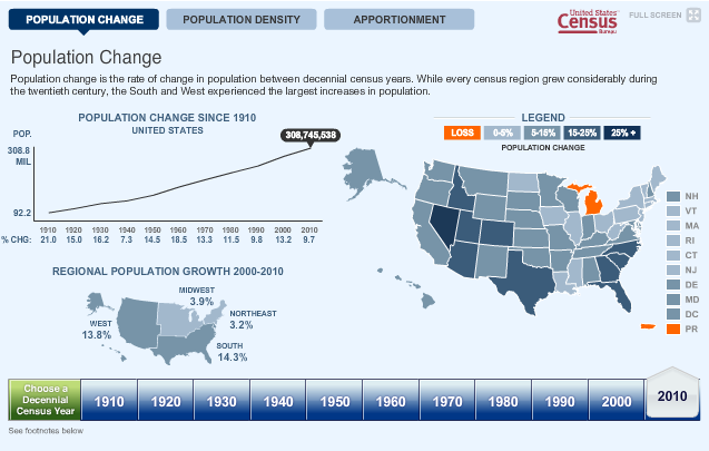
Further below the first map is a second map.
Census map 2
Census map 2

Here, one does have access to the state population change figures. Much of the critique above remains salient here, except the light brown for population loss in the first map is here replaced by a garish and obnoxious orange. An interesting addition is the range of historical data, from the 1910 census through the 2010 census and to see how those population changes affected the apportionment of seats in Congress. Another interesting story that one can glimpse is the ‘filling-in’ of the North American continent. Population density in 1910 was high only in the Northeast, but ever since, the people have spread, concentrating along the coasts and then moving inwards towards the vast centre of the continent.

…to the Shores of Tripoli…

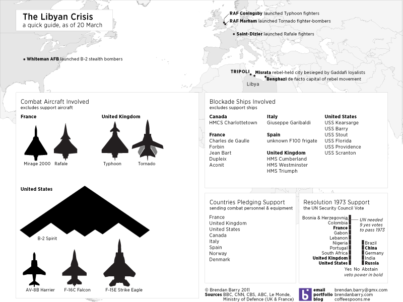
Two hundred years later, and the US Navy is again in action off the shore of Tripoli. Except instead of calling it the Barbary Coast, we now typically see the name the Maghreb. Things will surely be fluid and changing far faster than I can hope to detail in graphics, let alone follow casually. However, this here details what I have learned since this morning. Nothing too fancy, just mapping out some places to show just how far American, British, and French warplanes are flying to reach Libya. Then what aircraft are being used, at least that we know of, what ships are in the blockade and lastly who supported the Resolution 1973.

Detailing the Libyan Crisis as of 20 March

By Monday we shall surely be seeing further attempts by news and media agencies.

You Say You Want a Revolution…

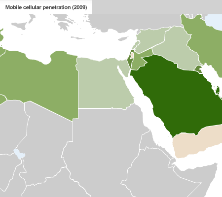
If you have been living under a rock—or perhaps I should say isolated at an oasis deep in the Sahara—you may not have heard that these are some interesting times in northern Africa and the Middle East. Popular protests begat revolutions that have now toppled two governments, Tunisia and Egypt, and quite possibly a third in the near future, Libya. And for those that have not seen governments fall, Bahrain, Yemen, Algeria, Jordan and Morocco have all been disrupted to some degree by protests against the governments in power.

Perhaps one of the defining characteristics of these movements have been the social-networking and mobile communications that spread the news of protests, riots, and crackdowns like wildfire. Sites like Facebook and Twitter were instrumental in passing word and for many other, people simply used their mobile phones to spread the news.

CNN has this series of maps to highlight internet and mobile phone use in the region. Nothing particularly fancy about the maps, though I wonder about the choice of green to represent so many Arab nations. Intentional or coincidence? Regardless of the colours, I think these maps are an example of using simple informational-based graphics to support a story. And given the goings-ons in the world, I thought this worth posting.

Internet and Mobile Phone Use in Northern Africa and the Middle East

From CNN via a post at the Map Room.

South Sudan

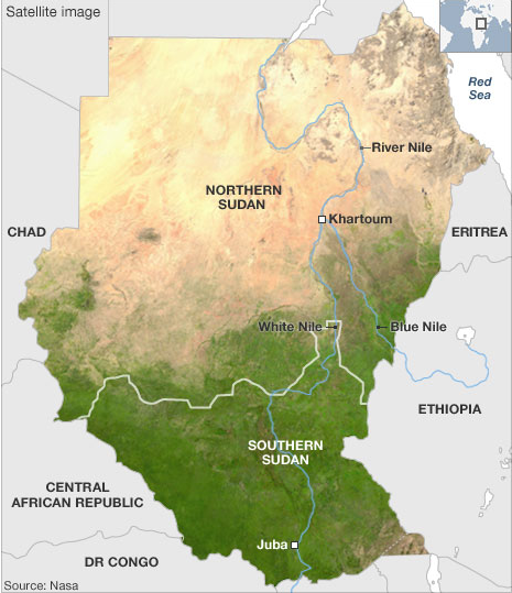
For those who may not be aware, part of Africa’s largest country is holding a referendum on whether it should remain a part of Sudan or secede and become an independent state, Southern Sudan—though one wonders if they would not come up with a different name. About 2005 a peace agreement all-but-ended a decades-long civil war in Sudan and as that violence subsided the attention in Sudan shifted to Darfur. The terms for the peace deal included a referendum on independence for Southern Sudan, long since joined with the northern half of Sudan as part of a British colony in Africa to control the Nile River.

Map of Southern Sudan

The two halves of the country were and are very much different and the BBC has used maps to highlight these differences. The problem is that there are oil fields along the proposed border and a disputed region, called Abeyi, has significant deposits of its own. And so the question of who controls the oil and thus the money and the power remains. That, however, is a story for another post. This is just to highlight the maps.

Overall, not bad. I find using the different hues for the different subject matters a smart idea. The shift forces the audience to focus on the change in meaning, which is very important if the shape of the coloured area is not otherwise changing. That said, the infant mortality choropleth uses too great a shift in hues between data bins when compared to the water, education, and food security maps. The oil field map, while not necessarily a data-heavy map in the same way as the choropleths, is a nice bookend to what started the series, i.e. the satellite view. These highlight the sheer environmental and, in a fashion, economic differences between the two regions of Sudan.

I find the ethnic groups map, however, the most difficult to fit into the series. Certainly from a subject matter it is the most important. However, the colours chosen to represent the various ethnic groups seem disparate. The southern Dinka, for example, are represented as an olive-green whereas the northern Beja are more of a bluish-green. I think a better solution would have been to keep the three main groups, i.e. the Arabs, Northern Sudan, and Southern Sudan, and then assign each a different hue, for the sake of an example say the three primary colours. Then within those groups, different tints for the various but related ethnic groups. This would highlight the various ethnic groups existing across Sudan, but show the geographic split between the two groups.

Overall, a good effort from the BBC to highlight the stark differences between Northern and Southern Sudan.

Midwestern Shrinkage

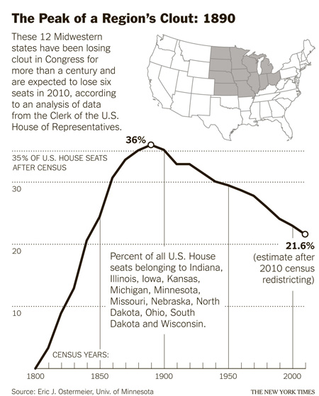
Charting the Rise and Fall of the Midwestern Congressional Delegation

The United States was founded on the East Coast as English (and the odd Scottish) colonies with the old cities of Philadelphia, Boston, and New York. These first colonies became the original 13 states. Ever since the 18th century, we have expanded westward into the Ohio Territory, the Northwest Territory, French colonies, Spanish colonies turned Mexico, and then again the British in the Pacific Northwest. (Overly simplified history of the United States’ growth, but it shall do.)

Every ten years, the United States is constitutionally obligated to hold a census. You cannot elect representatives to make political decisions for you if you do not know how many of you there are and where you live. But what these decennial censuses show are how the demographics of the United States have changed, with the population shifting from the East Coast, once almost 100% of the population, to the lands south and west. It’s only natural when you consider how unpopulated that part of the continent is.

But, because we rely on these censuses to redraw political districts and boundaries, every ten years politicians make much ado about…well, something. This article by the New York Times looks at how these changes are set to affect the Midwest in particular and this graphic, while simple, charts the congressional power of the Midwest through the total number of seats held in Congress over the years.

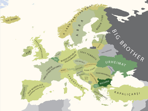
Europe According to [Insert a Country Here]

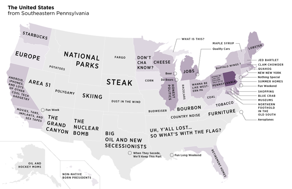
This comes via the blog The Map Room. Designer Yanko Tsvetkov created a series of maps that most wholly, completely, and accurately represent the cultures, peoples, and attitudes of various European countries towards, well, other European countries. Some of the usual suspects are in there, the Brits, the French, and the Germans. However, I find the Bulgarian perspective, my screenshot choice, of interest because one does not typically find Bulgaria in the list of usual suspects. (Though one perhaps should as it is a member of the European Union unlike the Norways, Switzerlands, and Icelands of Europe.)

Europe from Bulgaria

Anyway, these are funny—even if one does not necessarily understand the background to the humour there are enough that even we Americans can understand.

Delaware, Home of Tax Free Shopping and Political Upsets

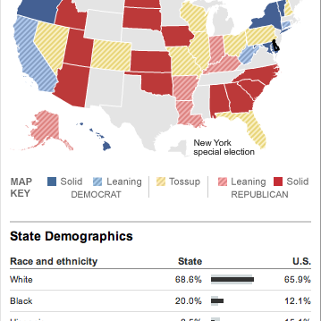
The big voting day in November is slowly—or rapidly—approaching. But before we get to the main fight, we have all the small-ring events to tease us. And to whet our appetite for magic walls and holographic projections and all the other technological wizardry that shall amaze and astound us all, we have nice graphics about the primaries.

Screenshot from the Delaware Senate Primary Page

This comes from the New York Times, in particular covering the Delaware primary where Mike Castle, long-time moderate Republican, has lost his party’s primary to a Tea Party candidate. (One wonders what would happen if the Tea Party candidates ran as an actual third party instead of co-opting the Republican party.) In general, the Times has there coverage pretty nailed down.

It is worth checking out their site for the mid-terms coming up if not for the news but then for the maps and charts they use to visualise all the data. (And with modern-day polling, how could we ever not have enough data to visualise?) After all, I will probably comment upon their work a few more times before Election Day.

Turkey Votes…Against Orange

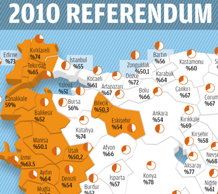
Turkish Vote Results

I like maps, I really do. And I also like politics. And that means I love election maps. Or just voting maps. This here comes from a Turkish news outlet, Today’s Zaman, via the Economist’s article on the election. A (very) brief background for those unfamiliar with the matter at hand: Turkey wants to be admitted into the European Union (EU), but the EU requires reforms made to the Turkish constitution to bring Turkey up to EU standards in terms of law, liberalism, &c. All well and good, except that Turkey has a unique history of being a staunchly secular country where Islam is the dominant religion. Relaxing the rules against Turkey’s strict brand of secularism has stoked resentment and controversy from those on the staunchly secular side. And the constitutional changes that upset this group of people are being enacted by a political party whose history is that of a party based in Islam. It gets a bit tricky…

But about the graphic…

First, I think a good if not expected place to start is with the three-dimensional pie chart and map. These two visual elements add little if not subtract from the overall graphic. By putting the ‘No’ vote in the background it is made to appear smaller than the ‘Yes’ vote and can be seen as marginalising that portion of the vote. Furthermore, note the change in the colour of the type for each section of the chart. While the orange and white is certainly a high contrast, the black versus white is even higher.

As to the map, I am not an expert in Turkish geography, but this appears to simply be adding a weird three-dimensional effect to the edges of an otherwise flat map. At least I should hope the map is otherwise flat and not distorting the geography. One can always make the argument that a map is not needed to show a single datapoint, in this case the ‘victor’ in the vote. However, from the perspective of an American not familiar with Turkish provinces (assuming they are indeed called provinces), this map is far more meaningful than would a statistically  more valuable chart highlighting the discrepancy in the vote. After all the little miniature pies in each province are largely useless except in the most obvious of differences. To actually show and detail the degree of victory a bar chart for all provinces would be more useful.

Or perhaps a compromise that would show each province in a colour that reflects the overall victor, yes or no, and the degree to which that camp beat the other through use of a gradient. Would that be ideal for showing the details of the numbers? No, not at all, but it would highlight that while the ‘No’ vote was concentrated along the western and northern provinces—do they share a political similarity because of their bordering on the Aegean or some other reason?—but that the strongest ‘No’ vote was in the very northwest—geographically the most European part—of Turkey, excepting some exceptional province in the centre of the country. None of this, of course, deals with the density of the population in each province, for none of that is known to me as a non-Turkish observer.

The colours, white and orange, work when considered against the blueish background. Of course, why the bluish background? It might be a branding element or some other such visual styling well-established with the news outlet with which I am unfamiliar. But if not, it does not really add anything other than that glossy feel. The white as a choice for the ‘Yes’ vote is interesting, because it draws more attention to the presence of the ‘No’ vote in the north and west whereas the positioning of the wedges of the pie in the pie chart would hint that the important element to draw forward is that of the ‘Yes’ vote. In terms of the message or the thesis of the graphic, I am unsure. However, using white to allow the orange to come forward is itself a nice visual touch to bring out one or the other camp. Now if only I could figure out which the graphic was going for…

All in all, it is an interesting piece that puts the news story in more context than I might typically read in a straight, text-only article. It has some flaws, but that might be owing to my perspective as an outsider looking in.

Thomas the Tank Engine, Meet Señor Jose AVE

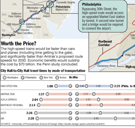
This comes from an older article in the Philadelphia Inquirer, but it is new to me. Anyway, it looks at a proposal for high-speed rail in the United States, specifically along the Northeast Corridor, the Washington to Boston route that includes Baltimore, Wilmington, Philadelphia, and New York. Anyway, go figure that we still have trains that run at a snail’s pace, even Acela has a low average-speed.

Comparing Routes and Modes of Travel

A proposal from a group out of Penn makes for an interesting debate, specifically in Philly a real high-speed route would require boring underneath most of Philadelphia to bypass 30th Street. Perhaps revitalising Market East—depending on how exactly the route would interact with the commuter tunnel currently in place.

The graphics are simple, basically an annotated map. But the variations in stroke weight and colour help bring contrast to the routes when looking at the entire proposal whereas the proposed route in Philadelphia has little overlap and could have made due with a single stroke. Another interesting piece is beneath in the comparison between travel times from Washington to Philadelphia, from Philly to New York, and New York to Boston. Without looking at cost—thought the article’s second page or graphics does that—we can clearly see that a dedicated high-speed rail system would make it even easier to travel between cities for short holidays or even day trips. Let alone business trips.