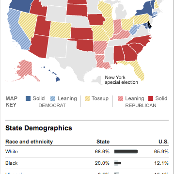
The big voting day in November is slowly—or rapidly—approaching. But before we get to the main fight, we have all the small-ring events to tease us. And to whet our appetite for magic walls and holographic projections and all the other technological wizardry that shall amaze and astound us all, we have nice graphics about the primaries.

This comes from the New York Times, in particular covering the Delaware primary where Mike Castle, long-time moderate Republican, has lost his party’s primary to a Tea Party candidate. (One wonders what would happen if the Tea Party candidates ran as an actual third party instead of co-opting the Republican party.) In general, the Times has there coverage pretty nailed down.
It is worth checking out their site for the mid-terms coming up if not for the news but then for the maps and charts they use to visualise all the data. (And with modern-day polling, how could we ever not have enough data to visualise?) After all, I will probably comment upon their work a few more times before Election Day.
Leave a Reply
You must be logged in to post a comment.