If you have been living under a rock—or perhaps I should say isolated at an oasis deep in the Sahara—you may not have heard that these are some interesting times in northern Africa and the Middle East. Popular protests begat revolutions that have now toppled two governments, Tunisia and Egypt, and quite possibly a third in the near future, Libya. And for those that have not seen governments fall, Bahrain, Yemen, Algeria, Jordan and Morocco have all been disrupted to some degree by protests against the governments in power.
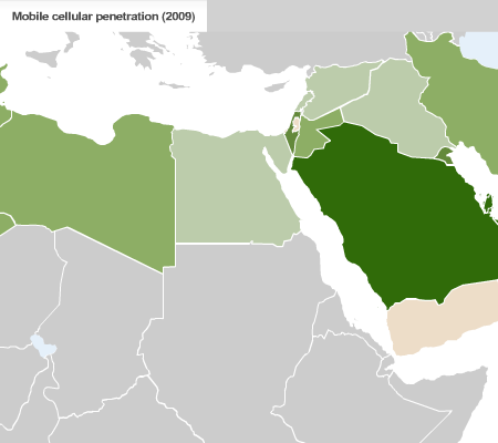
Perhaps one of the defining characteristics of these movements have been the social-networking and mobile communications that spread the news of protests, riots, and crackdowns like wildfire. Sites like Facebook and Twitter were instrumental in passing word and for many other, people simply used their mobile phones to spread the news.
CNN has this series of maps to highlight internet and mobile phone use in the region. Nothing particularly fancy about the maps, though I wonder about the choice of green to represent so many Arab nations. Intentional or coincidence? Regardless of the colours, I think these maps are an example of using simple informational-based graphics to support a story. And given the goings-ons in the world, I thought this worth posting.

From CNN via a post at the Map Room.
Leave a Reply
You must be logged in to post a comment.