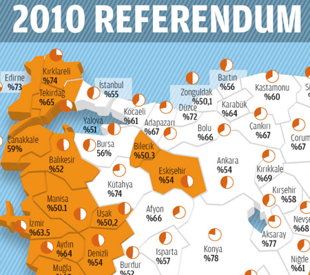
I like maps, I really do. And I also like politics. And that means I love election maps. Or just voting maps. This here comes from a Turkish news outlet, Today’s Zaman, via the Economist’s article on the election. A (very) brief background for those unfamiliar with the matter at hand: Turkey wants to be admitted into the European Union (EU), but the EU requires reforms made to the Turkish constitution to bring Turkey up to EU standards in terms of law, liberalism, &c. All well and good, except that Turkey has a unique history of being a staunchly secular country where Islam is the dominant religion. Relaxing the rules against Turkey’s strict brand of secularism has stoked resentment and controversy from those on the staunchly secular side. And the constitutional changes that upset this group of people are being enacted by a political party whose history is that of a party based in Islam. It gets a bit tricky…
But about the graphic…
First, I think a good if not expected place to start is with the three-dimensional pie chart and map. These two visual elements add little if not subtract from the overall graphic. By putting the ‘No’ vote in the background it is made to appear smaller than the ‘Yes’ vote and can be seen as marginalising that portion of the vote. Furthermore, note the change in the colour of the type for each section of the chart. While the orange and white is certainly a high contrast, the black versus white is even higher.
As to the map, I am not an expert in Turkish geography, but this appears to simply be adding a weird three-dimensional effect to the edges of an otherwise flat map. At least I should hope the map is otherwise flat and not distorting the geography. One can always make the argument that a map is not needed to show a single datapoint, in this case the ‘victor’ in the vote. However, from the perspective of an American not familiar with Turkish provinces (assuming they are indeed called provinces), this map is far more meaningful than would a statistically more valuable chart highlighting the discrepancy in the vote. After all the little miniature pies in each province are largely useless except in the most obvious of differences. To actually show and detail the degree of victory a bar chart for all provinces would be more useful.
Or perhaps a compromise that would show each province in a colour that reflects the overall victor, yes or no, and the degree to which that camp beat the other through use of a gradient. Would that be ideal for showing the details of the numbers? No, not at all, but it would highlight that while the ‘No’ vote was concentrated along the western and northern provinces—do they share a political similarity because of their bordering on the Aegean or some other reason?—but that the strongest ‘No’ vote was in the very northwest—geographically the most European part—of Turkey, excepting some exceptional province in the centre of the country. None of this, of course, deals with the density of the population in each province, for none of that is known to me as a non-Turkish observer.
The colours, white and orange, work when considered against the blueish background. Of course, why the bluish background? It might be a branding element or some other such visual styling well-established with the news outlet with which I am unfamiliar. But if not, it does not really add anything other than that glossy feel. The white as a choice for the ‘Yes’ vote is interesting, because it draws more attention to the presence of the ‘No’ vote in the north and west whereas the positioning of the wedges of the pie in the pie chart would hint that the important element to draw forward is that of the ‘Yes’ vote. In terms of the message or the thesis of the graphic, I am unsure. However, using white to allow the orange to come forward is itself a nice visual touch to bring out one or the other camp. Now if only I could figure out which the graphic was going for…
All in all, it is an interesting piece that puts the news story in more context than I might typically read in a straight, text-only article. It has some flaws, but that might be owing to my perspective as an outsider looking in.
Leave a Reply
You must be logged in to post a comment.