Well, okay, actually there is. But the cultural reference would have made even less sense if I omitted the negative. Anyway, in honour of the two baseball games I am seeing this week—last night’s and tonight’s Red Sox games—here comes this piece from Pew Research Center.
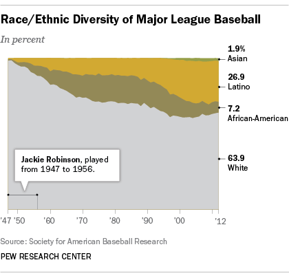
It’s a simple but fairly clear graphic. We are looking at the ethnic breakdown of baseball since 1947, when Jackie Robinson broke the colour barrier. My only qualm, as ever, with this stacked area chart is that while you can see the clear trend upward in white share, it is a bit more difficult to see the directions the other ethnicities are moving.

Credit for the piece goes to Pew Research Council.
Leave a Reply
You must be logged in to post a comment.