Aquifers Around the World

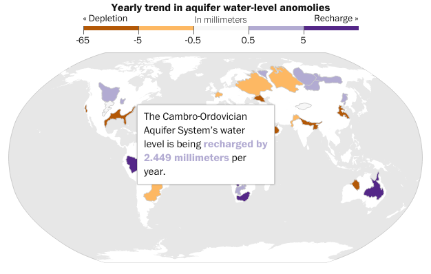
It has rained quite a bit in the south the last couple of days, thanks to tropical weather systems. But, as some new data from NASA shows us, the world is running out of water. That is largely because we drain large underground water systems called aquifers faster than the natural environment replenishes them. The Washington Post has a small interactive map that looks at the world’s largest aquifers and respective trend towards either being recharged or drained.

Aquifers are being drained around the world

Credit for the piece goes to Todd Frankel.

LeBron James in the NBA Finals

I really do not know much about basketball. I did not realise that the finals had been going on. But, rest assured, they were. The Washington Post looked at whether or not LeBron James had the best finals match performances since 1985. It turns out, not so much. For those of you from the Chicago area, you may instead take solace that one of those guys from that Chicago team represents well.

The top five performances since 1985

Credit for the piece goes to Todd Lindeman and Richard Johnson.

Donald Trump is Running for President

This week saw a few new people officially jump into the 2016 election: Jeb Bush and Donald Trump. Next week I want to at least look at some design-related elements to the forthcoming primaries. But, today is Friday. So let’s get to the important stuff first: Donald Trump’s hair. Thankfully, Time has that covered. (Get it?)

Anchoring the edifice

Credit for the piece goes to Kate Francis.

Rotting Wooden Beams

Earlier this week a balcony collapse in Berkeley, California killed six Irish students. The building had only been finished in 2007 and was barely ten years old. While the investigation is ongoing, the Los Angeles Times reported on what might have been the cause: dry rot.

Dry rot
Dry rot

Credit for the piece goes to Rong Gong-Lin II.

What if the World Were of States with Equal Populations?

Well, thanks to a reddit editor frayuk, via a nice post on Vox, we now can look at what that world would look like. It’s a bit difficult to see some of the details, but click through to the Vox piece to see just those.

A map of equals
A map of equals

Credit for the piece goes to frayuk.

Aircraft Cabin Flow

Today’s post looks at an illustration from the BBC about aircraft cabin flow. As I have flown on four aircraft in the last month—quite a lot for me—I do recall thinking during one particular flight just where the air intakes were on the aircraft. It never dawned on me that they were in the actual engines themselves.

Air flow diagram for an aircraft

I think from a design side the only thing I would change is the width of the line for the airflow. That would show how while some is released, replacement air comes from the air mixing unit.

Credit for the piece goes to the BBC graphics department.

FIFA’s Revenue and Spending

If you did not hear about it the other day, the head of FIFA resigned. That is kind of a big deal because football (in the rest-of-the-world sense of the word) is kind of a big deal. But the organisation that runs it is generally seen as wholly corrupt. So this BBC piece takes a look at the revenue and spending—at least so far as we know about it.

Sort of a Sankey diagram

Credit for the piece goes to the BBC graphics department.

Native Languages of the World

Today’s post looks at an infographic from the South China Morning Post. The graphic in question looks at languages and how many speak them. Specifically, the graphic narrows the focus down to those native languages spoken by 50+ million people, of which there are 23 spoken by a combined 4.1 billion people out of the world’s 7.2 billion inhabitants.

Native language speakers

Credit for the piece goes to Alberto Lucas López.