Where’s My Corona? Another Round, Please

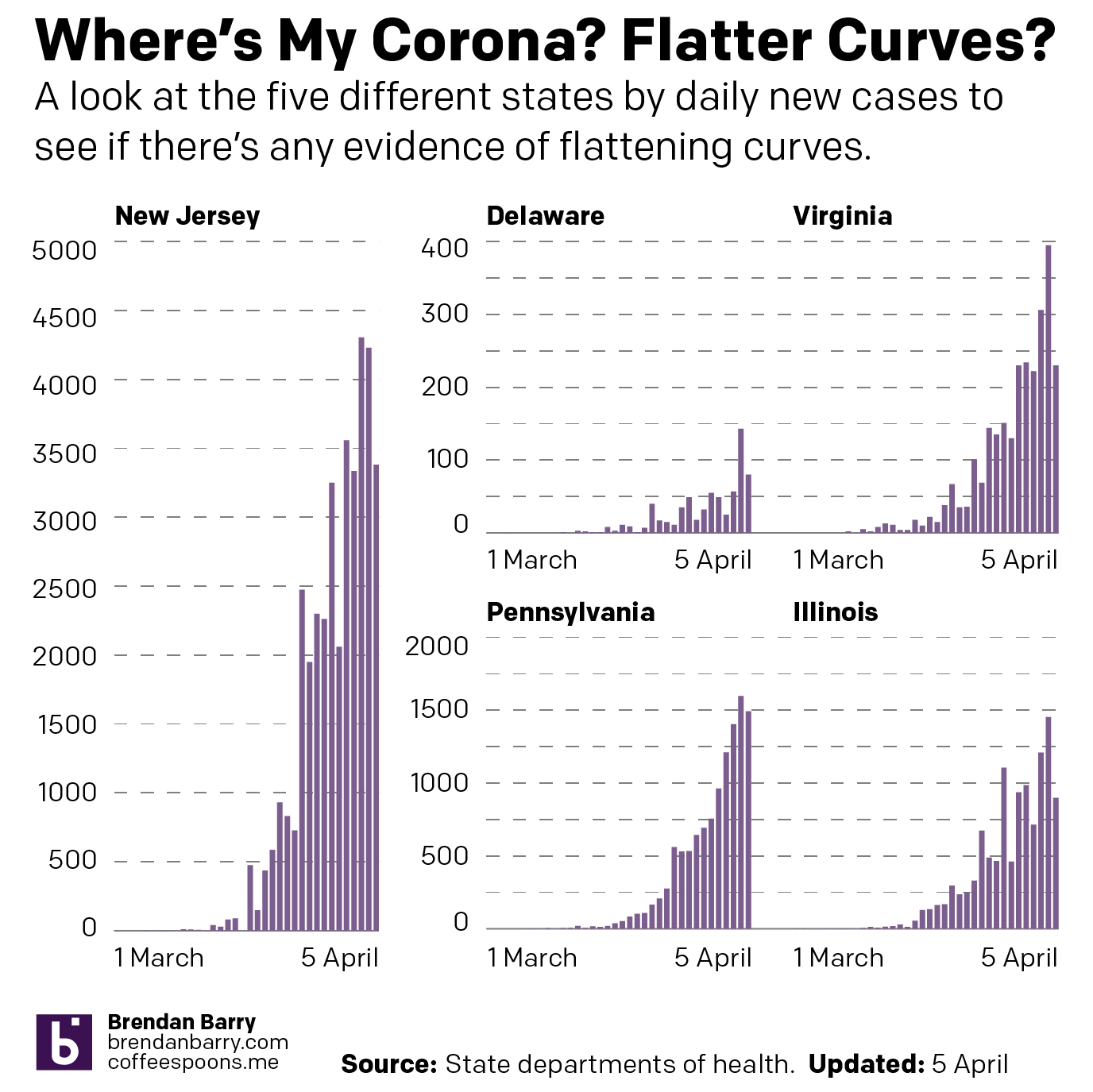
This past weekend I continued looking at the spread of COVID-19 across the United States. But in addition to my usual maps of Pennsylvania, New Jersey, Delaware, Virginia, and Illinois, I also looked at the number of cases across the United States adjusted for population. I then looked at the five aforementioned states in terms of new cases to see if the curve is flattening. Finally, I looked at the number of hospital beds per 1000 people vs the number of cases per 1000 people.

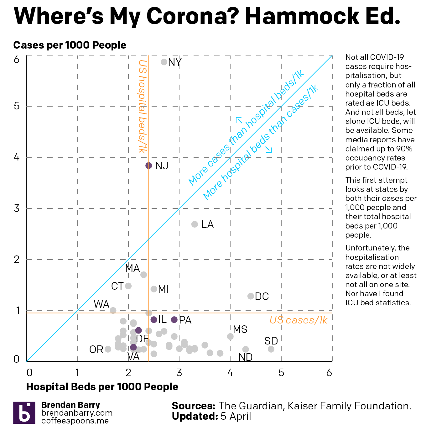
The latter in particular I wanted to be an examination of hospitalisation rates vs ICU beds, which are a small fraction of total hospital beds. But as I could not find that data, I made do with overall cases and overall beds.

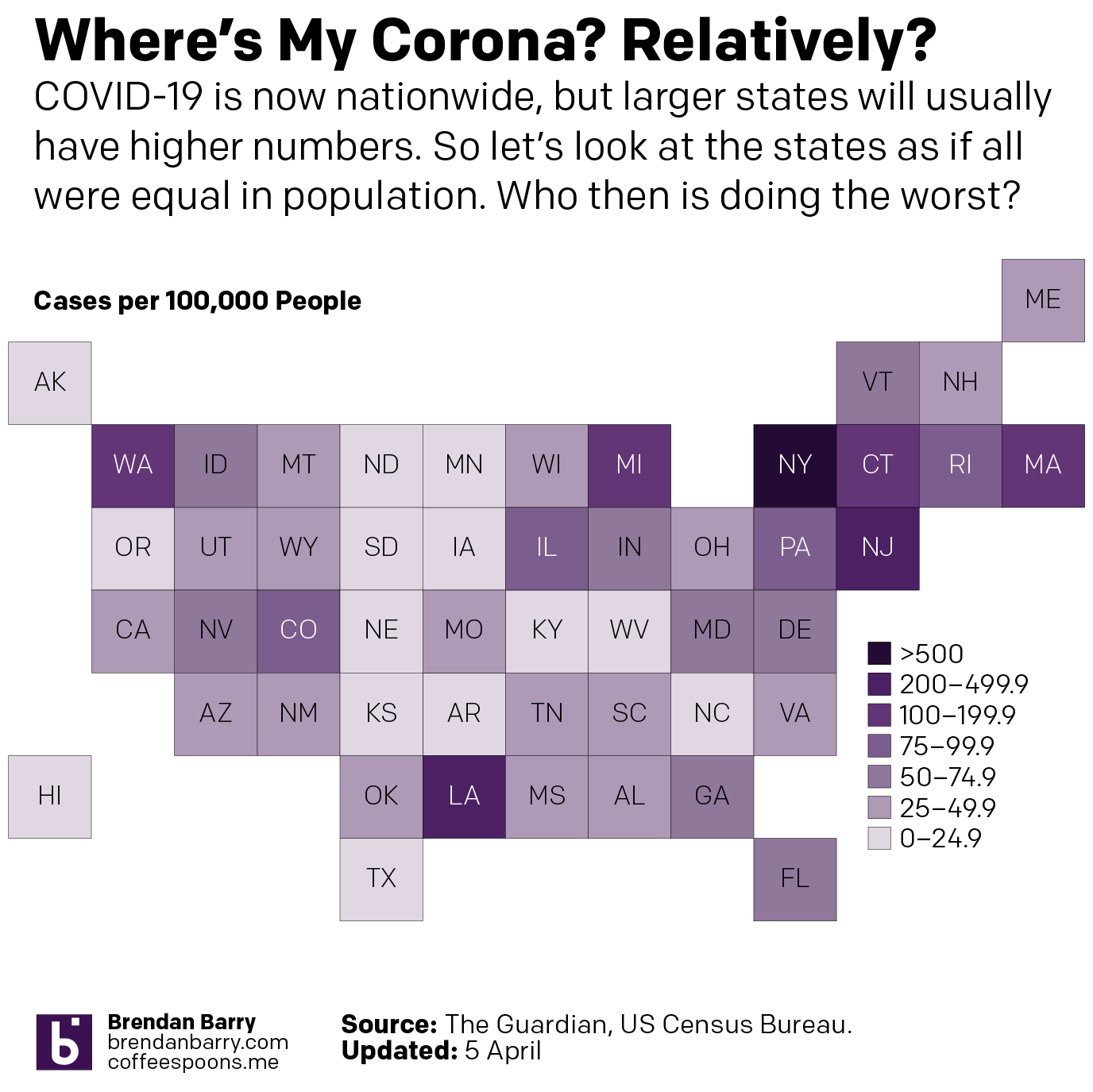
So first let’s look at the cases across the U.S. What you can see is that whilst New York and New Jersey do have some of the worst of the impact, Washington is still not great and Louisiana and Michigan are also suffering.

The situation across the United States

And then when we look at the states by their cases per 1000 people and their hospital beds per 1000 people, we see that the states often claimed to be overwhelmed, New York, New Jersey, and Washington are all well over the blue line, which indicates an equal number of beds and cases per 1000 people, or near it. Because it is important to remember that not all beds are the type needed for COVID-19 victims, who often require the more fully kitted out ICU beds. Additionally, not all cases are severe enough to warrant hospitalisation.

Cases per 1k people vs hospital beds per 1k people

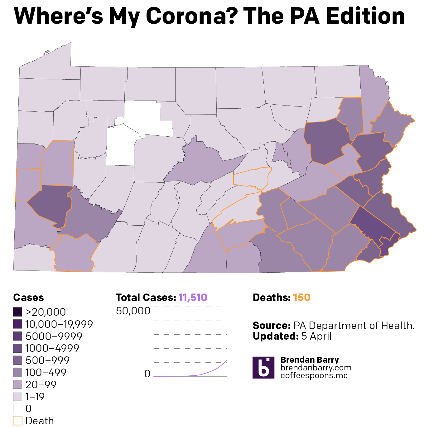
Then from the broader national view, we can look at the states of interest. Here, those of you who have been following my social media posts, you can see fewer dark purples in these maps. That’s because I have adopted a new palette that has sacrificed granularity at the lower end of the scale and added it at the top, a particular need in New Jersey and the Philadelphia and Chicago metro areas. And finally we look at the daily new cases to see if that curve is flattening.

Pennsylvania now has almost every county infected. But unlike Illinois, which has a similar infection rate but more unaffected counties, Pennsylvania has fewer cases in its big city, Philadelphia, and has more cases in the smaller cities and towns.

The situation in Pennsylvania

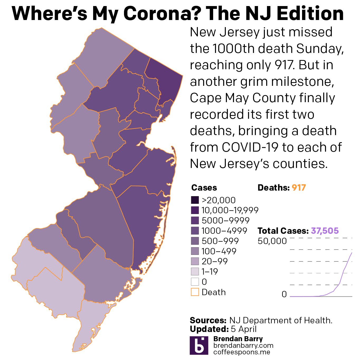
New Jersey is just a disaster. Deaths are now reported in every county—so I can probably remove those orange outlines. The only potential good news is that new cases for the second day in a row were fewer than the day before. It could be a blip. But it could also be a signal that the peak of infection has or is nearing. That said, hospitalisations and deaths are lagging indicators and could take two weeks to follow the positive test results. So in the best case scenario that this is a peak, New Jersey is far from out of the woods.

The situation in New Jersey

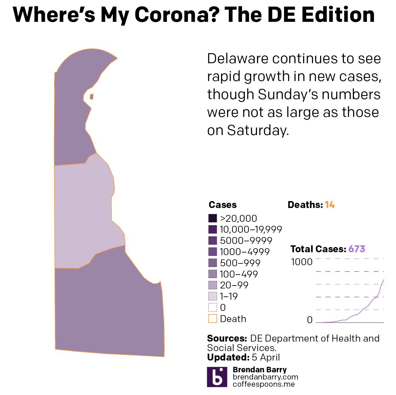
Delaware is the smallest state I look at—and one of the smallest in the union overall—but its cases are worryingly increasing rapidly, although like every state I examine in detail it had fewer new cases Sunday than Saturday.

The situation in Delaware

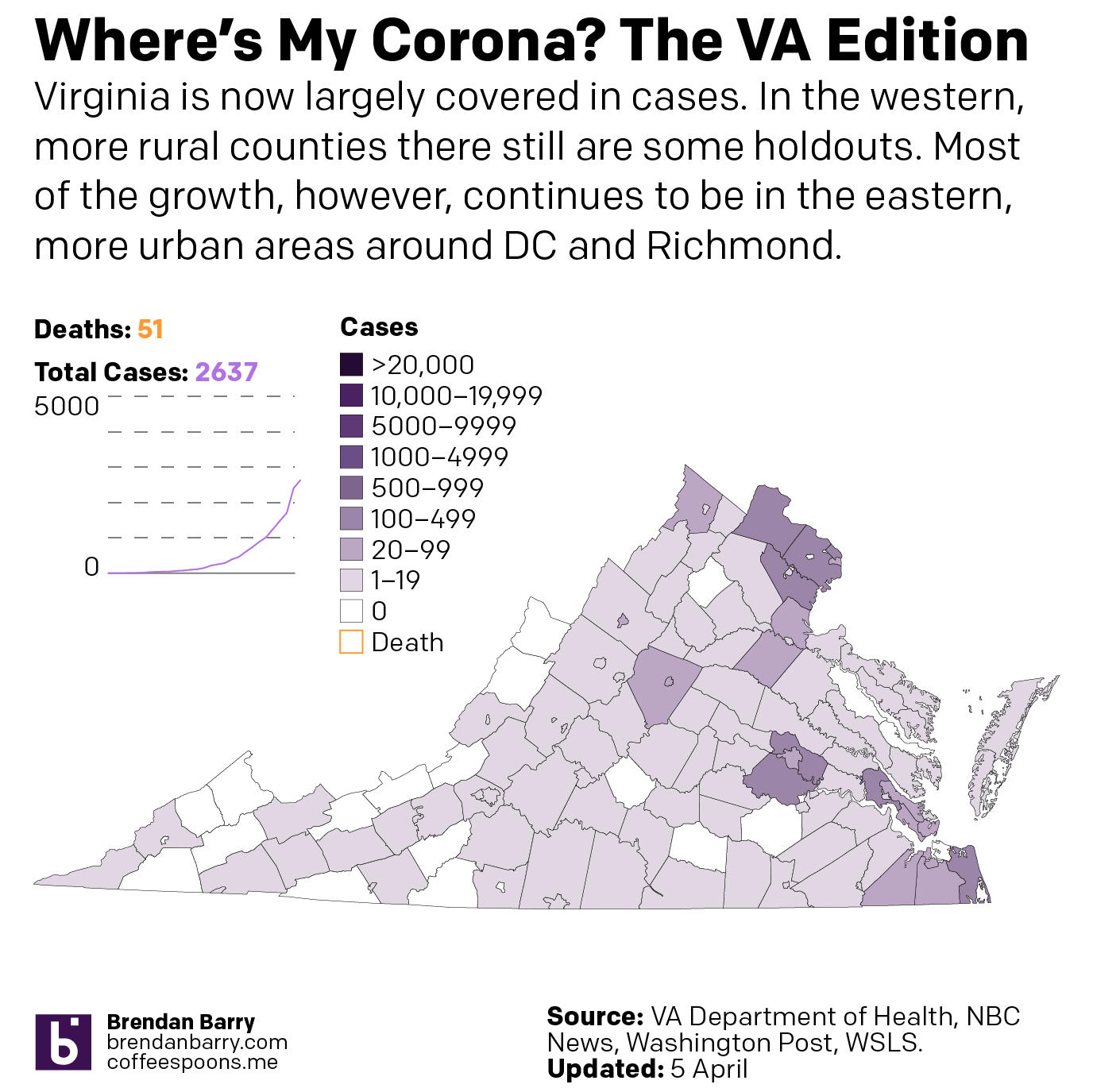
Virginia is in a better spot overall than the other four states. You can see that in the national map above. And most of Virginia’s cases are concentrated in the DC and Richmond areas as well as the cities along the peninsulas jutting into the Chesapeake.

The situation in Virginia

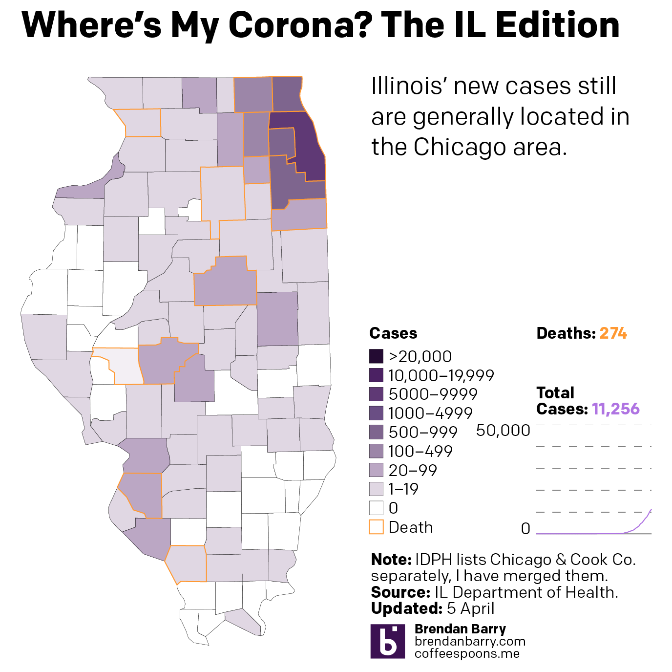
Illinois is, as noted above, similar to Pennsylvania in terms of infections. In terms of deaths, however, it is doubling Pennsylvania’s numbers. And most of its cases are located in and around Chicago. Big chunks of downstate Illinois are unaffected or lightly affected compared to the Commonwealth.

The situation in Illinois

Finally, as I noted in New Jersey, could these lower numbers Sunday than Saturday be meaningful? Possibly. But in all five states? Highly unlikely. Regardless, we can look at the number of daily new cases and see if that curve of infection is flattening. We should wait several days before beginning to make that assessment. But one can hope.

The case for flattening curves

All of this is to say that things are bad and likely will continue to get worse. But I will keep looking at the data daily and presenting it to the public to keep them informed.

Credit for this piece is mine.

The Vaping Outbreak Spreads

And now with more deaths.

On Friday, Pennsylvania reported its first death from the vaping disease spreading across the country. So I decided I would take a moment to update the map I made a month ago charting the outbreak. Then, the CDC had tallied 450 cases. Now we are at 1080. And whereas last time New England, parts of the deep South, and the Southwest were untouched, now the disease is everywhere but New Hampshire and Alaska.

But we are starting to see a pattern in a clustering of high numbers of cases around Lake Michigan and the Upper Midwest. Though I should point out these bin breakdowns come from the CDC. They did not provide more granular data.

Now with deaths in Pennsylvania.

Credit for this piece goes to me.

Abortion by State

In case you did not hear, earlier this week Alabama banned all abortions. And for once, we do not have to add the usual caveat of “except in cases of rape or incest”. In Alabama, even in cases of rape and incest, women will not have the option of having an abortion.

And in Georgia, legislators are debating a bill that will not only strictly limit women’s rights to have an abortion, but will leave them, among other things, liable for criminal charges for travelling out of state to have an abortion.

Consequently, the New York Times created a piece that explores the different abortion bans on a state-by-state basis. It includes several nice graphics including what we increasingly at work called a box map. The map sits above the article and introduces the subject direct from the header that seven states have introduced significant legislation this year. The map highlights those seven states.

We've been calling these box maps. It's growing on me.
We’ve been calling these box maps. It’s growing on me.

The gem, however, is a timeline of sorts that shows when states ban abortion based on how long since a woman’s last period.

There are some crazy shifts leftward in this graphic…

It does a nice job of segmenting the number of weeks into not trimesters and highlighting the first, which traditionally had been the lower limit for conservative states. It also uses a nice yellow overlay to indicate the traditional limits determined by the Roe v. Wade decision. I may have introduced a nice thin rule to even further segment the first trimester into the first six week period.

We also have a nice calendar-like small multiple series showing states that have introduced but not passed, passed but vetoed, passed, and pending legislation with the intention of completely banning abortion and also completely banning it after six weeks.

Far too many boxes on the right…

This does a nice job of using the coloured boxes to show the states have passed legislation. However, the grey coloured boxes seem a bit disingenuous in that they still represent a topically significant number: states that have introduced legislation. It almost seems as if the grey should be all 50 states, like in the box map, and that these states should be in some different colour. Because the eight or 15 in the 2019 column are a small percentage of all 50 states, but they could—and likely will—have an oversized impact on women’s rights in the year to come.

That said, it is a solid graphic overall. And taken together the piece overall does a nice job of showing just how restrictive these new pieces of legislation truly are. And how geographically limited in scope they are. Notably, some states people might not associate with seemingly draconian laws are found in surprising places: Pennsylvania, Illinois, Maryland, and New York. But that last point would be best illustrated by another box map.

Credit for the piece goes to K.K. Rebecca Lai.