Wear a Mask

It sounds so easy, but too many don’t do it.

Yesterday, Agence France-Presse published an article about a recent study in the Journal of the American Medical Association that examined the efficacy of the coronavirus’ airborne spread potential.

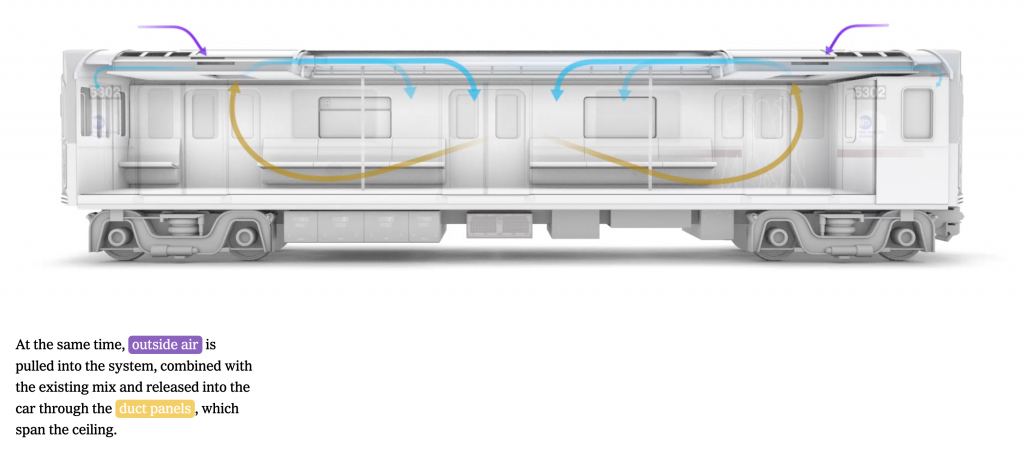
The study centred on a bus trip in eastern China from January, before the widespread adoption of masks as common courtesy let alone mandated safety equipment. Nobody on the bus of 68 travellers wore a mask and the bus’ air conditioning system recycled the air inside the vehicle. (Remember the importance of cycling and filtering air inside subway cars?)

Researchers then mapped the location of patient zero, conveniently from my point of view in the centre of the bus. It should also be noted that patient zero was also asymptomatic at the time of the bus trip. Then researchers mapped the seats of those infected on the bus and this is what they found.

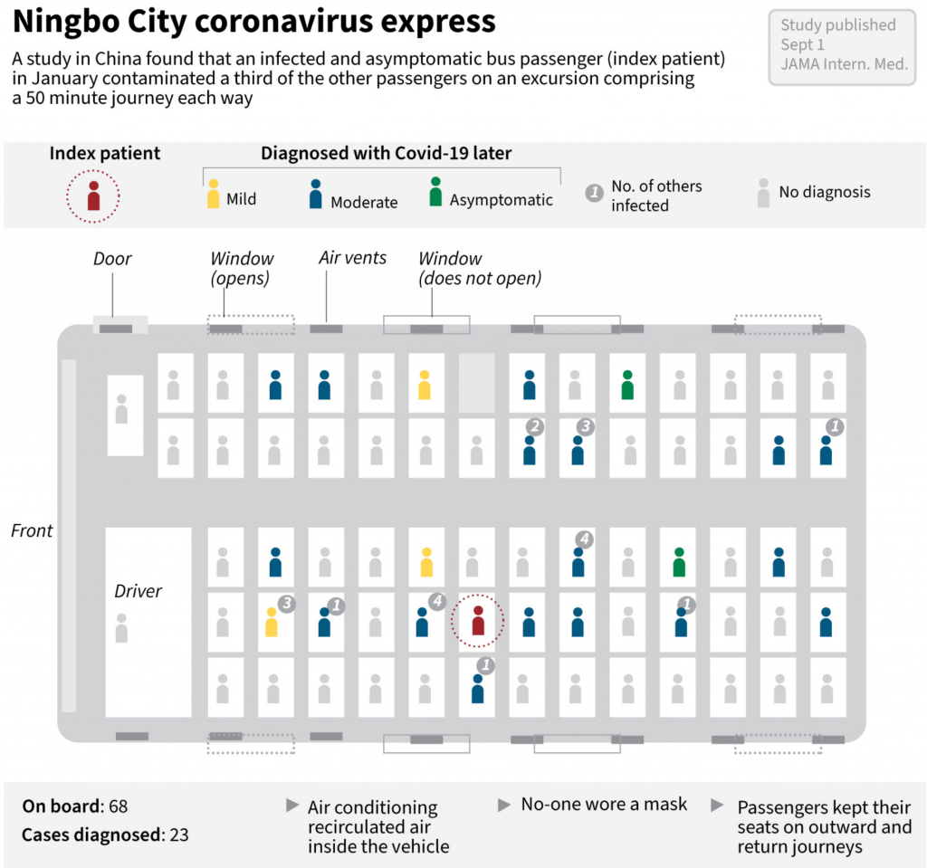
One of the key findings is these conditions, recirculated air amongst people not wearing masks, the virus was able to infect people outside the 2-metre safety radius (6-feet in the non-metric States).

Now from a design standpoint, I really like this graphic. It shows people’s seats and their condition to show the physical spread of the virus from patient zero. (Eerily, people far away were infected whilst one person sitting next to patient zero remained uninfected.) Not only that, but from a chain of transmission standpoint, the designer also included how many people these newly infected victims infected. Some infected nobody further whilst others infected up to four additional people.

My only real quibble here is with the colours used for the status of the infected. I think the light grey works well for those who were not diagnosed with Covid-19. But the green, yellow, blue, and red don’t quite work for me here. The value of the yellow is too close to the grey and consequently almost the mildly symptomatic people fall almost into the background. Compare that to the asymptomatic victims in green, who appear far more prominently.

I understand the desire to progress from mild to moderate vs. asymptomatic. So I wonder if those with mild symptoms were given a light blue and those with moderate a dark blue to contrast with the asymptomatic green. Of course, we still run into the red-green issue, but the dotted circle around patient zero mitigates that concern.

Remember, this was all among people not wearing masks. This piece strongly shows how important it is to wear a mask—not just to reduce the risk of receiving the virus, but to reduce your risk of spreading the virus if you are an asymptomatic case. (To be fair to the people on the bus, we knew very little about the virus in January and who knows what they knew as China was still attempting to downplay the virus.)

The point? Wear a mask.

Credit for the piece goes to John Saeki.

Covid-19 Update: 30 August

After dealing with hurricane forecast plots last Monday, we’re back to the nature-made, man-intensified disaster of Covid-19 in the United States. So in the five states we review, where are we with the pandemic?

Compared to the charts from two weeks, looking at daily new cases, in some places we are in a better spot, and in others not much has changed. In fact Illinois is the only place worse off with its seven-day average higher than it was two weeks ago, but not by dramatically much.

New cases curve in PA, NJ, DE, VA, & IL.

In fact we see in Pennsylvania, New Jersey, and Delaware that the average number of daily new cases is lower than it was two weeks ago. Virginia dipped lower, but has recently returned to approximately the same level and in that sense is in no different a place. Of course the key factor is how those trends all change over the coming week.

But what about in terms of deaths?

Deaths curve in PA, NJ, DE, VA, & IL.

Well here there is bad news in Virginia. Two weeks ago a spike in deaths there had largely subsided. Two weeks hence? We are in the middle of a third spike of deaths, reaching nearly 20 deaths per day.

Fortunately, the other four states remain largely the same, and that means few deaths per day. Indeed, for Pennsylvania and New Jersey that means deaths in the low double-digits or often in the single digits. Delaware has not reported a new death in four days. And Illinois, while up a little bit, is in the low single-digits, but generally just a few more deaths per day than Pennsylvania and New Jersey.

Credit for the piece is mine.

Is Covid-19 Surging in New Zealand?

Yesterday, President Trump claimed that Covid-19 was “surging” in New Zealand, a country widely lauded as having successfully contained and suppressed their outbreak. That has allowed Wellington to reopen large swathes of their economy without incident.

Until this surge.

And by surge we mean something like 30 cases in 3 days. So, let’s compare that surge to the numbers of new cases in the United States.

Now, to be fair, New Zealand has a population of nearly 5 million, the United States has nearly 335 million. So a direct number-to-number comparison of the number of new cases per day isn’t fair.

So let’s look at the number of new cases per million people, which equalises the data for population.

So yeah, New Zealand is not “surging”. The data shows that even with the more limited testing per capita conducted in the United States, we are nowhere near the point of bending the curve anywhere close to zero.

Credit for the piece is mine.

Covid-19 Update: 16 August

So here are the charts from the last week of Covid data in Pennsylvania, New Jersey, Delaware, Virginia, and Illinois.

When we compare last week’s update to today’s, we can see that Pennsylvania did indeed bottom out and is back on the rise and the same can probably be said for Delaware. Although a fair amount of the one-day spikes in those numbers we see today are from an outbreak in a correctional system.

Whilst Virginia did go up, by week’s end, it had settled back down to a point not dissimilar to last week. So nothing really changed and time stood still in Virginia. The same can also be loosely said for New Jersey, where it was more about fluctuations than determined rises or falls.

In Illinois, however, we finally saw a plateauing of the new cases numbers and with the slightest of declines .

New cases in PA, NJ, DE, VA, and IL.
New cases curve in PA, NJ, DE, VA, and IL.

Then in deaths we have not much to say as they remain low in New Jersey and Delaware and stable and moderate in Illinois.

Virginia’s recent spike appears to have subsided, as it’s back to nearly 10 deaths per day from the virus.

But most concerning is Pennsylvania. Here, while the numbers are still relatively low, they are on a slow and gradual rise. At this point the seven-day average is beginning to rise above 20 deaths per day.

Deaths in PA, NJ, DE, VA, and IL
Death curve in PA, NJ, DE, VA, and IL

Credit for the piece is mine.

Sweet Summer Air of Subway Cars

For those of my readers who live in a city where the subway or underground is a great means of getting around the city, you know you really miss that late Saturday night/early Sunday morning bouquet in the air. Though as this New York Times piece explains, sure it smells bad, but that air is probably safer than you dining indoors at a restaurant or even a child attending class in person.

The piece focuses on New York City subway cars, but they are very similar to the rest of the stock used in the United States. It uses a scrolling reveal to show how the air circulation and filtration systems work. Then it concludes with a model of how a person sneezing appears, both with and without a mask. (Spoiler, wear a mask.)

It’s a really nicely done and informative piece. It compares the rate of air recycled in a subway car to that of several other locations, and the results were a bit surprising to me. Of course, early on in the pandemic before we began to fully understand it, the threat was thought to be from contaminated surfaces—and let’s be honest, there are a lot of contaminated surfaces in a New York City subway car—but we now know the real risk is particles breathed/coughed/sneezed out from one’s mouth and nose. And we can now see just how efficient subways are at cycling and filtering that air.

Credit for the piece goes to Mika Gröndahl, Christina Goldbaum, and Jeremy White.

Covid-19 Update: 9 August

Weekend data means, usually, lower numbers than weekdays. And with the exception of Delaware that’s what we have today. Some drops, like Illinois, are more dramatic than others, like New Jersey. And so we look at the seven-day trend.

And that tells a slightly different story. On the one hand we have states like Virginia and Illinois that appear to be continuing upward. The rise in Illinois has been slow and steady, but the average is approaching nearly 2000 new cases per day. In Virgina, the rise was more abrupt and the question is whether this peak has crested in recent days or if come the middle of next week it will resume rising.

In New Jersey and Delaware we see two states with does declines after some sudden spurts of new cases. Jersey had risen to nearly 500 new cases less than two weeks ago, but that’s now back down to fewer than 350. And in Delaware, while today’s number is greater than yesterday’s, the trend is still downard after being at over 100 new cases per day two weeks ago.

New cases curves for Pennsylvania, New Jersey, Delaware, Virginia, and Illinois.

Then we have Pennsylvania. At one point doing it had done so well in controlling the outbreak to bend the curve to fewer than 500 new cases per day at one point. Then as the state began to reopen, cases began to rise again in the west and now the east. But over the last week that statewide average began to fall. But in the last two days that fall appears to have potentially bottomed out. So come the middle of next week, the question will be does the downward trend continue or has the state hit a new valley before another rise?

Finally, in terms of new deaths, with the exception of Virgina, we have yet to see any rise in deaths that might correlate with the recent rises in new cases. And so nothing new there. But it’s worth pointing out that New Jersey has now reached the high single digits in terms of daily deaths from Covid-19. That’s remarkable for a state that back in April saw nearly 300 people dying every single day.

New death curves for Pennsylvania, New Jersey, Delaware, Virginia, and Illinois.

Credit for the graphics is mine.

Covid-19 Update

As I mentioned last week, I am going to try using my blog here for the weekly update on the five states people have asked me to explore. And for the second week in a row, we are basically seeing numbers down compared to previous days. But given that numbers are generally lower on the weekends, that is not terribly surprising.

The real question is by Friday, will these numbers have rebounded?

The Covid-19 curves for PA, NJ, DE, VA, and IL
The Covid-19 death curves for PA, NJ, DE, VA, and IL.

Credit for these graphics is mine.

The Vaxx Path

Today we look at a wee graphic from the BBC examining the current state of Covid-19 vaccines. None have been approved, but 163 are on the path to approval.

The vaxx path

This falls into the category of not everything has to be super complex. Each vaccine is shown as a discrete unit, a small square. For me in this instance this works better than a bar chart showing the total number per each phase. It highlights how each vaccine is a distinct unit and that it can move from one section down to the next. (Although I suppose if it fails a phase it can also be removed entirely.)

And if you want another reason why a nationalist, isolationist foreign policy that bashes foreign countries is not great…none of the Phase 3 candidates, closest to approval, are from an American company or institution.

Credit for the piece goes to the BBC graphics department.

Wednesday’s Covid-19 Data

Here we have the data from Wednesday for Covid-19.

The situation in Pennsylvania

Pennsylvania saw continued spread of the virus. Notably, Monroe County in eastern Pennsylvania passed 1000 cases. It was one of the state’s earliest hotspots. That appears to have been because it was advertised as a corona respite for people from New York, not too far to the east and by then in the grips of their own outbreak.

The situation in New Jersey

New Jersey grimly passed 5000 deaths Wednesday. And it is on track to pass 100,000 total cases likely Friday or Saturday. Almost 2/3 of these cases are located in North Jersey, with some South Jersey counties still reporting just a few hundred cases and a handful of deaths.

The situation in Delaware

Delaware passed 3000 cases and Kent Co. passed 500. While those don’t read like large numbers, keep in mind the relatively small population of the state.

The situation in Virginia

Virginia has restarted reporting deaths, this time at the county level and not the health district level. What we see is deaths being reported all over the eastern third of the state from DC through Richmond down to Virginia Beach. In the interior counties we are beginning to see the first deaths appear. And in western counties, we still see that the virus has yet to reach some locations, but counties are beginning to report their first cases.

The situation in Illinois

Illinois continues to suffer greatly in the Chicago area, and at levels that dwarf the remainder of the state. However, the downstate counties are beginning to see spikes of their own. Macon and Jefferson Counties each saw increases of 30–40 cases in just 24 hours.

Preview(opens in a new tab)

How about those curves?

A longer-term look at the states shows how the states diverge in their outbreaks. Pennsylvania looks like it might be forcing the curve downward whereas New Jersey appears to have more plateaued. Earlier I expressed concern about Virginia, which does now appear to have not peaked and continues to see an increasing rate of spread. Then we have Illinois, which may have plateaued, but we need to see if yesterday’s record amount of new cases was a blip or an inflection point. And in Delaware a missing day of records makes it tricker to see what exactly the trend is.

Credit for the piece is mine.

Covid-19 Data from Monday

Monday’s Covid-19 data for Pennsylvania, New Jersey, Delaware, Virginia, and Illinois provided a glimmer of good news, most notably in Pennsylvania. That, however, occurred on the same day as a protest in Harrisburg that could set the state back days if not weeks. More on that below.

The situation in Pennsylvania

Pennsylvania saw fewer than 1000 new cases for the first time since 1 April. The curve here may be doing more than flattening, but it might actually be falling. That is to say the infection rate is decreasing rather than stabilising and holding steady, as it appears to be doing in New Jersey. That said, new cases are appearing sporadically in the rural and less dense areas of the state. Problematically, protestors arrived in Harrisburg to let it be known they are unhappy with the quarantine. Because the rest of us are.

The problem is that it appears a significant percentage of those infected with the virus are asymptomatic carrier, i.e. they are sick, but do not show any symptoms like fever, coughing, difficulty breathing. Critically, they may not appear sick, but they can spread the sickness. And so a gathering of several hundred people in close quarters? Not ideal.

Compare that to a Christian cultish church in Daegu, South Korea. There, an infected parishioner did not heed government calls to isolate and instead attended a church service. The average infected person spreads this virus to two or three people. This congregant? They infected 43 people who then went on to infect other people.

It is quite possible that someone in that Harrisburg protest was an asymptomatic carrier. And given the lack of social distancing, the lack of masks, and the general reckless behaviour, it is quite possible that the rally could be a super-spreading event. But we won’t know for 5–10 days, the apparent incubation period of the virus. Hopefully we dodge the proverbial bullet. But it is quite easy to see how these kinds of protests could lead to surges in infections. And those surges would then force the government to extend its quarantine by weeks thereby defeating the entire point of the protestors.

We get it. Quarantine sucks. But we all have to suck it up.

The situation in New Jersey

Moving on to New Jersey, where we see continuing evidence of the plateauing of cases. The bulk of the cases remain in the north in the New York suburban counties with the fewest numbers in the counties in South Jersey. However, averages of nearly 3500 new cases daily remains quite high and the death toll of 4377 is likely to continue to climb higher, even if Monday’s 175 new deaths was lower than most days in recent weeks.

The situation in Delaware

Delaware is back to reporting its figures. And in that release, we had Sussex County in the south climb above 1000 total cases. The levels or curves chart at the end will also show how the state might be flattening and stabilising its infection rate, but we will need several days of uninterrupted reporting to make that determination.

The situation in Virginia

Virginia might be worrying. Or it might not be. Cases continue to increase in the big metropolitan counties like Fairfax and Henrico. But, there are still several counties out in the west that remain unaffected. And the curves chart at the end shows how there has not yet been any sort of even a near-exponential growth curve. Instead we just see a steady, slow increase in the number of cases. That in its own way makes it more difficult to see when the curve flattens, because it was already a relatively flat curve.

The situation in Illinois

Illinois continues to be the tale of two states: Chicago vs. everywhere else. The combined Chicago and Cook County have over 20,000 total cases and the surrounding counties add a few thousand more, which gets you over 2/3 of the state’s 31,000 cases. That said, new cases and new fatalities are beginning to pop up in downstate counties.

Looking at the curves

Lastly a look at the curves. As I noted above when talking about Pennsylvania, you can clearly see the downward slope of the state’s new cases curve. Compare that to the plateau-like shape of New Jersey. Delaware and Illinois might be approaching a New Jersey-like curves. But I would want to see more data and in Delaware less volatility. But like I said, Virginia is a tricky one to read.

Credit for the pieces is mine.