Monday’s Covid-19 data for Pennsylvania, New Jersey, Delaware, Virginia, and Illinois provided a glimmer of good news, most notably in Pennsylvania. That, however, occurred on the same day as a protest in Harrisburg that could set the state back days if not weeks. More on that below.
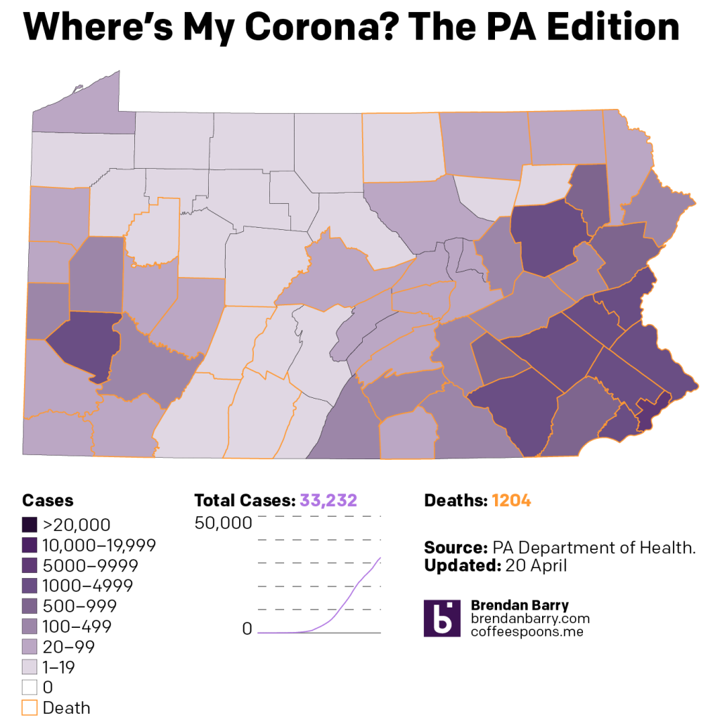
Pennsylvania saw fewer than 1000 new cases for the first time since 1 April. The curve here may be doing more than flattening, but it might actually be falling. That is to say the infection rate is decreasing rather than stabilising and holding steady, as it appears to be doing in New Jersey. That said, new cases are appearing sporadically in the rural and less dense areas of the state. Problematically, protestors arrived in Harrisburg to let it be known they are unhappy with the quarantine. Because the rest of us are.
The problem is that it appears a significant percentage of those infected with the virus are asymptomatic carrier, i.e. they are sick, but do not show any symptoms like fever, coughing, difficulty breathing. Critically, they may not appear sick, but they can spread the sickness. And so a gathering of several hundred people in close quarters? Not ideal.
Compare that to a Christian cultish church in Daegu, South Korea. There, an infected parishioner did not heed government calls to isolate and instead attended a church service. The average infected person spreads this virus to two or three people. This congregant? They infected 43 people who then went on to infect other people.
It is quite possible that someone in that Harrisburg protest was an asymptomatic carrier. And given the lack of social distancing, the lack of masks, and the general reckless behaviour, it is quite possible that the rally could be a super-spreading event. But we won’t know for 5–10 days, the apparent incubation period of the virus. Hopefully we dodge the proverbial bullet. But it is quite easy to see how these kinds of protests could lead to surges in infections. And those surges would then force the government to extend its quarantine by weeks thereby defeating the entire point of the protestors.
We get it. Quarantine sucks. But we all have to suck it up.
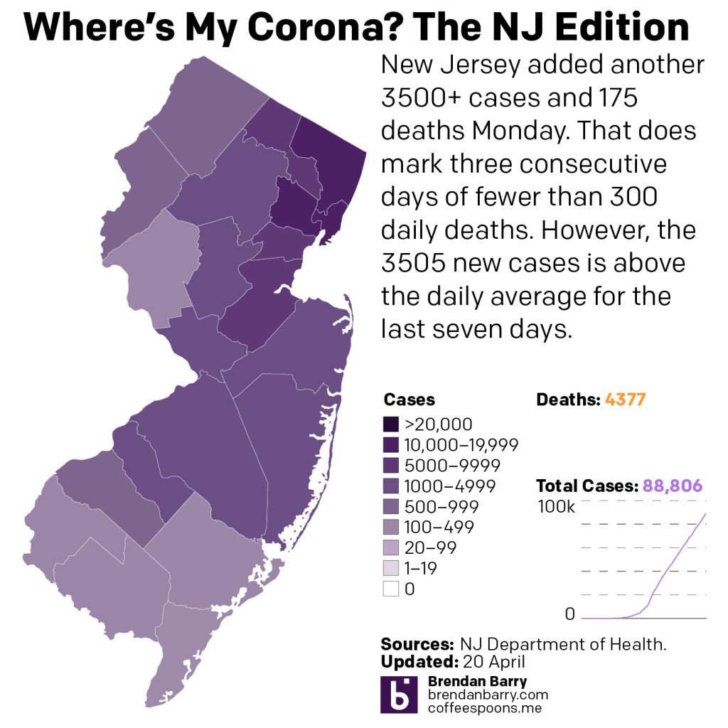
Moving on to New Jersey, where we see continuing evidence of the plateauing of cases. The bulk of the cases remain in the north in the New York suburban counties with the fewest numbers in the counties in South Jersey. However, averages of nearly 3500 new cases daily remains quite high and the death toll of 4377 is likely to continue to climb higher, even if Monday’s 175 new deaths was lower than most days in recent weeks.
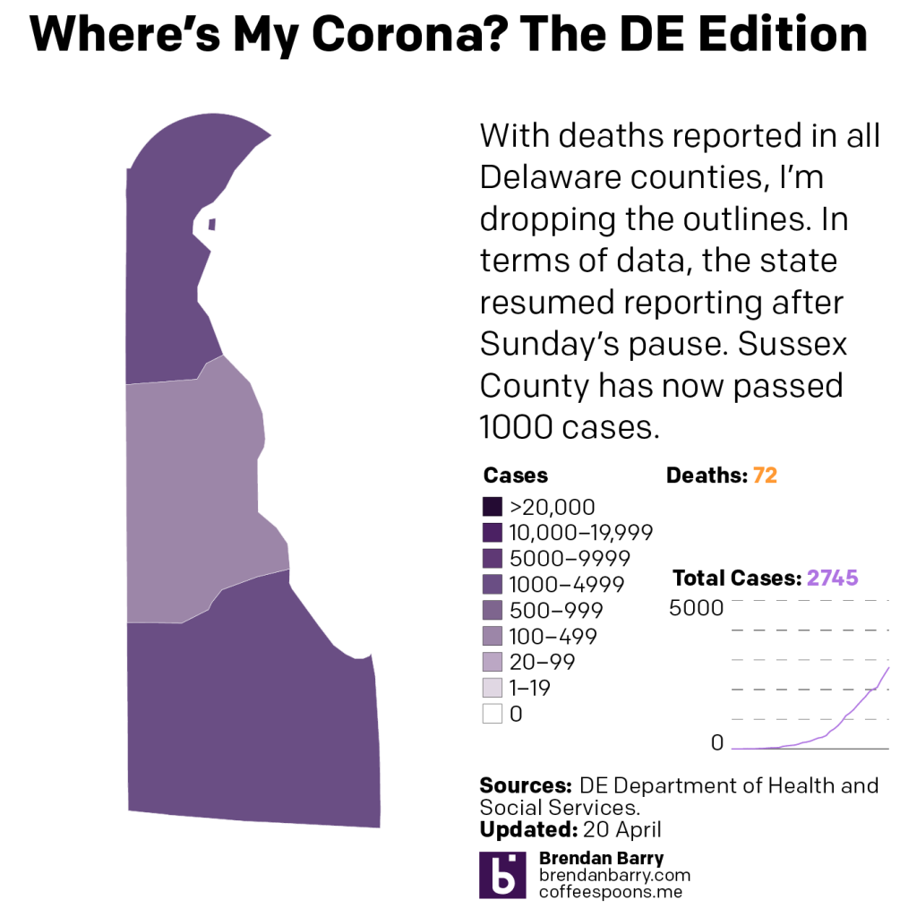
Delaware is back to reporting its figures. And in that release, we had Sussex County in the south climb above 1000 total cases. The levels or curves chart at the end will also show how the state might be flattening and stabilising its infection rate, but we will need several days of uninterrupted reporting to make that determination.
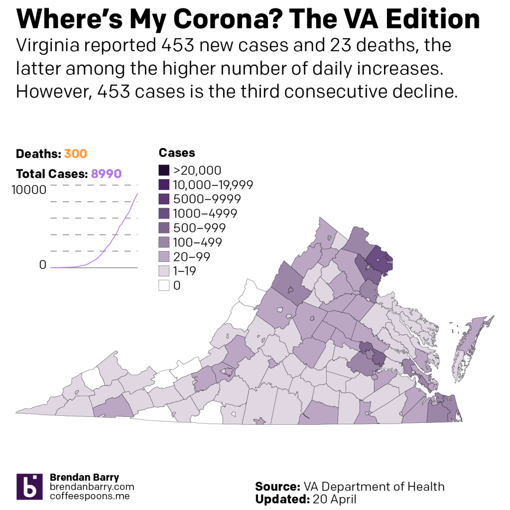
Virginia might be worrying. Or it might not be. Cases continue to increase in the big metropolitan counties like Fairfax and Henrico. But, there are still several counties out in the west that remain unaffected. And the curves chart at the end shows how there has not yet been any sort of even a near-exponential growth curve. Instead we just see a steady, slow increase in the number of cases. That in its own way makes it more difficult to see when the curve flattens, because it was already a relatively flat curve.
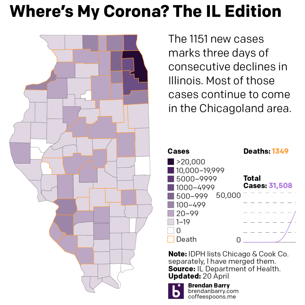
Illinois continues to be the tale of two states: Chicago vs. everywhere else. The combined Chicago and Cook County have over 20,000 total cases and the surrounding counties add a few thousand more, which gets you over 2/3 of the state’s 31,000 cases. That said, new cases and new fatalities are beginning to pop up in downstate counties.
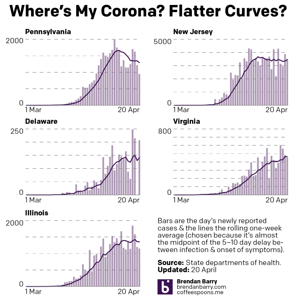
Lastly a look at the curves. As I noted above when talking about Pennsylvania, you can clearly see the downward slope of the state’s new cases curve. Compare that to the plateau-like shape of New Jersey. Delaware and Illinois might be approaching a New Jersey-like curves. But I would want to see more data and in Delaware less volatility. But like I said, Virginia is a tricky one to read.
Credit for the pieces is mine.
Leave a Reply
You must be logged in to post a comment.