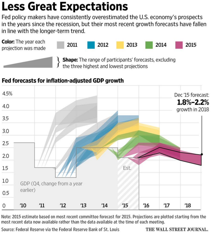
Organisations that forecast things are not often inclined to go back and review their forecasts against the actual results. So that makes today’s post from the Wall Street Journal fascinating. They reviewed the Federal Reserve’s forecasts for US GDP growth against the actual growth. And it turns out the Fed consistently overestimated US growth.
US Federal Reserve Forecasts
From a design standpoint, what makes this piece interesting is how they presented the range of forecasts. After all, it would otherwise become a plot of squiggly spaghetti lines. Instead, they used colour to group each projection set. A smart idea. Plus a nice literary allusion. I mean if you like Dickens.
Credit for the piece goes to the Wall Street Journal graphics department.
I’m sure the word you were looking for was symbolism. (Points if you get the reference.) Apologies for yesterday, I was a bit under the weather.
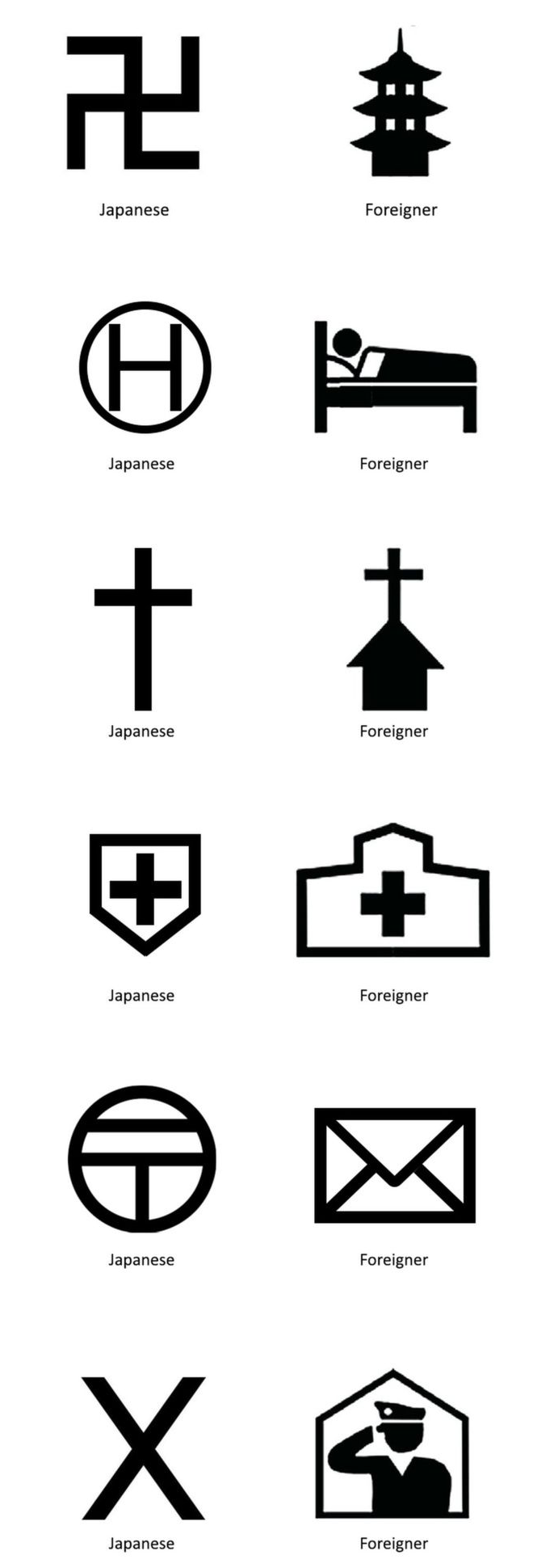
Today we deviate from graphs and things and go to another area of conveying information: symbology. I mean iconography. The BBC featured an article about possible new symbols for maps ahead of the 2020 Olympics when, presumably, lots of foreigners will need maps to get around Tokyo. And so you can imagine that the agency behind the proposed ideas has received a backlash about changing customary Japanese symbols for foreigners.
I combined each of the examples from the article. Each row includes the proposed Japanese version and the foreigner version. See if you can identify them without the word. You can imagine, however, that the focus of the article was upon that first row. The answers are after the credits.
Proposed map symbols
Credit for the original work goes to the Geospatial Information Authority of Japan.
The answers, top to bottom: temple, hotel, church, hospital, post office, police station.
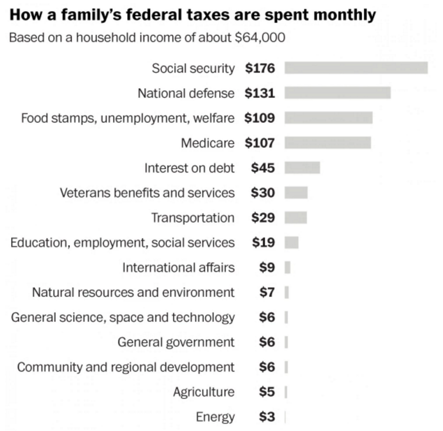
One of the things that irritates me about when people complain about government spending is the comparison against household budgeting. The two are very different. I mean on the surface, I suppose yes, both have income and both spend on stuff and services. But, to put it all in context there is this nice piece from the Washington Post that shows what US federal government monthly spending looks like from the perspective of a household earning $64k.
The government-is-a-household budget
I wish I could get away with that level of spending on housing and transportation…
Credit for the piece goes to the Washington Post graphics department.
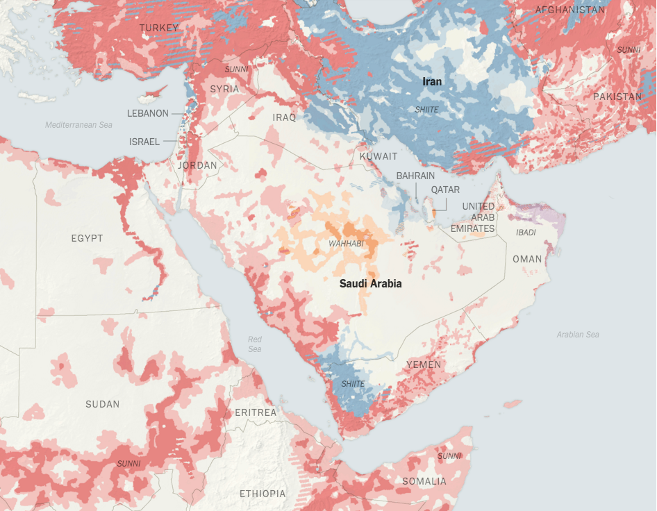
Yesterday we looked at the Economist’s work on breaking down the Sunni and Shia split throughout the Middle East. Let’s take a look at that again today, especially since the world’s largest Muslim nation dealt with a terror attack overnight. That’s right, Indonesia is actually the world’s largest Muslim country and it is also largely secular in nature. But, back to the Middle East where the New York Times put together an article exploring the two power blocs and the religious affiliations within.
A map of the region
The map provides a bit more detail on a few different sects that are relevant, especially the Wahhabists in Saudi Arabia.
Credit for the piece goes to Sarah Almukhtar, Sergio Peçanha, and Tim Wallace.
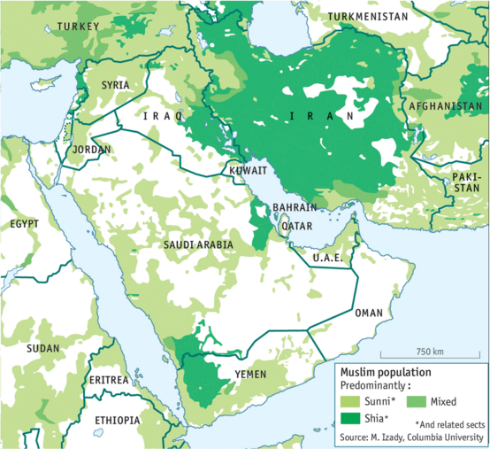
Turning away from selfies and returning to the upbeat world of the Middle East, today we look at a graphic from the Economist that breaks down the Middle East into the Sunni and Shia sects. See anything that looks familiar? Do you know how Saudi Arabia and Iran are feuding at the moment? Well, take a look at the predominant sect in each country.
Sunni vs. Shia
Credit for the piece goes to the Economist’s Data Team.
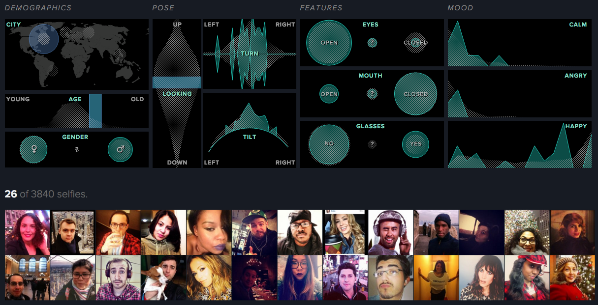
New year, new selfies. Thankfully we have the Selfiecity to look at a sample of selfies, the goal to determine patterns and trends in the art of the selfie. Of course you also want to be able to look at the aforementioned selfies. For that they built the Selfiexploratory, an application that allows you to filter the set to see what you want. What I like is the return of data to show what the results of the filter look like against the whole set.
When I was in high school I began to listen to music. To find music. To find artists. A guy who owned and operated the store next to where I worked recommended David Bowie, that guy whose songs I had heard on Philly’s classic rock radio stations. Back in those days we still had record stores—not that I knew what a record was—and I found a few used CDs—now that kids today would know what a CD is. Over that summer, I picked up a lot of new music. But what struck me about this David Bowie guy is that Space Oddity, Tonight, and Heathen all sounded so different from each other. He was a great one. And while I’m certain there will be some graphic in the future about his timeline—how can there not—today I am going to follow up once more on the North Korean nuclear test after coming across this graphic from Reuters.
You will recall how last week I looked at a New York Times post that explained the differences between a few different types of nuclear weapons. Well, here Reuters illustrates those differences.
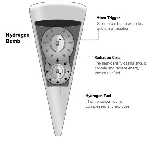
Yesterday we looked at the sites and timeline of nuclear weapons tests. Today, however, as we learn more about North Korea’s hydrogen bomb test, some are wondering whether it really was a hydrogen bomb or something else. After all, there are different ways to build the bomb. Some suggest North Korea tested an atom bomb on steroids, more properly called boosted fission. Anyway, the New York Times does a nice job explaining the differences between the atom bomb, the hydrogen bomb, and how we can infer what North Korea tested from the calculated size of the blast.
Inside the hydrogen bomb
Credit for the piece goes to Josh Keller, Ford Fessenden, and Tim Wallace.