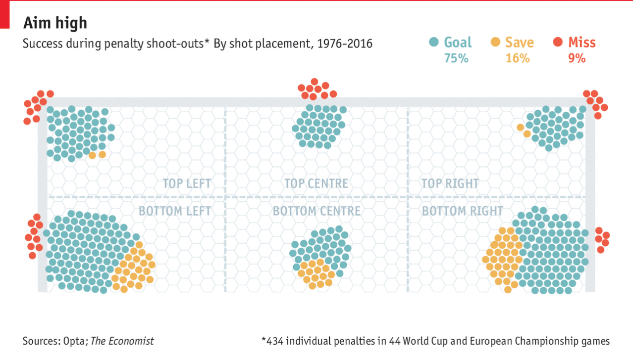
Well, football is not coming home. But the World Cup continues. And should we get another final match tied at the end of extra time, that means penalty shoot outs. Thankfully, the Economist did a nice job detailing the success rates on goal by placement of the ball.
Coin flips
The only thing I am unsure about is whether the dots represent the actual placement or just positioning within the aggregate zone. The colours work well together and the graphic of the goal is not overpowering.
Credit for the piece goes to the Economist Data Team.
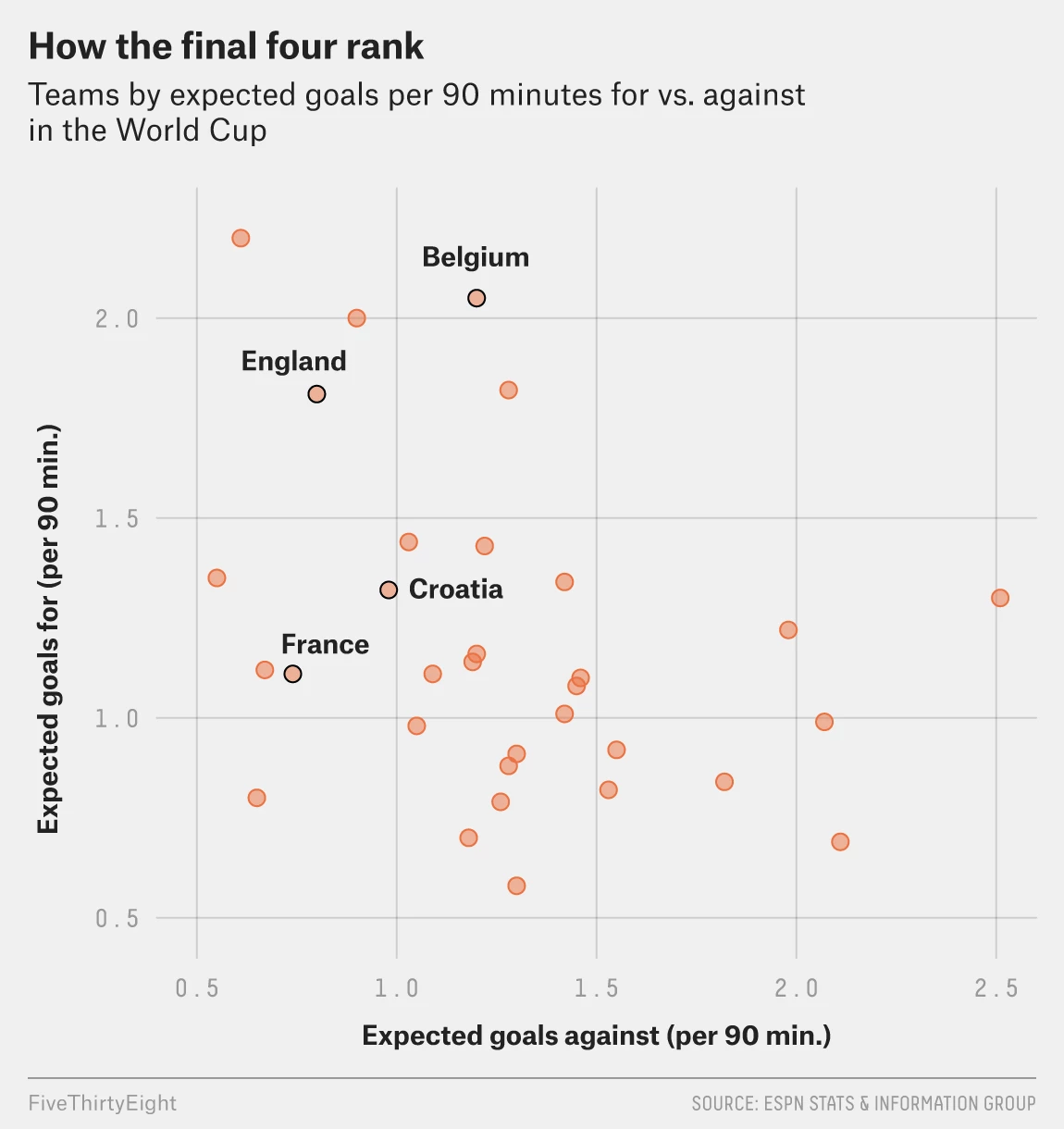
Today is the semifinal match between England and Croatia. I could have posted this yesterday, but the US Supreme Court selection seemed more important. But today’s post is a simple scatter plot from FiveThirtyEight. It is part of a broader article comparing the four semifinalists of the World Cup. (Spoiler alert, France won its match.)
No drama today, please
In terms of design, we can contrast this to yesterday’s dot plot about Kavanaugh. There the highlighted dot was orange with a black outline. Here, same deal. But yesterday, the other justices were shown with black dots and an empty dot for retiring Justice Kennedy. Here all the other countries in the World Cup are orange dots.
I wonder, given the orangeness of the other countries, maybe a solid black dot would have worked a little better for the four semifinalists. Or to keep the orange with black outline dots, maybe a lighter orange or grey dots for the other World Cup teams. (I think black would probably be too strong in this case.)
Overall, it shows that today’s match between England and Croatia will be tough. And should England advance, a match against France will be even tougher.
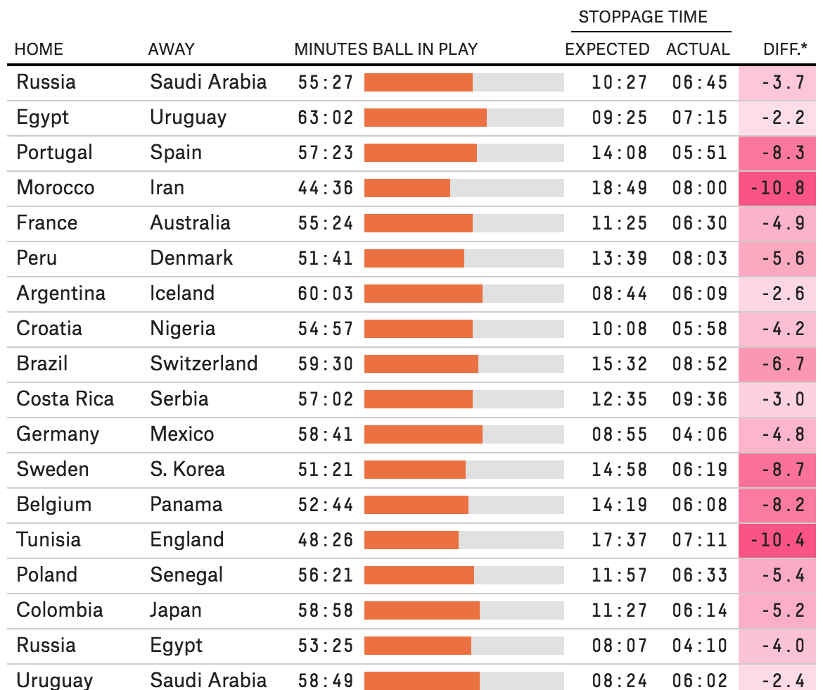
Late last week I was explaining to someone in the pub why the World Cup matches are played beyond their 90 minute booking. For those among you that do not know, basically the referees add up all the stoppage time, i.e. when play stops for things like injuries or people dilly dallying, and then tack that on to the end of the match.
But it turns out that after I explained this, FiveThirtyEight published an article exploring just how accurate this stoppage time was compared to the amount of stopped time. Spoiler: not very.
In design terms, the big takeaway was the dataset of recorded minutes of actual play in all the matches theretofore. It captured everything but the activity totals where they broke down stoppage time into categories, e.g. injuries, video review, free kicks, &c. (How those broke out across an average game are a later graphic.)
Through 27 June
The setup is straightforward: a table organises the data for every match. The little spark chart in the centre of the table is a nice touch that shows how much of the 90 minutes the ball was actually in play. The right side of the table might be a bit too crowded, and I probably would have given a bit more space particularly between the expected and actual stoppage times. On the whole, however, the table does its job in organising the data very well.
Now I just wonder how this would apply to a baseball or American football broadcast…
The World Cup continues. Well for a few teams. Some have already been eliminated from the Round of 16. But for those Americans rooting for Team America, well, if you have not yet figured it out, you got knocked out well before the World Cup even started by…Panama. And so you are stuck in the question of who’s next? Thankfully FiveThirtyEight, in addition to their fantastic live probabilities that we looked at the other day, put together a little quiz to help you find your new team.
You answer seven questions and you are told your new allegiance. Questions like this:
How would you answer?
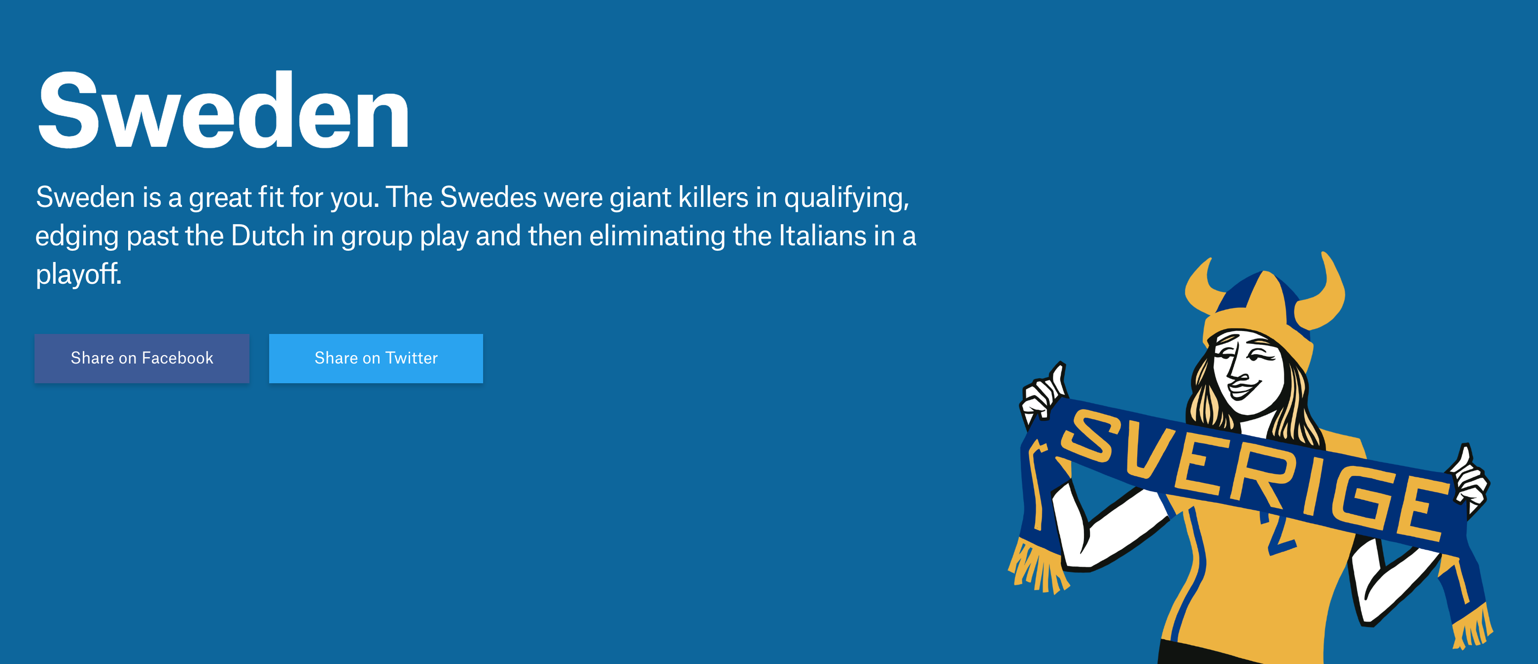
Naturally I took the quiz and discovered that in addition to England, I am cheering for…
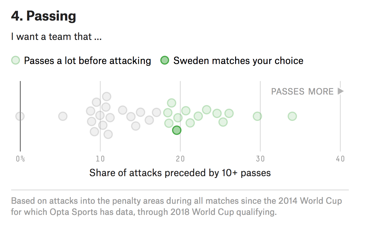
Goal? Make that skål!
Yep. Fantastic since I was just there in December and happened to love Stockholm. But what I love about this piece is how it uses data to create the newfound bond I have with Sweden. Often times you take a quiz and are given an answer without any sense of why the answer was correct. Here, FiveThirtyEight plots the seven different variables used to create your newfound personality and then shows you how you scored.
Right in the middle there
It’s Friday, it’s the World Cup. Have a great weekend. And in addition to England on Sunday, I’ll now be cheering for Sweden against Germany on Saturday.
Credit for the piece goes to Michael Caley, Rachael Dottle, Geoff Foster, Gus Wezerek, Daniel Levitt, Emily Scherer, and Jorge Lawerta.
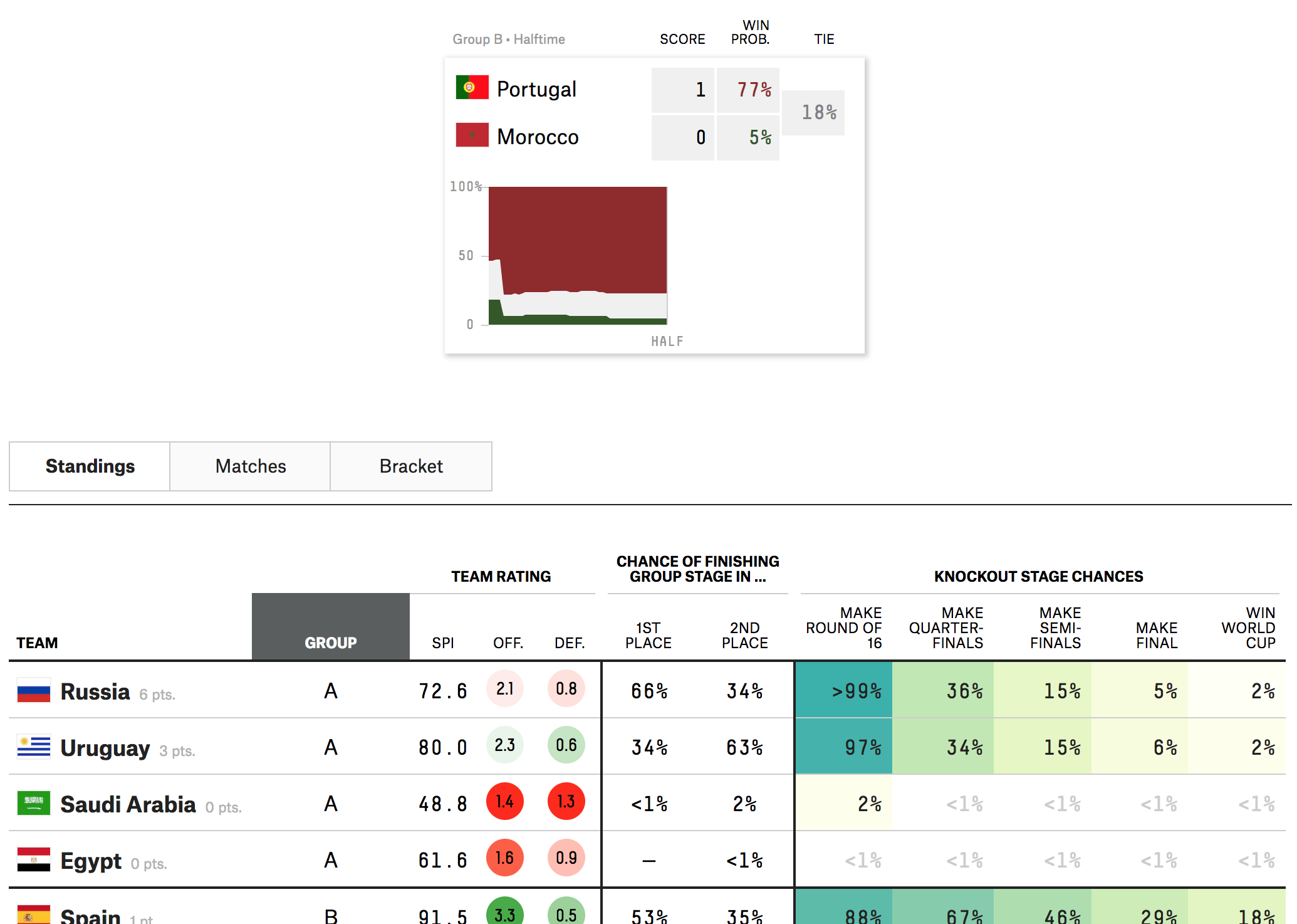
The World Cup has had some impressive matches and some stunners. (And the two are not mutually exclusive.) But if you are like me and have to work during most of the broadcasts, how can you follow along? Well thankfully FiveThirtyEight put together a nice statistical model that provides the probability of a team winning—or drawing—in real time.
Looking pretty good for Portugal this morning…
The design is fairly simple: a small table with the score and probability followed by a chart drawn as the match goes on. (Clearly I took this image at the half.)
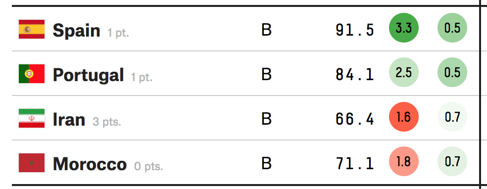
I included a snippet of the table below to show the other work the FiveThirtyEight team put out there. You can explore the standings, the screenshot above, as well as the matches and then the brackets later in the competition.
The table makes nice use of the heat map approach to show is likely to make easy of the different stages of the competition. Like I said the other day, they are high on Brazil, because Brazil. But a little lower on Germany. But never count Germany out.
Shouldn’t Iran be in the top slot?
The only unclear thing to me in the table? The sorting mechanism. In Group B, at least whilst the Portugal match is ongoing, should probably have Iran at the top. After all, as of writing, it is the only team in the group to have won a match. The only thing I can guess is that it has to do with an overall likelihood to advance to the next round. I highly doubt that Iran will defeat either Spain or Portugal. But as with many knockout-style championships, anything can happen in a single match sample size.
Credit for the piece goes to Jay Boice, Rachael Dottle,Andrei Scheinkman, Gus Wezerek, and Julia Wolfe.
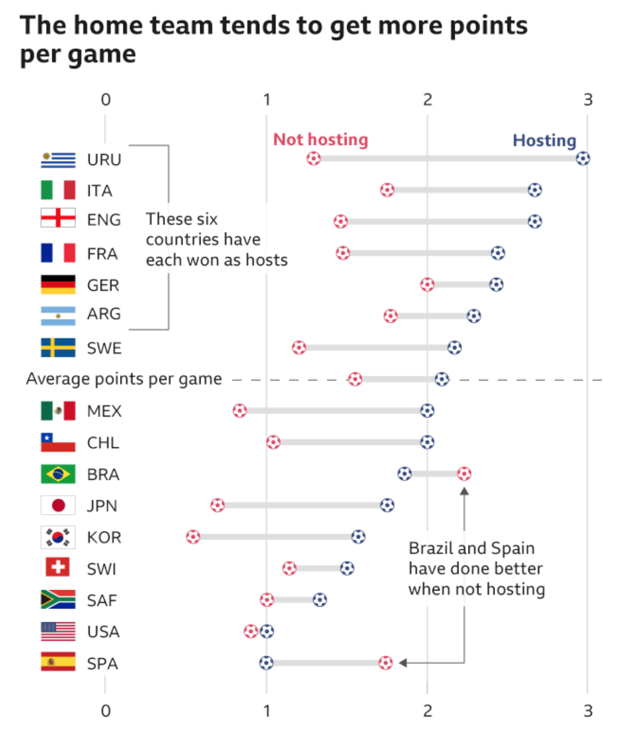
If you live under a rock or in America, the World Cup starts today. (Go England.) So what else to have but a chart-driven piece from the BBC from last week about the World Cup. It features seven charts encapsulating the competition. But the one I want to focus on? It’s all about the host nations, in this case Russia.
To host, or not to host, that is the question of how much can you pay FIFA officials under the table…
On its design, I could go without the football icons to represent points on the dot plot, but I get it. (Though to be fair, they work well as icons depicting the particular World Cup event in another set of graphics elsewhere in the article.) In particular, I really like the decision to include the average difference between a host nation’s points in non-hosting matches vs. hosting matches.
It does look like the host nation scores more points per match than when they are not hosting. And that—shameless plug—reminds me of some work I did a few years back now looking at the Olympics and the host nation advantage in that global competition.
This piece will make a ton of sense to my British and European readers, likely less so to those of you from the States. The English Premier League has been not so great at finishing well let alone winning in the Champions League.
Super briefly, English football—soccer—has a whole bunch of teams that play at different levels. Kind of like the US minor leagues, but without the affiliation of minor league teams to major league teams. That is, every team for itself. The Premier League is the top rung. (Every year, the worst teams in the Premier League are dropped into the minors and the very best from the minors move up into the Premier League.) This league includes the ones even Americans have heard of: Manchester, Arsenal, Chelsea. And maybe even Liverpool. Liverpool is playing today to make it into the Champions League finals.
(Full disclosure: I always say if I had to pick an English team to follow it would be Liverpool. Why? Because they are owned by Fenway Sports Group, the same group that owns the Boston Red Sox.)
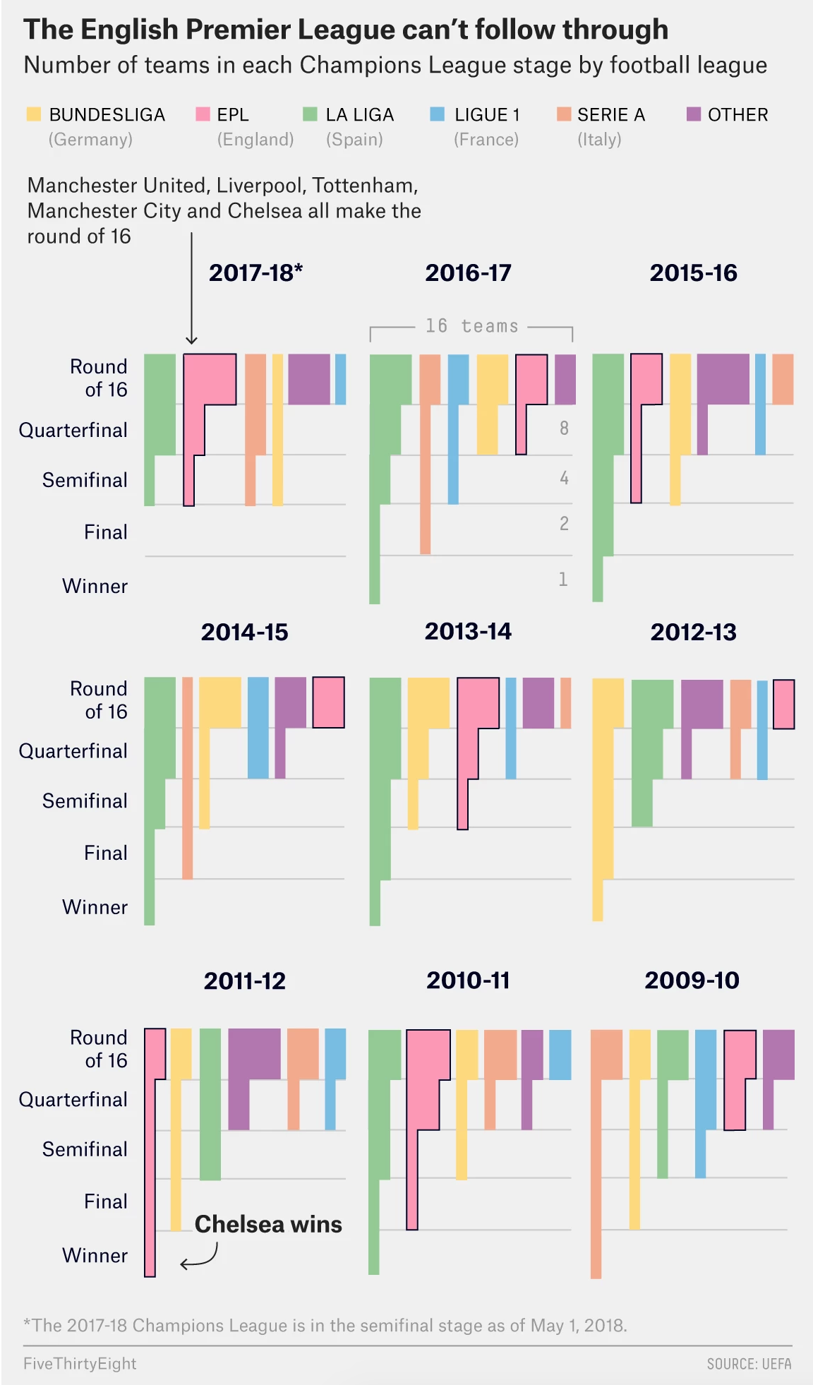
The thing is that as well known as many of these teams are, they have been faring not well in the Champions League, which is like the Premier League but of all European football. That is, the best teams from every top league in all of Europe compete for a European trophy. FiveThirtyEight explored some reasons why, but also included a nice graphic to showcase the relative failures of the Premier League teams.
Making it through the Champions League…
The chart makes nice use of grouped bar charts showing the number of teams from each league at each stage of the playoffs. The designers made good use of labelling, especially at the top to indicate to which country each league belongs. My only question would be is whether these make sense from the top down, as they presently are, or if they would work better bottom up, in that the winning team has to climb their way to victory.
To be honest, I am not really sure which approach would work best. I think it might be even odds. Either way, Liverpool plays Roma later today.
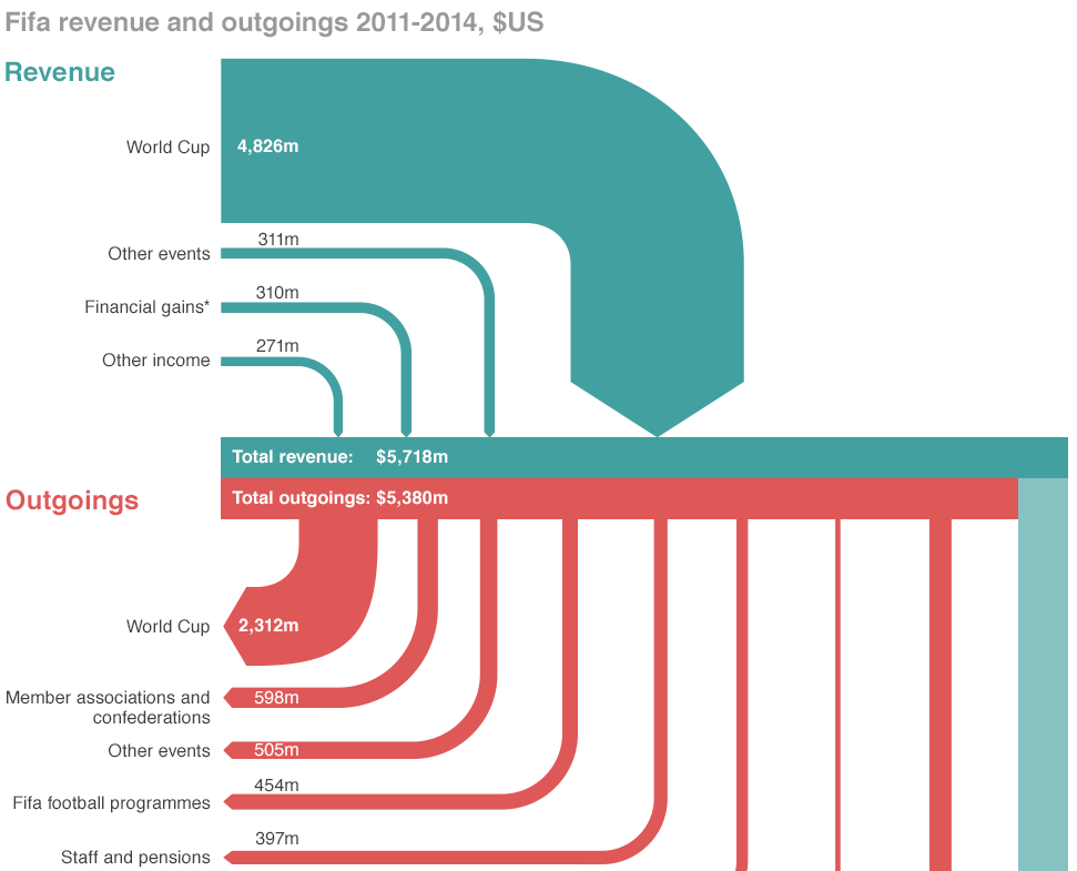
If you did not hear about it the other day, the head of FIFA resigned. That is kind of a big deal because football (in the rest-of-the-world sense of the word) is kind of a big deal. But the organisation that runs it is generally seen as wholly corrupt. So this BBC piece takes a look at the revenue and spending—at least so far as we know about it.
Sort of a Sankey diagram
Credit for the piece goes to the BBC graphics department.
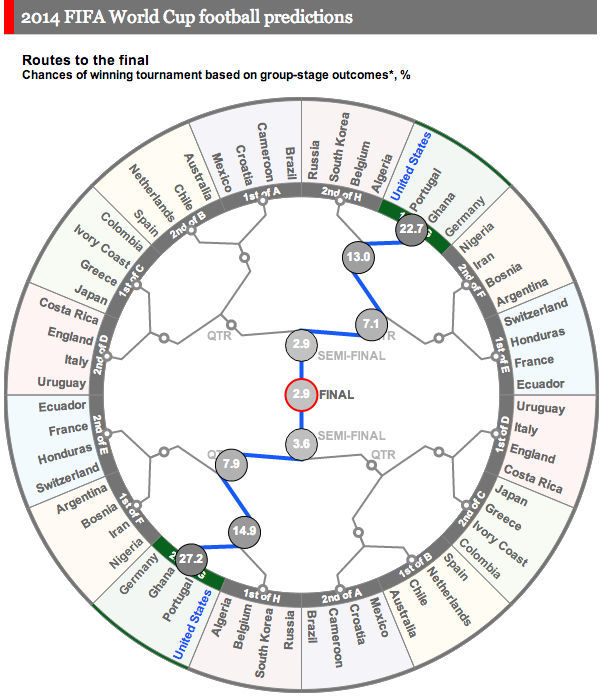
Earlier this week we looked at how Bloomberg was doing predictions and odds for the World Cup. Today we look at the Economist’s go. It uses something called the probability circle. It lacks the depth of Bloomberg’s piece, but from a design angle does play off the shape of the soccer ball and not in the cheesiest of fashions. Here it actually begins to work in lieu of our familiar bracket system (see every other sports final tournament series I have ever seen). To be fair, the Economist does not actually make any predictions in this, rather, it provides the odds that different teams will make different stages.
Economist’s odds on each team
Credit for the piece goes to A.Y., P.K., D.D.M., J.M.F., and K.N.C.
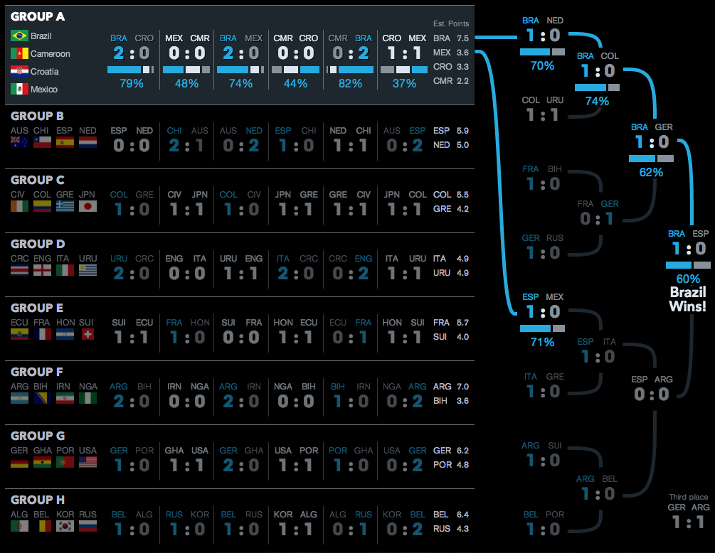
The World Cup is starting soon and that means predictions are also on their way. And snazzy graphics. Today’s snazzy graphic with predictions comes from Bloomberg. They have host Brazil winning the overall tournament. And if you want to investigate the matches further, you can do that by clicking on the match.
Brazil wins
Credit for the piece goes to the Bloomberg graphics department.