Well, football is not coming home. But the World Cup continues. And should we get another final match tied at the end of extra time, that means penalty shoot outs. Thankfully, the Economist did a nice job detailing the success rates on goal by placement of the ball.
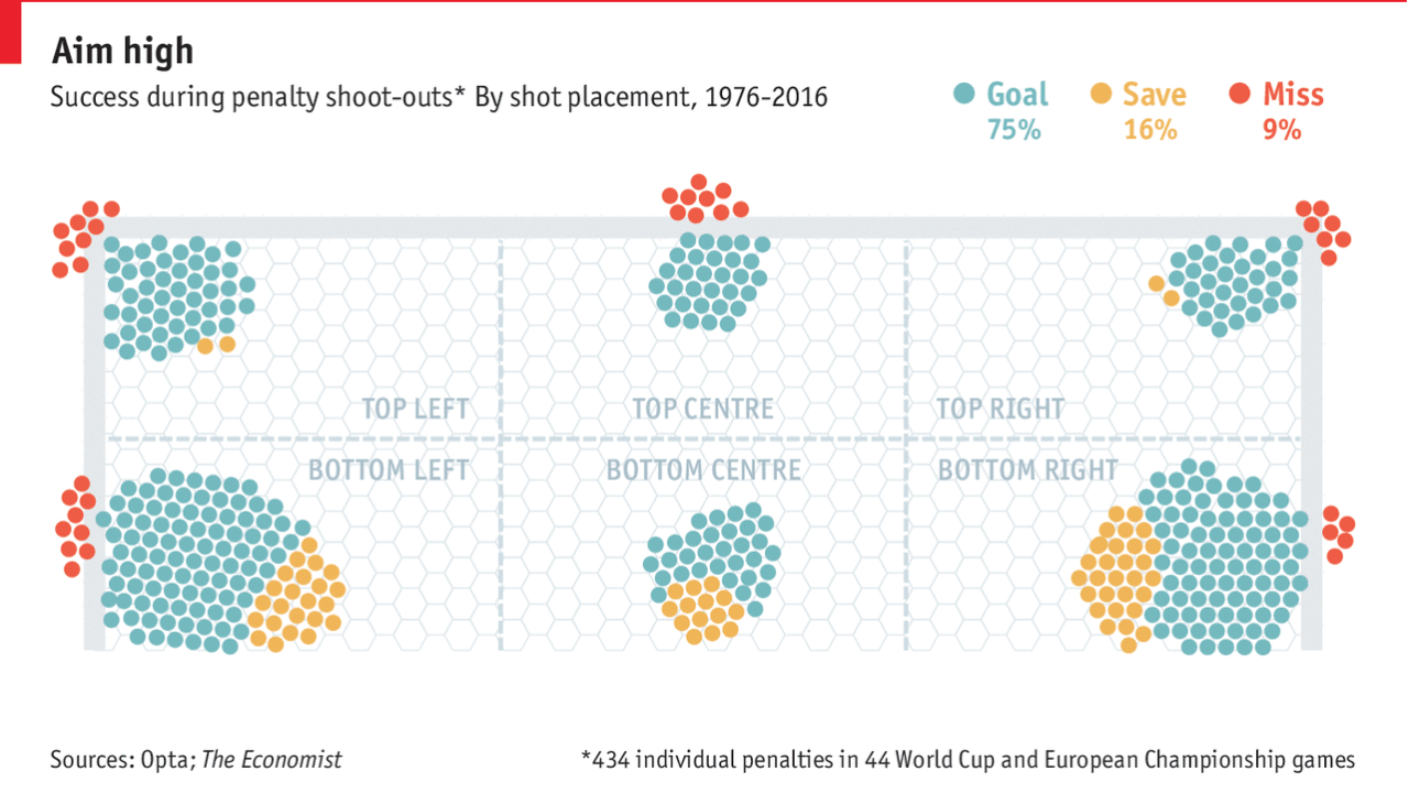
The only thing I am unsure about is whether the dots represent the actual placement or just positioning within the aggregate zone. The colours work well together and the graphic of the goal is not overpowering.
Credit for the piece goes to the Economist Data Team.
Author: Brendan Barry
I am a graphic designer who focuses on information design. My day job? Well, they asked me not to say. But to be clear, this blog is my something I do on my own time and does not represent the views of…my employers. I think what I can say is that given my interest in information design—be it in the shape of clear charts, maps, diagrams, or wayfinding systems—I am fortunate that my day job focuses on data visualisation. Outside of work, I try to stay busy with personal design work. Away from the world of design, I have become an amateur genealogist and family historian. You will sometimes see that area of work bleed into my posts.
View all posts by Brendan Barry