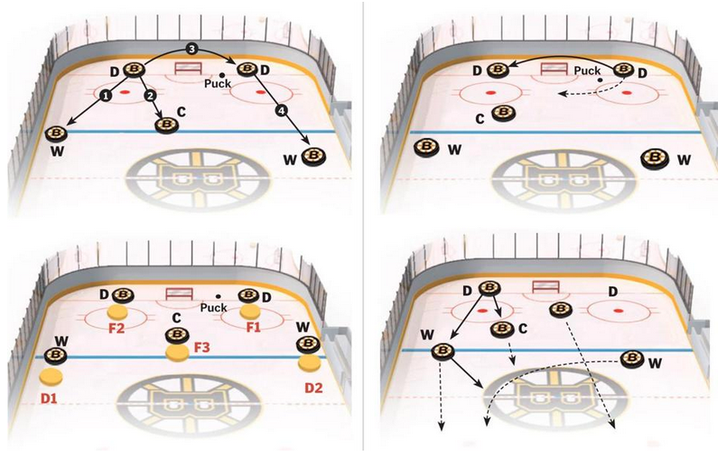
If you guys have not yet figured out, I am a baseball guy. But that is pretty much my only sport. And so maybe you can help explain to me just what is going on in today’s piece from the Boston Globe. I think it is attempting to explain hockey formations for the Boston Bruins.
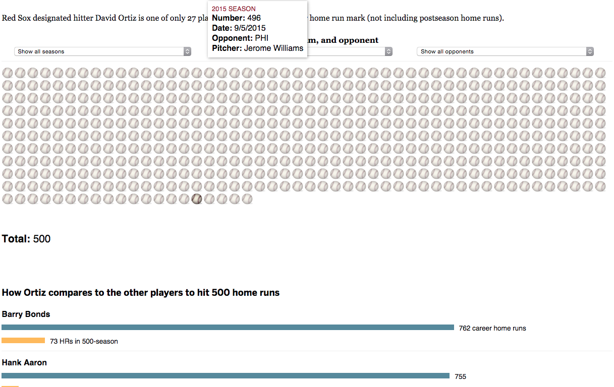
So what I was saying yesterday about there not being a new Boston Globe piece about David Ortiz’s 500 home runs. I was wrong. I missed it. But, here you go, in its semi-splendour (not digging the illustration of the baseballs /quibble). There are some merits to the piece in terms of the filtering—you can by season, opponent, or the teams for which Ortiz played (only 58 for the Twins)—but let us not lose fact of the fact that this is all about No. 500.
I have seen a few in my years, including that one.
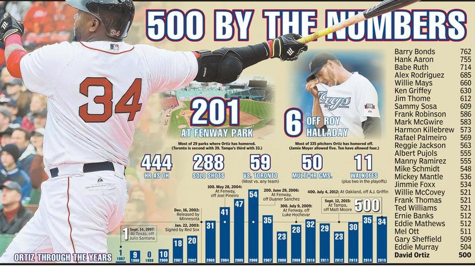
This past weekend, David Ortiz hit his 500th home run, a significant milestone in Major League Baseball attained only by a handful of players. This piece from the Boston Herald commemorates the feat—with too many photographs and embellishment for my liking—by putting his season totals on a timeline while putting Ortiz at the bottom of the 500+ home run club.
The timeline of the home runs
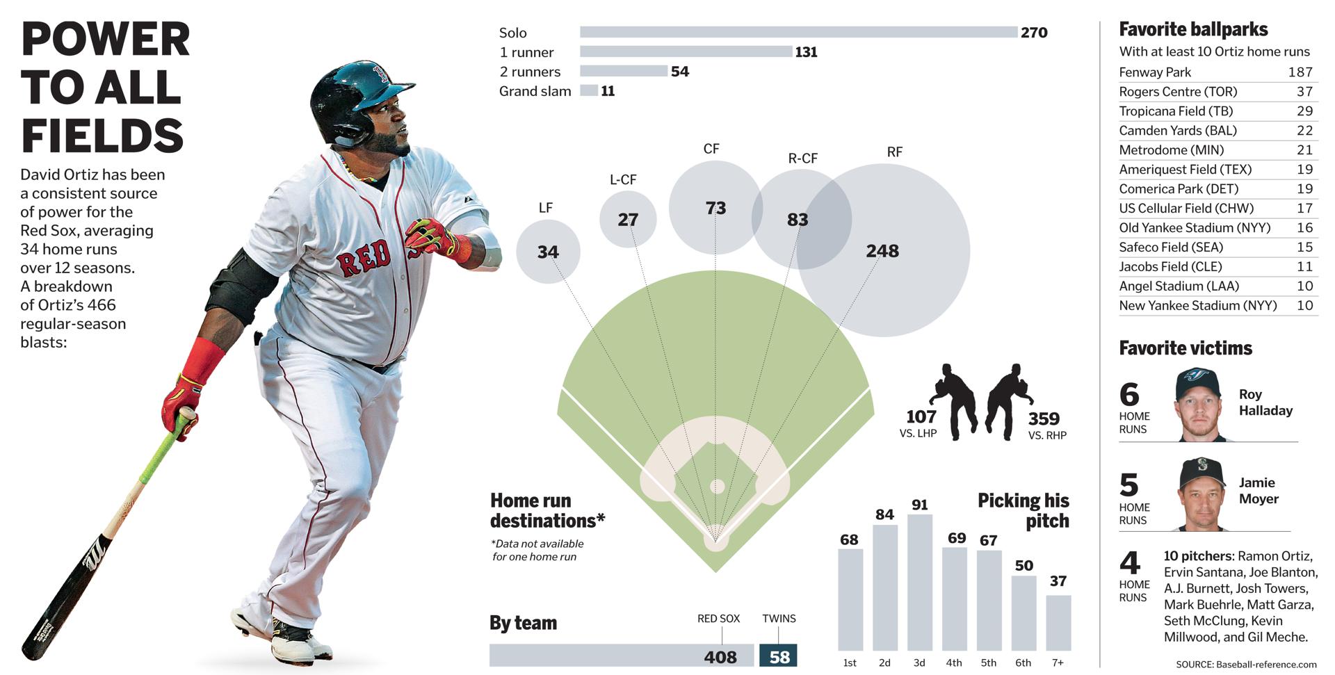
The following piece dates from April 2015 and was about the impact of defensive shifting on Ortiz, but it has a nice graphic on his home run output. It’s just outdated by most of this season. But, from a data viusalisation standpoint, I find it a far more useful and telling graphic.
A look at Ortiz’s home runs
Credit for the Boston Herald piece goes to Jon Couture.
Credit for the Boston Globe piece goes to the Boston Globe graphics department.
So the Red Sox in 2015 are godawful, terrible, bloody bad baseball. But, go back 11 years and they were amazing, fantastic, great and awesome baseball. 2004 was, of course, the year the curse was broken and that was in no small part due to the pitching efforts of Pedro Martinez, who would head down to Flushing in the off-season to end a seven year run of Pedro pitching for Boston. Well, this weekend, after being elected in his first year of eligibility, Pedro enters the Hall of Fame and then will have his number retired at Fenway.
The Boston Globe looked at Pedro, his arsenal, his career, and his best game ever: the 1999 17-strikeout, one-hit performance against the Yankees in Yankee Stadium. The whole piece is worth a looking. But this screenshot shows just how devastating his changeup was, especially in the context of an upper-90s fastball.
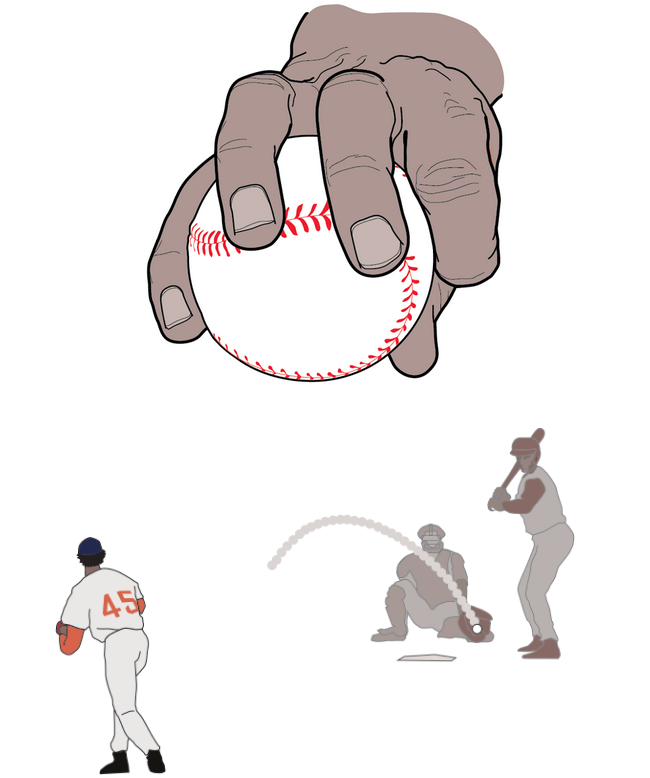
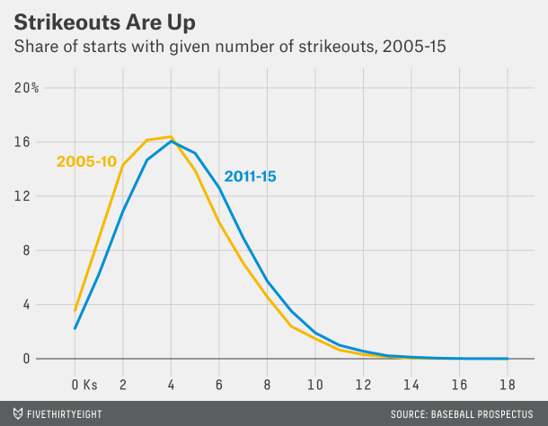
Baseball has changed in the last twenty years or so. (And I’m old enough to recognise it.) Gone are the days of the high strikeout/high pitch count starts from the likes of Roger Clemens, Pedro Martinez, Randy Johnson, and Kerry Wood. In are high strikeout/low pitch count games…
What does that mean? You can read this article from FiveThirtyEight to make the most sense of it. But this chart explains part of it:
More strikeouts per game
Basically, baseball is played with a lot more data than it used to be. We now know empirically that pitchers are most effective the first time through the lineup. Less so the second time. Even less so the third. The great pitchers, obviously, lose less effectiveness, but everybody does. So, if you can maximise your strikeouts (which come at a great cost of pitches thrown per arm—separate story that) by limiting a start to, say, twice through a lineup, you do so. Because then you can plug in hard-throwing relievers who, in their first and often only time through the lineup, can rack up a few strikeouts. So the result from that is higher strikeouts, lower pitch counts.
And that means that it is highly unlikely you will see games where a starting pitcher throws 120, 130, 140 pitches in a start and strikes out 16+ batters. Which is a shame, because I’m clearly old as those were my favourite ball games to watch.
Credit for the piece goes to the FiveThirtyEight graphics department.
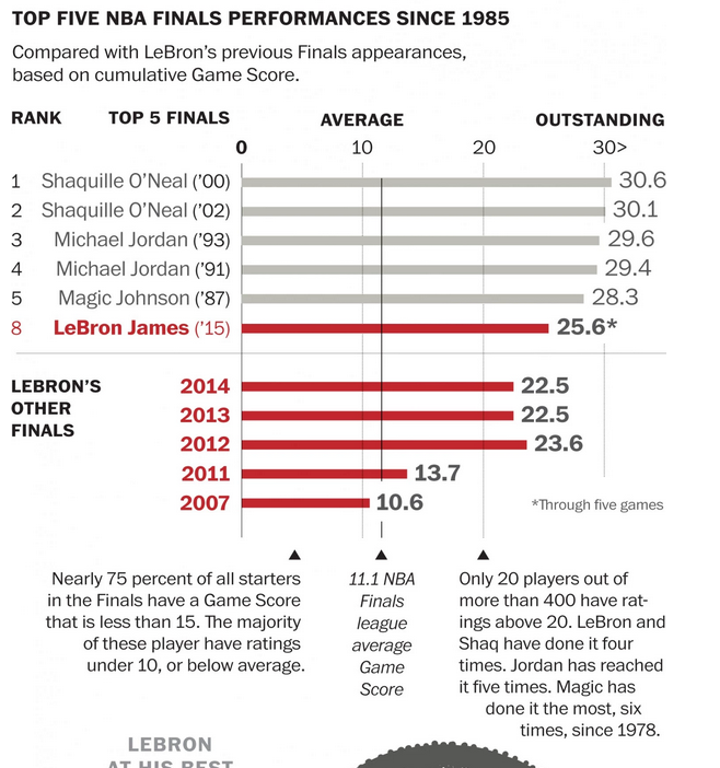
I really do not know much about basketball. I did not realise that the finals had been going on. But, rest assured, they were. The Washington Post looked at whether or not LeBron James had the best finals match performances since 1985. It turns out, not so much. For those of you from the Chicago area, you may instead take solace that one of those guys from that Chicago team represents well.
The top five performances since 1985
Credit for the piece goes to Todd Lindeman and Richard Johnson.
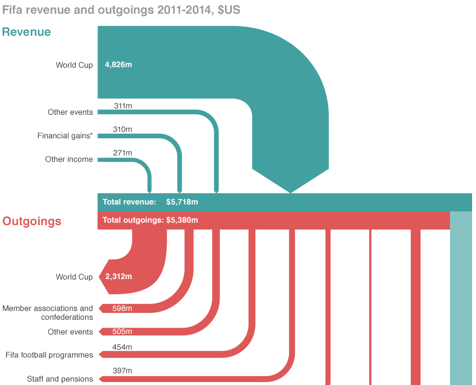
If you did not hear about it the other day, the head of FIFA resigned. That is kind of a big deal because football (in the rest-of-the-world sense of the word) is kind of a big deal. But the organisation that runs it is generally seen as wholly corrupt. So this BBC piece takes a look at the revenue and spending—at least so far as we know about it.
Sort of a Sankey diagram
Credit for the piece goes to the BBC graphics department.
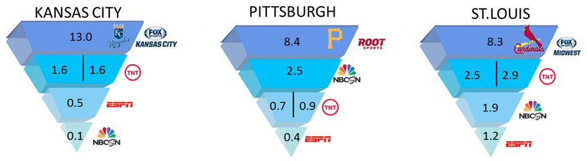
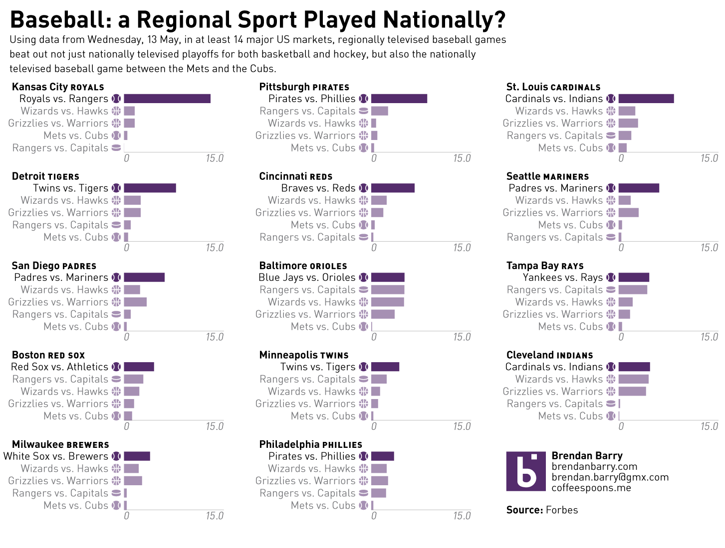
There was an interesting article in Forbes on Monday that looked at baseball’s popularity. In short, the commonly believed argument is that baseball is becoming less popular vs. sports like football, basketball, &c. Hence, one of the reasons for the pace of play changes. However, last Wednesday, there were three nationally televised playoff games—two in basketball and one in hockey—and one nationally televised baseball game, Mets at the Cubs. The logic of the common argument would have non-playoff baseball falling behind the playoff games. But, in 14 of 24 media markets, the local baseball games drew more television viewers than playoff basketball or hockey, or even national baseball games. Unfortunately, the article in question used some really poor graphics to communicate this story. So, I decided to spend my Monday night making it clearer for you. Compare a snippet of the original to mine. You make the call.
The original chartHow the local baseball game did against the national sports games
Credit for the original piece goes to the Forbes graphics department.
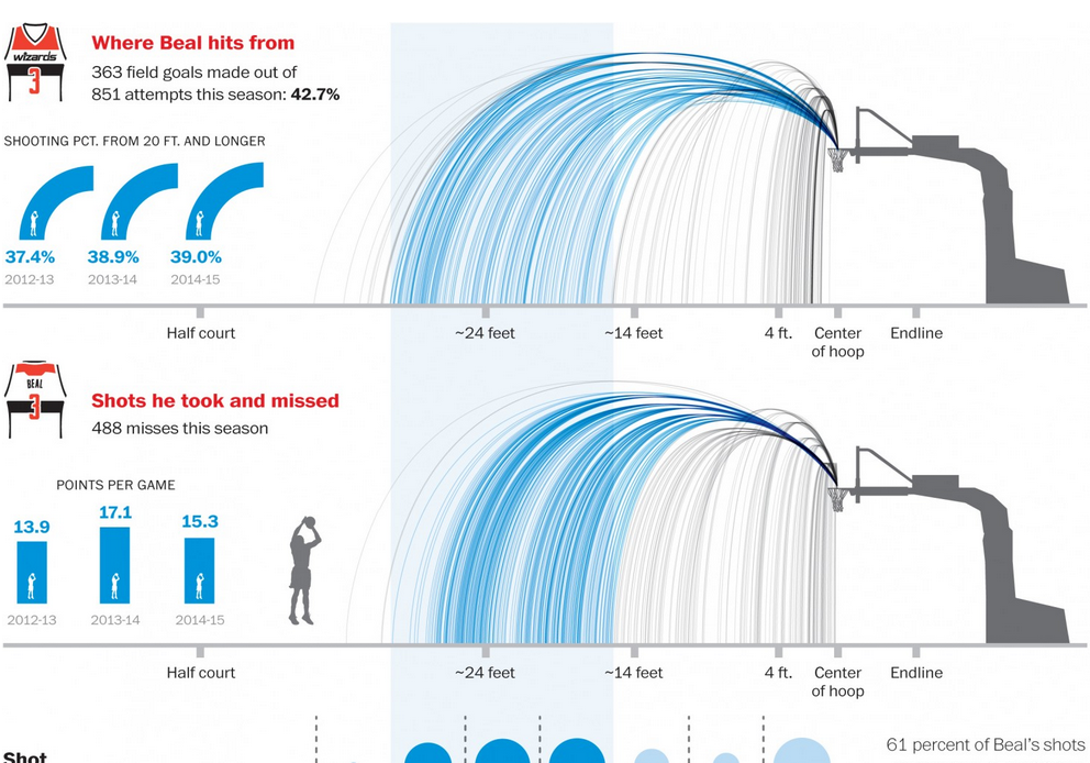
I really am only a one sport kind of guy. Basketball is not that sport. However, similar to baseball, it is a sport that plays many games and has many in-game actions, which allows for data collection and analysis. This Washington Post piece looks at the season for some player named Bradley Beal. Ask me to interpret the data, and that’s a different story. But, I am sure it will make sense to you basketball fans out there.
Whence good and bad shots came
Credit for the piece goes to Todd Lindeman and Lazaro Gamio.
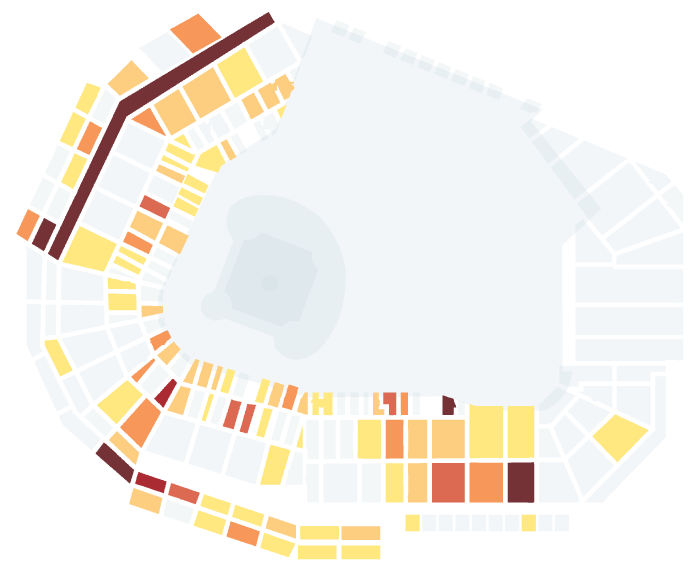
Happy Friday, everyone. Foul balls are the souvenirs of fortune at baseball games. (Home runs as well I suppose.) You can’t buy them, you can only hope to be one of the lucky few who catch one. So the Boston Globe ran an article with an integrated interactive piece that told the story of a select few foul balls caught by fans at ten games at Fenway. But from the data visualisation side, they plotted where each foul ball landed. But, the real gem is that they then had a few small multiples showing where various Boston hitters tended to deposit their fouls.
Ten games’ worth of foul balls
Credit for the piece goes to Stan Grossfeld, Rachel G. Bowers, and Luke Knox.