Wear a Mask

It sounds so easy, but too many don’t do it.

Yesterday, Agence France-Presse published an article about a recent study in the Journal of the American Medical Association that examined the efficacy of the coronavirus’ airborne spread potential.

The study centred on a bus trip in eastern China from January, before the widespread adoption of masks as common courtesy let alone mandated safety equipment. Nobody on the bus of 68 travellers wore a mask and the bus’ air conditioning system recycled the air inside the vehicle. (Remember the importance of cycling and filtering air inside subway cars?)

Researchers then mapped the location of patient zero, conveniently from my point of view in the centre of the bus. It should also be noted that patient zero was also asymptomatic at the time of the bus trip. Then researchers mapped the seats of those infected on the bus and this is what they found.

One of the key findings is these conditions, recirculated air amongst people not wearing masks, the virus was able to infect people outside the 2-metre safety radius (6-feet in the non-metric States).

Now from a design standpoint, I really like this graphic. It shows people’s seats and their condition to show the physical spread of the virus from patient zero. (Eerily, people far away were infected whilst one person sitting next to patient zero remained uninfected.) Not only that, but from a chain of transmission standpoint, the designer also included how many people these newly infected victims infected. Some infected nobody further whilst others infected up to four additional people.

My only real quibble here is with the colours used for the status of the infected. I think the light grey works well for those who were not diagnosed with Covid-19. But the green, yellow, blue, and red don’t quite work for me here. The value of the yellow is too close to the grey and consequently almost the mildly symptomatic people fall almost into the background. Compare that to the asymptomatic victims in green, who appear far more prominently.

I understand the desire to progress from mild to moderate vs. asymptomatic. So I wonder if those with mild symptoms were given a light blue and those with moderate a dark blue to contrast with the asymptomatic green. Of course, we still run into the red-green issue, but the dotted circle around patient zero mitigates that concern.

Remember, this was all among people not wearing masks. This piece strongly shows how important it is to wear a mask—not just to reduce the risk of receiving the virus, but to reduce your risk of spreading the virus if you are an asymptomatic case. (To be fair to the people on the bus, we knew very little about the virus in January and who knows what they knew as China was still attempting to downplay the virus.)

The point? Wear a mask.

Credit for the piece goes to John Saeki.

Covid-19 Update: 30 August

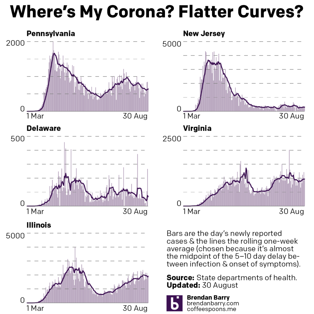
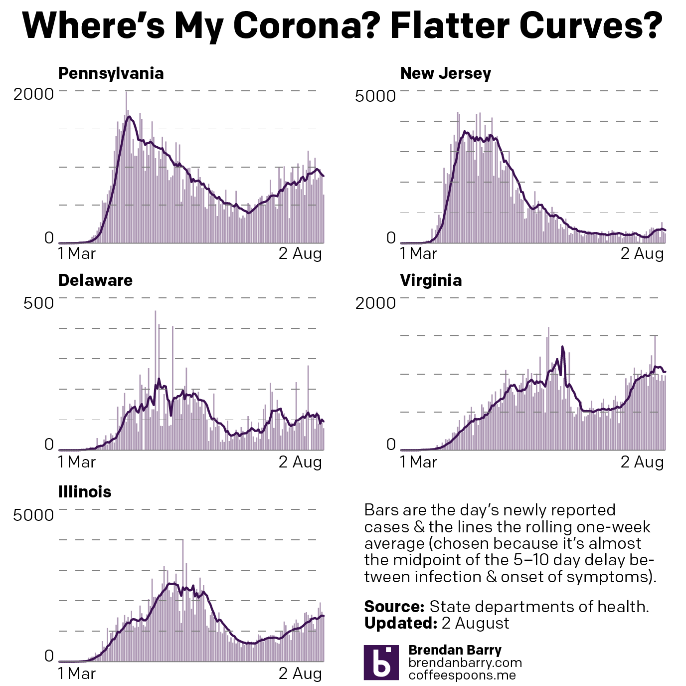
After dealing with hurricane forecast plots last Monday, we’re back to the nature-made, man-intensified disaster of Covid-19 in the United States. So in the five states we review, where are we with the pandemic?

Compared to the charts from two weeks, looking at daily new cases, in some places we are in a better spot, and in others not much has changed. In fact Illinois is the only place worse off with its seven-day average higher than it was two weeks ago, but not by dramatically much.

New cases curve in PA, NJ, DE, VA, & IL.

In fact we see in Pennsylvania, New Jersey, and Delaware that the average number of daily new cases is lower than it was two weeks ago. Virginia dipped lower, but has recently returned to approximately the same level and in that sense is in no different a place. Of course the key factor is how those trends all change over the coming week.

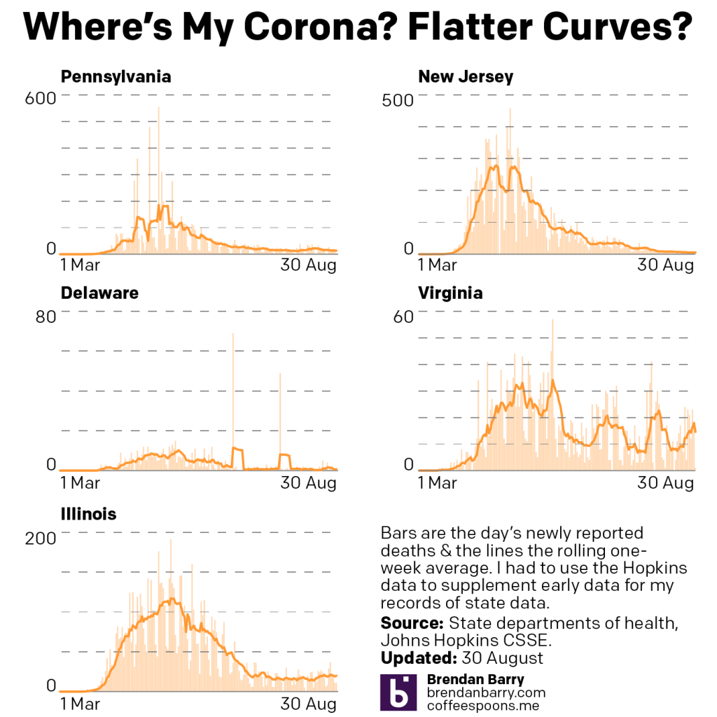
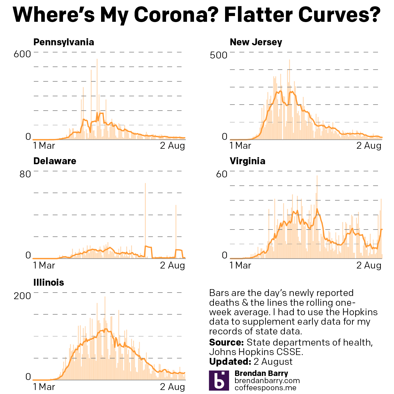
But what about in terms of deaths?

Deaths curve in PA, NJ, DE, VA, & IL.

Well here there is bad news in Virginia. Two weeks ago a spike in deaths there had largely subsided. Two weeks hence? We are in the middle of a third spike of deaths, reaching nearly 20 deaths per day.

Fortunately, the other four states remain largely the same, and that means few deaths per day. Indeed, for Pennsylvania and New Jersey that means deaths in the low double-digits or often in the single digits. Delaware has not reported a new death in four days. And Illinois, while up a little bit, is in the low single-digits, but generally just a few more deaths per day than Pennsylvania and New Jersey.

Credit for the piece is mine.

Is Covid-19 Surging in New Zealand?

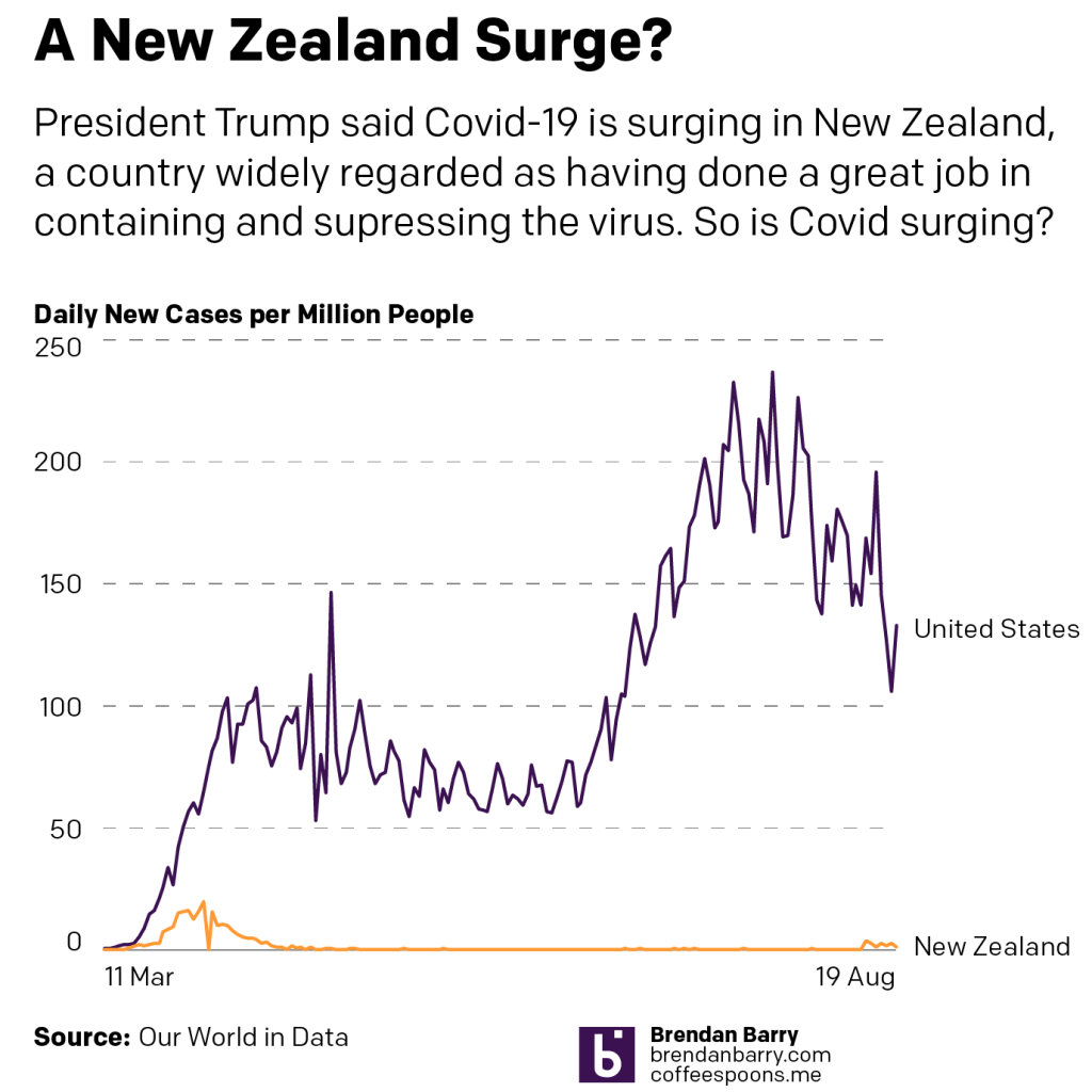
Yesterday, President Trump claimed that Covid-19 was “surging” in New Zealand, a country widely lauded as having successfully contained and suppressed their outbreak. That has allowed Wellington to reopen large swathes of their economy without incident.

Until this surge.

And by surge we mean something like 30 cases in 3 days. So, let’s compare that surge to the numbers of new cases in the United States.

Now, to be fair, New Zealand has a population of nearly 5 million, the United States has nearly 335 million. So a direct number-to-number comparison of the number of new cases per day isn’t fair.

So let’s look at the number of new cases per million people, which equalises the data for population.

So yeah, New Zealand is not “surging”. The data shows that even with the more limited testing per capita conducted in the United States, we are nowhere near the point of bending the curve anywhere close to zero.

Credit for the piece is mine.

Covid-19 Update: 16 August

So here are the charts from the last week of Covid data in Pennsylvania, New Jersey, Delaware, Virginia, and Illinois.

When we compare last week’s update to today’s, we can see that Pennsylvania did indeed bottom out and is back on the rise and the same can probably be said for Delaware. Although a fair amount of the one-day spikes in those numbers we see today are from an outbreak in a correctional system.

Whilst Virginia did go up, by week’s end, it had settled back down to a point not dissimilar to last week. So nothing really changed and time stood still in Virginia. The same can also be loosely said for New Jersey, where it was more about fluctuations than determined rises or falls.

In Illinois, however, we finally saw a plateauing of the new cases numbers and with the slightest of declines .

New cases in PA, NJ, DE, VA, and IL.
New cases curve in PA, NJ, DE, VA, and IL.

Then in deaths we have not much to say as they remain low in New Jersey and Delaware and stable and moderate in Illinois.

Virginia’s recent spike appears to have subsided, as it’s back to nearly 10 deaths per day from the virus.

But most concerning is Pennsylvania. Here, while the numbers are still relatively low, they are on a slow and gradual rise. At this point the seven-day average is beginning to rise above 20 deaths per day.

Deaths in PA, NJ, DE, VA, and IL
Death curve in PA, NJ, DE, VA, and IL

Credit for the piece is mine.

Sweet Summer Air of Subway Cars

For those of my readers who live in a city where the subway or underground is a great means of getting around the city, you know you really miss that late Saturday night/early Sunday morning bouquet in the air. Though as this New York Times piece explains, sure it smells bad, but that air is probably safer than you dining indoors at a restaurant or even a child attending class in person.

The piece focuses on New York City subway cars, but they are very similar to the rest of the stock used in the United States. It uses a scrolling reveal to show how the air circulation and filtration systems work. Then it concludes with a model of how a person sneezing appears, both with and without a mask. (Spoiler, wear a mask.)

It’s a really nicely done and informative piece. It compares the rate of air recycled in a subway car to that of several other locations, and the results were a bit surprising to me. Of course, early on in the pandemic before we began to fully understand it, the threat was thought to be from contaminated surfaces—and let’s be honest, there are a lot of contaminated surfaces in a New York City subway car—but we now know the real risk is particles breathed/coughed/sneezed out from one’s mouth and nose. And we can now see just how efficient subways are at cycling and filtering that air.

Credit for the piece goes to Mika Gröndahl, Christina Goldbaum, and Jeremy White.

Covid-19 Update: 9 August

Weekend data means, usually, lower numbers than weekdays. And with the exception of Delaware that’s what we have today. Some drops, like Illinois, are more dramatic than others, like New Jersey. And so we look at the seven-day trend.

And that tells a slightly different story. On the one hand we have states like Virginia and Illinois that appear to be continuing upward. The rise in Illinois has been slow and steady, but the average is approaching nearly 2000 new cases per day. In Virgina, the rise was more abrupt and the question is whether this peak has crested in recent days or if come the middle of next week it will resume rising.

In New Jersey and Delaware we see two states with does declines after some sudden spurts of new cases. Jersey had risen to nearly 500 new cases less than two weeks ago, but that’s now back down to fewer than 350. And in Delaware, while today’s number is greater than yesterday’s, the trend is still downard after being at over 100 new cases per day two weeks ago.

New cases curves for Pennsylvania, New Jersey, Delaware, Virginia, and Illinois.

Then we have Pennsylvania. At one point doing it had done so well in controlling the outbreak to bend the curve to fewer than 500 new cases per day at one point. Then as the state began to reopen, cases began to rise again in the west and now the east. But over the last week that statewide average began to fall. But in the last two days that fall appears to have potentially bottomed out. So come the middle of next week, the question will be does the downward trend continue or has the state hit a new valley before another rise?

Finally, in terms of new deaths, with the exception of Virgina, we have yet to see any rise in deaths that might correlate with the recent rises in new cases. And so nothing new there. But it’s worth pointing out that New Jersey has now reached the high single digits in terms of daily deaths from Covid-19. That’s remarkable for a state that back in April saw nearly 300 people dying every single day.

New death curves for Pennsylvania, New Jersey, Delaware, Virginia, and Illinois.

Credit for the graphics is mine.

The Covid Recession’s Continuing Impact on Youth

Earlier this week, some of the work work my team does was published. We produced a one-page summary of a far larger and more comprehensive (relative to the scope of the summary) survey of consumers during the Covid Recession. I will spare you the details of recreating existing templates from scratch and the design decisions that went into that bit—neither insignificant nor unsubstantial—and rather focus on the one graphic we designed.

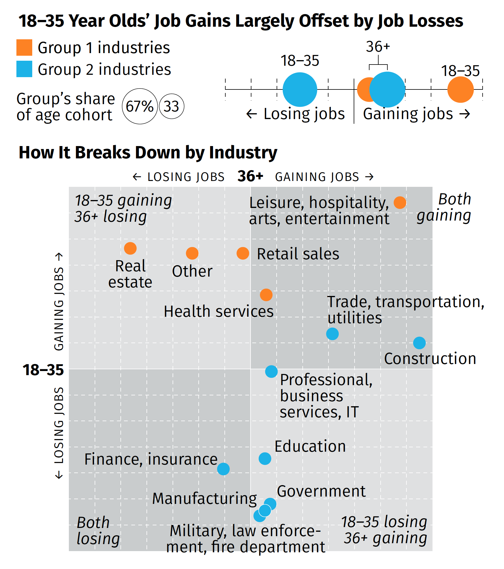
The broad thrust of the summary is that while overall we are beginning to see some job recovery, that the recovery is uneven and that, in fact, those below the age of 36 are getting hit pretty hard (my words, not the authors). That while in some industries the young are recovering in good numbers, in other industries, industries with a larger share of the youth population, young people are still losing jobs. Then we broke those top line numbers out by industries in the below graphic captured by screenshot.

How different age groups in different industries are faring in the recession.

There are a couple of things from a design side to discuss. We had about two or three days from when we started the project to develop some ideas and then execute and produce the summary. And as I noted above, that also included quite a bit of time in emulating existing documents and building ourselves a new template should we need to do something similar in the future.

But for that graphic in particular, there’s one thing I wanted to highlight: the lack of values on the axis. The challenge here was that the data displayed is people not working. And when we compared this time period (Wave 3) to the earlier waves, we were looking for declines. And so if we going to say that 36+ are gaining construction jobs, that would be -2% value and the youth are about a -13% increase. If you are doing a bit of a double-take at a negative increase, so did the team. Ultimately, we used the data to generate the chart, but then opted for qualitative labelling on the axes. They simply point that in one direction, youth are either gaining or losing jobs, and the same for the 36+. To reinforce this idea, we also added some descriptors in the far corner of each quadrant that said whether the age groups were gaining or losing jobs.

Despite the unusual design decisions I took in the graphic, I’m really proud of this piece especially given its tight turnaround. It shows in almost real-time how fractured the recovery—is this a recovery?—is at this point.

Credit for the piece goes to the team on this, Tom Akana, Kate Gamble, Natalie Spingler, and myself.

Big Bar Chart Better

Today isn’t a Friday, but I want to take a quick look at something that made me laugh aloud—literally LOL—whilst simultaneously cringe.

Not surprisingly it has to do with Trump and data/facts.

This all stems from an interview Axios’ Jonathan Swan conducted with President Trump on 28 July and that was released yesterday. I haven’t watched the interview in its entirety, but I’ve seen some excerpts. Including this gem.

It’s eerily reminiscent of a British show called The Thick of It written by Armando Iannucci or probably more accurately an interview out of one his earlier works with Chris Morris, On the Hour or The World Today. He later went on to create Veep for American audiences, based loosely or inspired by the Thick of It, but I found it a weak substitute for the original. But I digress.

In that clip, the President talks about how he looks at the number of deaths as a share of cases, the case fatality rate, whilst Swan is discussing deaths as a share of total population, deaths per capita. Now the latter is not a great data point to use, especially in the middle of the pandemic, because we’re not certain what the actual denominator is. I’ve discussed this before in some of my “this is not the flu” posts where the case fatality rate, sometimes more commonly called simply the mortality rate, was in the 3–5% range.

Regardless of whether or not one should use the metric, here is how the President visualised that data.

2+2=5

Four big and beautiful bar charts. The best charts.

The President claims the United States “Look, we’re last. Meaning we’re first. We have the best. Take a look again, it’s cases [it’s actually still the case mortality rate]. And we have cases because of the testing.”

The problem is that one, it’s the wrong metric. Two, the idea that testing creates cases is…insane. Third, the United States is last in that big set of bar charts. Why is every country a different colour? In the same data series, they should all be the same, unless you’re encoding a variable such as, say, region via colour. But with four data points, a bar chart taking up the entirety of a US-letter sized paper is grossly inefficient.

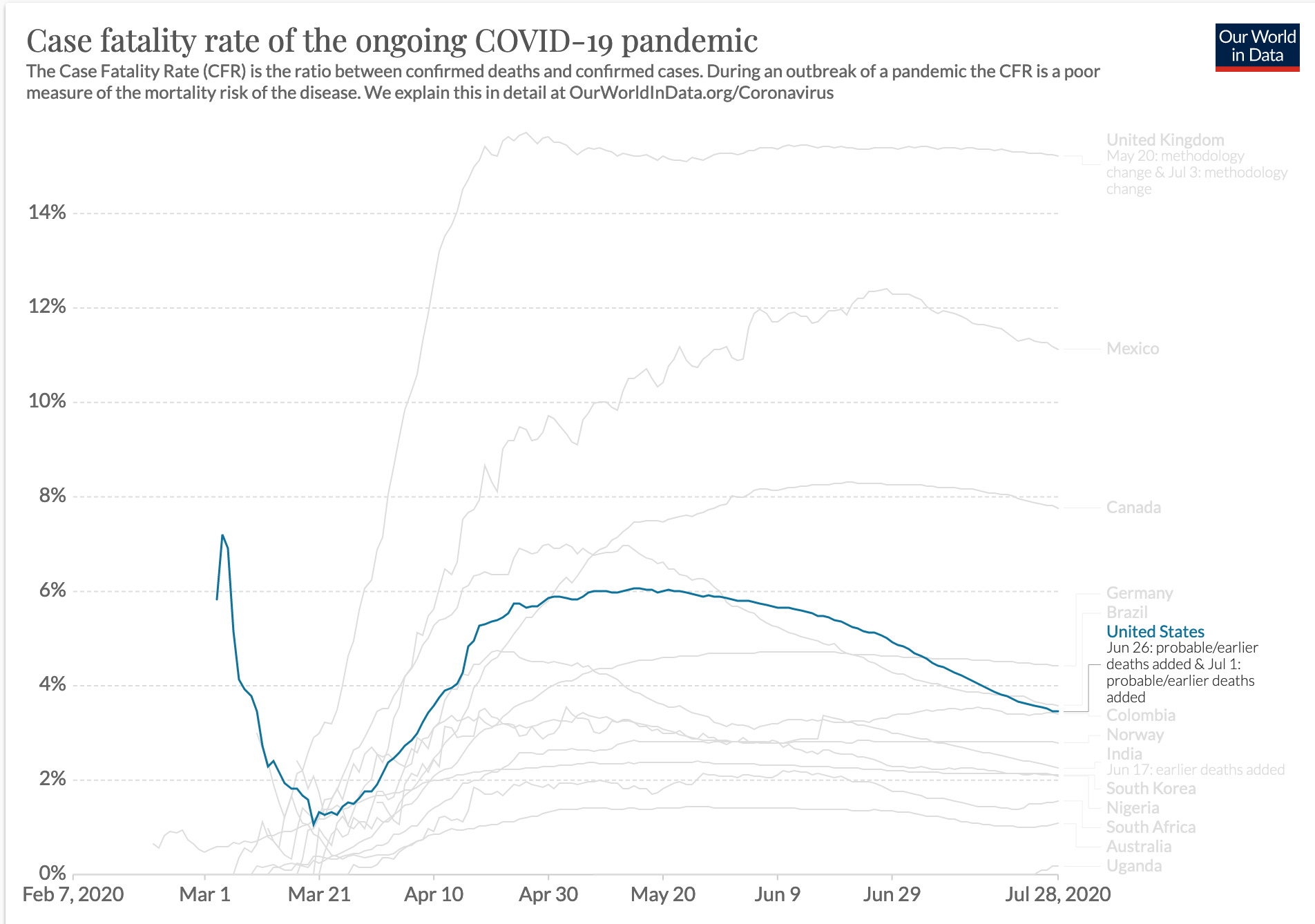
But that’s not even the full picture. Because if you look at a more robust data set, this one from Our World in Data, we get a better sense of where the United States sits.

2+2=4

Still not the highest on the chart, true. But even in this set; Norway (of not a shithole fame), India, South Korea, New Zealand, South Africa, and Congo all rank lower. The United States is far from last. And for those wondering, yes, I took the data from the same date as the interview.

There’s another clip within that clip I linked to earlier that deals with South Korea’s numbers and how the President says we “don’t know that”. And this is the bigger problem. We all know that data can be manipulated. But if we cannot agree that the data is real, we cannot have a framework for a real discourse on how to solve very real problems.

As someone who works with data to communicate information or stories on a near daily basis, this is just frightening. It’s as if you say to me, the sky is a beautiful shade of blue today without a cloud in the sky and I reply, no, I think it’s a foreboding sky with those heavy clouds of green with red polka dots. At that point we cannot even have a discussion about the weather.

And it’s only Tuesday.

Credit for the Trump graphic goes to somebody in the White House I assume.

Credit for the complete graphics goes to Our World in Data.

Covid-19 Update

As I mentioned last week, I am going to try using my blog here for the weekly update on the five states people have asked me to explore. And for the second week in a row, we are basically seeing numbers down compared to previous days. But given that numbers are generally lower on the weekends, that is not terribly surprising.

The real question is by Friday, will these numbers have rebounded?

The Covid-19 curves for PA, NJ, DE, VA, and IL
The Covid-19 death curves for PA, NJ, DE, VA, and IL.

Credit for these graphics is mine.

What Will the Next Recovery Look Like?

Earlier this morning, the Bureau of Economic Analysis released its US 2nd quarter GDP figures and the news…isn’t great. On an annualised basis, we saw -32.9% growth. That’s pretty bad. Like Great Depression level bad. I’ve posted on the social media how bad this current recession is and how nobody in the workforce today worked or didn’t through the Great Depression to really relate to the numbers we are seeing.

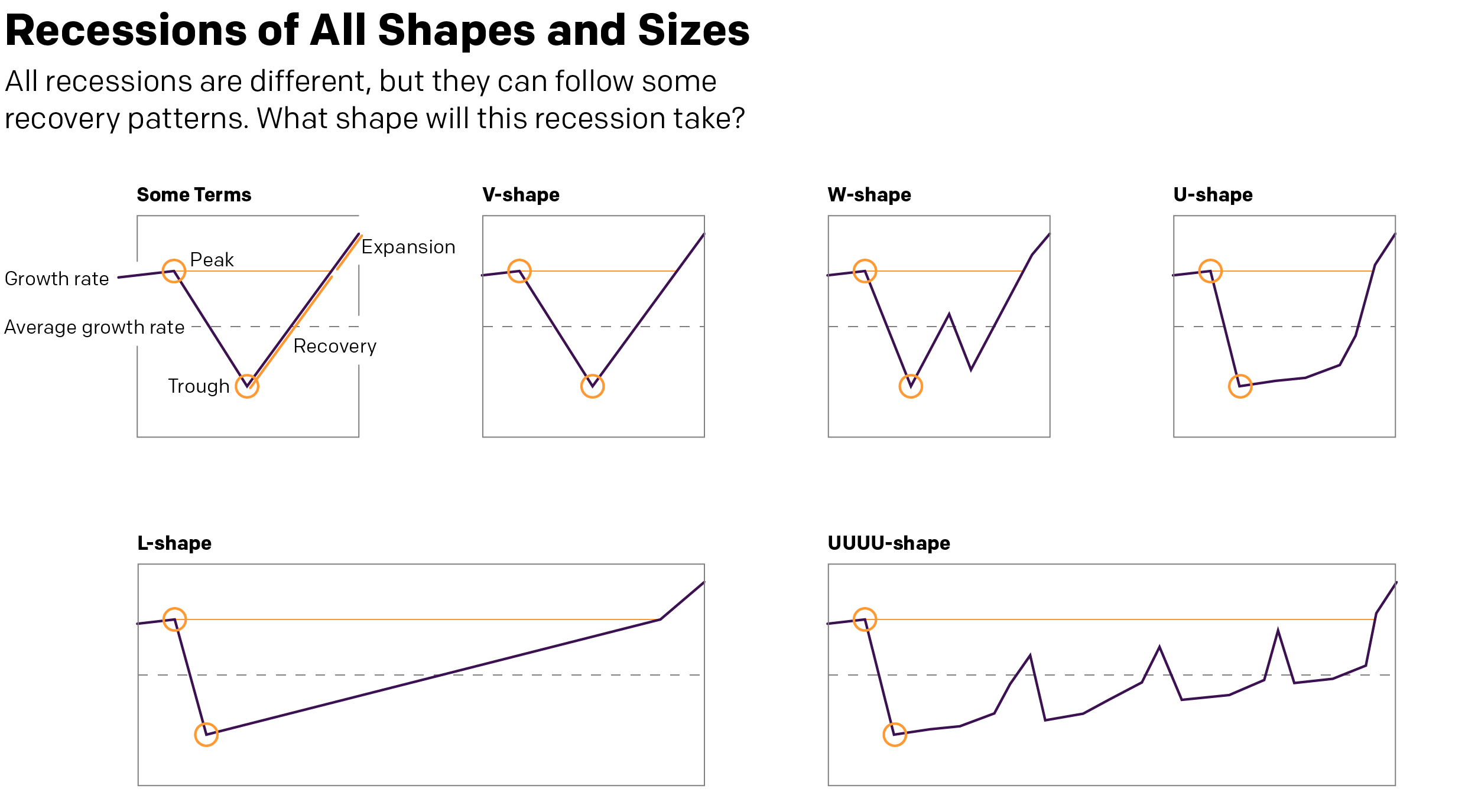
But that’s all today. The sun will come out tomorrow. (And scorch the Earth as climate change renders certain parts of the globe uninhabitable to mankind. But we’ll get to those posts in later weeks.) And when it does come out, eventually, what will the recovery look like? I’ve seen a few mentions recently in the media of a V-shaped recovery. What is this mysterious V-shape?

A long time ago, in a galaxy far away. Or during the last recession in Chicago, I worked with some really smart people in some of my professional projects and we covered the exact same question. There are a couple key “shapes” to an economic recovery. And when we say recovery, we mean just to return to pre-recession peak levels of growth. Anything above that is an expansion. That’s what we want to get back to.

What kind of shape will the recovery take?
Who knew typographers loved economics?

The V-shape we hear a lot about is a sharp recovery after the economy bottoms out (the trough). Broadly speaking, if a recession has to last two consecutive quarters (it doesn’t, but that’s a pretty common definition so let’s stick with it), then in a V-shape, we are talking about a recovery one or two quarters later.

Similar to the V is the W-shape, where things start to improve rapidly, but some kind of shock to the economic system and things go back negative once again before finally picking up quickly. It’s not hard to imagine something going horribly wrong with the Covid-19 pandemic to be just that external shock that could push the economy back down again.

Similar still is the U-shape. Here, after hitting rock bottom, growth isn’t quite as quick to pick up as we linger in the depths of the valley of recession. But after a bit of time, we again see a rapid recovery to pre-recession levels of growth.

These are all pretty short term recoveries, the W being a little bit longer because two sharp downturns. But they are nothing compared to what’s also possible.

First we have the L-shape. Here, after hitting bottom, things start to recover quickly. But that recovery is slow and takes a long time. Growth remains slower than average, creeping up to average, and then still takes its time to reach pre-recession levels. Is something like this possible? Well, if vaccines fail and if some countries still can’t get their act together (cough, US, cough), the willingness of consumers to go out, eat, drink, buy things, travel, and generally make merry could be suppressed for a long time. So it’s certainly not out of the question.

And then lastly we have the UUUU-shape. Though you could probably add or subtract a U or two. This features more drawn out stays at the bottom of the valley with quick and sharp upticks in growth. But those growths, never reaching pre-recession levels, also collapse quickly back into declines, though also never really reaching the same depths as earlier. Essentially, the recovery faces multiple setbacks knocking the economy back down as it sputters to life. As with the L-shape, it’s also not hard to imagine a world where a country hasn’t managed to contain its outbreak struggling to get back on its feet.

What do you think? Are we at rock bottom? Did I miss a recovery type?

Credit for the graphic is mine.