Earlier this week, some of the work work my team does was published. We produced a one-page summary of a far larger and more comprehensive (relative to the scope of the summary) survey of consumers during the Covid Recession. I will spare you the details of recreating existing templates from scratch and the design decisions that went into that bit—neither insignificant nor unsubstantial—and rather focus on the one graphic we designed.
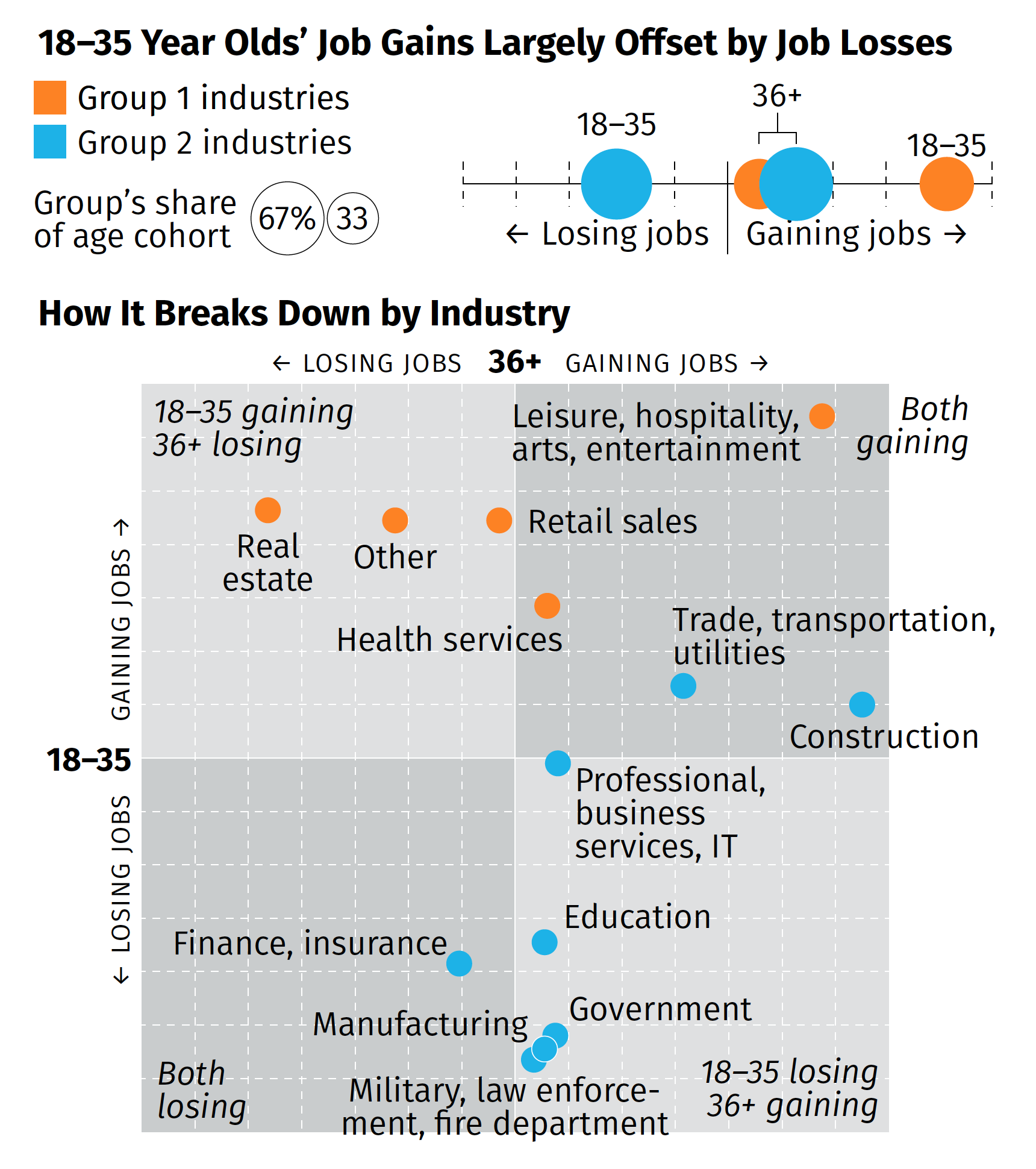
The broad thrust of the summary is that while overall we are beginning to see some job recovery, that the recovery is uneven and that, in fact, those below the age of 36 are getting hit pretty hard (my words, not the authors). That while in some industries the young are recovering in good numbers, in other industries, industries with a larger share of the youth population, young people are still losing jobs. Then we broke those top line numbers out by industries in the below graphic captured by screenshot.
There are a couple of things from a design side to discuss. We had about two or three days from when we started the project to develop some ideas and then execute and produce the summary. And as I noted above, that also included quite a bit of time in emulating existing documents and building ourselves a new template should we need to do something similar in the future.
But for that graphic in particular, there’s one thing I wanted to highlight: the lack of values on the axis. The challenge here was that the data displayed is people not working. And when we compared this time period (Wave 3) to the earlier waves, we were looking for declines. And so if we going to say that 36+ are gaining construction jobs, that would be -2% value and the youth are about a -13% increase. If you are doing a bit of a double-take at a negative increase, so did the team. Ultimately, we used the data to generate the chart, but then opted for qualitative labelling on the axes. They simply point that in one direction, youth are either gaining or losing jobs, and the same for the 36+. To reinforce this idea, we also added some descriptors in the far corner of each quadrant that said whether the age groups were gaining or losing jobs.
Despite the unusual design decisions I took in the graphic, I’m really proud of this piece especially given its tight turnaround. It shows in almost real-time how fractured the recovery—is this a recovery?—is at this point.
Credit for the piece goes to the team on this, Tom Akana, Kate Gamble, Natalie Spingler, and myself.
Leave a Reply
You must be logged in to post a comment.