Wakey, Wakey

It’s time to get up. Whether or not you hear the explicitly Monday morning or if’s meant by your alarm shouting at you, who really enjoys waking up Monday? A lot of the reluctance to wake up may have to do with when one goes to bed. One of my colleagues sent me a post over on Huffington Post that looks at Jawbone’s data visualisation of bedtimes across America.

Cities stay up late—not surprising. What I do find interesting is that in the rural and suburban, i.e. principally non-major city counties, there seem to be some interesting things going on. In particular, look at the shift in bedtime across the Eastern–Central and Central–Mountain time zones in particular. It’s a pretty clean break. And then within the Central timezone we have another shift. I wonder how much of this has to do with the needs of farming daylight hours. And that because the sun does not really set according to our clocks, the later sunset times in the western portions of timezones shift those bedtimes later. Like I said, interesting.

Then from the data side of things, I wonder if “thousands of users” across the 3000+ counties of the US are distributed sufficiently to achieve meaningful samples in many of those rural/suburban counties. And then what about those who have to work night shifts? How does that impact the data set?

Nighty, night
Nighty, night

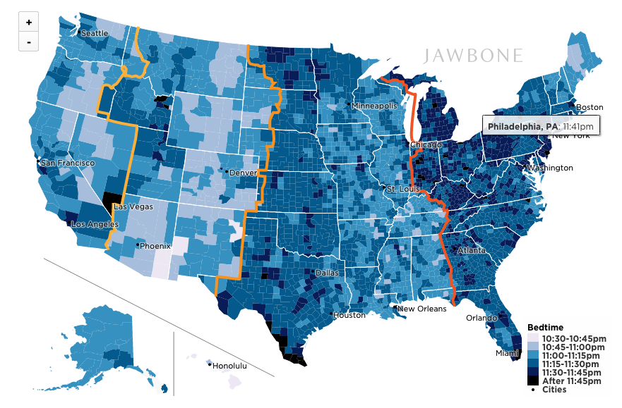
Credit for the piece goes to Brian Wilt.

The State of Gay Marriage in the States

I have been fairly out of the loop of the news the last few weeks, but I did at least catch one of the headlines: gay marriage in the States is more legal than ever. Between Supreme Court stays and Appeals Court rulings, gay marriage is now legal in more than 50% of the country—at least by number of states. The Wall Street Journal does a nice job in this static graphic showing just how far equality has come.

Marriage equality
Marriage equality

Credit for the piece goes to Randy Yelp.

Where the Youth Are Going

Places need young people to support old people. A gross oversimplification, I admit, but a good basic principle. This piece in the Washington Post looks at that shifting balance across the United States. This map and the others supporting it show which areas of the country may have problems in the years to come, especially if they cannot grow their youth population.

Youth growth
Youth growth

Credit for the piece goes to Jeff Guo.

Linguistics Are…Um…Fun?

So today is Friday and that means it is time for some…um…lighter than usual content. Consequently we have a map from Quartz looking at the preferred use of um or uh.

Mapping the preference for Um or Uh

Credit for the piece goes to the Quartz graphics department.

Soda

Happy Friday, everybody. I cannot say about you, but I certainly love seeing dialects and regional variations of words, phrases, pronunciations mapped out. So thankfully we have some work by Alan McConchie to look at today, specifically versus the soda vs. pop debate. As the screenshot shows, I come from a solidly soda camp. But I was reminded recently at a wedding that the Midwest is, generally speaking, pop country. Midwesterners have to learn to straighten that out.

It's soda in Chester County
It’s soda in Chester County

Credit for the piece goes to Alan McConchie.

The Distribution of Debt in the United States

In a good example of comparing share versus actuals, the National Journal looks at the state of debt across the United States. The choropleth map shows adult share of debt while the bar charts show the regional value of said debt. While the south holds more debt, the west and east coasts have more debt. They also, however, have higher incomes that make servicing or paying off said debt easier than lower income adults in the south.

The South's victory is debt
The South’s victory is debt

Credit for the piece goes to Nancy Cook and Stephanie Stamm.

Do You Know Africa?

Beyond the fact that it isn’t a country? This week the White House hosted the US–Africa Summit. The Washington Post took the opportunity to quiz readers on their knowledge of African countries’ locations on a blank map. So this Friday, you get to take the quiz and post your results if you dare. A nice touch is that the map colours the countries by the number of guesses and then provides different colour outlines for your selection and the correct one—should you err.

Sierra Leone
Sierra Leone

I messed up Burundi—I always confuse it and Rwanda—and only got a 98%. /humblebrag

Credit for the piece goes to Kevin Schaul.

Big Mac Index

For years, the Big Mac Index from the Economist has been a standard of sorts for examining differences in currencies across the world. Well now we have an online, interactive version of the index.

The Big Mac Index
The Big Mac Index

Credit for the piece goes to the Economist’s graphics department.

Where’s the Beef?

Today I’m enjoying some really good burgers. So via Fastco, today’s graphic looks at cattle, pig, and chicken populations across different regions of the world. In the United States, as you can see in the map here, that dark red spot in eastern Pennsylvania, that has to be Lancaster County.

US cattle population

Credit for the piece goes to International Livestock Research Institute.