Where’s the Beef?

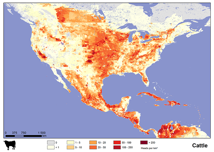
Today I’m enjoying some really good burgers. So via Fastco, today’s graphic looks at cattle, pig, and chicken populations across different regions of the world. In the United States, as you can see in the map here, that dark red spot in eastern Pennsylvania, that has to be Lancaster County.

US cattle population

Credit for the piece goes to International Livestock Research Institute.

Author: Brendan Barry

I am a graphic designer who focuses on information design. My day job? Well, they asked me not to say. But to be clear, this blog is my something I do on my own time and does not represent the views of…my employers. I think what I can say is that given my interest in information design—be it in the shape of clear charts, maps, diagrams, or wayfinding systems—I am fortunate that my day job focuses on data visualisation. Outside of work, I try to stay busy with personal design work. Away from the world of design, I have become an amateur genealogist and family historian. You will sometimes see that area of work bleed into my posts.

Leave a Reply