2-point Conversions

I rarely watch American football. But I do like charts about it. So today’s post looks at a piece from Benjamin Morris who explored the scenarios in which a team should opt for the two-point conversion. For those of you who know even less about American football, you can attempt such a conversion after your team scores a touchdown. More often than not your team will go for the far safer and more assured one-point conversion, which if made makes a touchdown of seven points.

It turns out that teams should probably be looking for those two points a wee bit more often than they presently do. And to help teams figure that out, Morris made a small multiple chart looking at many different scenarios.

When to do it
When to do it

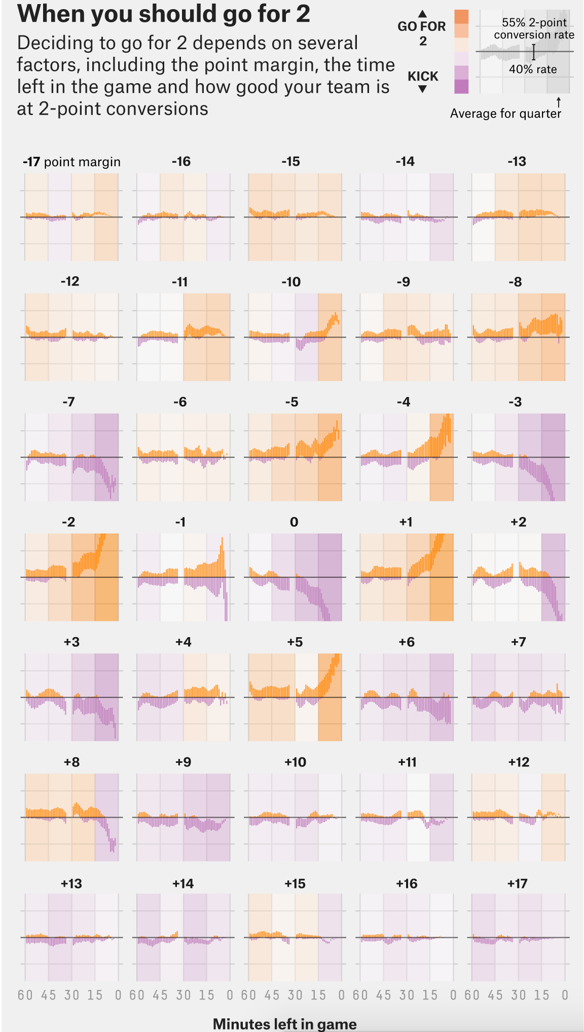
Credit for the piece goes to Benjamin Morris.

How Serious Is the Rise in Violent Crime?

On Monday, Attorney General Jeff Sessions and the Justice Department released figures for violent crimes in 2016. The administration talked about the rise in violent crime. And yes, such crime did rise in 2016. But, what was not raised nearly as much is that we are also living in an era of historically low crime. FiveThirtyEight broke down the crime numbers through a series of charts and put them in their historical context.

The screenshot below looks just at murder rates. And again, nobody denies that the murder rate is up. But it still below the level it was in the 2000s, 1990s, and 1980s. One has to go back to the 1960s to find murder rates so low.

Murder is up, but still historically low

The point is really just to reiterate that context matters. If we were to look at the rise over the last year, yes an increase from 4.9 to 5.3 would look bad. But, really, we are still living in a far safer country than we were for most of the latter half of the 20th century. You just need to extend the endpoints of the chart to see it.

Credit for the piece goes to Jeff Asher.

The Best Rivalry Is Back

But to be honest, it never really went anywhere. As you know, your humble author visited Boston this past weekend and got to see two games of his Red Sox against Tampa Bay. Tampa, of course, is not the rivalry to which I am referring, but things were heated back in the days when Maddon managed Tampa.

No, I am of course talking about the Red Sox–Yankees rivalry. Two weeks ago FiveThirtyEight posted an article about the rivalry and how it has returned. Admittedly, they meant not from the perspective of bitter hatred for all things Yankees, but rather that the Yankees are attempting to be good again.

This chart from the article is nothing more than a line chart. But I just wanted to point out that the rivalry lives, though in my mind it never really went away.

Down with the Empire…

Credit for the piece goes to the FiveThirtyEight graphics department.

Trump’s Polling

My battery is about to die this morning and I don’t have my charger so this is going to be a shorter piece than usual. But I wanted to look back on the 100 Day polling that the New York Times posted. It does paint an interesting picture of somebody so polarising that Trump is probably safe despite being one of the least favourably viewed presidents in modern times. Why? Because his supporters are so fervently loyal.

Not only is Trump low, he's low historically
Not only is Trump low, he’s low historically

But that piece is almost a month old now. And so I wanted to point out something that FiveThirtyEight is doing—a running tracker of Trump’s polling. I am sure I will return to it in the future, after all we have over three and a half years to go until the next four year presidential term begins.

Trump is pretty low…

Credit for the piece goes to Karen Yourish and Paul Murray for the Times and Aaron Bycoffe, Dhrumil Mehta, and Nate Silver for FiveThirtyEight.

Life Expectancy in the US and All Its States

Happy Monday, all.

If this week’s news cycle cooperates, I am going to try and catch up on some things I have seen over the last several weeks that got bumped because of, well, Trump usually. Today we start with a piece on life expectancy from FiveThirtyEight.

The piece begins with a standard choropleth to identify, at county levels, pockets of higher mortality. But what I really like is this small multiples map of the United States. It shows the changes in life expectancy for all 50 states. And the use of colour quickly shows, for those states drastically different than the national average, are they above or below said average.

Look at all the little boxes

Credit for the piece goes to the FiveThirtyEight graphics department.

Here We Go Again

Well as of last night, we are having yet another vote on AHCA, better known as Trumpcare. I will not get into the details of the changes, but basically it can be summed up as waivers for Obamacare regulations. And as of last night, $8 billion over five years to cover those at high-risk. What about after five years? What if, as experts say, that sum is insufficient and it runs out before five years are up?

This is still a bad bill.

But thankfully we have FiveThirtyEight who looked at support before the Upton amendment—the $8 billion bit—and found that the bill could still fail because of a lack of moderate support.

Round and round we go

The basic premise is this: In order to get the conservative Freedom Caucus, which scuppered the bill a few weeks ago, on side Ryan et al. had to make the bill more conservative. They likely had to make it cover fewer people at a higher cost. I say likely because Ryan is not sending this to the Congressional Budget Office (CBO) to score the bill, something typically done to see how much it costs and whether it might work. Problem is, by making the bill more conservative, they push away moderate Republicans. Yes, Virginia, they do exist.

Today’s question is whether an $8 billion throw-in will buy in enough moderate votes.

It’s going to be a long day.

Credit for the piece goes to Harry Enten.

All the Eggs

We made it to Friday, everyone. Huzzah.

This is based off absolutely one of my favourite infographics out there—Charles Joseph Minard’s map of Napoleon’s invasion of Russia. For those unfamiliar with it, he tracks the size of the French army as it invades Russia and gets thinned out along the way. Yes, some are to battles. But, the bottom of the plot also tracks temperature. The temperature of winter in Russia. And you can see how that too impacted French troop numbers.

So this modern work needed to get a shoutout here, even if it doesn’t have the temperature on Hoth. Or in the vacuum of space. I hesitated to post it for a few weeks because of the film and not wanting to post spoilers. But upon further reflection, we basically all know how Rogue One has to end—the plans get stolen and the Death Star eventually gets blown up. So I see no harm posting this now.

I wonder if it's just basically don't invade colder countries in winter.
I wonder if it’s just basically don’t invade colder countries in winter.

Credit for the piece goes to Walt Hickey.

How Did Obamacare Change Our Healthcare?

We are counting down the days until President Obama steps aside. And shortly thereafter his signature work, the Affordable Care Act, may be repealed. But looking back, what is the legacy of the first few years under Obamacare? Besides the obvious death panels, of course. Well FiveThirtyEight took a look. And in this graphic, we see simple line charts. But what I really like is the attention that went into the titling/labelling. The titles draw you down through the story, explaining just what you are looking at.

How have things changed?

Credit for the piece goes to the FiveThirtyEight graphics department.

Pardon the Interruptions

Well that does it for the three presidential debates. Didn’t they seem very presidential with all those interruptions and interjections? Thankfully after the debate, FiveThirtyEight put together a quick graphic highlighting the total number of each per candidate per debate.

Wait, but, stop
Wait, but, stop

Credit for the piece goes to the FiveThirtyEight graphics department.

Beating Ted Williams

Last week the Red Sox’s season came to an end after being swept by the Cleveland Indians and with the sweep so too ended David Ortiz’s career. He is one of the best Red Sox hitters of all time, but Ted Williams was the best. And so last week FiveThirtyEight ran a piece on how one manager from the Cleveland Indians—hence the relevance, right?—beat Ted Williams by “inventing” what we all know in baseball as the shift.

The below photo comes from the game and shows what we baseball fans now think of as routine was at the time almost brand new. (Although to be fair, the shift in this case left only one fielder on the left side of the field—the left fielder. Typically today both the shortstop and left fielder both remain.) Anyway, for those baseball fans, the article is worth a quick read.

Who's on first? Not Ted Williams after his at bat.
Who’s on first? Not Ted Williams after his at bat.

Credit for the piece goes to an unknown photographer ca. 1946.