We made it to Friday, everyone. Huzzah.
This is based off absolutely one of my favourite infographics out there—Charles Joseph Minard’s map of Napoleon’s invasion of Russia. For those unfamiliar with it, he tracks the size of the French army as it invades Russia and gets thinned out along the way. Yes, some are to battles. But, the bottom of the plot also tracks temperature. The temperature of winter in Russia. And you can see how that too impacted French troop numbers.
So this modern work needed to get a shoutout here, even if it doesn’t have the temperature on Hoth. Or in the vacuum of space. I hesitated to post it for a few weeks because of the film and not wanting to post spoilers. But upon further reflection, we basically all know how Rogue One has to end—the plans get stolen and the Death Star eventually gets blown up. So I see no harm posting this now.
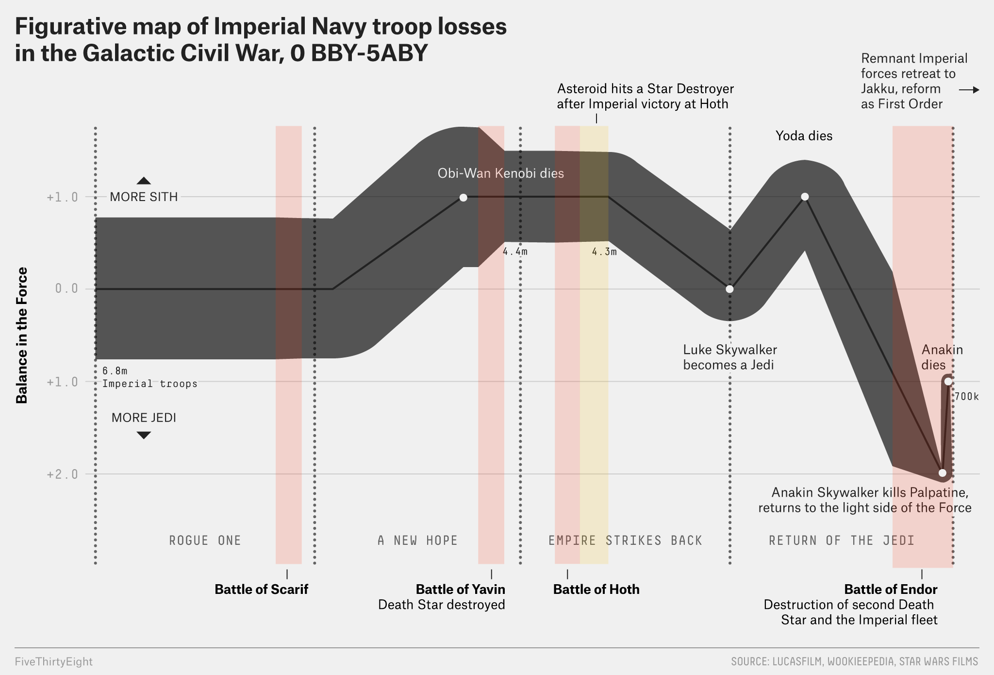
Credit for the piece goes to Walt Hickey.
Leave a Reply
You must be logged in to post a comment.