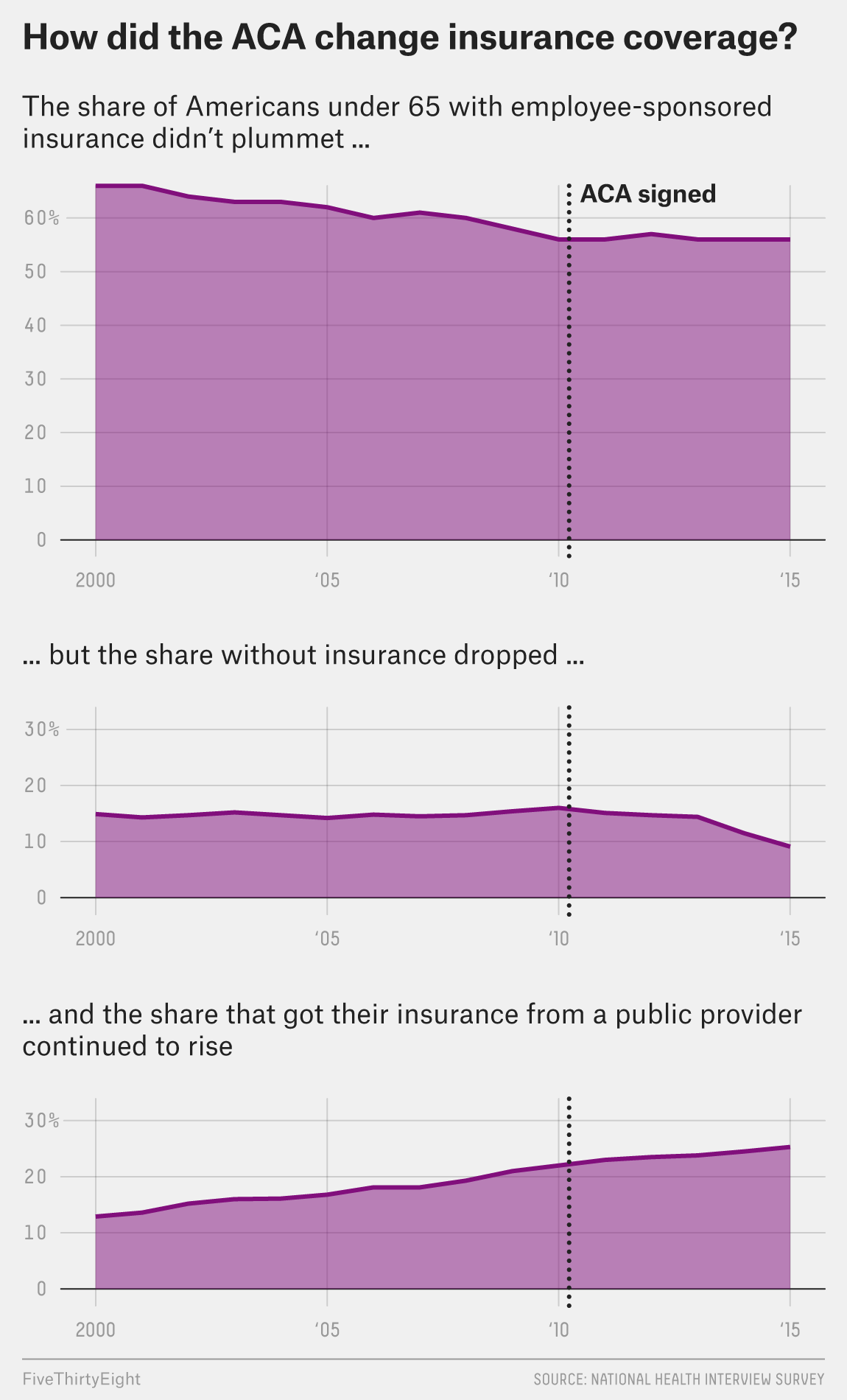
We are counting down the days until President Obama steps aside. And shortly thereafter his signature work, the Affordable Care Act, may be repealed. But looking back, what is the legacy of the first few years under Obamacare? Besides the obvious death panels, of course. Well FiveThirtyEight took a look. And in this graphic, we see simple line charts. But what I really like is the attention that went into the titling/labelling. The titles draw you down through the story, explaining just what you are looking at.

Credit for the piece goes to the FiveThirtyEight graphics department.
Leave a Reply
You must be logged in to post a comment.