Shoutout to my very good friend Jonathan Fairman for passing this one along.
Browsing the internets, I often find these little adverts saying something about “10 Things You Didn’t Know About Your Name” or “10 Things Your Name Says About You”. They grab my attention because, as you all know, genealogy is kind of a thing that I do and I am curious where lots of names in my family come from.
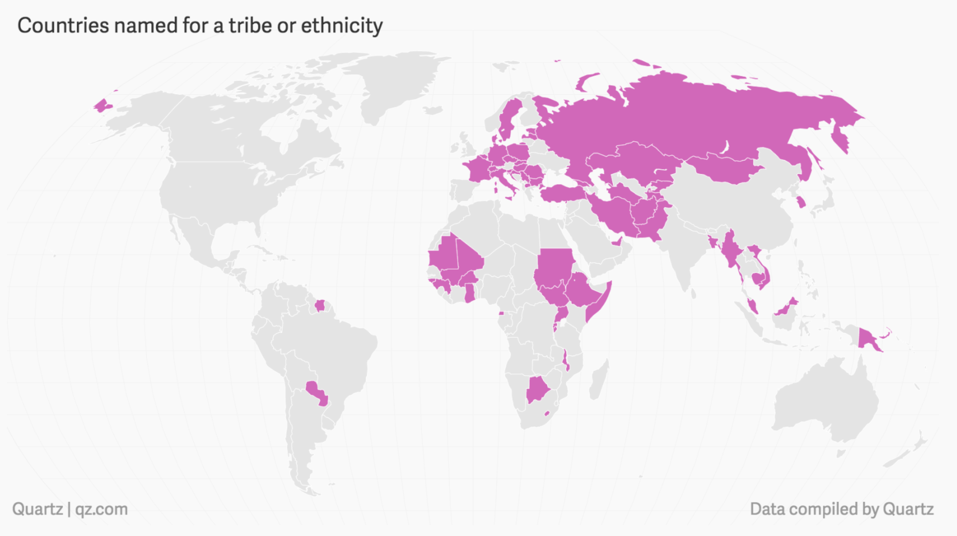
But where do countries names originate? We all probably know America comes from Amerigo Vespucci. But how about Mexico? Thankfully Quartz put together a piece exploring country name origins. And it turns out that most can be grouped into four different types. Being named after a man, like America, well you guessed it, that’s one of the four.
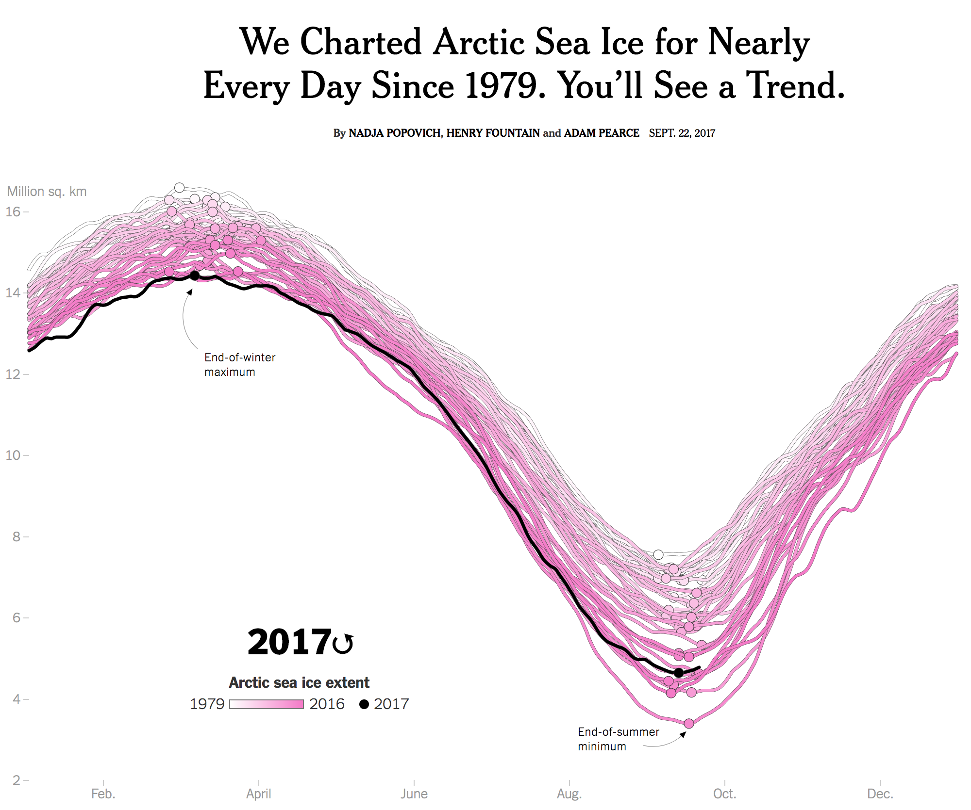
You may recall how over two years ago I posted about a piece from the New York Times that explored the levels of Arctic sea ice. It showed how the winter sea ice of 2015 was the lowest level ever recorded. Well last week the Times updated that piece with new data. And instead of the static graphic we enjoyed last time around, this time the piece began with a nice animation. It really helps you see the pattern, so you should click through and check out the whole piece.
Go hit play and you’ll see the trend
But this isn’t just a visually top heavy piece. No, the remainder of the article continues to explore the state of Arctic sea ice through a number of other charts and maps.
Credit for the piece goes to Nadja Popovich, Henry Fountain, and Adam Pearce.
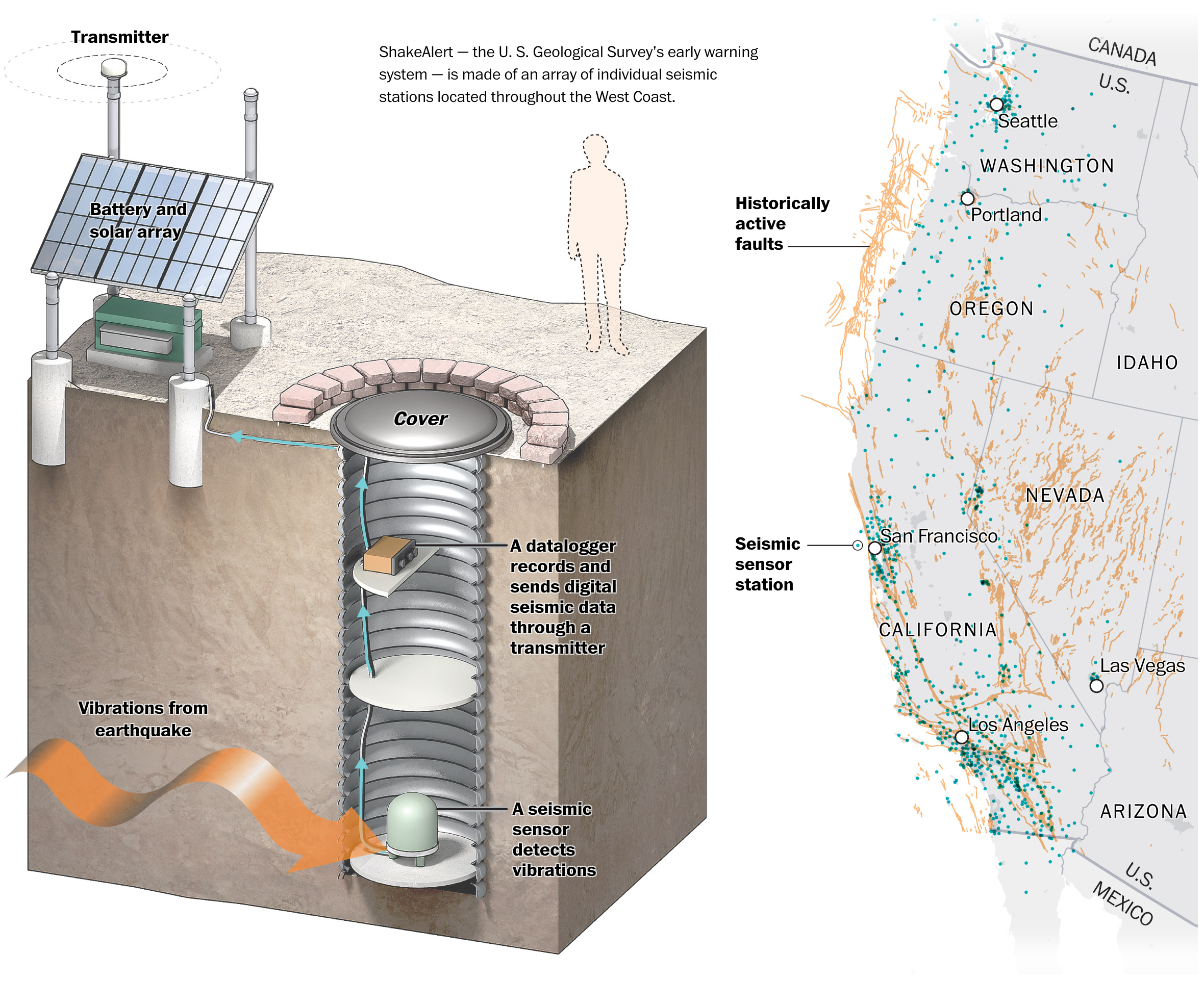
Last month, two massive earthquakes devastated Mexico. Now, if you were like me, you were captivated by the photos and videos of the quakes striking and tearing down buildings and infrastructure. But, think about it for a second, how did people know to take out their mobiles and record the tremors for posterity’s sake?
Well, the first thing you should know is that earthquakes consist of a number of different waves of energy. Some move quicker and are less damaging than the slower travelling ones. And it turns out that scientists have been able to use that speed differential to build early warning systems along and around fault lines.
The Washington Post did a really nice job of explaining how earthquake-prone California is developing just such a system to deal with its tremors. I won’t spoil all the details, you should go read the article if earthquakes are of any interest to you.
C’mon. You knew I was not going to let that one slip by.
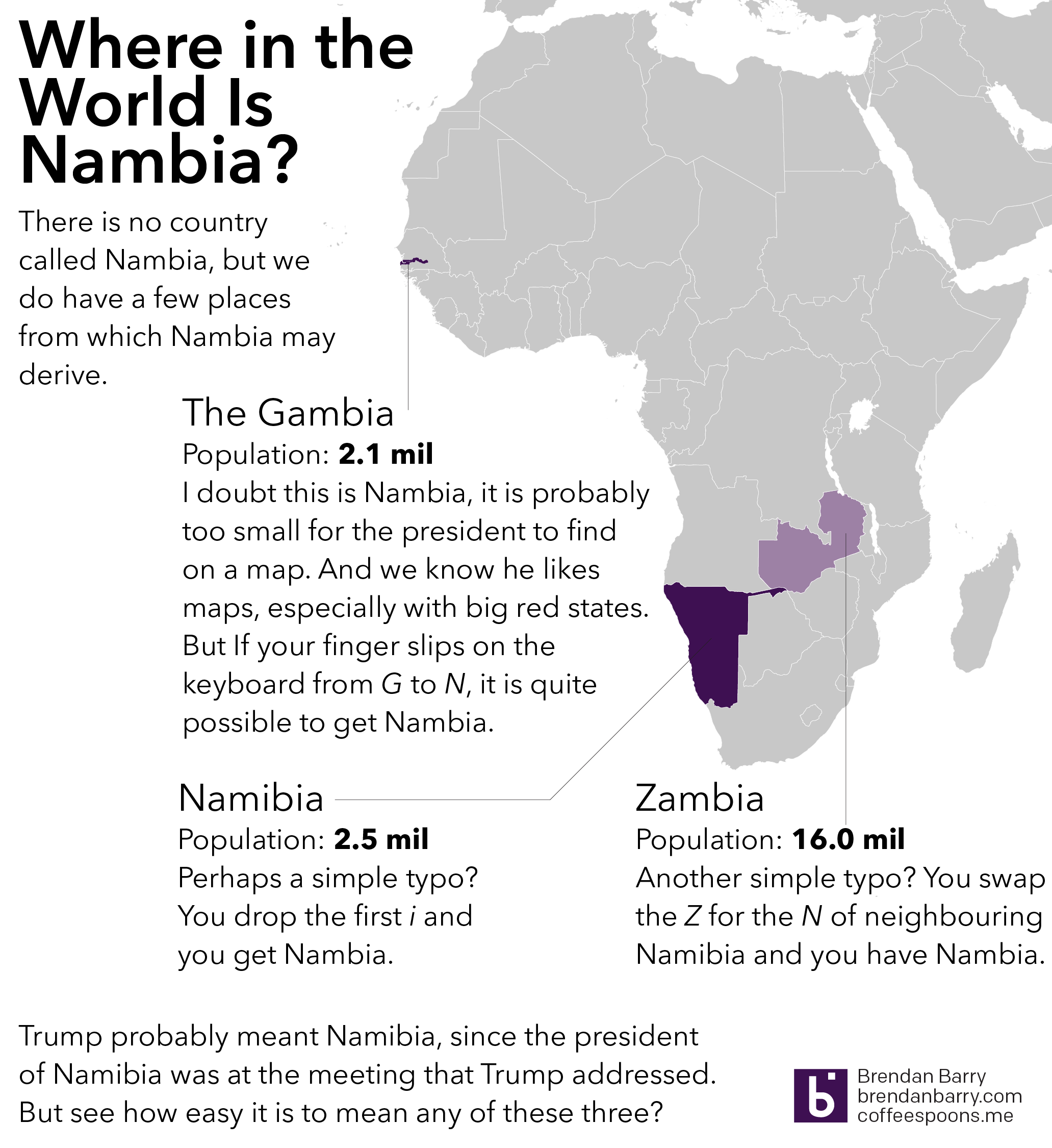
President Trump, in a meeting with African leaders, twice name-dropped Nambia and in one mention held it up as having a nearly self-sufficient healthcare system. Funny thing to mention as the US is on the brink of eviscerating its healthcare system. But I digress. The point is that when you are speaking to the president of a country, you take a minute to learn how to pronounce the country’s name correctly. Even write it phonetically in the text if you have to. (I’ve done that.) So where is Nambia?
One of the stories I am interested to work on visualising in that mythical land of free time is a comparison of potential host cities for Amazon’s recently announced HQ2, a second corporate headquarters. In the meantime, I read this piece from the Times that attempted to decide for them.
Where oh where…
I have some qualms with it, first that it excludes other North American cities—I would not be surprised to see Toronto win the headquarters. I have doubts that Mexico City would work, but it is possible. But my biggest problems are with the exclusionary nature of the selection. That is, within this set, cities that have x. Of the cities that have x, the cities that have y, and so on and so forth.
Personally I suspect Amazon will be looking at which cities not only fit the most requirements, but also which cities will ultimately give them the best business deal. And that I think is a very difficult to describe category.
But it is fun to try.
Credit for the piece goes to Emily Badger, Quoctrung Bui, and Claire Cain Miller.
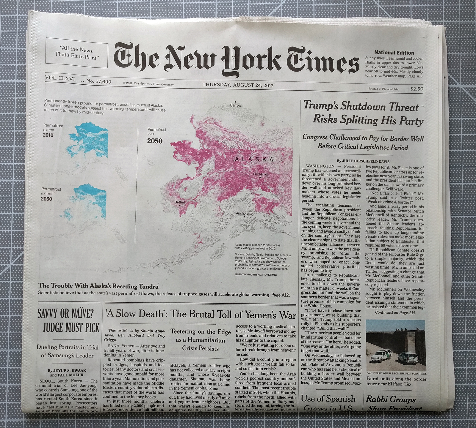
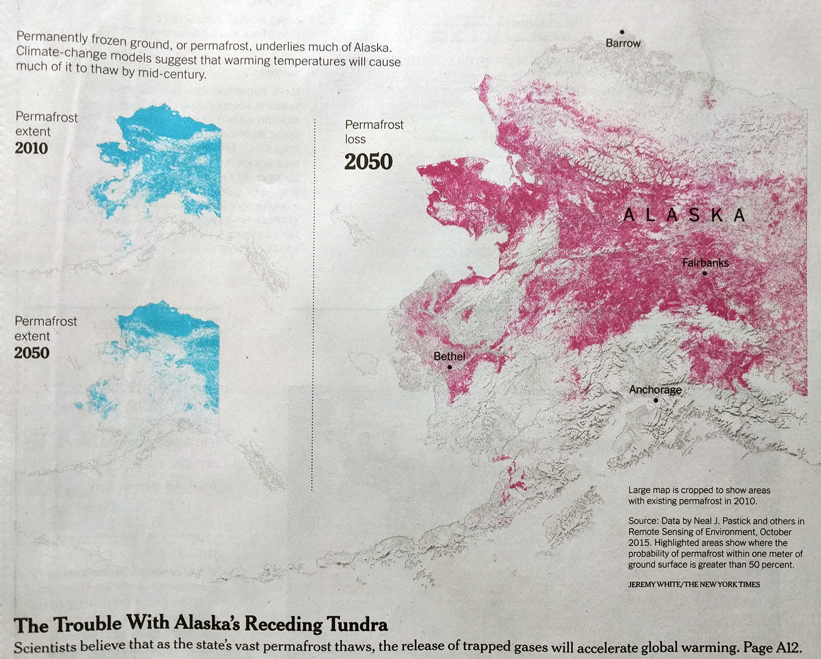
I woke up this morning and before breakfast I opened the door to bring in today’s edition of the New York Times. I enjoy reading the paper, or at least a few articles, over breakfast (and more often than not preparing a post for here at Coffeespoons.me). Some of the best days are when I open the door and find a giant piece of data visualisation there above the fold. Other images, for example the other day’s eclipse coverage, also strike me, but as someone who visualises data as part of his career, I particularly enjoy things like maps. (I should point out I also do editorial design, so things like this layout are even closer to the intersection of my interests.)
Lo and behold, this morning I opened the door and we had the shrinking permafrost of Alaska this morning.
Now that is basically it. I have a crop of the map at the end here, but the map was the extent of the data visualisation in the article. Indeed, other articles in today’s edition carried more interesting graphics—I took photos to hopefully circle back—but the nerd I am, I really do get a kick finding a paper like this in the morning.
The graphic itself occupies half the space above the fold and the bright cyan and magenta steal the user’s attention. Even the headlines of the other articles recede behind the Alaska maps.
White space around the maps subtly helps focus attention on the piece. To be fair, the shape of Alaska with its archipelagos and bays along with the southeast extension help to create that space. A more squarish shape, say Colorado, would not quite have the same effect.
If I had to critique anything, I might have placed the city labels, especially Fairbanks, and the state label elsewhere to enhance their legibility. But at that point, I’m really just quibbling around the edges.
Today’s post is not so much about a graphic per se, instead I read an article in the Guardian about how Boston’s public school system has decided to switch from the Mercator map projection system to the Gall-Peters projection system.
The article is worth a read if only for the embedded clip of the episode of the West Wing where they talk about the Gall-Peters. But for those of you not familiar with map projection systems, the problem is it is impossible to perfectly reproduce a three-dimensional spheroid onto a two-dimensional flat plane. Some maps sacrifice proportions for straight lines, others sacrifice shape for area, and so on and so forth.
Seriously, where is France?
Credit for the map image goes to Alamy Stock Photo via the Guardian.
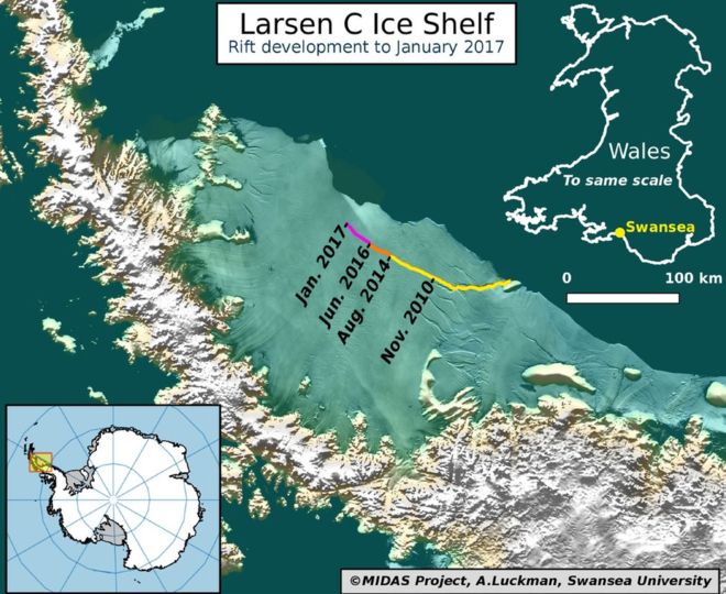
When I was in high school in 2002, it was big news when one of the three Larsen ice shelves in Antarctica, Larsen B, collapsed. And then when I was at university, the band British Sea Power wrote a song titled “Oh Larsen B” that I have always enjoyed.
Now Larsen B was not the first Larsen ice shelf to collapse. That dubious honour belongs to Larsen A, which collapsed in 1995. But, Larsen B will not be the last as the third, Larsen C, is now on the verge of collapse. This graphic from Adrian Luckman, reproduced by the BBC, illustrates how the rift calving the shelf has seen accelerated growth recently.
The rift’s growth has accelerated lately
I believe the colours could have been designed a bit better to show more of the acceleration. The purple fades too far into the background and the yellow stands out too much. I would be curious if the data existed to create a chart showing the acceleration.
The inclusion of the map of Wales works well for showing the scale, especially for British audiences. In other words, an iceberg 1/4 the size of Wales will be released into the Southern Ocean. For those not well versed in British geography, that means an iceberg larger than the size of Delaware. That’s a big iceberg.
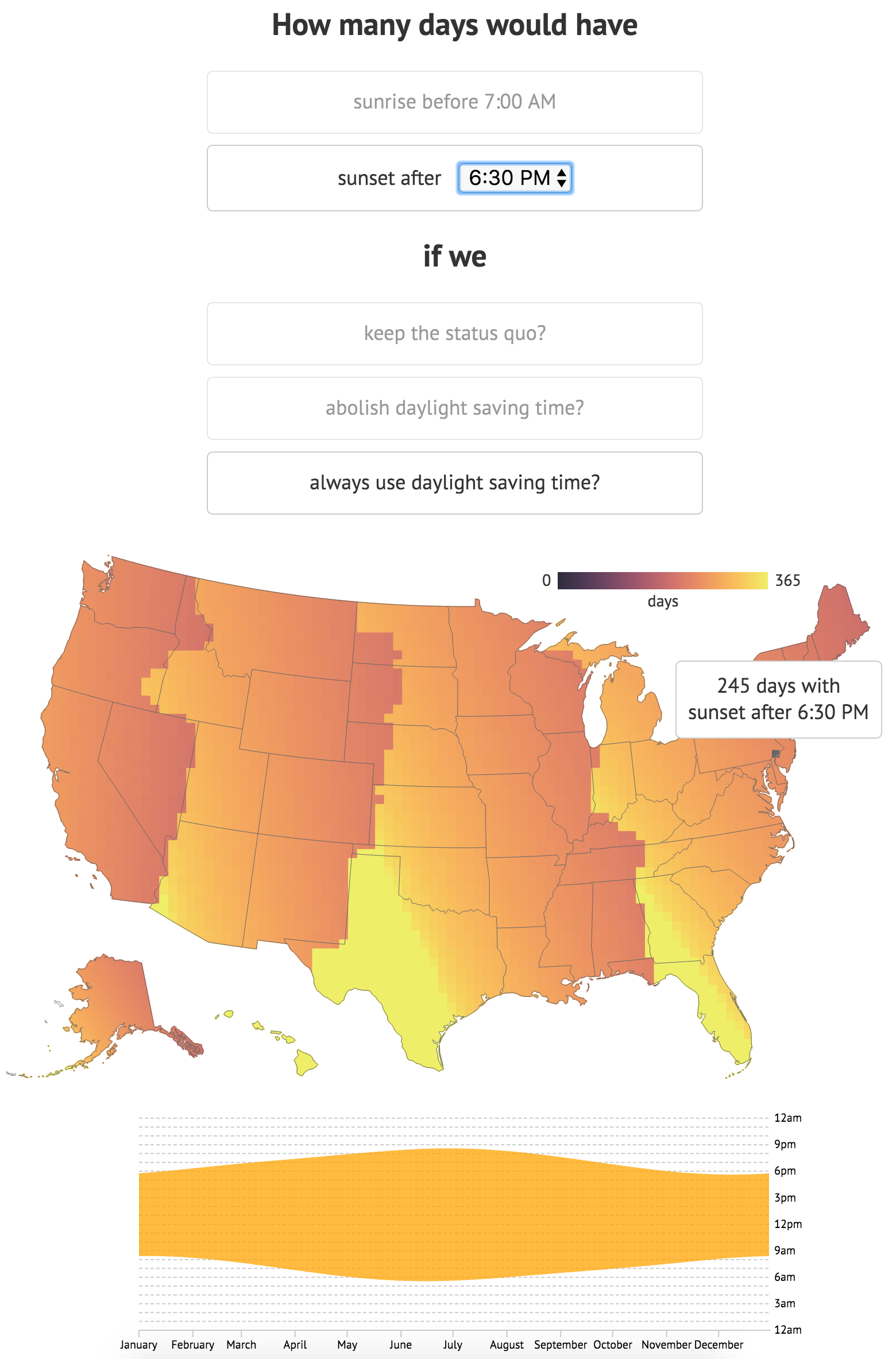
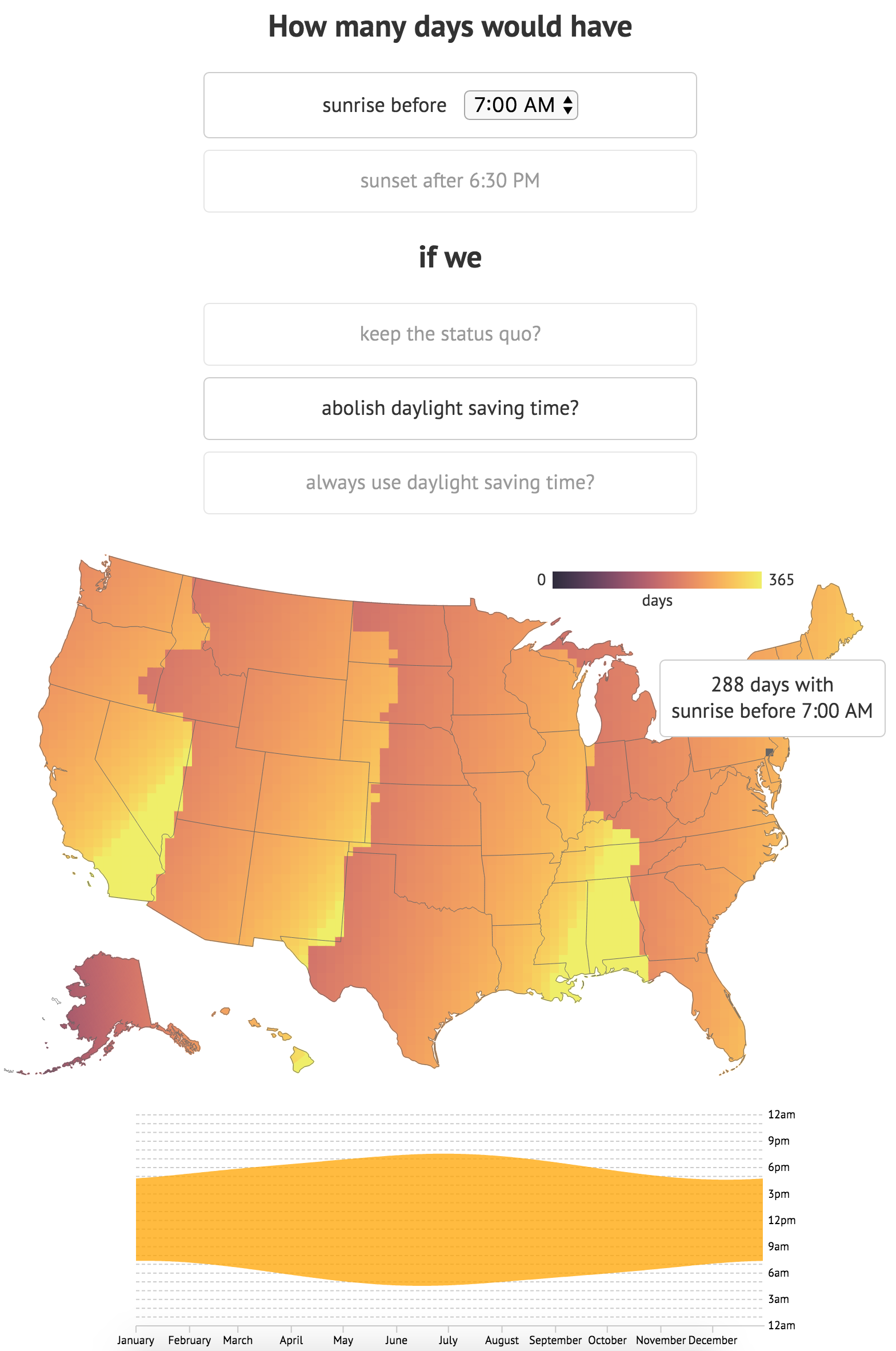
You clearly didn’t miss this story from two weeks ago, because we all had to change our clocks. But, you might not have thought much about it. Which is fine, because I think there was an election or something a day or two later. Or was I dreaming/nightmaring?
Thankfully Andy Woodruff did think about it and he put together a really nice piece about how the changes to time affect the amount of perceived sunlight. I say perceived because obviously the same amount of sunlight falls upon the Earth, but it’s whether we can see it from underneath the covers or hidden behind our office computer monitors.
His interactive piece lets you examine scenarios based on your preferred inputs. For example, as someone who goes to work a bit later in the morning—I have to write this blog sometime, right?—I would prefer the sun to be up later into the evening. And based on my selections, that means that I should consider the argument for always using Daylight Savings Time.
Making DST year-long would make for sunlit evenings throughout the year
Whereas if I valued a sunrise with daylight, I might prefer to abolish Daylight Savings Time.
Abolishing DST would mean for me more days of sunlight in the morning