Today’s post is a graphic from the New York Times that looks at Russia’s hold on energy across Europe. I’m not terribly keen on this particular graphic for a few reasons. First, the design needs to incorporate the actual datapoint so the reader can compare across countries. Comparing the height of each black bar to each other is difficult at best.
Secondly, the data excludes the energy trade between European Union countries. And that strikes me as potentially quite a lot. Just because a country is importing from another EU country does not mean it is importing less.
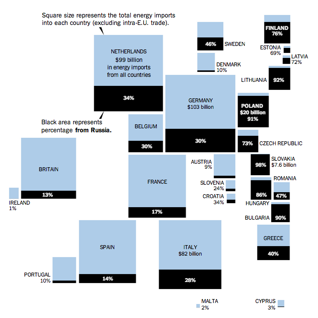
Credit for the piece goes to the New York Times graphics department.