Category: My Work
-
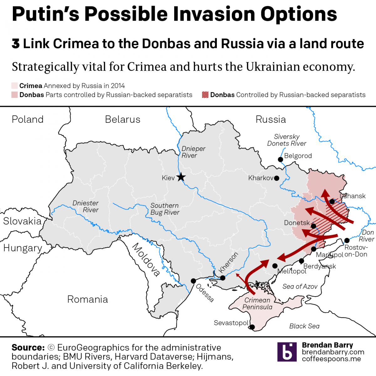
Some Possible Shapes a Russian Invasion of Ukraine Could Take
I’ve been trying to figure out how to start several days’ worth of coverage about Ukraine and Russia’s “further invasion”. For those that haven’t followed me here at Coffeespoons for very long, eight long years ago, in addition to covering other media outlets’ work, I did quite a lot of research, designed several pieces trying…
-
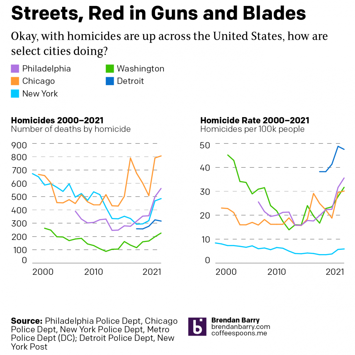
America’s Crime Problem
During the pandemic, media reports of the rise of crime have inundated American households. Violent crimes, we are told, are at record highs. One wonders if society is on the verge of collapse. But last night a few friends asked me to take a look at the data during the pandemic (2020–2021) and see what…
-
Low Expectations
Today the 2021 Major League Baseball season begins its playoffs. Tomorrow we get the Los Angeles Dodgers and the St. Louis Cardinals. Why the Dodgers, the team with the second-best record in all of baseball, need to play a one-game play-in is dumb, but a subject for perhaps another post. Tonight, however, is the American…
-
Updated DNA Ethnicity Estimates
Earlier this year I posted a short piece that compared my DNA ethnicity estimates provided by a few different companies to each other. Ethnicity estimates are great cocktail party conversations, but not terribly useful to people doing serious genealogy research. They are highly dependent upon the available data from reference populations. To put it another…