Category: My Work
-
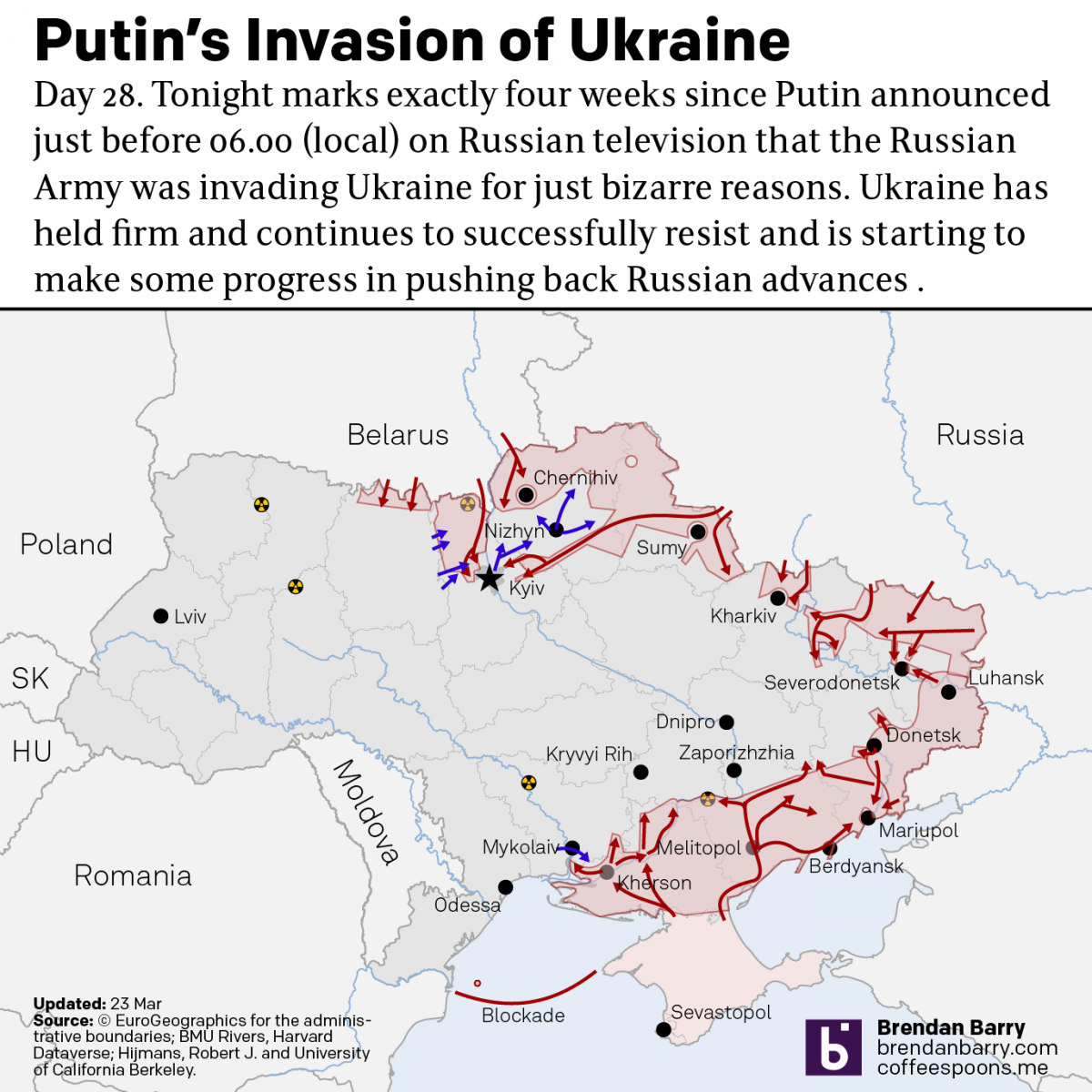
Russo-Ukrainian War Update: 23 March
Just when I thought I wasn’t going to post an update, we get some news out of Kyiv itself. The municipal government allowed journalists to see an unclassified map of the battlefield as they understand it. It highlighted those areas where Ukrainians have recaptured areas captured by the Russians in the first four weeks. A…
-
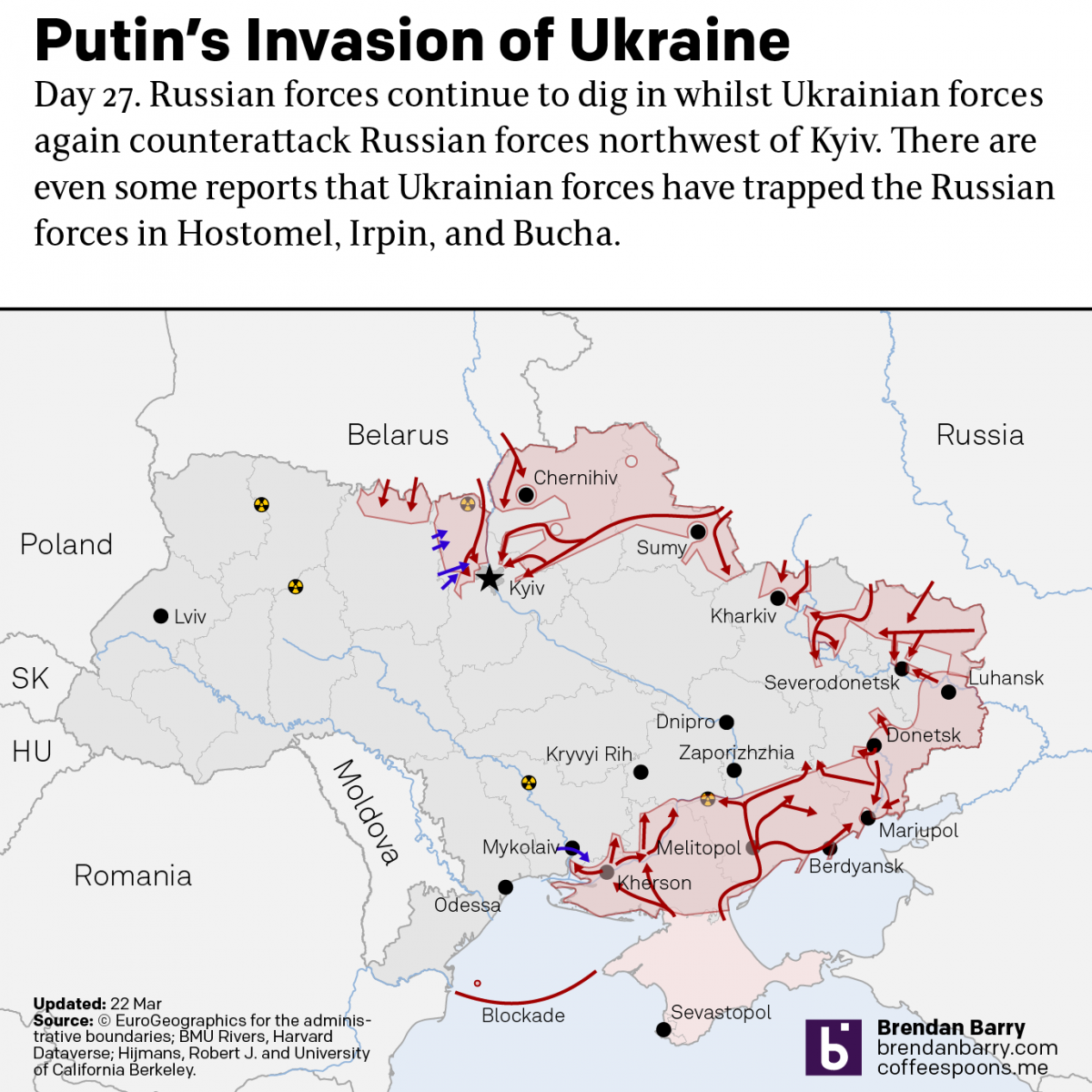
Russo-Ukrainian War: 22 March Update
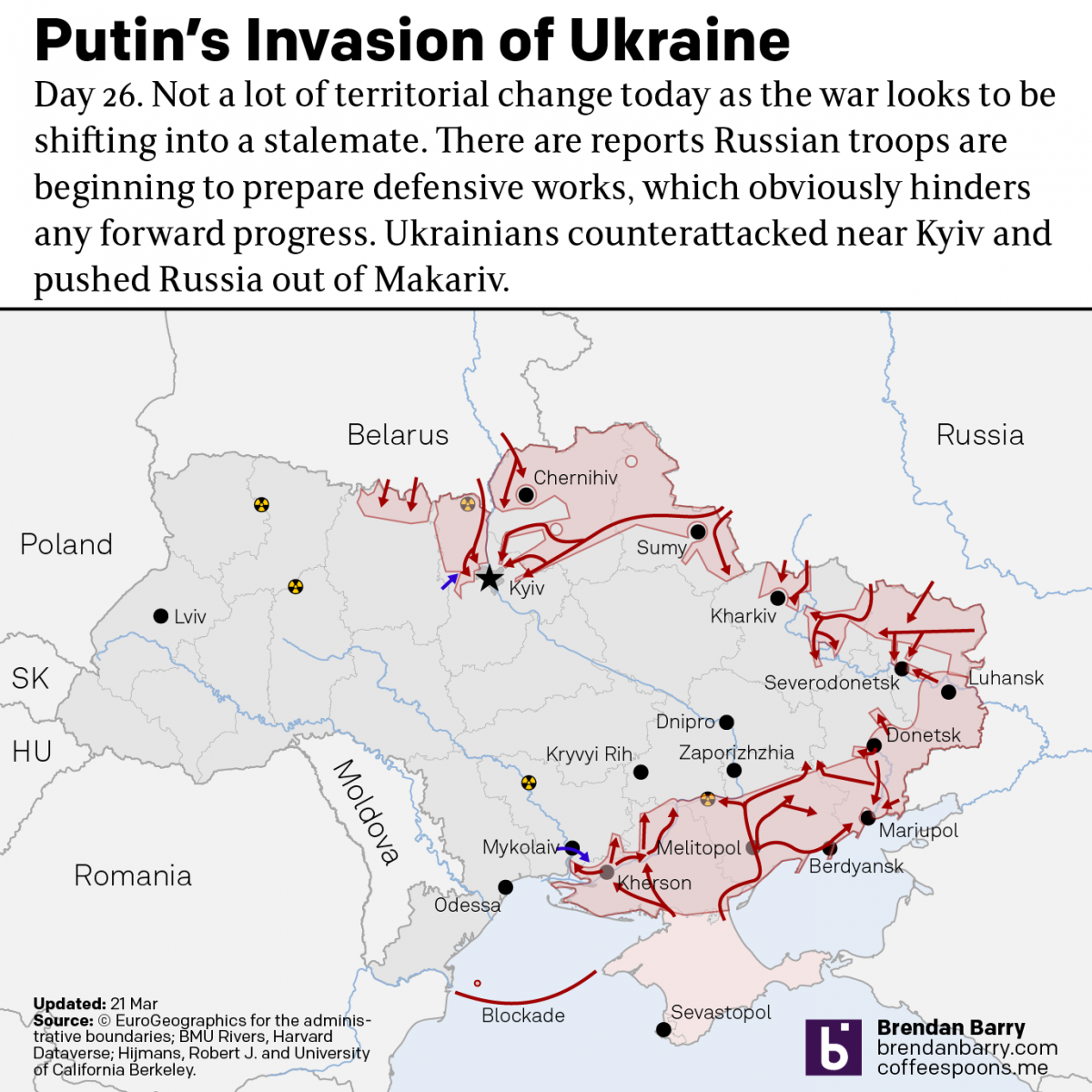
I’m still trying to post these updates in the morning about what happened yesterday, even though we’re well into the afternoon in Ukraine. The situation on the ground, at least in terms of territorial change, remains largely static. I mentioned yesterday how Ukraine recaptured the town of Makariv. Yesterday, Ukrainian forces made a broader push…
-
Russo-Ukrainian War Update
Yesterday we looked at no-fly zones. Today I want to take a brief moment to look at the status of the war on the ground. I’ve been doing this later in the evening on my social media because of the time zone difference, but I want to see if it works holding off the posting…
-
The Horrible, No-good, Terrible Idea of a No-fly Zone Over Ukraine
I took a few days off last week and on my social media I posted a series of graphics explaining why a no-fly zone over Ukraine is a terrible idea. To be clear, Russia’s deliberate targeting of civilians and civilian infrastructure is horrific. But when Russia failed to quickly take Kyiv and capture/execute Zelensky, what…
-
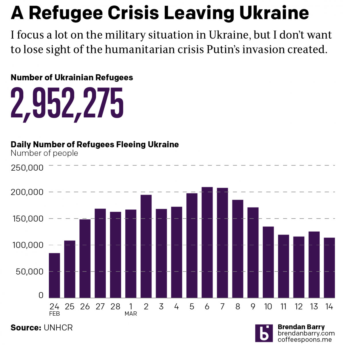
The Refugee Crisis from Ukraine
A quick little post for today, more coverage on Ukraine of course. But whilst I normally focus on the battlefield because that’s what interests me, we shouldn’t lose sight of the enormous refugee problem Putin has created by invading Ukraine. Putin’s war will likely be the largest European refugee crisis since World War II. Previously,…
-
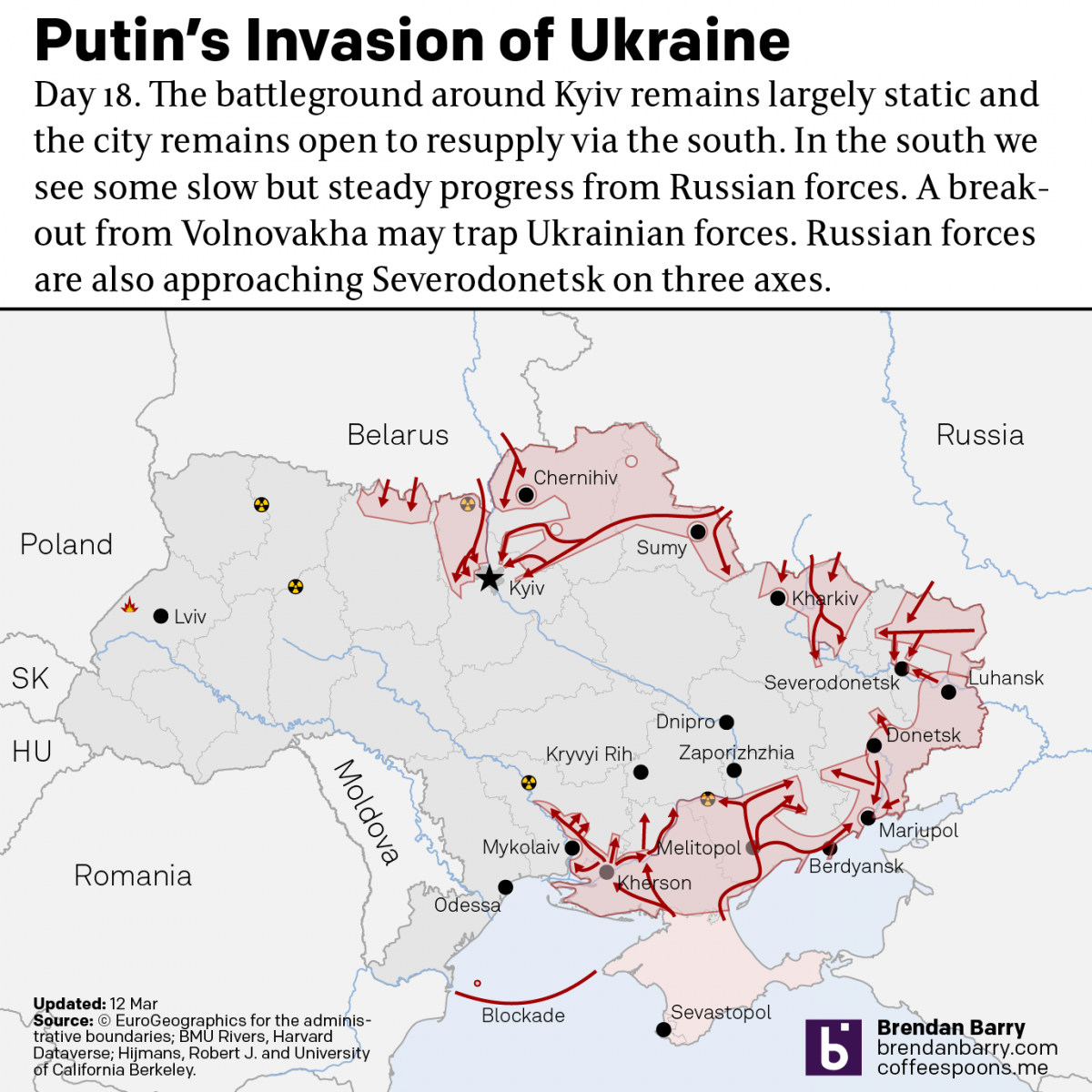
What Is Putin Trying to Accomplish Now in Ukraine?
So first, these maps are from last night and by the time this posts, most of the daytime in Ukraine will have happened and things on the ground could have changed dramatically. But let’s start the week out with where things are at in Ukraine. In short, on most fronts not a lot has changed…
-
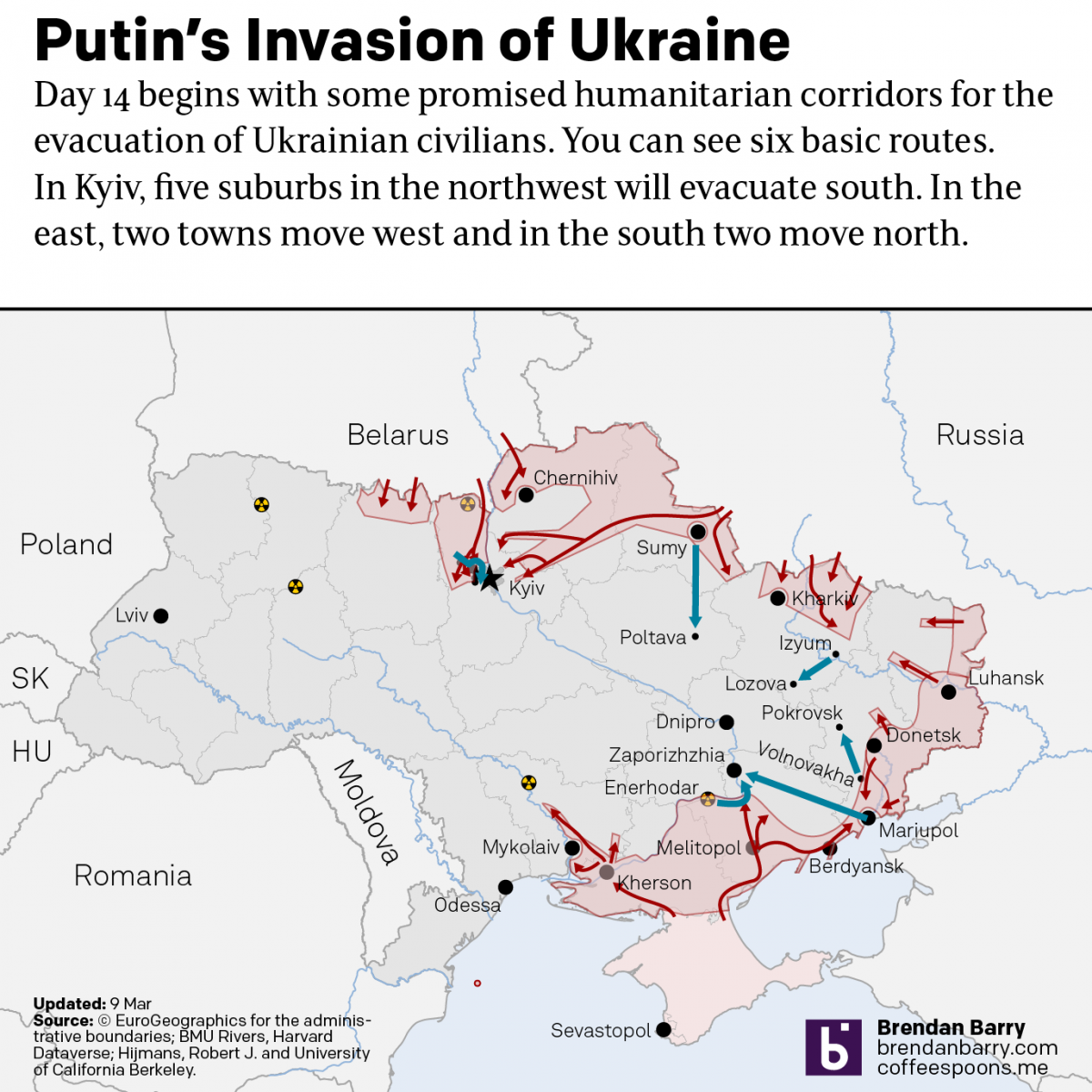
Evacuation Corridors
I’ve been posting a lot of map updates to my personal social media accounts instead of to the blog here. In part that’s because at the end of the night, it’s the wee hours in Ukraine and I can post something that will hold up fairly well for a few hours. But right now in…
-
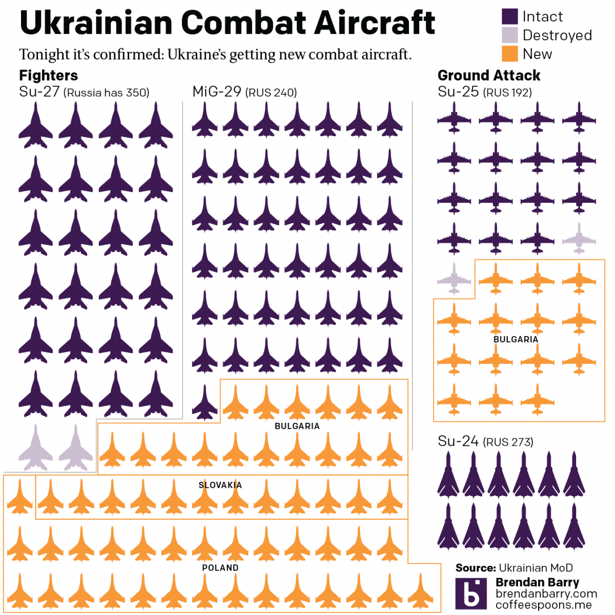
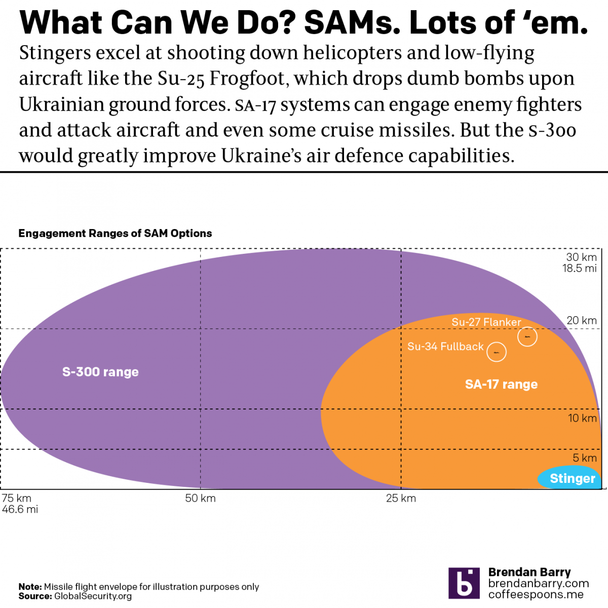
Bolstering the Ukrainian Air Force
Undeniably, Russia outnumbers and outguns the Ukraine on the ground, on the sea, and in the air. The latter matters because Ukraine’s air attacks have devastated Russian convoys. But beyond drones, Ukraine could use additional combat aircraft: both ground attack aircraft and fighter jets to try and defend Ukrainian airspace. The problem is that Ukrainians…
-
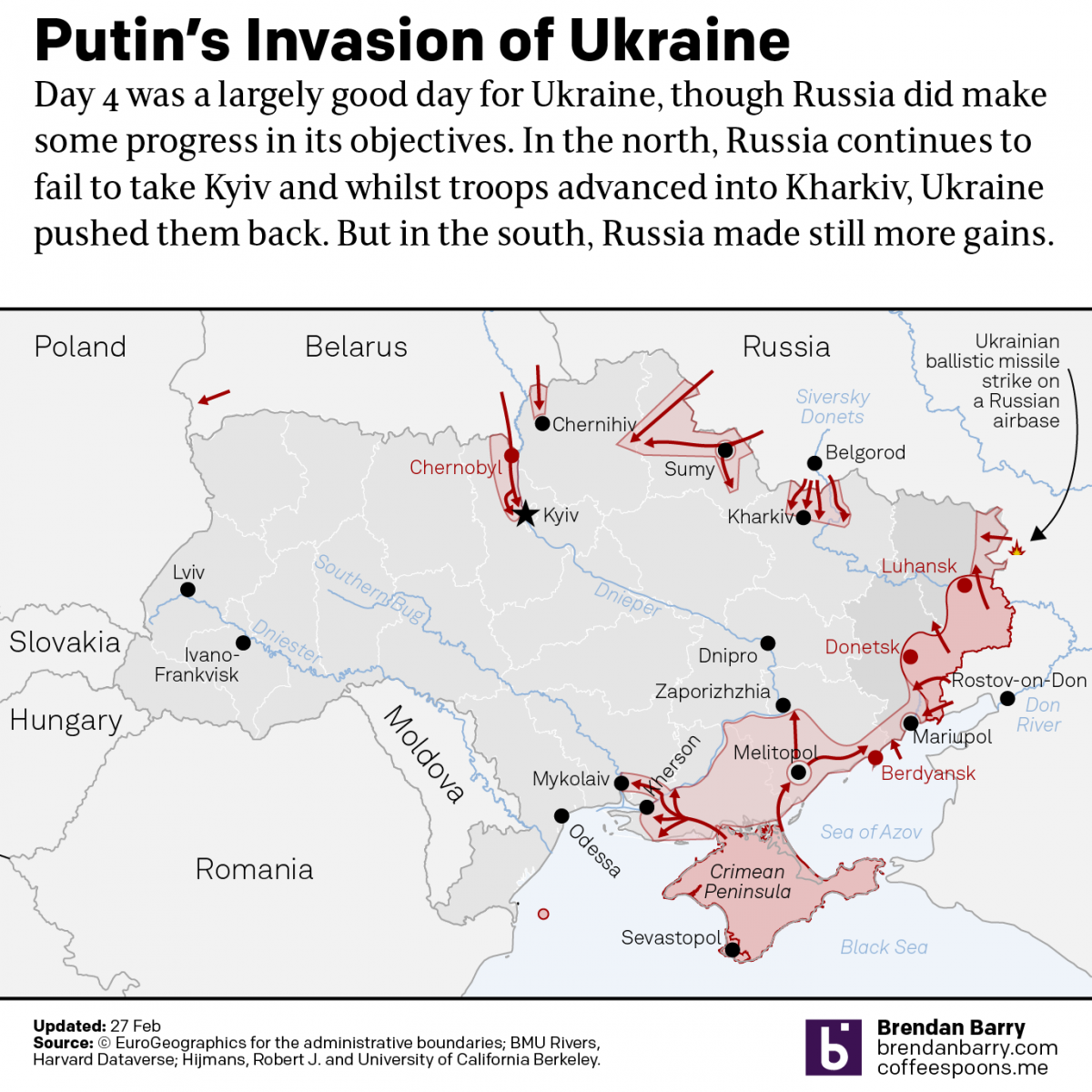
Putin’s War in Ukraine
Last week I wrote about what I considered Russia’s most likely plans of attack in a war with Ukraine. For the next day I had a post planned about what we could perhaps glean from Russian troop movements in days prior. But, the day I posted the first piece, late that night (US time), Russian…
-
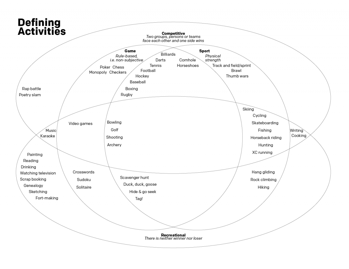
Sports and Games
Well that was a week. Let’s try to stay on the lighter side this Friday. Several weeks ago I was debating with several people about the difference between a game and a sport. I decided that the best way to try and capture our conversation was with a Venn diagram. So in the interest of…