Examining How We Measure Our Lives
Commentary, critiques, and observations on information design and data visualisation
-
Read on…: The Shrinking Colorado River
Last week the Washington Post published a nice long-form article about the troubles facing the Colorado River in the American and Mexican west. The Colorado is the river dammed by the Hoover and Glen Canyon Dams. It’s what flows through the Grand Canyon and provides water to the thirsty residents of the desert southwest. But […]
-
Hey, Cousin!
Read on…: Hey, Cousin!As many of my long-time readers know, I count genealogy as one of my hobbies. A few weeks ago for Orthodox Easter I travelled up to the hometown of my late grandfather. There I get to see people to whom I’m related as many of us can point to ancestors from the same few villages […]
-
Whilst We Wait for Roe…
Read on…: Whilst We Wait for Roe…to be overturned by the Supreme Court, as seems likely, states have been busy passing laws to both restrict and expand abortion access. This article from FiveThirtyEight describes the statutory activity with the use of a small multiple graphic I’ve screenshot below. Each little map represents an action that states could have taken recently, for […]
-
Kids Do the Darnedest Things: Shoot Other Kids
 Read on…: Kids Do the Darnedest Things: Shoot Other Kids
Last month, a 2-year old shot and killed his 4-year old sister whilst they sat in a car at a petrol station in Chester, Pennsylvania, a city just south of Philadelphia. Not surprisingly some people began to look at the data around kid-involved shootings. One such person was Christopher Ingraham who explored the data and […]
-
One Million Covid-19 Deaths
Read on…: One Million Covid-19 DeathsThis past weekend the United States surpassed one million deaths due to Covid-19. To put that in other terms, imagine the entire city of San Jose, California simply dead. Or just a little bit more than the entire city of Austin, Texas. Estimates place the number of those infected at about 80 million. Back of […]
-
Off the Deep End
Read on…: Off the Deep EndSummer rapidly approaches. As does this weekend. Combining those two elements, we can thank xkcd for a wonderful explainer about how the deep ends of pools form. Credit for the piece goes to Randall Munroe.
-
Black Holes and Revelations: Remastered
Read on…: Black Holes and Revelations: RemasteredTwo years ago I posted about how the Event Horizon Telescope Collaboration managed to take the first photograph of a black hole, in particular a supermassive black hole at the centre of the M87 galaxy, one of those galaxies far, far away that we see at a long time ago. This morning, the same group […]
-
Political Hatch Jobs
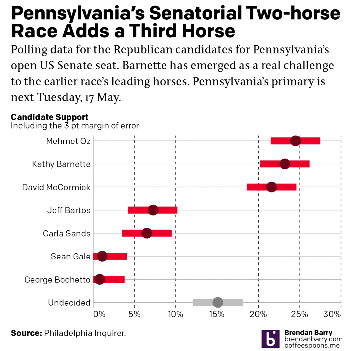 Read on…: Political Hatch Jobs
Earlier this week I read an article in the Philadelphia Inquirer about the political prospects of some of the candidates for the open US Senate seat for Pennsylvania, for which I and many others will be voting come November. But before I get to vote on a candidate, members of the political parties first get […]