Tag: maps
-
One Million Covid-19 Deaths
This past weekend the United States surpassed one million deaths due to Covid-19. To put that in other terms, imagine the entire city of San Jose, California simply dead. Or just a little bit more than the entire city of Austin, Texas. Estimates place the number of those infected at about 80 million. Back of…
-
Madagascar
Well we made it through the week. Yesterday we looked at plate tectonics and the future shape of the world. So today it’s time to look at a map recently made by xkcd. Specifically it looks at the world through the lens of Madagascar. Greenland isn’t as big as it looks on Google Maps. So…
-
The Continents Will Fall Off the Flat Earth
To be clear, we know the Earth is round. At least most people know that. Some people delude themselves. We also know that sitting atop the mantle we have plates of rock that move around. Sometimes they slip underneath others. Other times they collide and crumple. Plate tectonics explain why there are so many similarities…
-
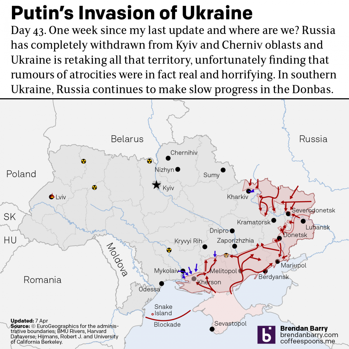
Russo-Ukrainian War Update: 6 April
It’s been a week since my last update and that’s in part because a lot has changed. When we last spoke, the Russians had announced they had successfully completed the first phase of the “special military operation”. They didn’t. Instead, Russian forces have completed a full-on retreat from northern Ukraine, sending troops and equipment back…
-
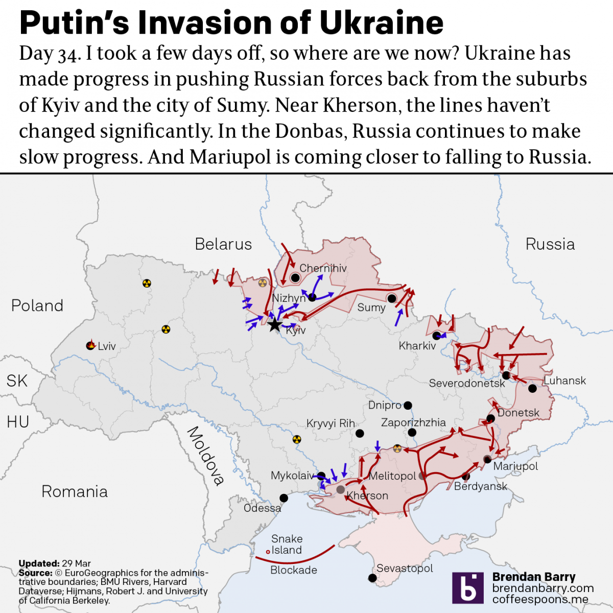
Russo-Ukrainian War Update: 29 March
I took a few days off from covering the war in Ukraine. Now it’s time to jump back in and catch up on things. Putin and his generals have declared the first phase of his “special military operation” over and that it was a success. They claimed that their goal was never the capture of…
-
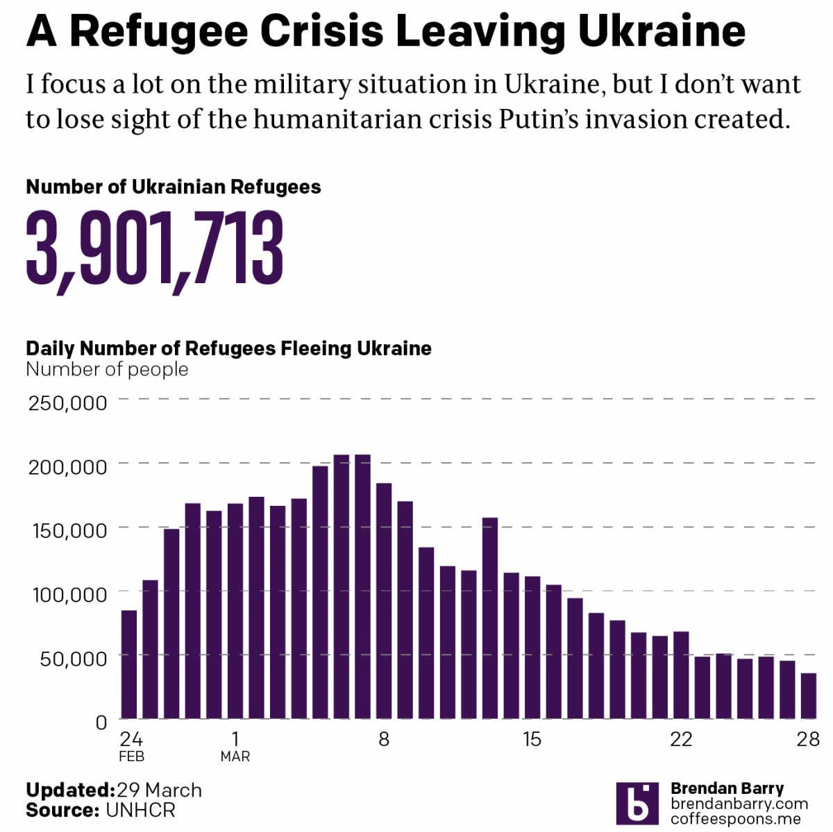
Russo-Ukrainian War Refugees
This data took far longer to clean up than it should have. And for that reason I’m going to have to keep the text here relatively short. We still see tens of thousands of refugees fleeing Putin’s war in Ukraine. Although, we are down from the peaks early on in this war. In total, nearly…
-
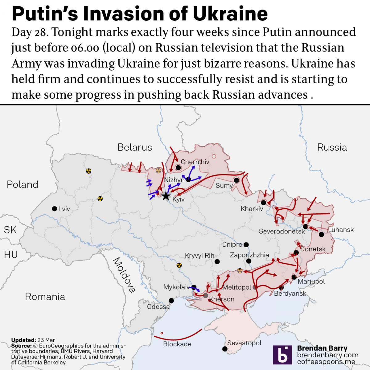
Russo-Ukrainian War Update: 23 March
Just when I thought I wasn’t going to post an update, we get some news out of Kyiv itself. The municipal government allowed journalists to see an unclassified map of the battlefield as they understand it. It highlighted those areas where Ukrainians have recaptured areas captured by the Russians in the first four weeks. A…
-
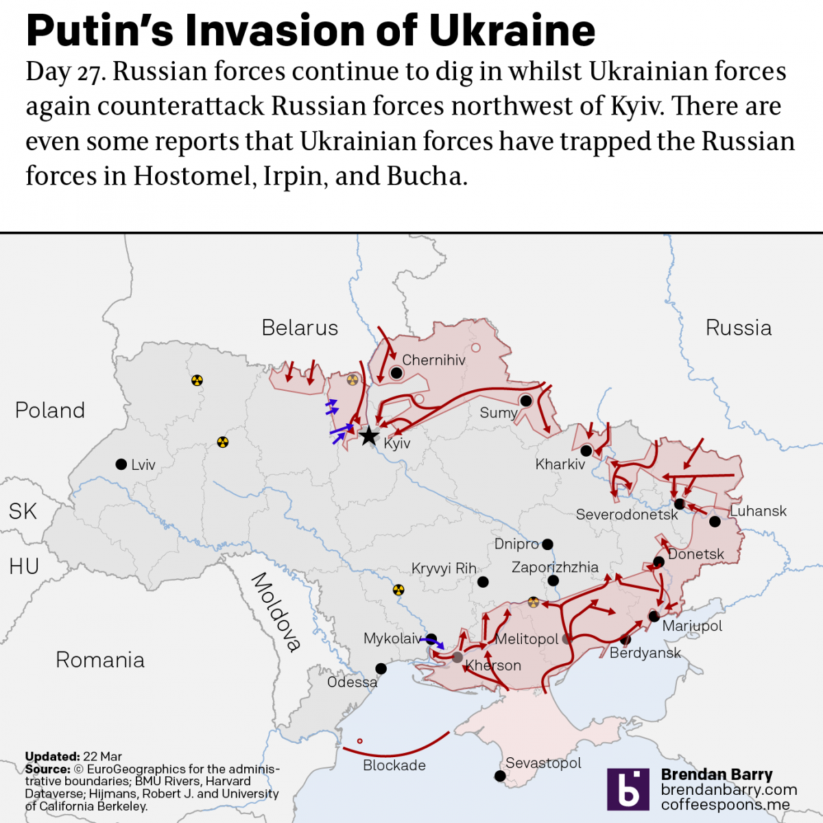
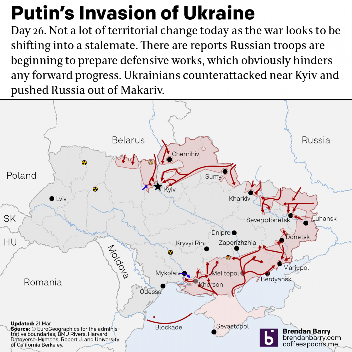
Russo-Ukrainian War: 22 March Update
I’m still trying to post these updates in the morning about what happened yesterday, even though we’re well into the afternoon in Ukraine. The situation on the ground, at least in terms of territorial change, remains largely static. I mentioned yesterday how Ukraine recaptured the town of Makariv. Yesterday, Ukrainian forces made a broader push…
-
Russo-Ukrainian War Update
Yesterday we looked at no-fly zones. Today I want to take a brief moment to look at the status of the war on the ground. I’ve been doing this later in the evening on my social media because of the time zone difference, but I want to see if it works holding off the posting…