Tag: maps
-
The Sun’s Over the Yardarm Somewhere
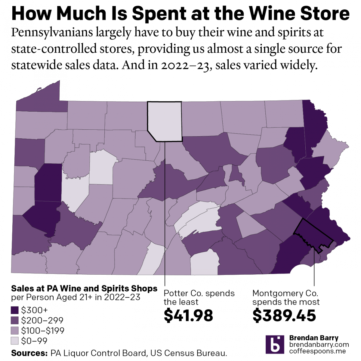
It’s been a little while since my last post, and more on that will follow at a later date, but this weekend I glanced through the Pennsylvania Liquor Control Board’s annual report. For those unfamiliar with the Commonwealth’s…peculiar…alcohol laws, residents must purchase (with some exceptions) their wine and spirits at government-owned and -operated shops. It’s…
-
Cavalcante Captured
Well, I’ve had to update this since I first wrote, but had not yet published, this article. Because this morning police captured Danelo Cavalcante, the murderer on the lam after escaping from Chester County Prison, with details to follow later today. This story fascinates me because it understandably made headlines in Philadelphia, from which the…
-
It’s Been a Little While, But I Haven’t Gone Very Far
I last posted to Coffeespoons a year ago. Well, I’m back. Sort of. Over the last year, there has been a lot going on in my family and personal life. Suffice it to say that all’s now relatively well. But the last 12 months forced me to prioritise some things over other things, and a…
-
Fort Pitt
Yesterday I discussed some of the work at the Fort Pitt Museum in Pittsburgh, Pennsylvania. Specifically we looked at Fort Duquesne, the French fortification that guarded the linchpin of their colonies along the Saint Lawrence Seaway and the Mississippi and Ohio River valleys. In 1753, the royal governor of Virginia dispatched a British colonial military…
-
Diagramming and Diorama-ing Fort Duquesne
Pittsburgh exists because of the city sits at the confluence of the Allegheny, Monongahela, and Ohio Rivers. As far back as the early 18th century, English and French colonists had recognised the strategic value of the site and as imperial ambitions ramped up, the French finally wrested control of the area from the English and…
-
We’re a Long Way from Kansas
I had something else for today, but this morning I opened the door and found my morning paper. Nothing terribly special. No massive headline. No large front-page graphic. See what I mean? But then as I bent down to pick it up, I spotted a little tree map. But it turned out it wasn’t a…
-
Europe By Rail
Many of us have pent up travel demand. Covid-19 remains with us, lingering in the background, but it’s largely from our front-of-mind. For those of my readers in Europe, or just curious how superior European rail infrastructure is over American, this piece from Benjamin Td provides some useful information. It uses isochrones to map out…
-
A New Downtown Arena for Philadelphia?
I woke up this morning and the breaking news was that the local basketball team, the 76ers, proposed a new downtown arena just four blocks from my office. The article included a graphic showing the precise location of the site. For our purposes this is just a little locator map in a larger article. But…
-
Small Dog Days of Summer
For my readers in the northern hemisphere, which is the vast majority of you, we are in the middle of meteorological summer, the dog days. And whilst my UK and Europe readers continue to bake under temperatures greater than 40ºC (104ºF), the northeast United States and Philadelphia in particular is looking at a heatwave starting…
-
Legendary Adjustments
The other day I was reading an article about the coming property tax rises in Philadelphia. After three years—has anything happened in those three years?—the city has reassessed properties and rates are scheduled to go up. In some neighbourhoods by significant amounts. I went down the related story link rabbit hole and wound up on…