Today we have an interesting little post, a choropleth map in a BBC article examining the changes occurring in the voting systems throughout the United States. Broadly speaking, we see two trends in the American political system when it comes to voting: make it easier because democracy; make it more restrictive because voter fraud/illegitimacy. The underlying issue, however, is that we have not seen any evidence of widespread or concerted efforts of voter fraud or problems with elections.
Think mail-in ballots are problematic? They’ve been used for decades without issues in many states. That doesn’t mean a new state could screw up the implementation of mail-in voting, but it’s a proven safe and valid system for elections.
Think that were issues of fraudulent voters? We had something like sixty cases brought before the courts and I believe in only one or two instances were the issues even remotely proven. The article cites some Associated Press (AP) reporting that identified only 500 cases of fraudulent votes. Out of over 14 million votes cast.
500 out of 14,000,000.
Anyway, the map in the article colours states by whether they have passed expansive or restrictive changes to voting. Naturally there are categories for no changes as well as when some expansive changes and some restrictive changes were both passed.
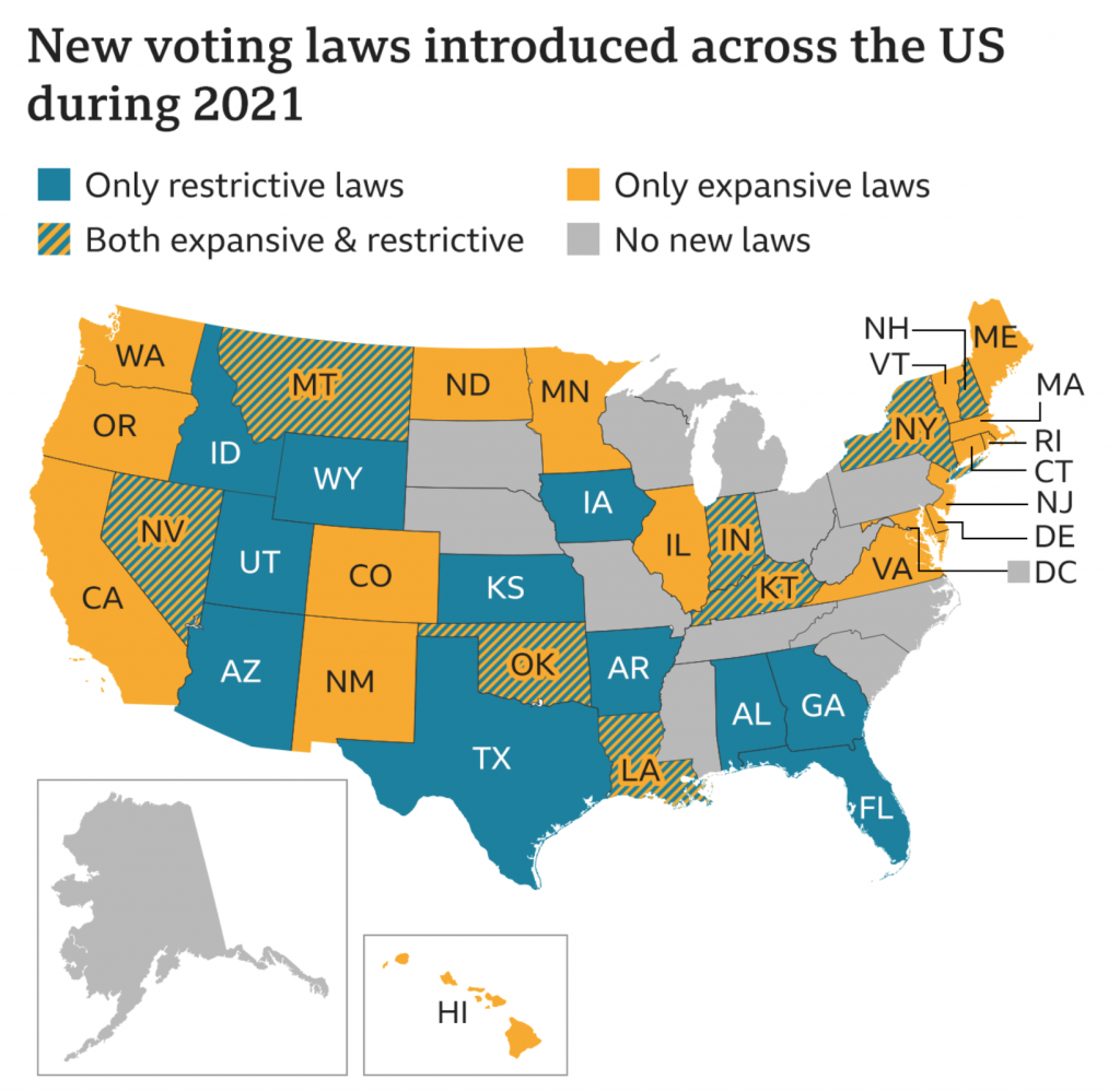
Normally I would expect to see a third colour for the overlap. Imagine we had red and blue, a blend of those colours like purple would often be a designer’s choice. Here, however, we have a hatched pattern with alternating stripes of orange and blue. You don’t see this done very often, and so I just wanted to highlight it.
I don’t know if this marks a new stylistic design direction by the BBC graphics department. Here I don’t necessarily love the pattern itself, the colours make it difficult to read the text—though the designers outlined said text, so points for that.
But I’ll be curious to see if I, well, see more of this in coming weeks and months.
Credit for the piece goes to the BBC graphics department.
Leave a Reply
You must be logged in to post a comment.