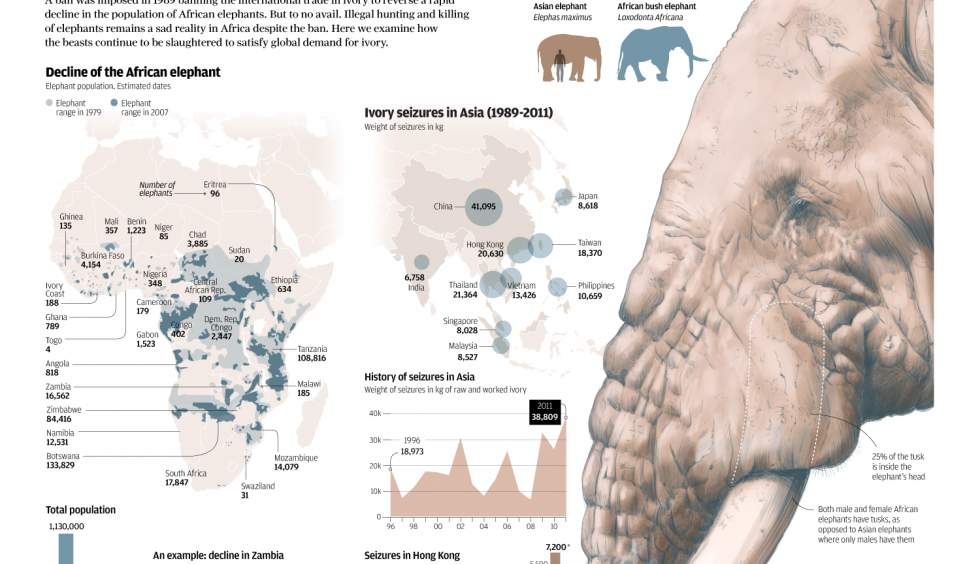
The South China Morning Post had a fantastic infographic detailing the hunting of elephants for their ivory. Despite bans to make such hunting illegal, the problem continues and is worsening because of the Asian trade in ivory.
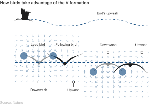
We all know of the Flying V, the great hockey plan developed in the 1990s—wait, no, wrong one. I meant to talk about birds flying in formation. Because science is finally allowing us to understand the mechanisms of how and why birds fly in these tight, v-shaped formations. In a BBC article reporting on the most recent findings, the graphics team included a diagram showing just how formation flying works.
How the Flying V works
Credit for the piece goes to the BBC graphics department.
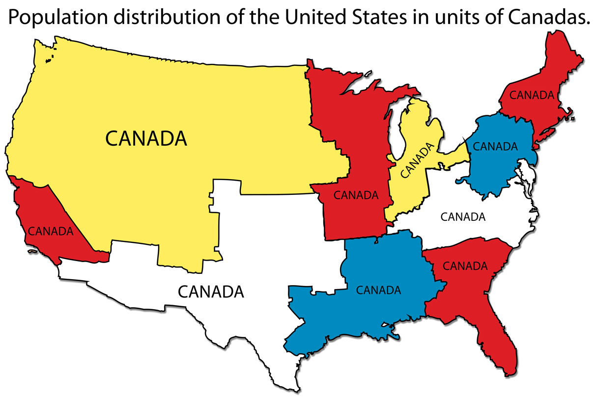
Last week I was asked what was the population of Canada. I first said 30 million. I then figured that was too small so I said more like 50–60 million. Turns out I was closer to being correct the first time. A Google search that cites the World Bank among its sources listed the population as nearer to 35 million. But what does that mean?
Over at I Love Charts, the United States was broken down into units shaped by the size of the population of Canada. Roughly, the United States = 10 Canadas.
How many Canadas in the US?
Credit for the piece goes to an unknown individual. If discovered, I would appreciate being informed.
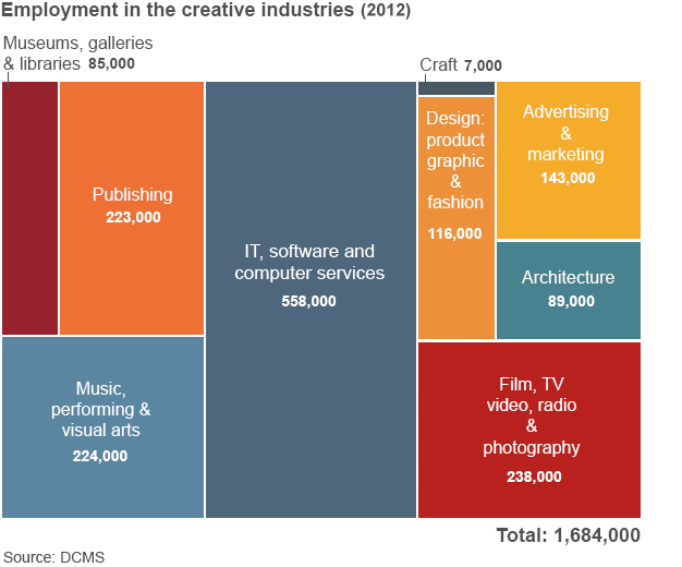
Yesterday the BBC published an article about the success of the United Kingdom’s creative industry especially given the not-so-successful economy of the last few years. Unfortunately, the article included the tree map below.
A not so necessary tree map
The problems are a few. First, a tree map is usually looking at two variables. One is encoded through the size of the block and the other often its colour. Here, colour means nothing. So you are instead looking at only the size of the blocks. Basically, the same type of information that would be clearer to differentiate if this were a bar chart.
Second, a tree map has a hierarchy of placement. In other words, even if you cannot tell how much larger one block is from another—we all know we are not so great at comparing areas—you know which block is larger than the other by their arrangement in the map. Here we see no such hierarchy. The smallest block follows the largest block, which itself follows three other blocks.
Now that arrangement would be acceptable if the tree map were nested. That is to say if the different industries were grouped within like industries. Because then you would order those nested blocks. But that is also something not happening here.
All in all, this would have been a lot more effective of a chart if it had simply been made into a bar chart.
Credit for the piece goes to the BBC graphics department.
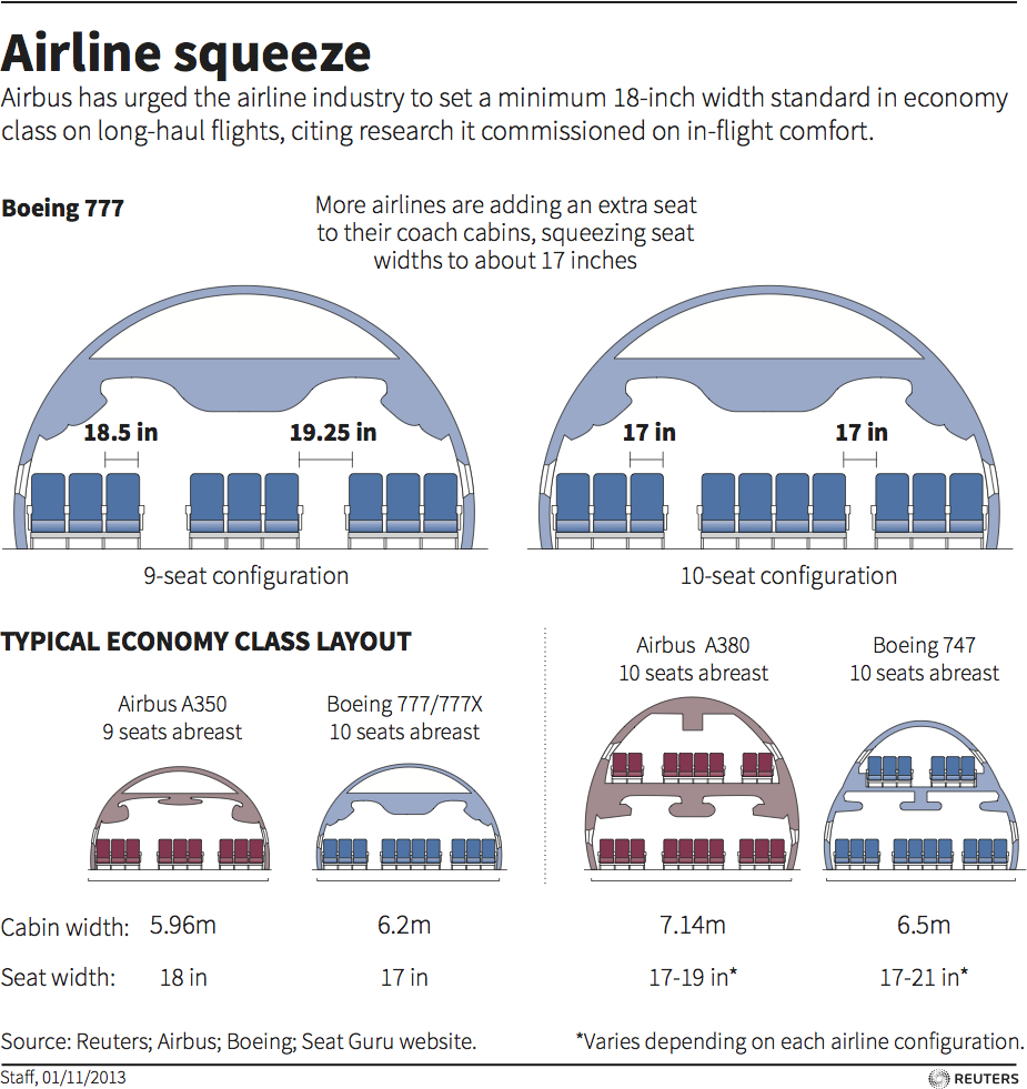
Airlines want to make flights as profitable as possible. And that largely entails cramming as many people into those hollow cylinders called aircraft fuselages as possible. This is despite advice from Airbus, one of the world’s largest aircraft manufacturers to set a minimum seat width standard greater than US airlines are investigating. Thomson Reuters does a nice job illustrating the changes in this graphic.
Airline seat sizes
Credit for the piece goes to the Thomson Reuters graphics staff.
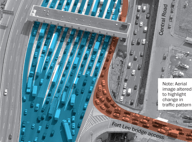
A lot of people have been talking about Bridgegate, a scandal in New Jersey wherein the governor’s office allegedly abused its power to negatively impact the residents of Fort Lee, New Jersey. What actually happened for a few days this past fall? The Washington Post uses aerial photography and illustration to diagram the normal traffic flow and the flow during the traffic “study”.
Traffic on the George Washington Bridge
Credit for the piece goes to the Washington Post graphics department.
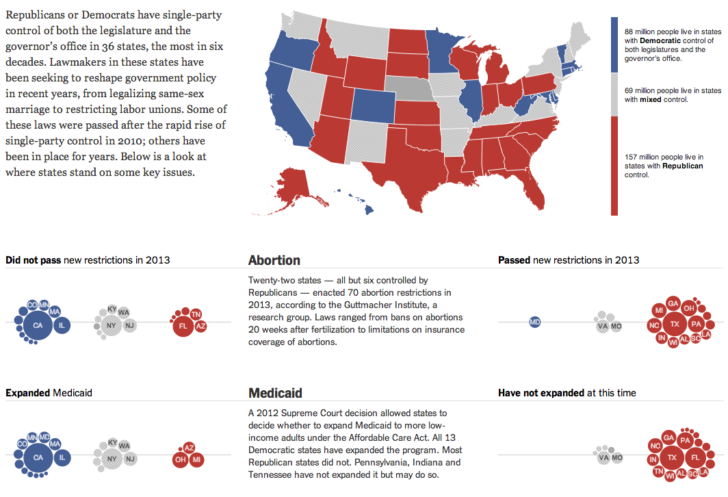
Today’s piece comes from this past weekend. The New York Times looked at how states fell on various politically sensitive issues, e.g. abortion and same-sex marriage, depending upon the political control of the executive and legislative functions of each state. In other words, which states have passed legislation to regulate abortion or same-sex marriage? States controlled by Democrats, or states controlled by Republicans?
The overall lay of the land and two issues
I am not terribly keen on the clustered bubbles. Showing the population of each state could be handled better by different chart forms. But to a certain extent in this piece, the population figures are secondary to the aggregate of people living in blue or red states. And in that case, while you cannot easily visualise the number of people living in the aggregates, you can at least get a feel for which group is home to more people.
Credit for the piece goes to Haeyoun Park, Jeremy Ashkenas, and Mike Bostock.
For those of you unaware of the shenanigans going on in New Jersey, this won’t make any sense. But for those that are, it sucks to be a commuter in North Jersey as this comic map illustrates.
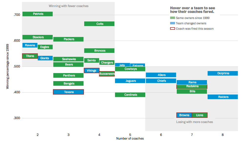
This weekend we will have yet more football. My preferred team, the Philadelphia Eagles, is of course now out of contention. But more than likely, the coach’s job is secure for at least another year. As we have already seen, however, that cannot be said for other coaches. So the Washington Post looked at ownership’s role in the success of their respective team by the hiring and firing of coaches.
Coaches in the NFL
Credit for the piece goes to Bonnie Berkowitz, Darla Cameron, Dan Keating, and Rick Maese.
Okay, we have all watched enough science fiction to know that there is not one future, but multiple futures. All options existing as if taken in parallel universes. Today’s post is not about a specific graphic, but rather a short article in the New York Times examining data visualisation. Through the work of Eric Rodenbeck of Stamen Design, it looks at how we may need to change our current vocabulary, if you will. Naturally the article offers a counterpoint nearer the end about how older forms are still useful.