Answering Some More Questions About Ukraine

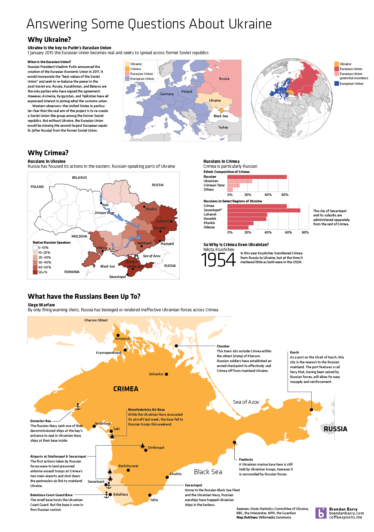
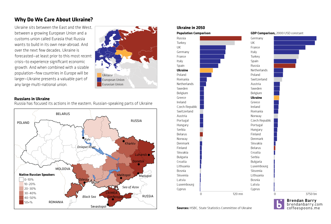
So Ukraine is even more of a mess and in less than a week’s time, the Crimean people will vote in a referendum on whether they want to remain a part of Ukraine or rejoin Russia. This graphic of mine is an attempt to answer some questions—though hardly all I wanted—about Ukraine, Crimea, and about what the Russians have been doing. (To be fair, the Russians still don’t admit that the troops and soldiers are theirs. But really, I mean come on, we all know they are.)

Why Crimea?
Why Crimea?

Ukraine

A lot of things happened in Ukraine this past weekend. Unfortunately, I was not able to quite capture all of the events and the background I wanted. So, until I do, this quick graphic will have to suffice. In short, Ukraine is a big European country, one of the largest prizes remaining in the struggle between the West/EU and the East/Russia. I took a look at the forecast for Ukraine in 2050 for both number of people and the size of the economy and put that in the context of Europe. And while forecasting that far out clearly has risks, one can see with a grain of salt that Ukraine is set to be an important middle-sized European nation.

A quick introduction to Ukraine

But, like I said, there is more to do. I just was not able to do it.

The Swiss and Immigration

Last week, the Swiss people narrowly rejected the principle of freedom of movement. This principles serves as one of the foundations of the European Union. And while Switzerland does not belong to the EU, its economy benefits from access to the single market via that freedom of movement principle. That may be an oversimplification perhaps, but it provides some context to the consternation in Europe over the Swiss people rejecting the principle.

This graphic is not particularly complex. It is a choropleth of the vote results. However, it does show that the vote was not unanimous. Rather it was contained to the cantons (analogous to states in the US) more rural in character, i.e. less urban places like Geneva.

Swiss immigration vote results

Credit for the piece goes to the BBC graphics department.

Explaining What is Going on in Ukraine

Not “the Ukraine” as it is (admittedly) fun to do in pop-culture references to Seinfeld. This comes from the Washington Post and the article tries to show that the protests in Kiev are not necessarily a vast majority against the government. Certainly the opposition is strong, but there is also a very strong pro-government movement. Why? Because in the broadest of senses, Ukraine is where the West, i.e. the European Union, meets the East, i.e. Russia.

A divided Ukraine
A divided Ukraine

Credit for putting this all together goes to Max Fisher. Credit for each of the original graphics is to their respective designers whom I cannot identify.

Mapping Economic Mobility

This piece from the Washington Post examines the idea of economic mobility. That is, what is the likelihood that children born and raised in an impoverished family will surpass their parents’ standard of living.

Economic mobility
Economic mobility

Credit for the piece goes to Darla Cameron and Ted Mellnik.

Smart Banking Cards

As I noted in my Friday post, I spent last week in Lithuania for work. That same Friday night, I had a conversation with a few coworkers over dinner and a beer about credit cards. They teased me that for all of America’s technological advances and advantages, even in Lithuania they were using more secure forms of bank card payment: chipped cards. And that story seems a perfect segue into today’s post from the Washington Post.

Through a combination of charts, maps, and illustrations—a cropping of which is shown below—the Post details the advantages of using microchipped cards in preventing certain types of fraud. Additionally, because of the integration of the visuals with the written explanations, text can be used to provide longer anecdotes to explain exceptions and outliers when and where necessary.

Cropping of microchipped card story

Credit for the piece goes to Todd Lindeman.

Views on Gay Marriage Around the World

If you have been living under a rock, Sochi, Russia is hosting the winter Olympics this year. A year in which the Russian government passed legislation banning not same-sex relationships but advocacy for said relationships. Several countries, including the United States, take issue with the legislation. But this graphic from the National Journal hints that in order to reverse such barriers to same-sex marriages, the United States and like-minded societies have a long way to go to convince not just Russians, but many other societies across the world.

Views on gay marriage

Credit for the piece goes to Brian McGill.

Holiday Tidings…of War

I’ve been away for over two weeks on holiday. So to spread good cheer to all, today I am sharing an image from a series of maps the BBC put together to try and explain the civil war in South Sudan.

Ethnic groups and tribes of South Sudan

Credit for the piece goes to BBC graphics department.

Internet Explorer in South Korea

The Washington Post had an interesting story on how, in South Korea, Internet Explorer dominates the internet. I won’t spoil the story, it is kind of fascinating and worth a short read, but the accompanying graphics show just how dominant the browser has been in a leading technology country in Asia.

Internet Explorer in South Korea

Credit for the piece goes to Richard Johnson.

Differences in Population Growth and What That Means

Last week the Washington Post published a piece that looked at demographic trends and their impact on the world’s different geographies. None of the graphics in the piece are revolutionary, nor are they mind-blowing fantasticness. They are, however, clear and concise and show the story. In fact the overall piece is well done because while the graphics show the trends and trajectories, the written word above and below the graphics explains some of the underlying causes and potential effects. In short, a solid piece that is worth the read.

Population growth centred in Sub-Saharan Africa

Credit for the piece goes to Max Fisher.