Armistice Day

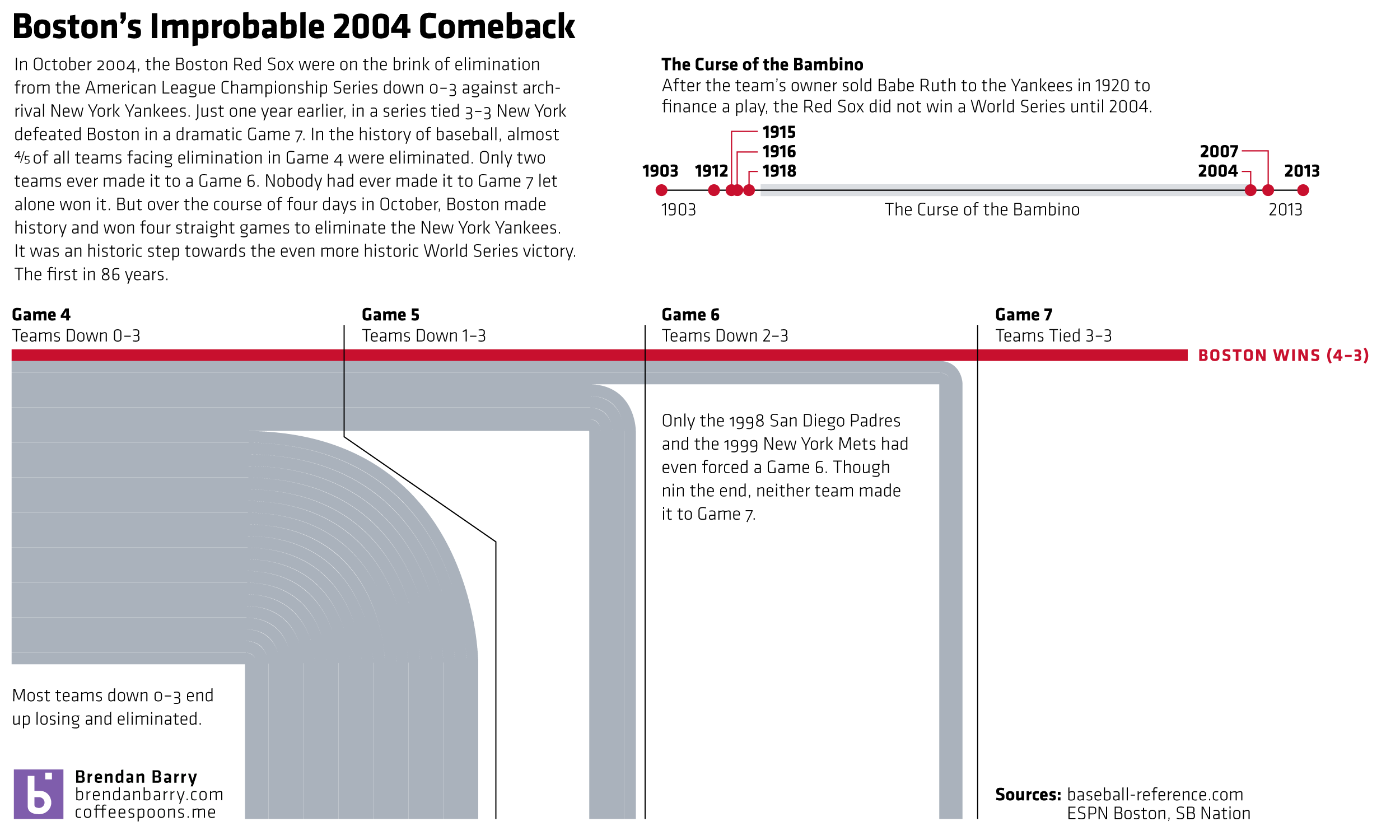
Today is Armistice Day, alternately known as Remembrance Day or Veterans Day. Originally the date remembered the armistice that ended World War I (hence those two names). The war ended at the 11th hour on the 11th day of the 11th month. But in the preceding years, millions of Europeans died along with just over a hundred thousand Americans. (We entered the war quite late.) This had a dramatic impact on the populations of European countries. In the United Kingdom, the Office of National Statistics put together a page for Remembrance Day 2014 that looks at four charts detailing the changes to the UK’s population structure. Suffice it to say there were lasting effects.

UK population in 1921

Credit for the piece goes to the ONS graphics department.

The Fall of the Berlin Wall

Yesterday marked the 25th anniversary of the fall of the Berlin Wall. But with the reunification of Germany a year later, has the former East Germany been able to catch up to what was West Germany? The Economist looks at the results in this graphic and the answer is yes. And no.

East vs. West. 1989 vs. 2013.

Credit for the piece goes to the Economist’s graphics department.

New New Orleans

Nine years after the impact of Hurricane Katrina upon the city of New Orleans, the touristy French Quarter has returned according to an article in the National Journal. However, the new New Orleans beyond the French Quarter is different from what once was. In short, the new city is whiter and more Hispanic.

And while this graphic that accompanies the piece does a fair job of showing the title, a snapshot, I wish the focus would have been on more of a comparison between pre and post, old and new.

A quick look at New Orleans

I would not necessarily chosen the same components to tell the story. But, I really want to see more direct comparisons of even just the 2000 census and data to that of 2010.

Credit for the piece goes to the National Journal’s graphics department.

University Graduation

Today’s piece from the Washington Post examines the graduation rates of 100 people who enrolled at university in 2002. The data set tracked them over the following six years.

Who dropped out vs who finished?

Credit for the piece goes to Darla Cameron.

The Libyan Revolution’s Results So Far…

The Libyan Revolution that removed Gaddafi from power was just over three years ago. Unfortunately, if we have not learned by now, the process of building Western-like liberal democracies is clearly a messy process. Because Libya is far from it as this graphic from the Economist shows.

So how's that revolution working out for you?
So how’s that revolution working out for you?

Credit for the piece goes to P.J.W. and L.P.

Eli Manning’s Brother and the Record Books

Two weekends ago Eli Manning’s brother accomplished a feat in American football. And it was not in Indianapolis. The New York Times documented the story in an interactive article.

I have no idea who most of these people are…

In fairness, I generally do not follow American football. I am largely a one sport person and that sport is baseball. But since the active baseball season is over—baseball ends when the Red Sox stop playing—I figured the rest of you might enjoy this.

Credit for the piece goes to Gregor Aisch and Kevin Quealy.

Calories and Consumption

National Geographic recently published a piece designed and built for them by Fathom Information Group. Content-wise, they looked at the historic consumption of food by several different countries. What do individual food groups contribute to the overall nutritional breakdown? For the piece this basically amounted to morphing donut charts. I get the reference, but do not care for the result.

Instead more interesting is the second main view of the piece: meat consumption. Using stacked line charts, National Geographic explores changes in consumption patterns over the last 50 years. Some countries change a bit, others not so much. But as always the best examples are called out with an explanation as to why the changes. Mexico, for example, has the story about slashes in government subsidies and economic problems as to a decline in pork consumption.

Mexican pork consumption

Clearly I still have issues with the data visualisation. I would much rather see the selected view isolate the selection off the common baseline. But a nice touch is the small multiples from the country selection mechanism appearing to the right.

Credit for the piece goes to Fathom Information Design.

Chinese Nuclear Submarine Navy

This weekend the Wall Street Journal published an article that combined my interest in data visualisation with my interest in naval ships. The article looks at the growth of the Chinese nuclear submarine programme. And alongside the article are maps, charts, illustrations, and a narrated video that support the written word.

Choke points for the Chinese navy

Credit for the piece goes to Alberto Cervantes and the Wall Street Journal’s graphics department.

Some of the Best Baseball I’ve Ever Seen

Was ten years ago this time in October. Boston was on their way to winning their World Series in 86 years. But to get there, they had to go through the New York Yankees. And they did it in dramatic fashion, winning a riveting best-of-seven series. Why riveting? Because it had never been done before. (Nor since, actually, but that’s not included in the graphic.)

The improbable comeback