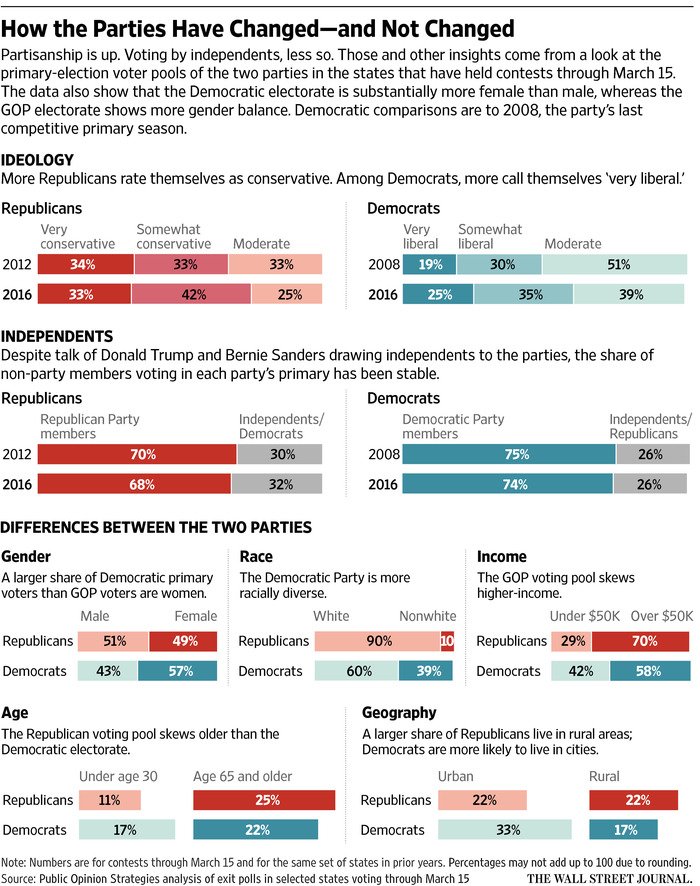
Alas, these are not the fun type of parties, but the two main US political ones. But overall, before some more primary and caucus votes tomorrow, I think this Wall Street Journal piece nicely captures and illustrates the changes in and the differences between the bases of the two parties.
The makeup of the two large US political parties
Credit for the piece goes to the Wall Street Journal graphics department.
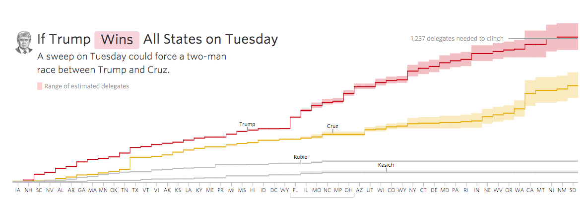
Well, here’s another Tuesday so here’s another election day. Today we have an animation from the Wall Street Journal that succinctly shows how important this evening’s results are for Donald Trump. If he wins everything, his path to the nomination is easier, if not, it is doable, but far from easy. That sounds obvious, but it contrasts with other candidates who, if they lose, no longer have a chance.
Trump’s route to the nomination
The really nice bit about this piece, however, is that at the end you can make your own predictions for each state and see how that impacts the delegate count.
Credit for the piece goes to Randy Yeip and Stuart Thompson.
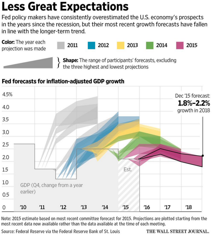
Organisations that forecast things are not often inclined to go back and review their forecasts against the actual results. So that makes today’s post from the Wall Street Journal fascinating. They reviewed the Federal Reserve’s forecasts for US GDP growth against the actual growth. And it turns out the Fed consistently overestimated US growth.
US Federal Reserve Forecasts
From a design standpoint, what makes this piece interesting is how they presented the range of forecasts. After all, it would otherwise become a plot of squiggly spaghetti lines. Instead, they used colour to group each projection set. A smart idea. Plus a nice literary allusion. I mean if you like Dickens.
Credit for the piece goes to the Wall Street Journal graphics department.
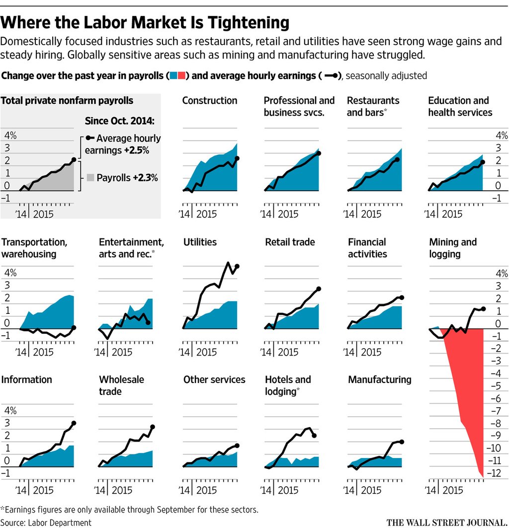
You should all know by now I am sucker for small multiples. So it should come as no surprise to you that I liked this piece from Friday from the Wall Street Journal. It looks at payroll and wage growth across various sectors in the American economy. And what I really like is that they took a space at the beginning to explain how to read the charts.
Mining, not so good
Credit for the piece goes to the Wall Street Journal graphics department.
As New Horizons will soon begin sending back photographs of Pluto, Charon, and the other moons, I figured it would be a good to share a Wall Street Journal piece that looks at the other photographed bodies of the system.
Field Guide to the Solar System
Credit for the piece goes to Jon Keegan, Chris Canipe, and Alberto Cervantes.
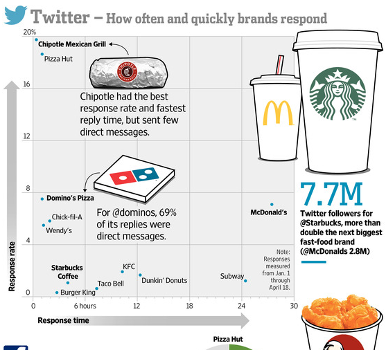
Let’s aim for something a bit lighter today. Well, lighter in all things but calories, perhaps. Today we have a piece from the Wall Street Journal that looks at the social media presence of several large fast food brands. Overall, it has a few too many gimmicky illustrations for my comfort. But, the strength of the piece is that it does look at some real data, e.g. plotted Twitter response rates, and then contextualises it with appropriate callouts.
Who cares about your tweets?
The illustrations are killing me, though.
Credit for the piece goes to Marcelo Prince and Carlos A. Tovar.
Today we look at the cross section of a coaxial cable. It fits into a story from the Wall Street Journal about how some media providers want to be classified as a different type of company so they can gain access to different parts—mainly less congested—of your data service.
Cutting into the coaxial cable
Credit for the piece goes to the Wall Street Journal’s graphics department.
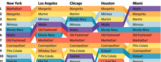
Now that it’s Friday, it’s time for happy hour drinks. Well, maybe not quite yet. Let’s get through the workday first. But over at the Wall Street Journal, together with Yep, they looked at which cocktails are most popular in eight cities based on Yelp reviews. They do note that the metric is not perfect as people will complain about Manhattan in a New York bar review but not actually drink a Manhattan. But, honestly, when you’ve had a few cocktails, the maths are bound to get a bit fuzzy.
A cropping for the top ten in half the cities
Of course the next step would be to make an interactive version with links to recipes. And from the visualisation side, you could cluster the data by drink bases. And no, the martini should not start with vodka. Come on, people, you use gin.
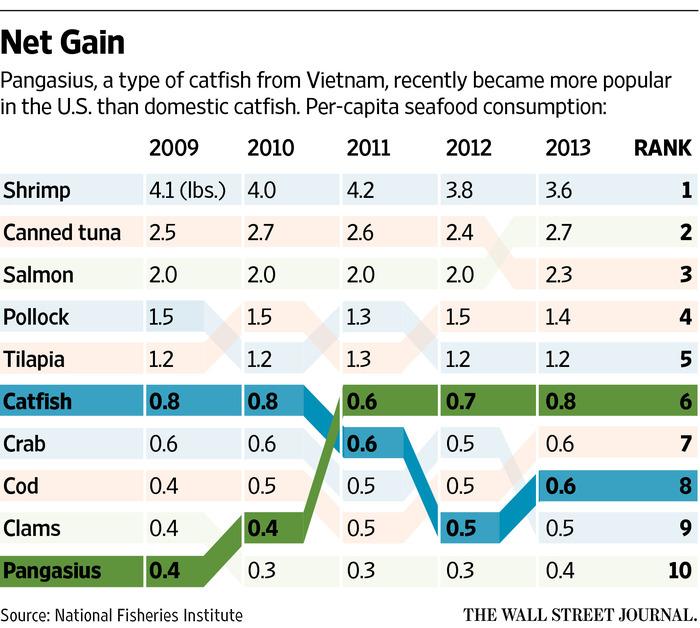
Pardon the title, but don’t mind the graphic. Sometimes ranking charts tell the story well. The Wall Street Journal has a graphic supporting a larger article about fish. And while I am not sure that I understand the reason behind the colours, they do make it quite clear that catfish is not nearly as popular as it used to be. Unfortunately the article is behind the pay wall, but broadly it appears that the fish on the move here might be banned from the US.
Fish ranking
Credit for the piece goes to the Wall Street Journal graphics department.