Tag: infographic
-
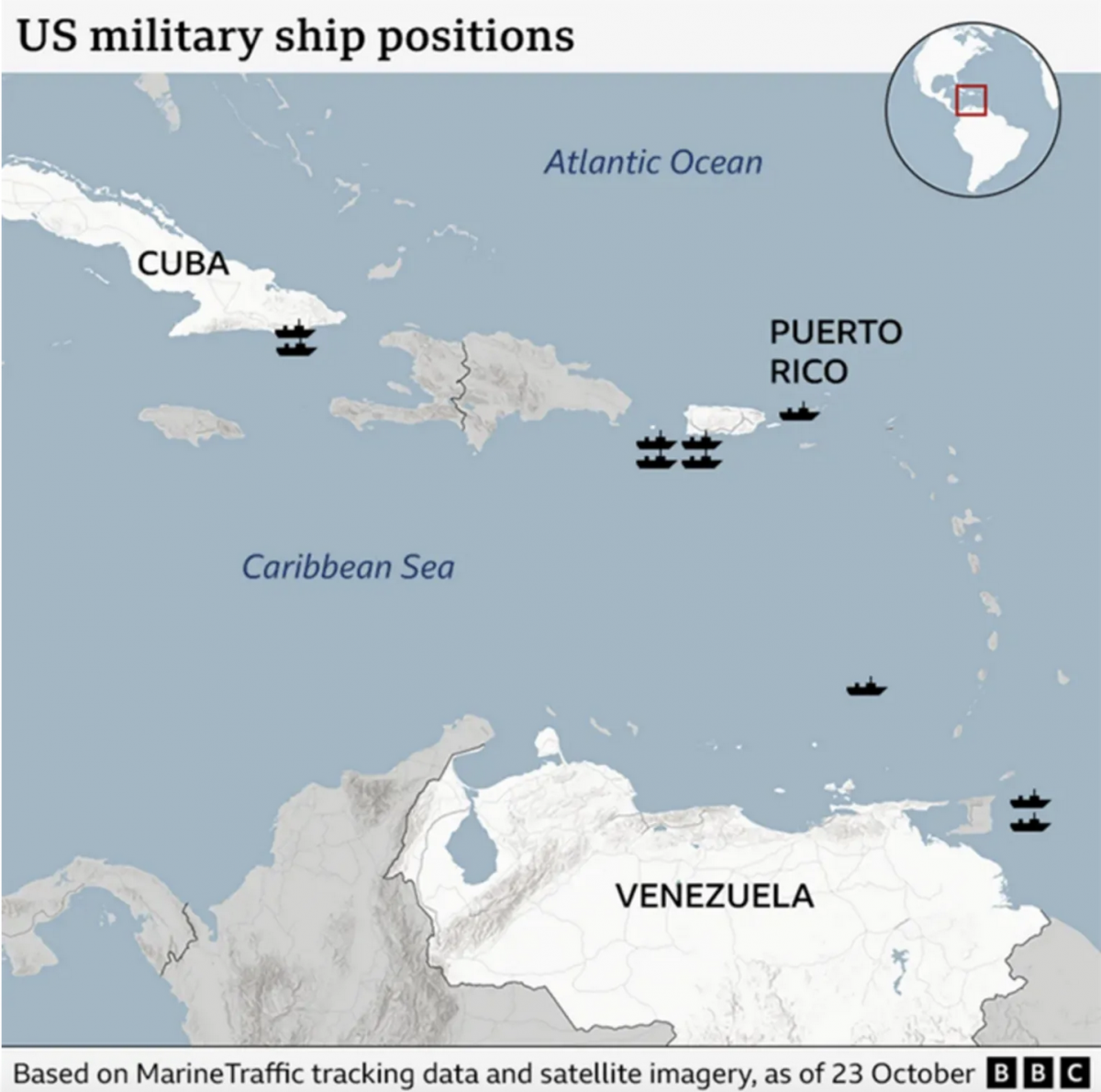
Where’s the Tin Can?
After a few weeks away for some much needed R&R, I returned to Philadelphia and began catching up on the news I missed over the last few weeks. (I generally try to make a point and stay away from news, social media, e-mail, &c.) One story I see still active is the US threatening Venezuela.…
-
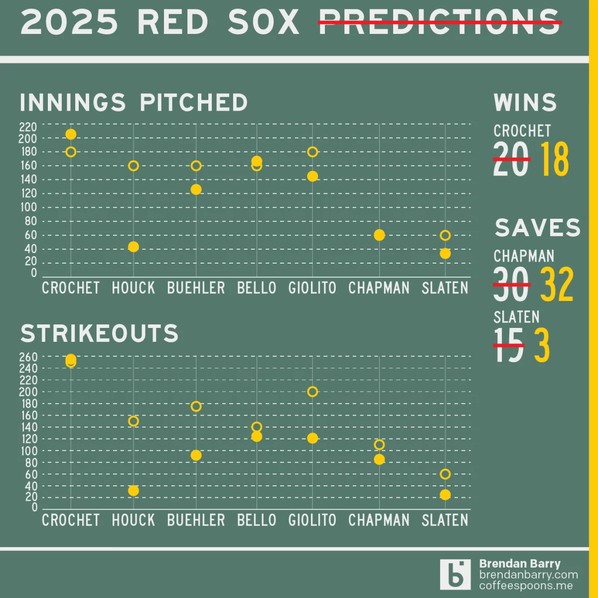
Revisiting My 2025 Red Sox Predictions
Back in March I posted my predictions for the 2025 Boston Red Sox on my social media feeds. I chose not to post it here, because the images had no real data visualisation and the only real information graphic was my prediction of the playoffs via a bracket. I did, however, write about how the…
-
Pick Your Pizza
As many longtime readers know, I lived in Chicago for eight years. I probably had Chicago-style pizza fewer than eight times in my life. I grew up in the Philadelphia suburbs and for the last nine years I have lived in central Philadelphia, where pizza is very much a different thing. And in my life…
-
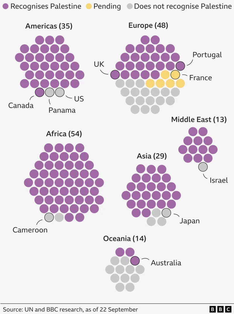
Palestine. The Newest Country in the World?
One of the most debated questions one could ask at pub trivia: How many countries are there in the world? To start, the question cannot be answered completely. What is a country? What is a state? What is a nation? Define recognition. Whose definition? When I worked at Euromonitor International I had to edit a…
-
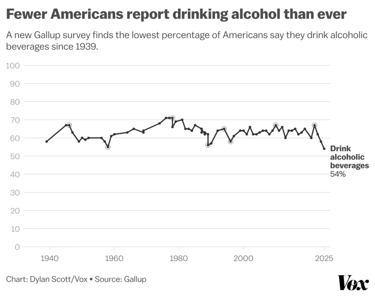
Pour One Out—For Your Liver
Last month Vox published an article about the trend in America wherein people are drinking less alcohol. They cited a Gallup poll conducted since 1939 and which reported only 54% of Americans reported partaking in America’s national tipple—except for that brief dalliance with Prohibition—making this the least-drinking society since, well, at least 1939. Vox charted…
-
Baby You Can Drive My Car
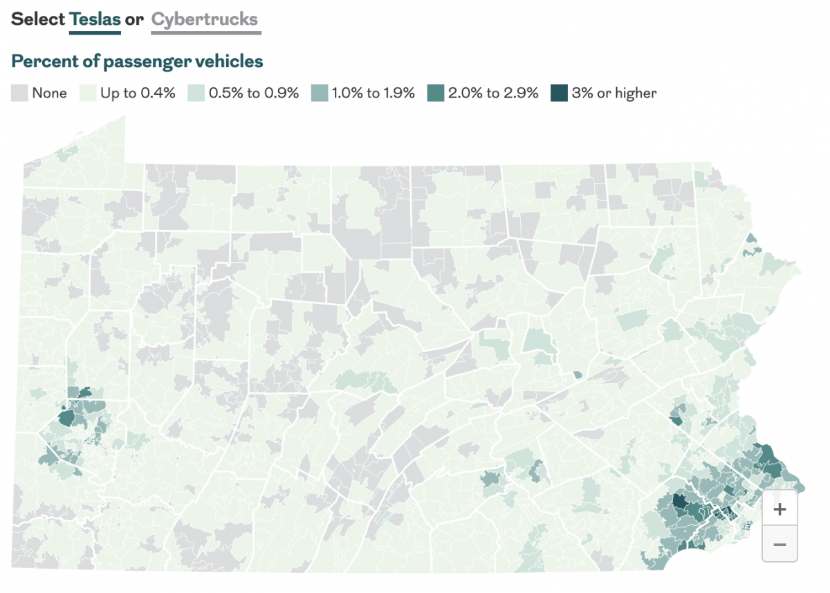
Last month the Philadelphia Inquirer published an article examining the geographic distribution of Teslas and Cybertrucks and whether or not your car is liberal or conservative. The interactive graphics focused more on a sortable table, which allowed you to find your vehicle type. The sortable list offers users option by brand and body type—not model.…
-
Sudan Side by Side
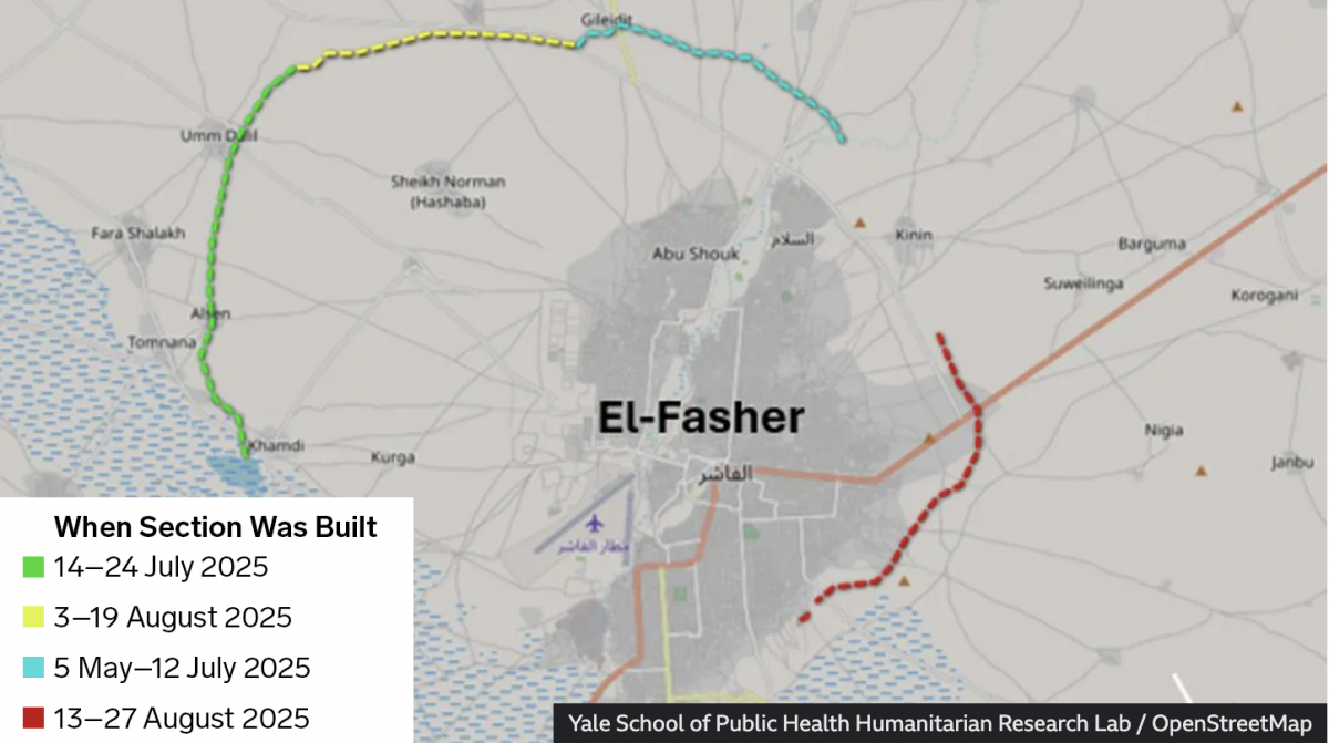
Conflict—a brutal civil war—continues unabated in Sudan. In the country’s west opposition forces have laid siege to the city of el-Fasher for over a year now. And a recent BBC News article provided readers recent satellite imagery showing the devastation within the city and, most interestingly, one of the most ancient of mankind’s tactics in…
-
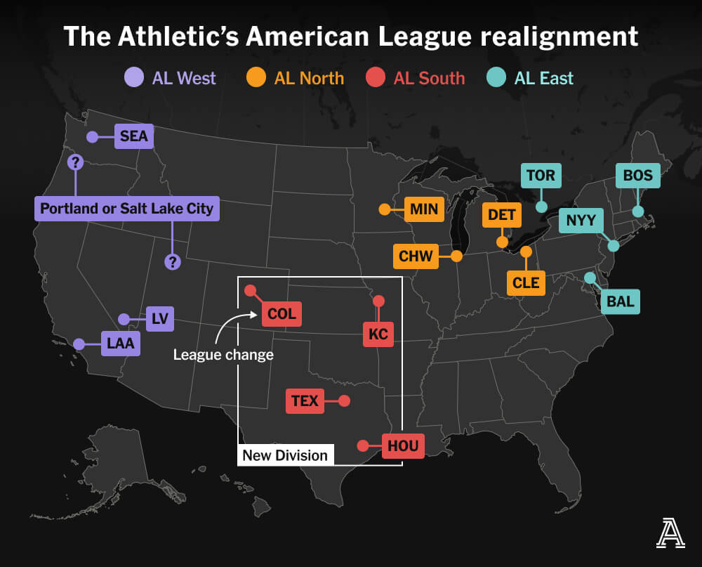
MLB’s Realignment
Last weekend, Major League Baseball Commissioner Rob Manfred created a mild furore when he discussed the sport’s looming expansion and how it would likely prompt a geographic realignment. I am old enough I still recall baseball’s two leagues—the American and National—organised into only two divisions—East and West. In the early 1990s, baseball expanded and created…
-
You Get a War, You Get a War, You Get a War…
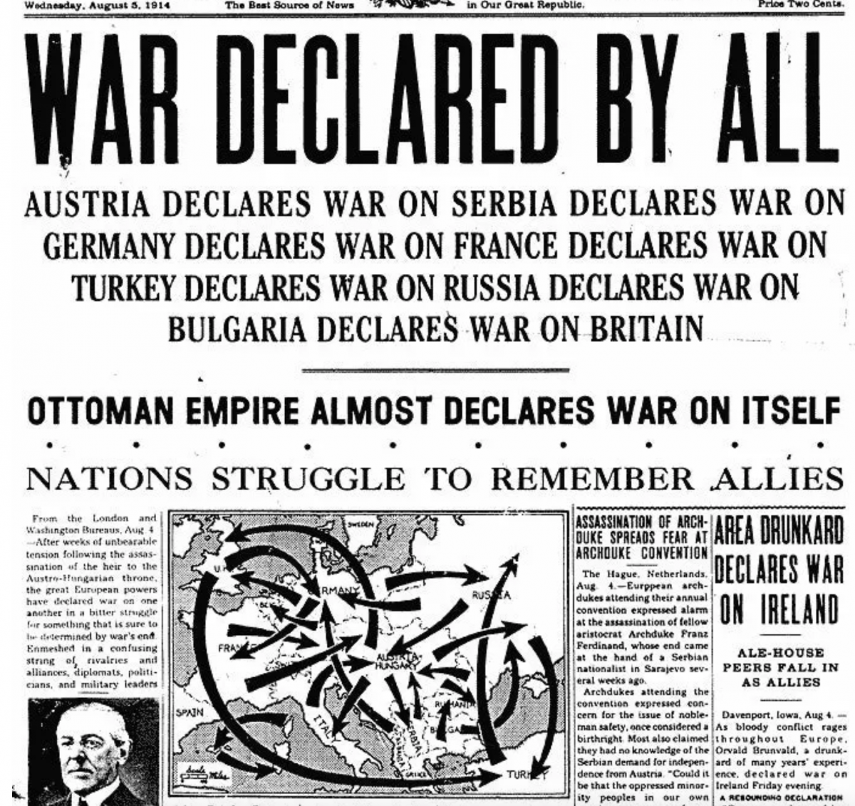
A good friend of mine sent me this graphic earlier this week. The World Wars fascinate me—to be fair, most history does, and yes, that even includes the obligatory guy thinking of the Roman Empire—and I can see on my bookshelf as I type this post up my books on naval warships from World War…
-
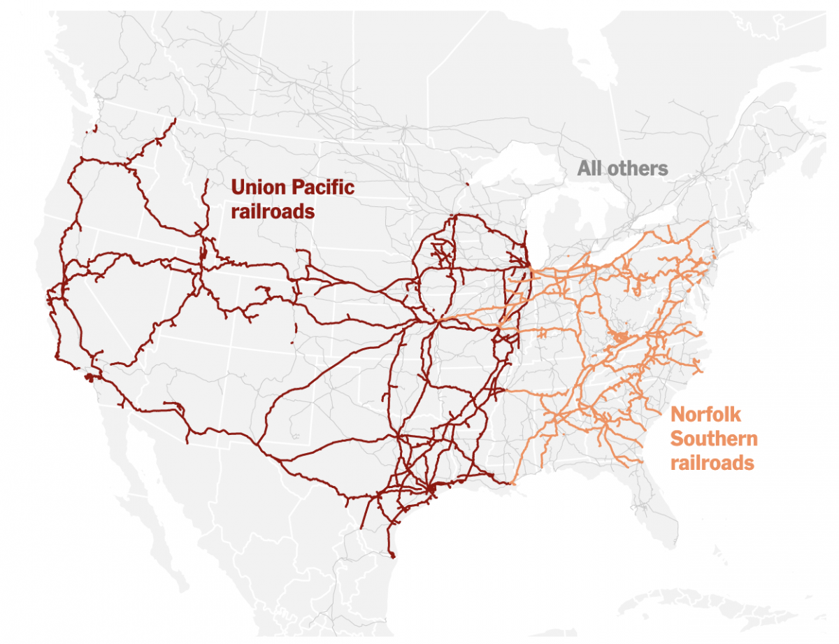
Truly Transcontinental
Last week two of the largest American freight railroads agreed to a merger with Union Pacific purchasing Norfolk Southern. Railroads have long played an important part in the history of the United States, from the Second Industrial Revolution to settlement and development of the West, through to the time zones in which we live and…