
For those of you in the Northeast, you already know you are dealing with a little bit of snow. Thankfully the BBC put the amount received in Boston in context…of dogs.
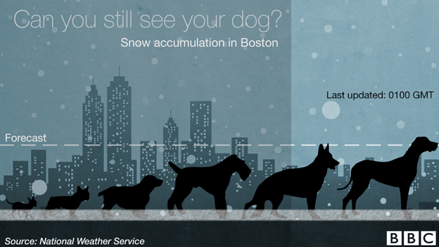
Credit for the piece goes to the BBC graphics department.
For those of you in the Northeast, you already know you are dealing with a little bit of snow. Thankfully the BBC put the amount received in Boston in context…of dogs.
Credit for the piece goes to the BBC graphics department.
For those of you don’t know, there is an Islamist group operating in northeastern Nigeria. And they have been for a few years now. But recently they devastated a town and killed somewhere between 150 and 2000 people. Now they have taken to kidnapping Cameroonians, who live across the border, but whose government has been taking military action against Boko Haram. In this context, the BBC put together a map that shows the spread and scale of Boko Haram attacks in Nigeria.
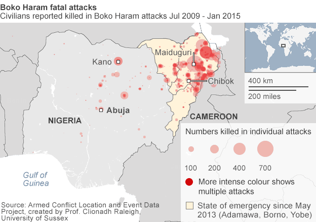
Credit for the piece goes to the BBC graphics department.
Today is Friday, so let’s take it a bit easy. You have heard of Philae and the comet landing. But we also know now that it bounced upon landing. But could you do any better? The BBC produced this game to let you try to do just that.
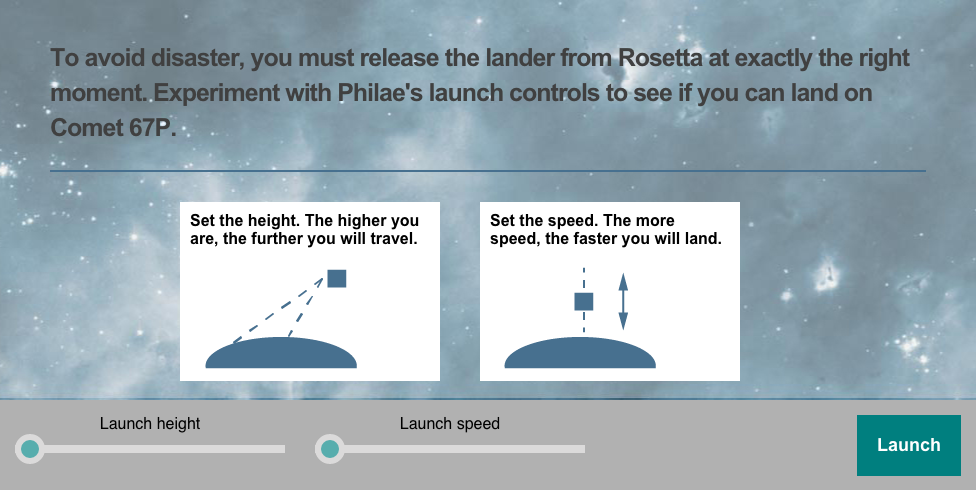
Credit for the piece goes to the BBC graphics department.
Ebola is still a thing. And it is still getting worse. Or rather, with deaths and/or infections in both Europe and the United States, we are finally paying a bit more attention to it. We have no cure for Ebola, but we still need to treat people for symptoms, but most importantly we need to isolate those infected from the broader population. How and where is this done? Thankfully, the BBC put together an interactive graphic illustrating a typical treatment centre. Each main section is a clickable link that explains the functions and key points to the different areas.
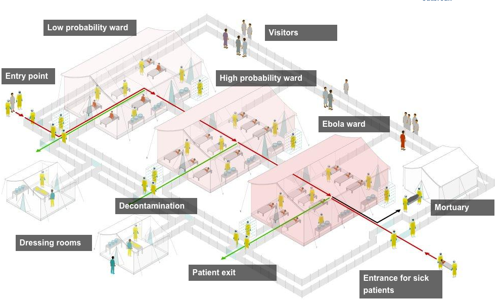
The article goes on to explain in more detail what is going on and does so with photos and also a map of treatment centres in Guinea, Sierra Leone, and Liberia.
Credit for the piece goes to the BBC graphics department.
By the time this post goes live, Scotland will have already been voting on independence for several hours. At the time of writing this post, it appears more a toss-up than anything else. And so today we highlight a piece that is a little bit different than what I might normally cover. Here we have a long-form piece from the BBC that looks at how different trends across recent decades of history have converged at this point in time to give Scotland this choice.
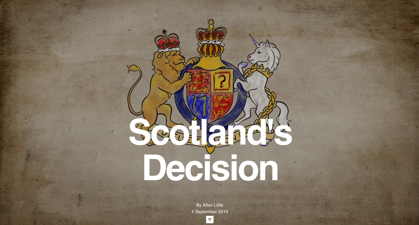
Credit for the overall piece goes to Allan Little, Paul Kerley, Finlo Rohler, Jonathan Duffy, Kevin McKeown, Darren McLarkey, Marcelo Zanni, Sally Morales, Giles Wilson, and the opening illustration (the screen capture) is Cognitive Media.
Last week, the Swiss people narrowly rejected the principle of freedom of movement. This principles serves as one of the foundations of the European Union. And while Switzerland does not belong to the EU, its economy benefits from access to the single market via that freedom of movement principle. That may be an oversimplification perhaps, but it provides some context to the consternation in Europe over the Swiss people rejecting the principle.
This graphic is not particularly complex. It is a choropleth of the vote results. However, it does show that the vote was not unanimous. Rather it was contained to the cantons (analogous to states in the US) more rural in character, i.e. less urban places like Geneva.
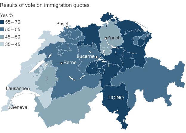
Credit for the piece goes to the BBC graphics department.
…before any of this occurs. Courtesy of BBC Future and the New Year, welcome to the end of the world as we know it. (Sing it, Michael.)
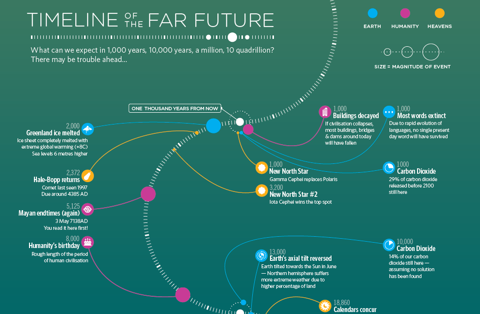
Credit for the piece goes to iibStudio.
We all know of the Flying V, the great hockey plan developed in the 1990s—wait, no, wrong one. I meant to talk about birds flying in formation. Because science is finally allowing us to understand the mechanisms of how and why birds fly in these tight, v-shaped formations. In a BBC article reporting on the most recent findings, the graphics team included a diagram showing just how formation flying works.
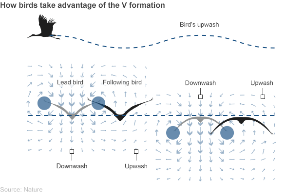
Credit for the piece goes to the BBC graphics department.
Yesterday the BBC published an article about the success of the United Kingdom’s creative industry especially given the not-so-successful economy of the last few years. Unfortunately, the article included the tree map below.
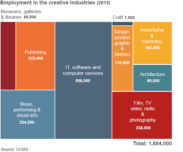
The problems are a few. First, a tree map is usually looking at two variables. One is encoded through the size of the block and the other often its colour. Here, colour means nothing. So you are instead looking at only the size of the blocks. Basically, the same type of information that would be clearer to differentiate if this were a bar chart.
Second, a tree map has a hierarchy of placement. In other words, even if you cannot tell how much larger one block is from another—we all know we are not so great at comparing areas—you know which block is larger than the other by their arrangement in the map. Here we see no such hierarchy. The smallest block follows the largest block, which itself follows three other blocks.
Now that arrangement would be acceptable if the tree map were nested. That is to say if the different industries were grouped within like industries. Because then you would order those nested blocks. But that is also something not happening here.
All in all, this would have been a lot more effective of a chart if it had simply been made into a bar chart.
Credit for the piece goes to the BBC graphics department.
I’ve been away for over two weeks on holiday. So to spread good cheer to all, today I am sharing an image from a series of maps the BBC put together to try and explain the civil war in South Sudan.
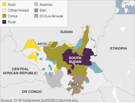
Credit for the piece goes to BBC graphics department.