For those of you don’t know, there is an Islamist group operating in northeastern Nigeria. And they have been for a few years now. But recently they devastated a town and killed somewhere between 150 and 2000 people. Now they have taken to kidnapping Cameroonians, who live across the border, but whose government has been taking military action against Boko Haram. In this context, the BBC put together a map that shows the spread and scale of Boko Haram attacks in Nigeria.
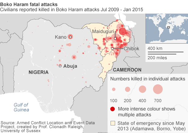
Credit for the piece goes to the BBC graphics department.
Author: Brendan Barry
I am a graphic designer who focuses on information design. My day job? Well, they asked me not to say. But to be clear, this blog is my something I do on my own time and does not represent the views of…my employers. I think what I can say is that given my interest in information design—be it in the shape of clear charts, maps, diagrams, or wayfinding systems—I am fortunate that my day job focuses on data visualisation. Outside of work, I try to stay busy with personal design work. Away from the world of design, I have become an amateur genealogist and family historian. You will sometimes see that area of work bleed into my posts.
View all posts by Brendan Barry