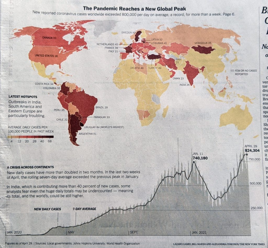
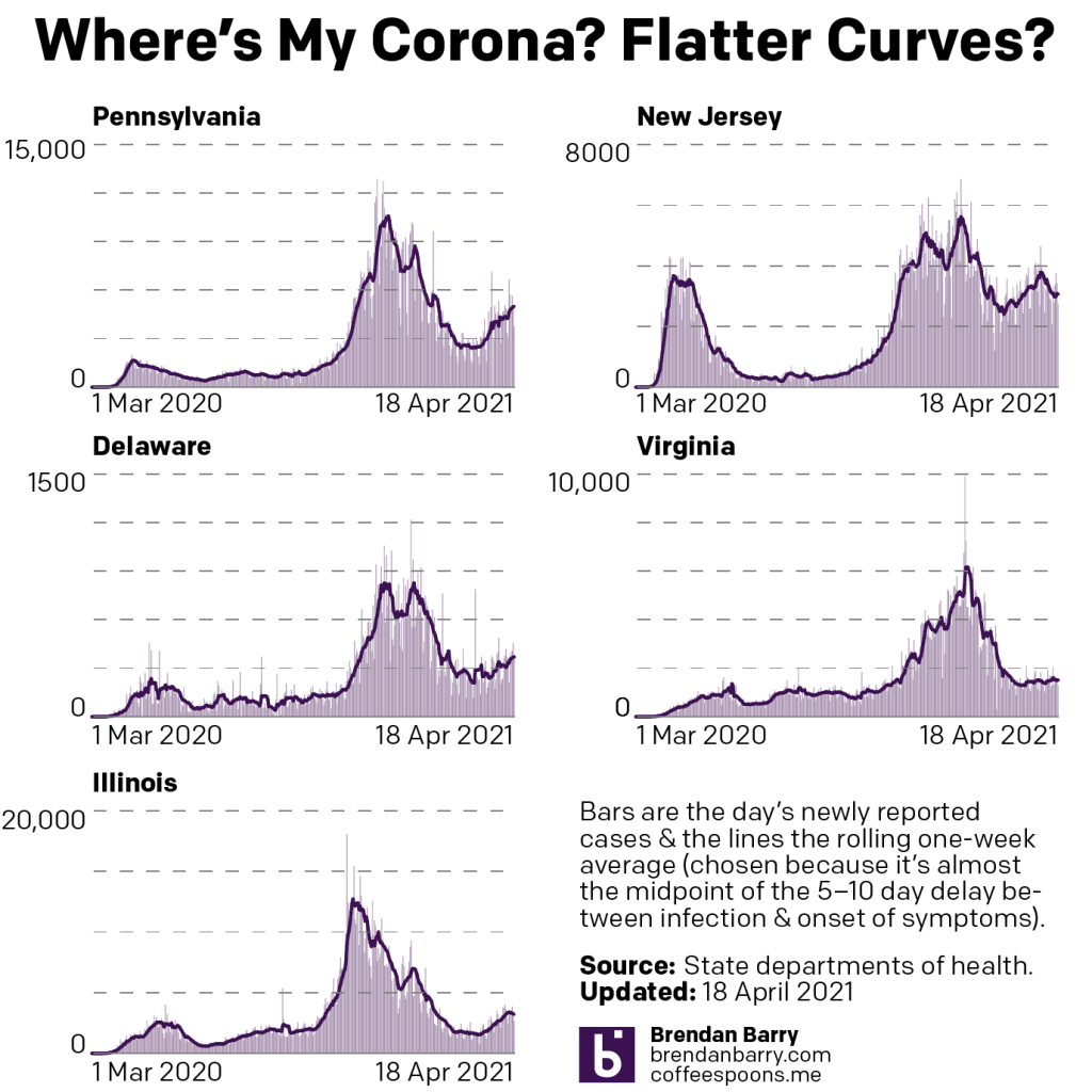
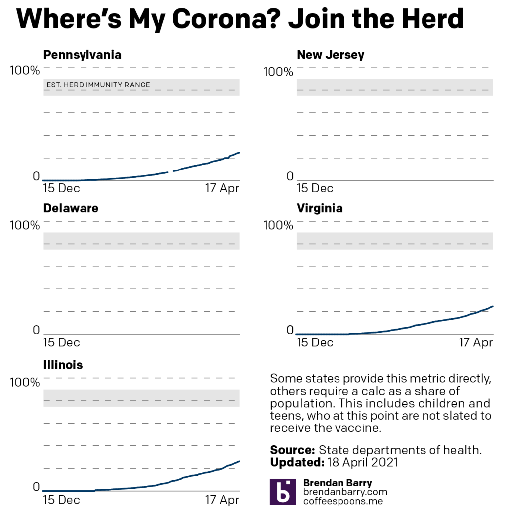
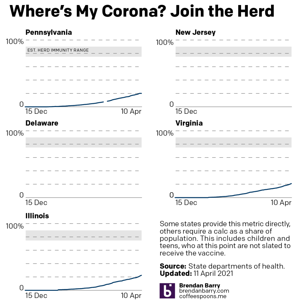
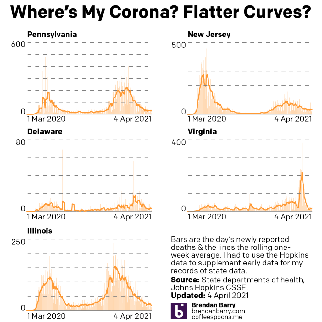
I’ve been trying to limit the amount of Covid-19 visualisations I’ve been covering. But on Sunday this image landed at my front door, above the fold on page 1 of the New York Times. And it dovetails nicely with our story about the pandemic’s impact on Pennsylvania, New Jersey, Delaware, Virginia, and Illinois.
Some not so great looking numbers across the globe.
For most of 2020, the United States was one of the worst hit countries as the pandemic raged out of control. Since January 2021, however, the United States has slowly been coming to grips with the virus and the pandemic. Its rate is now solidly middle of the pack—no longer is America first.
And if you compare the chart at the bottom to those that I’ve been producing, you can clearly see how our five states have really gotten this most recent wave under control to the point of declining rates of new cases.
However, you’ve probably heard the horror stories from India and Brazil where things are not so great. It’s countries like those that account for the continual increase in new cases at a global level.
Credit for the piece goes to Lazaro Gamio, Bill Marsh, and Alexandria Symonds.
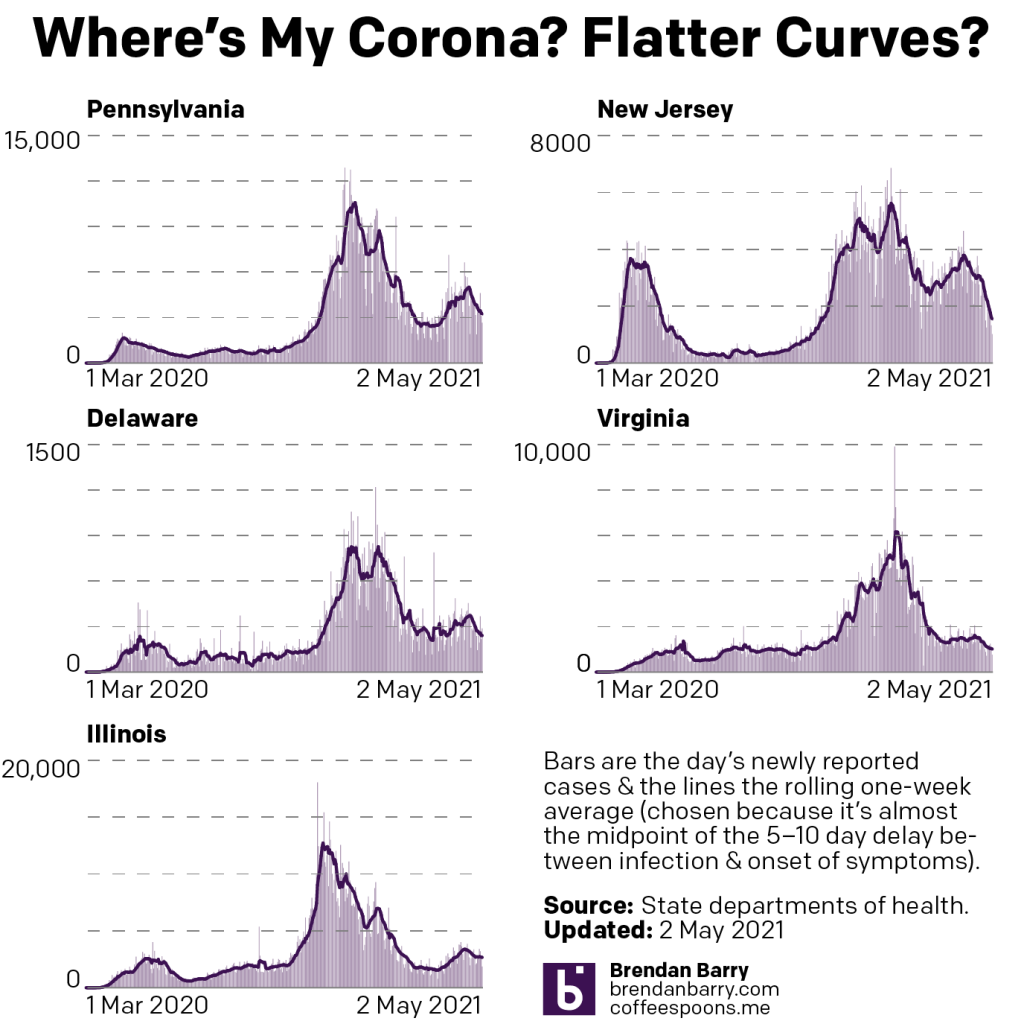
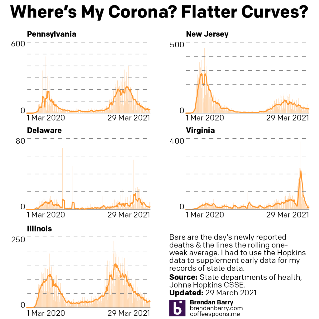
I didn’t write a post last Monday, but this Monday I am. A few things may have changed in the Covid situation. The most important is that we may have finally seen the peak of this current wave’s surge of new cases.
For the last few weeks we’ve seen cases rising in the five states. Only New Jersey of late had shown a return to declining cases. About the middle of the week before last, we began to see those numbers decline. And so in this past week we did begin to see cases decline in all five states.
New case curves for PA, NJ, DE, VA, & IL.
The thing to watch this week will be that at the very end of last week, new cases ticked up slightly for two or three days in a number of states. It could be an aberrant one-off, but with full vaccinations still well below herd immunity and cases still at high levels, it isn’t difficult to imagine a scenario where the virus begins to surge once again.
Deaths on the other hand, they continue to climb. We aren’t seeing massive increases, instead these are largely marginal. But they are increasing all the same.
Death curves for PA, NJ, DE, VA, & IL.
Encouragingly, if cases can continue to decline, deaths will begin to fall. As a lagging indicator, they will be the last metric we see decline. Consequently, it’s a question of when, not if, deaths begin to decline. On Saturday, we did see a small decline in deaths, but one day before the weekend is insufficient to determine whether or not we’ve seen the inflection point, after which deaths would fall.
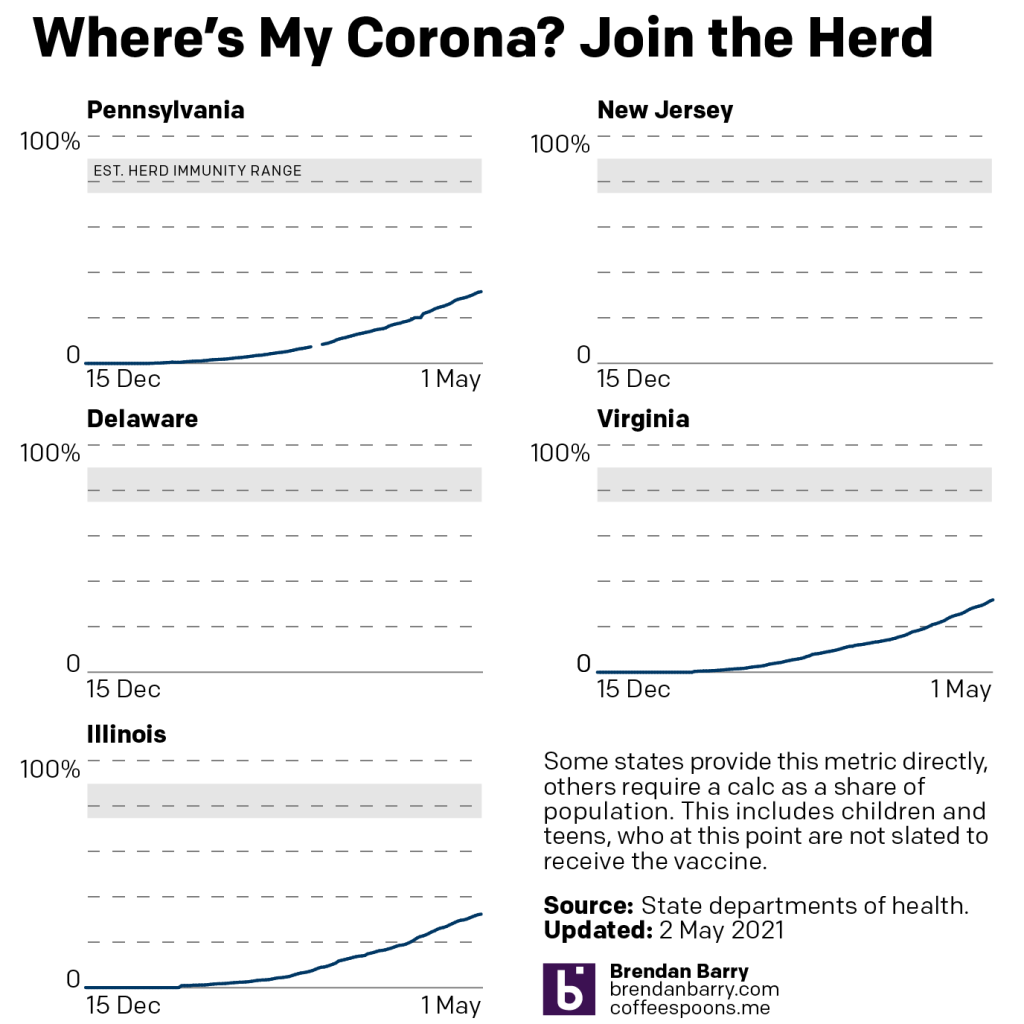
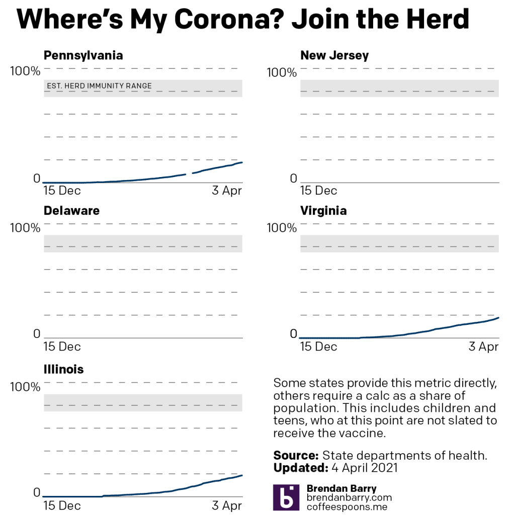
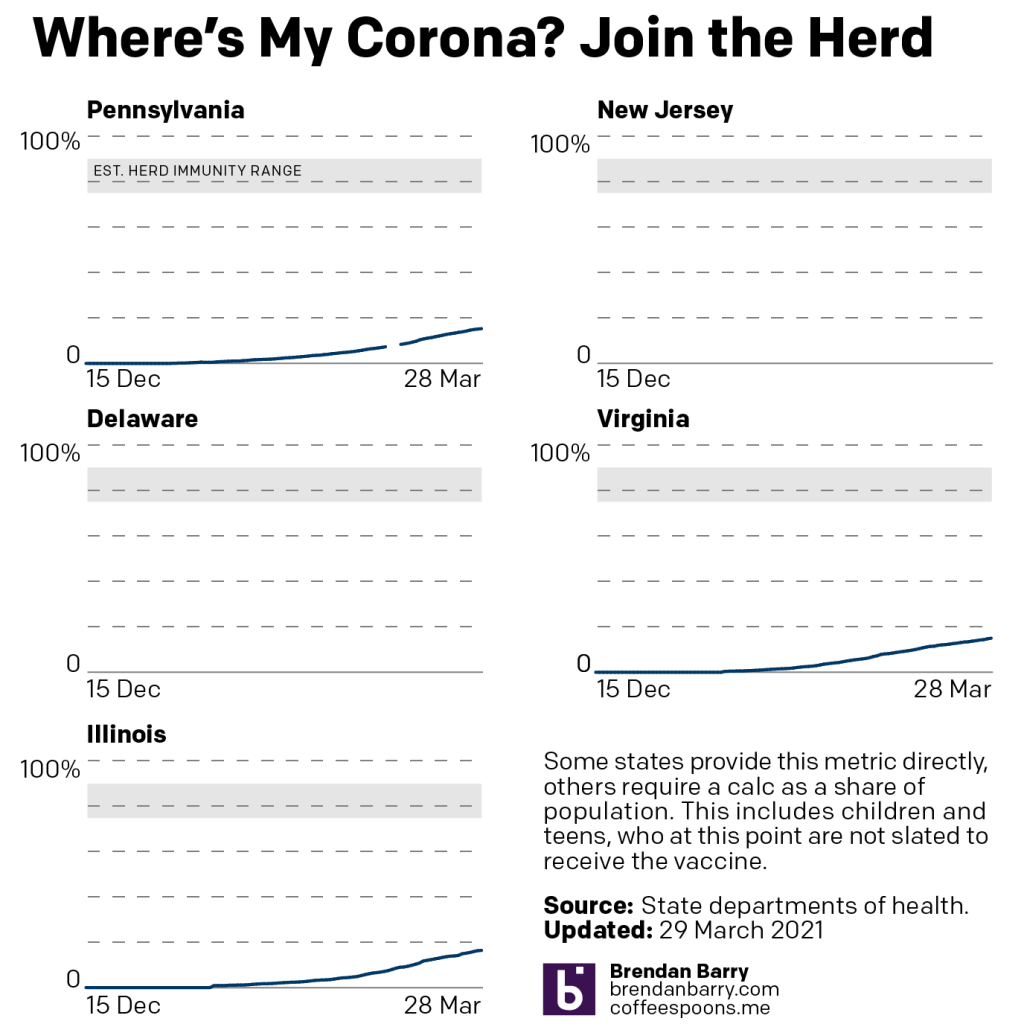
Vaccinations remain a broad set of positive news. All three states are now reporting just over 30% of their populations as fully vaccinated. However, the rate of vaccination has begun to slow.
Total vaccination curves for PA, NJ, DE, VA, & IL.
And that worries me and the professionals, because we are still far from herd immunity. Until we reach that level, the virus can easily spread among unvaccinated populations. The charts above don’t show the decline, as they look only at the total, cumulative effect. But the charts that I see make it quite clear the decline over the last week or two.
Moral of that story is, if you haven’t been vaccinated yet, please register to do so or visit a location that allows walk-up vaccinations.
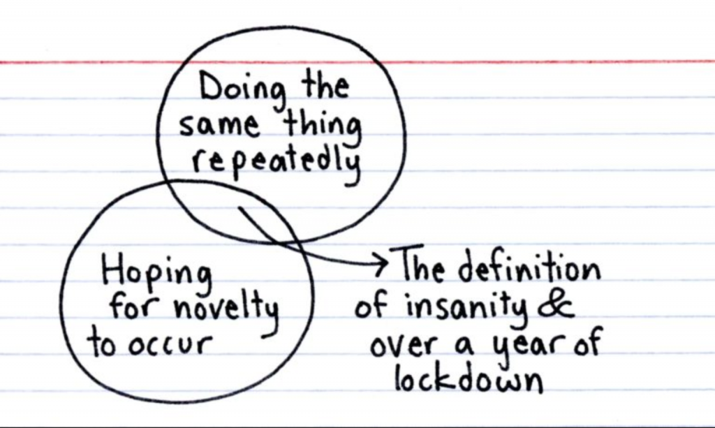
Last Friday I received my first dose of the vaccine, and I’m not counting the time until my second and then the two weeks after that to let it take effect. It also means that the repetition can begin to end.
Over at Indexed, Jessica Hagy sort of captured that idea in a single Venn diagram.
Yesterday I wrote my usual weekly piece about the progress of the Covid-19 pandemic in the five states I cover. At the end I discussed the progress of vaccinations and how Pennsylvania, Virginia, and Illinois all sit around 25% fully vaccinated. Of course, I leave my write-up at that. But not everyone does.
This past weekend, the New York Times published an article looking at the correlation between Biden–Trump support and rates of vaccination. Perhaps I should not be surprised this kind of piece exists, let alone the premise.
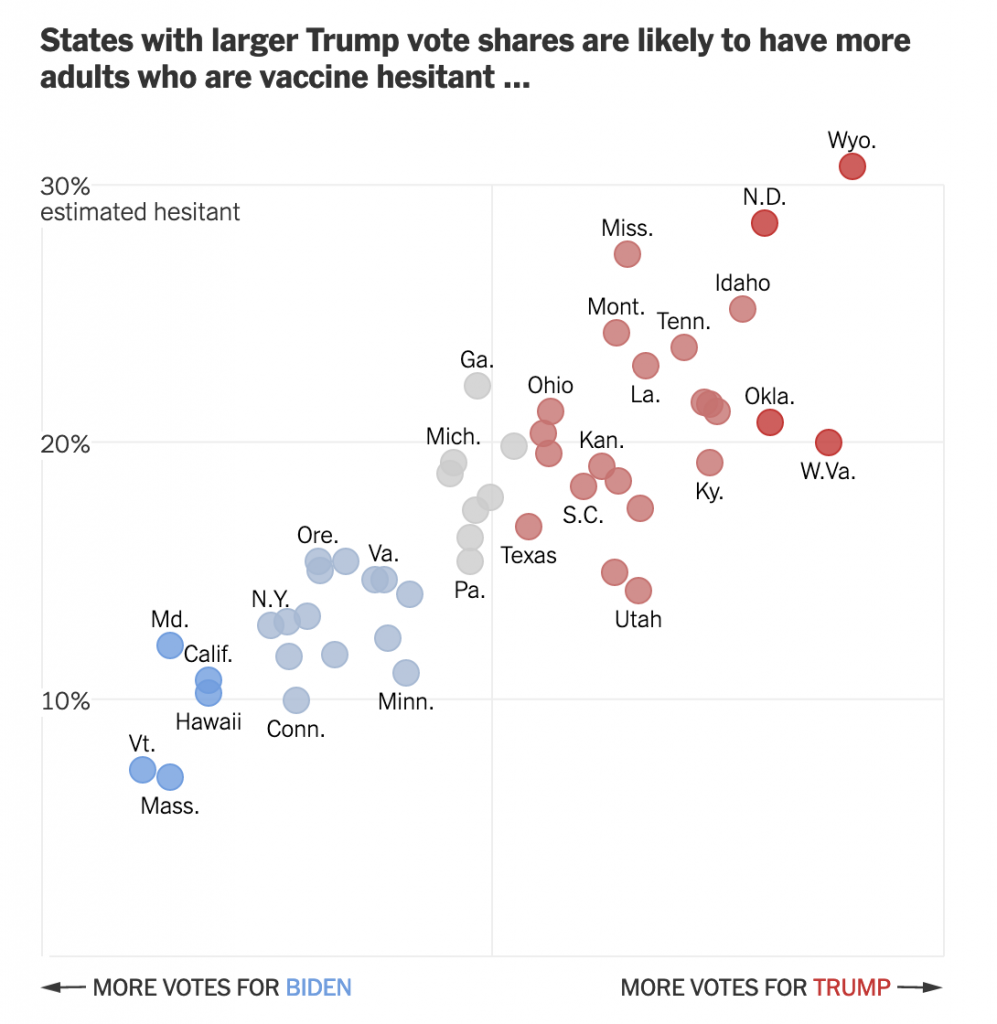
From a design standpoint, the piece makes use of a number of different formats: bars, lines, choropleth maps, and scatter plots. I want to talk about the latter in this piece. The article begins with two side by side scatter plots, this being the first.
Hesitancy rates compared to the election results
The header ends in an ellipsis, but that makes sense because the next graphic, which I’ll get to shortly, continues the sentence. But let’s look at the rest of the plot.
Starting with the x-axis, we have a fairly simple plot here: votes for the candidates. But note that there is no scale. The header provides the necessary definition of being a share of the vote, but the lack of minimum and maximum makes an accurate assessment a bit tricky. We can’t even be certain that the scales are consistent. If you recall our choropleth maps from the other day, the scale of the orange was inconsistent with the scale of the blue-greys. Though, given this is produced by the Times, I would give them the benefit of the doubt.
Furthermore, we have five different colours. I presume that the darkest blues and reds represent the greatest share. But without a scale let alone a legend, it’s difficult to say for certain. The grey is presumably in the mixed/nearly even bin, again similar to what I described in the first post about choropleths from my recent string.
Finally, if we look at the y-axis, we see a few interesting decisions. The first? The placement of the axis labels. Typically we would see the labelling on the outside of the plot, but here, it’s all aligned on the inside of the plot. Intriguingly, the designers took care for the placement—or have their paragraph/character styles well set—as the text interrupts the axis and grid lines, i.e. the text does not interfere with the grey lines.
The second? Wyoming. I don’t always think that every single chart needs to have all the outliers within the bounds of the plot. I’ve definitely taken the same approach and so I won’t criticise it, but I wonder what the chart would have looked like if the maximum had been 35% and the grid lines were set at intervals of 5%. The tradeoff is likely increased difficulty in labelling the dots. And that too is a decision I’ve made.
Third, the lack of a zero. I feel fairly comfortable assuming the bottom of the y-axis is zero. But I would have gone ahead and labelled it all the same, especially because of how the minimum value for the axis is handled in the next graphic.
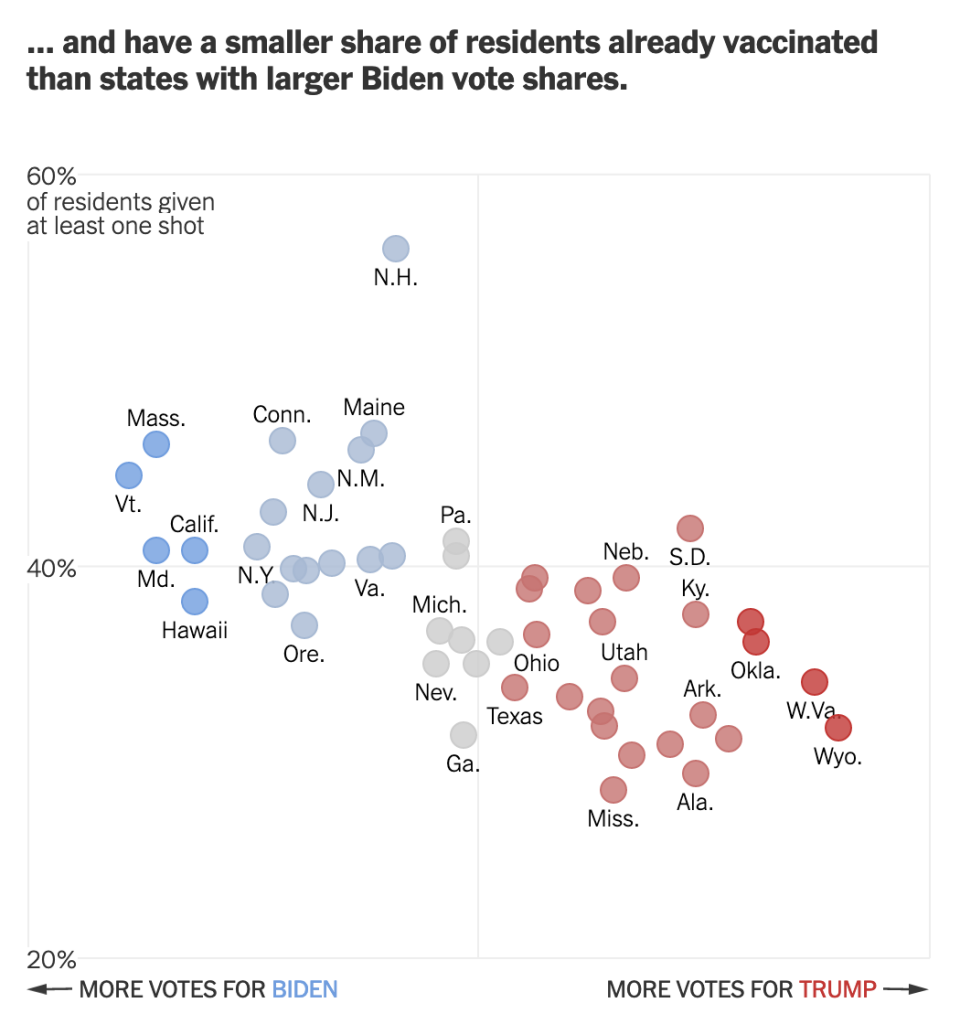
Speaking of, moving on to the second graphic we can see the ellipsis completes the sentence.
Vaccination rates compared to the election results
We otherwise run into similar issues. Again, there is a lack of labelling on the x-axis. This makes it difficult to assess whether we are looking at the same scale. I am fairly certain we are, because when I overlap the graphics I can see that the two extremes, Wyoming and Vermont, look to exist on the same places on the axis.
We also still see the same issues for the y-axis. This time the axis represents vaccination rates. I wish this graphic made a little clearer the distinction between partial and full vaccination rates. Partial is good, but full vaccination is what really matters. And while this chart shows Pennsylvania, for example, at over 40% vaccinated, that’s misleading. Full vaccination is 15 points lower, at about 25%. And that’s the number that needs to be up in the 75% range for herd immunity.
But back to the labelling, here the minimum value, 20%, is labelled. I can’t really understand the rationale for labelling the one chart but not the other. It’s clearly not a spacing issue.
I have some concerns about the numbers chosen for the minimum and maximum values of the y-axis. However, towards the middle of the article, this basic construct is used to build a small multiples matrix looking at all 50 states and their rates of vaccination. More on that in a moment.
My last point about this graphic is on the super picky side. Look at the letter g in “of residents given”. It gets clipped. You can still largely read it as a g, but I noticed it. Not sure why it’s happening, though.
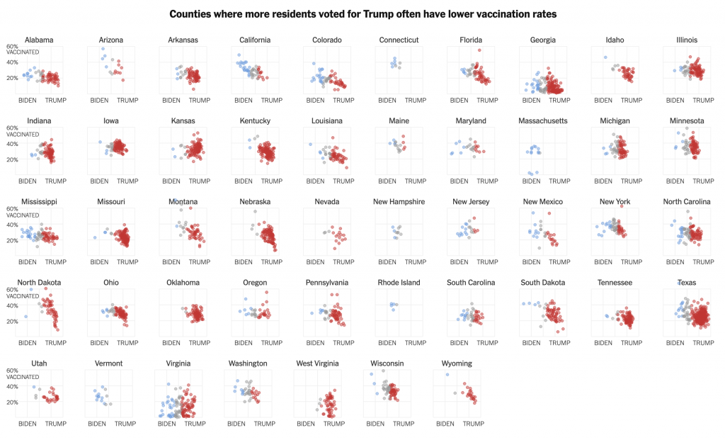
So that small multiples graphic I mentioned, well, see below.
All 50 states compared
Note how these use an expanded version of the larger chart. The y-minimum appears to be 0%, but again, it would be very helpful if that were labelled.
Also for the x-axis in all the charts, I’m not sure every one needs the Biden–Trump label. After all, not every chart has the 0–60% range labelled, but the beginning of each row makes that clear.
In the super picky, I wish that final row were aligned with the four above it. I find it super distracting, but that’s probably just me.
Overall, this is a strong piece that makes good use of a number of the standard data visualisation forms. But I wish the graphics were a bit tighter to make the graphics just a little clearer.
Credit for the piece goes to Danielle Ivory, Lauren Leatherby and Robert Gebeloff.
Last week I wrote about how we may have been beginning to see divergent patterns in new cases, i.e. how New Jersey in particular had seen its new cases numbers falling whilst other states continued with increasing case counts.
One week later, that may still broadly hold true.
Emphasis on may.
New case curves for PA, NJ, DE, VA, & IL.
If we look at the new charts, we can see that broadly, New Jersey did continue its downward trend as Pennsylvania and Delaware experienced significant rises in new cases. Virginia remained fairly stable, but with a slight trend towards increasing numbers of new cases.
But New Jersey and now Illinois present some interesting trends to watch this coming week. Illinois reminds me of New Jersey in that despite rising numbers most of last week, the last few days (and of course the weekend) saw numbers lower than preceding days. You can see from the slightest of dips at the tail of the line the trend has flipped direction. Will the direction hold, however, once we start receiving weekday reporting figures starting Tuesday?
Back to New Jersey, though. The downward trend continued most of the week. But, the last several days could portend a reversal of sorts. For most of the last week, the state saw daily new case numbers increasing day after day. But the trend line, as it should, remained heading downwards. Until just a few days ago. If you look at the tail of the line there, you will see a slight uptick. This too will be something to watch in the coming week.
Deaths also need careful attention this week.
Death curves in PA, NJ, DE, VA, & IL.
Last I asked the question, will deaths follow rising cases? After a week of data, the answer is unmistakably yes. However, unlike new cases, the increases are largely of a marginal number. Look closely at the ends of the lines for Pennsylvania, New Jersey, Delaware, and Illinois and you will see last week’s shallow rise continued.
Virginia bucked the trend with decreasing numbers of deaths. And of course marginal increases could easily give way to marginal decreases. Now I try not to mention too many daily numbers in these posts because I take the weekly view, but I will be closely following Pennsylvania this week. For the last several weeks, the Commonwealth regularly reported deaths on Sunday and Monday in the single digits. Yesterday Harrisburg reported 40. Is this a one-day surge of reports? Is the state resuming reporting more deaths at the weekend? Or does it portend something worse, a mores significant rise in the number of deaths?
Vaccinations continue apace. Although, I would expect to see some slowdown as the Johnson & Johnson vaccine pause ripples out across the vaccination programme.
Fully vaccinated curves for PA, NJ, DE, VA, & IL.
For now though we continue to see increasing numbers. Indeed, the three states I track have now all reached or should reach today 25% of their population as fully vaccinated.
One, that is good news.
But, two, this is just the beginning.
Last week in some tense questioning about when we can expect resumption of “normal”, Dr. Fauci provided a figure of 10,000 new cases per day across the US. (Currently we are about at 60,000 or so.) Vaccines will impede the transmission as they become ever more widely administered and fully implemented—remember that a first dose of a two-dose regimen does not mean you should be heading out and socialising.
At present, we have Pennsylvania averaging 5,000 new cases per day. In other words, Pennsylvania alone represents half of Dr. Fauci’s target. We are clearly far from that reopening level.
What I will be curious about in the coming weeks though is that interplay between new cases and vaccinations. If Illinois does begin to see a downward trend in new cases this week, how much of it is due to the state being 25% fully vaccinated?
That’s a complex question to answer, but at some point, increasing vaccinations will force new cases to reach an inflection point. First they will begin to bend downward, increasing more slowly instead of exponentially. Then with even more vaccinations a second point will be reached at which this new surge begins to finally turn and new cases drop.
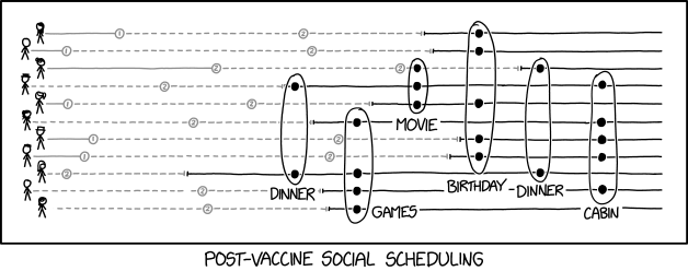
If all goes according to plan, your author today will receive his first dose of the Covid-19 vaccine, the Pfizer variety for the curious. As such, it feels appropriate to share this recent piece from xkcd.
Also looks like some funky bar chord notation.
All joking aside, it should be said that, and as this graphic illustrates, just because you receive your first dose, doesn’t mean you should be out socialising and seeing people later that night.
You are not fully vaccinated until two weeks after your second dose, or the first if you received Johnson & Johnson. And so while I may be receiving my first dose this afternoon, it is going to be close to a month and a half before I’m able to leave my household unit and socialise with others. Probably three weeks for my second dose and then another two weeks for the vaccine to fully take effect.
Doesn’t mean I won’t be counting the days, though.
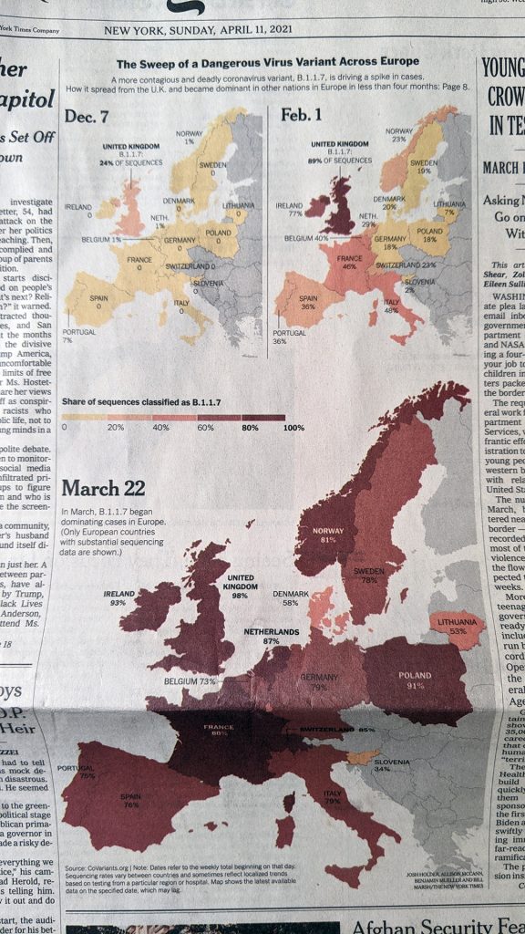
Last Thursday I wrote about the use of colour in a choropleth map from the Philadelphia Inquirer. Then on Sunday morning, I opened the door to collect the paper and saw a choropleth above the fold for the New York Times. I’ll admit my post was a bit lengthy—I’ve never been one described as short of words—but the key point was how in the Inquirer piece the designer opted to use a blue-to-red palette for what appeared to be a data set whose numbers ran in one direction. The bins described the number of weeks a house remained on the market, in other words, it could only go up as there are no negative weeks.
Compare that to this graphic from the Times.
More choropleth colours…
Here we are not looking at the Philadelphia housing market, but rather the spread of the UK/Kent variant of SARS-CoV-2, the virus that causes COVID-19. (In the states we call it the UK variant, but obviously in the UK they don’t call it the UK variant, they call it the Kent variant from the county in the UK where it first emerged.)
Specifically, the map looks at the share (percent) of the variant, technically named B.1.1.7, in the tests reported for each country. The Inquirer map had six bins, this Times map has five. The Inquirer, as I noted above, went from less than one week to over five weeks. This map divides 100% into five 20-percent bins.
Unlike the Inquirer map, however, this one keeps to one “colour”. Last week I explained why you’ll see one colour mean yellow to red like we see here.
This map makes better use of colour. It intuitively depicts increasing…virus share, if that’s a phrase, by a deepening red. The equivalent from last week’s map would have, say, 0–40% in different shades of blue. That doesn’t make any sense by default. You could create some kind of benchmark—though off the top of my head none come to mind—where you might want to split the legend into two directions, but in this default setting, one colour headed in one direction makes significant sense.
Separately, the map makes a lot of sense here, because it shows a geographic spread of the variant, rippling outward from the UK. The first significant impacts registering in the countries across the Channel and the North Sea. But within four months, the variant can be found in significant percentages across the continent.
Credit for the piece goes to Josh Holder, Allison McCann, Benjamin Mueller, and Bill Marsh.
This time last week I wrote about how we should not be surprised at rising levels of coronavirus in the states of Pennsylvania, New Jersey, Delaware, Virginia, and Illinois. After all, our elected officials reopened economies despite data saying they should do otherwise. On top of that, people have been engaging in reckless behaviour and seemingly abandoning the very behaviours that had been leading to declining rates. With those two failures, our last hope is that vaccines will come quickly and be widely taken by the public.
A week hence.
Well, we are beginning to see some divergent patterns, especially with new cases.
New case curves for PA, NJ, DE, VA, & IL.
Last week there was some evidence that New Jersey might be bucking the trend and headed downwards after weeks of rising new cases. And now that appears to be a more sustained trend as the line for the Garden State’s seven-day average clearly began headed the right direction this past week.
That’s the good news. The bad news is that we continue to see rising numbers of new cases in Pennsylvania, Delaware, and Illinois. Although if we want to try and find the positives in the bad, we can see that Delaware’s upward trend remains fairly shallow. Illinois, while steeper, is rising from a lower base as the Land of Lincoln managed to reach low, summer levels of new case spread earlier this year. And in Pennsylvania, there is a bend in the curve, an inflection point, that could indicate growth in the number of new cases is slowing. We still need to see it turn negative, but slowing growth is better than increasing growth.
Virginia splits the difference between those sets. It remains at an elevated level of new case transmission, but the upward tick we saw—unlike the other states—was not followed by a general surge in new cases. The little rise we did see, in fact seems to have perhaps shifted back downward.
One of the big questions in this current wave of new cases is will deaths rise? We are seeing increasing numbers of new cases and hospitalisations, but will deaths follow? The hope is that we have vaccinated enough of the most vulnerable populations to prevent them from suffering the most serious of results.
Death curves for PA, NJ, DE, VA, & IL.
So far so good. While death rates remain slightly elevated over summer levels, we do not yet see any signs of rising numbers of deaths. The only possible exception is Virginia, where cases bottomed out after the state added delayed death certificates from the holidays, but have risen in recent days.
Finally we have vaccinations. Here is the best news at which we can look. We can now say that at least 20% of the populations of Pennsylvania, Virginia, and Illinois are fully vaccinated. To be clear, that is still a long way from herd immunity levels, but that’s 20 percentage points more than we had four months ago.
Total full vaccination curves for PA, VA, & IL.
One big outstanding question is how much, if at all, can vaccinated people spread coronavirus? This is why we need to continue to wear masks and socially distance even those who have been vaccinated. But at some point—I don’t know when—these increasing levels of full vaccination should begin to flatten the new case curves. Could that be what’s flattening the curves in New Jersey, Virginia, and Pennsylvania? It’s too early to say, but one can hope.
Last week I wrote about how the inevitable rise in new Covid-19 cases was occurring in Pennsylvania, New Jersey, Delaware, Virginia, and Illinois. Now, one, in the last week, we saw no evidence of states preparing to reinforce their public health and safety restrictions. And two, whilst we have no data on people not following guidelines, anecdotally a large group of people threw a party in my building’s common amenities space so it does seem like people are feeling less inclined to wear masks, socially distance, and isolate to their own households.
Those two conditions, of course, do not help reduce the case count. Instead they add to it. So it should come as no surprise that Covid-19 continues to rapidly spread in our five states, though some are doing worse than others.
New case curves for PA, NJ, DE, VA, & IL.
New Jersey and Pennsylvania arguably performed the worst. If we look at the peak to trough decline from early winter’s surge to late winter’s nadir, we can see that New Jersey has reached 40% of that peak. Pennsylvania enjoyed a better decline and so has a large gap, but is still nearing 20% its previous peak.
Illinois is also remarkable—again not in a good way—as its peak to trough fall was even greater than Pennsylvania’s, however it’s also now clearly rising. The Land of Lincoln, however, did manager to reach late summer levels of new cases—good. But those are now rising—bad. Delaware too is seeing a rise, albeit at a slower rate than its two tristate neighbours.
Only Virginia’s rise remains slight, barely discernible in the chart.
Deaths, while not exactly good news, aren’t exactly good news either. Last week I mentioned how they had stalled out and stopped declining. That is better than rising death rates, but the levels of deaths per day is still higher than we saw last summer. In other words, things could be significantly better even in pandemic terms.
Death curves for PA, NJ, DE, VA, & IL.
Last week? Deaths continued to stubbornly persist at those elevated levels. We remain vigilant, looking for any indication that deaths will follow the rates of new cases and hospitalisations and begin to climb.
The hope, of course, is that we have vaccinated enough of the most at risk populations to prevent a surge in deaths. But, we just don’t know yet. The only good news is that vaccinations continue to progress.
Vaccination curves for PA, VA, & IL.
Illinois has surpassed 18% of its population being fully vaccinated. Virginia is not far behind at 17.75%. Pennsylvania, because of the bifurcated nature of its data reporting, remains unclear. It sits at 17.8% fully vaccinated, but Philadelphia has not posted updated data since late Thursday. It’s likely that the Commonwealth has joined Illinois in surpassing 18%, but it’s not fully certain.
Also this past week, the CDC updated its guidance for the fully vaccinated, saying that it was safe for them to travel. I take some issue with this, primarily on the messaging front.
First, we need to be clear about what fully vaccinated means. It means two weeks after your final dose. For Johnson & Johnson’s vaccine, that means two weeks after your shot as you only receive one. For both Pfizer and Moderna, you are only fully vaccinated two weeks after your second shot—not before. And keep in mind with Pfizer you need to wait three weeks between first and second dose. With Moderna it’s four weeks. In other words, with J&J you need to wait two weeks after your first (and only) shot before you can begin to follow the loosened guidelines. If you receive Pfizer’s, you need to wait five weeks from your first shot, assuming you do receive your second three weeks later, and with Moderna it’s six weeks, again assuming the recommended four week gap.
The problem is that only about 20% of the US population is fully vaccinated. And with the virus spreading at high rates and at high levels, it poses a significant risk as the newer, more lethal, and more infectious variants could take root in the United States and overwhelm the healthcare systems of the 50 states. We do not yet know if fully vaccinated people can spread the virus if they do become infected.
I think the advice should have remained to refrain from all but essential travel until we reached a high percentage of fully vaccinated folks. I ballparked earlier this week something like 2/3 the estimated amount of full vaccinations required for herd immunity (est. at 75%). In other words, keeping restrictions on travel until at least 50% of the US becomes fully vaccinated.
We remain several weeks away from that milestone, unfortunately. I understand the desire/urge people have to get out and do things and enjoy spring after a year of isolation. Sadly, if winter was the darkest/hardest part of the pandemic, I think that makes spring and early summer the most challenging. Because we see progress, we see the light at the end of the tunnel, and it coincides with warmer weather and we want nothing more to get out and do things and see people. But that is the last thing we need to be doing at this point.
I’ve often described the vaccination as the marshmallow test. In a study, scientists presented kids with a marshmallow. They could eat the marshmallow immediately, but if they waited 15 minutes, unsupervised, they could then have an additional marshmallow. We are all just grabbing that first marshmallow whilst the promise of a more normal summer is ours if we can wait just 15 minutes.
Two weeks ago I wrote about how new cases in the states of Pennsylvania, New Jersey, Delaware, Virginia, and Illinois were stalling out, i.e. no longer declining. Additionally, with the exception of Illinois, they were stalling at rates far higher than what we saw last summer. I wrote
This means that the environment is ripe for a new surge of cases if people stop following social distancing and begin resuming indoor activities with other people. Sadly, both those things appear to be occurring throughout the US.
Two weeks hence, one of one thing inevitably occurred.
New cases are now rising in all five states. I wrote about the flat tails of the curves for the seven-day averages. A quick look at the chart shows those have swung upwards, in some cases sharply.
New case curves in PA, NJ, DE, VA, & IL.
Two weeks ago I referenced Europe as a cautionary tale. Governments there eased up on their restrictions, cases surged, and then as hospitalisations rose, governments had to reimpose restrictions and effect new lockdowns. Europe has typically been 3–4 weeks ahead of us throughout the pandemic. So that we are now at a point where we are seeing rising cases, absolutely none of this should be surprising.
The evidence has been in our faces for weeks, plus we have the European example to look at. Reopening makes no sense until we can get case numbers lower, especially with new more virulent and lethal strains of coronavirus now circulating.
Deaths too have been trending the wrong way over the last few weeks.
Death curves for PA, NJ, DE, VA, & IL.
We have seen the curves largely bottom out. And if you look closely, these bottoms are higher than the rates we saw last summer, in some cases more than 3× as much. This flattening occurred just a few weeks after cases began to flatten. The question becomes, will they rise in a few weeks time? Or have we vaccinated enough of our most vulnerable populations?
That’s the real wildcard.
Right now, we have only fully vaccinated about 15% of the populations of Pennsylvania, Virginia, and Illinois.
Vaccination curves for PA, VA, & IL.
Is that enough to prevent hospitalisations and deaths in what looks like will be a fourth wave?