Last Thursday I wrote about the use of colour in a choropleth map from the Philadelphia Inquirer. Then on Sunday morning, I opened the door to collect the paper and saw a choropleth above the fold for the New York Times. I’ll admit my post was a bit lengthy—I’ve never been one described as short of words—but the key point was how in the Inquirer piece the designer opted to use a blue-to-red palette for what appeared to be a data set whose numbers ran in one direction. The bins described the number of weeks a house remained on the market, in other words, it could only go up as there are no negative weeks.
Compare that to this graphic from the Times.
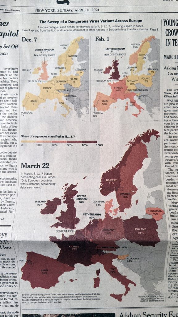
Here we are not looking at the Philadelphia housing market, but rather the spread of the UK/Kent variant of SARS-CoV-2, the virus that causes COVID-19. (In the states we call it the UK variant, but obviously in the UK they don’t call it the UK variant, they call it the Kent variant from the county in the UK where it first emerged.)
Specifically, the map looks at the share (percent) of the variant, technically named B.1.1.7, in the tests reported for each country. The Inquirer map had six bins, this Times map has five. The Inquirer, as I noted above, went from less than one week to over five weeks. This map divides 100% into five 20-percent bins.
Unlike the Inquirer map, however, this one keeps to one “colour”. Last week I explained why you’ll see one colour mean yellow to red like we see here.
This map makes better use of colour. It intuitively depicts increasing…virus share, if that’s a phrase, by a deepening red. The equivalent from last week’s map would have, say, 0–40% in different shades of blue. That doesn’t make any sense by default. You could create some kind of benchmark—though off the top of my head none come to mind—where you might want to split the legend into two directions, but in this default setting, one colour headed in one direction makes significant sense.
Separately, the map makes a lot of sense here, because it shows a geographic spread of the variant, rippling outward from the UK. The first significant impacts registering in the countries across the Channel and the North Sea. But within four months, the variant can be found in significant percentages across the continent.
Credit for the piece goes to Josh Holder, Allison McCann, Benjamin Mueller, and Bill Marsh.
Leave a Reply
You must be logged in to post a comment.